


LogoFan
-
Posts
675 -
Joined
-
Last visited
Posts posted by LogoFan
-
-
17 hours ago, oldschoolvikings said:
Just as a quick mental impression, the Lions don't necessarily feel like a team that changes their uniforms all the time, but in reality, they absolutely are. In fact, unless I'm forgetting some other team, they are tied with Jacksonville (who definitely does feel like a team that changes uniforms constantly) with the most in the NFL in this century. Both have four official uniform changes, and unless you count alts, color rushes, and throwbacks, no one else has more than 3. And after 2024, the Lions will have 5. That FIVE in 25 years, in a league that doesn't let you change more than once every 5 years... the math already doesn't seem possible.

I actually feel like their current uniform is entirely salvageable. I'd get rid of the lettering on both sleeves, drop all occurrences of the dark gray and the white practice pants, and get a non-italicized number font, and I'd be all set.
The last one sure beats the hell out of the two with the tacked-on black trim.
I'm not sure how logical it is, but I always think of teams whose uniforms are constantly changing as poorly run, across all sports.
Meh. To each their own. Their 2009-2016 set was actually one of my favorite NFL sets.
Now the current set? Not so much. At all. The uniforms loose a lot when white is dropped.-
 4
4
-
-
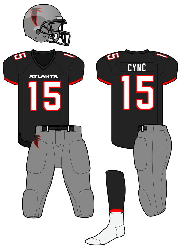
21 hours ago, Ted Cunningham said:
Interestingly enough, this exact thought was posited back before the Falcons' latest rebrand was revealed, and I mocked it up in that discussion:
While I agree the dark gray and black looks good together, I loathe that old Falcs logo and it's even worse with the red outline.
They already have the correct answer to their uniform issues with their current throwbacks. I'd replace the old logo for the new and call it a day. Oh, and add a black facemask. Done.
That said, I'm not sure it would be good to have the Falcons go to the dark gray/black when the Bucs have a very similar pallette with the pewter. They have red jerseys but their alts are black. Not sure if that's good with both being in the same division. -
On 2/25/2023 at 7:48 PM, GFB said:
It feels a little pointless critiquing an XFL logo (because they are all bad), but the new Seattle logo looks so awkward with the negative space on the bottom of the “S” and the negative space filled in on the top half of the letterform.
Regardless, Overwatch League did the same concept better:
I've always thought they tried too hard to force the new logo to look like the Dragon's secondary. A 10 year old could do better.
-
2
-
 1
1
-
-
On 2/26/2023 at 4:19 PM, ManillaToad said:
Those shoulder stripes are awful. San Antonio has them too
I actually prefer the shoulder stripe setup on the UA jerseys better than the half-assed version the NFL has thrown at us for the last 20+ years where the stripes stop way to short.
My gripe with the XFL stripes is how "cutesy" they got with them (the "cracked" pattern for the Brahmas, the "scale" patter for the SeaDragons...which look NOTHING like scales) and of course the"oiler splatters" for the Roughnecks.-
1
-
-
On 2/18/2023 at 6:51 PM, Volt said:
Even my wife pointed how badly mismatch the shades are.Look, it happens…colors don’t always match across mediums. But this looks like the league used maybe the former Pantone for the helmet paint, rather than, you know, updating it to match UA’s “Light Blue” or whatever they call it.
If they had just left the uniforms alone, it would've been far less noticable as the black would have separated the helmet blue with the jersey blue.
-
Found this...it explains the features in the Vipers' primary. I'm kind of speechless that this kind of minute explanation is even necessary. Whatever happened to simplicity?
https://www.fox5vegas.com/2022/10/31/las-vegas-xfl-team-be-named-vipers/
-
10 hours ago, GDAWG said:
If they were to rename the team, then why not keep the orange and pink?
You mean orange and purple?
My thoughts on the Vipers's whole logo identity:
Primary: the team site describes the "V" logo as two red fangs coming down". All I can say is, if those are supposed to be fangs, the angle screams that the Viper needs to see a reptilian orthodontist. Badly. Fail.
Secondary: any time you leave literally everyone confused about what a logo is and why/what it represents, you have failed completely in your mission.
-
3
-
-
1 hour ago, MJWalker45 said:
I just remember Arlington's secondary being the previous primary logo which should still be on the helmet.
Amen. The current one looks like a sports energy drink logo.
-
2
-
-
As much as I hate the Vipers logo, the secondary really has me thinking "WTF?" When the logo was out on TESS many thought it might be related to St Louis, which at least would make sense. But what was revealed does not tie into either a viper or Vegas. Truly stumped on that one.
Replacing the Defenders shield was a step back, but at least the Pentagon design ties directly to DC.
Absolutely love the Houston secondary. Out of the 16 logos (primary and secondary) for the 3.0 version, it's my favorite.-
2
-
-
1 hour ago, Skycast said:
Both of which are reminiscent of the Oregon Ducks and Philadelphia Eagles helmets.
Yup. The thing is, I would've never gotten "Stallions" out of that helmet design. Not sure what they were thinking unless it was Pegasus. LOL
-
5
-
-
2 hours ago, AgentColon2 said:
I’ve always thought silver, black and gold really work well together since the old WAFL knights did it.
They were my favorite. VERY sharp.
-
1
-
-
On 1/27/2023 at 12:35 PM, maz said:
Y'know what... they aren't as bad as I remember them being. In fact, I like them. And the Maulers already have a similar pattern on their uniforms. A simple color swap would be enough to achieve a similar look. This also shows gray is a good third color and would help them look a little different from the rest of the Pittsburgh pack (which the Pirates failed at when they brought in red as a third color in the late 90's for some reason).
Wow, someone beat me to the silver/gray thing, but I didn't even think about this great example. That uniform is actually very nice.
I think to keep true to Pittsburgh cookie-cutter colors, yet have their own slant on them, silver or gray (preferably gray) would work very well with the Maulers set AND it would actually keep a link to their team history as it's already been an established color in both the 1.0 and 2.0a sets.
I'd like to see gray in the background of the logo instead of the stark white...it would also serve to separate them from the Steelers more. One thing I hated about the 2.0a set was the ridiculously heavy number outlines...I really hope they tone them back or remove them completely.-
1
-
-
22 hours ago, PERRIN said:
Exactly my thoughts. This is the biggest uniform downgrade from XFL2020 in my book; the previous iteration was a gorgeous uniform that perfectly utilized its color scheme with some very tasteful striping and an awesome helmet. Super sad to see how watered down this newer set is. All the personality of the previous set got completely sucked out in favor of a boring and lazily-made look.
Battlehawks were definitely downgraded. I think even moreso with the Roughnecks; I know the logo had to change but scrapping the entire uni for a gradient-filled mess is very disappointing and look too much like a Texas ripoff. Don't even get me started on how they mutilated a very nice Renegades uni and replaced a nice logo with an out-of-place-looking logo more fit for an energy drink than a football helmet.
-
1
-
-
12 hours ago, CDCLT said:
That's disappointing. The purple and orange was something unique and while I know nothing says Pittsburgh like black and gold, I'll miss what they had. Hopefully the uniforms stay at least somewhat close to what they had. Those were excellent.
I am very, very disappointed in the direction they took with this. As you said, the purple, orange and gray was very unique. Now they look generic. In fact, if they go with a black helmet, they are going to scream "Steelers Knock-off". Outside of hard-core Pittsburgh fans, not sure if this is going to resonate with anyone outside the steel city.
The original Maulers had a great look and the 2.0 ruined it by going with a metallic day-glow purple instead of the original darker purple that looked so sharp. Then they brought orange out even more, with heavy numeral outlines and yolks in orange. The 2.0 version was an eyesore, granted, but could've easily been fixed without sacrificing the unique brand identity. Now, they just look like bastardized ripoffs. FAIL.
And it's a real WTF head-scratcher when you realize that in December they took further steps to revive the Federals, Invaders and Gold...the Gold had the same color scheme Pitt now has.-
5
-
-
So we have energy-drink logos, logos with colors no where on the home uniform, gradients, cracks, oil spillage, camo, everything but the kitchen sink. And these monstrosities still suck. They went for too much "cutesy" bull:censored: when less would have been more, and then dumbed down previously good uniforms. It amazing one group did so much damage.
-
1
-
-
1 hour ago, GDAWG said:
Houston from the other side:
There's just too much going on here. I get it...it's supposed to be the Texas flag. The numbers are too much along with how unusual the paint scheme is on the lid. And it almost looks like the helmet has a white cap on top of a red shell from this side. What a trainwreck. -
31 minutes ago, Volt said:
These all really suck.
Just got it in under the wire for 2022 Understatement of the Year Award.
Tornados don't have as much sucking power as these as a whole do. There are dead people crying over this mess.
-
 1
1
-
-
Oh, joy. On top of all the "cutsey" elements, we also have gradients.
And Dwayne's bull logo on the back of every jersey.
I look at all this hot mess and can only conclude they were trying to out-do Oregon in eye-sore elements.-
3
-
-
8 minutes ago, nuordr said:
The Houston Roughnecks helmet is awful...it reminded me of the Jacksonville Jaguars two-toned helmet when I first seen it. I am not a fan of the Vipers either as it is very plain.
It looks like someone got drunk and just started slapping crap on the shell. It's really a bad eyesore...so incredibly the opposite of what the team had originally.
-
1
-
-

I see a few elements that I actually like, but overall these things are awful. SO much to critique, so little time. Wow.
First reaction:
I love the orange SeaDragon shell, not a fan of the texture in the stripe or facemask color.
Defenders looked better with red helmet. Battlehawks had good details ripped away for a generic look.
The actually went with the "Sports Drink" logo on the Renegades helmet? Instant fail. Doesn't look right and DOES NOT match the rest of the uniform.
What the *#&$ did they do the Roughnecks???? WORSE than an eyesore...a true trainwreck.
I don't like the "cutesy" elements in the SeaDragons stripes, camo watermark on the Defenders shell or the "cracked" (it's "cracked" all right!) look in the Brahmas logowork.
Defenders and Battlehawks are okay but downgrades. Seattle looked better in blue jersey. Best 2 are Guardians and Brahams. Vipers are boring, Renegades doesn't work with the helmet and Roughnecks just need to be flush. FFS, this is a hot mess.-
1
-
-
10 hours ago, Brave-Bird 08 said:
I'm so glad I see other folks acknowledging the Lions Stafford era uniforms. They were PERFECT.
Full striping agreement and the numbers followed the same pattern, with a very Lion-esque custom font that had way more life than the current one.
The addition of black in 2003 wasn't bad, it just wasn't right out of the gate. It helped differentiate them from the Cowboys and also defines the edges around honolulu blue and white much better than silver.
The logo was also massively improved. That was the best the Lions have looked since I have been alive.
The black really did a LOT to separate and clarify the colors. And they added black at a minimal level...primarily as an outline. At a time of black-for-black's-sake changes, it was done very conservatively. I always felt they looked classy.
-
2
-
-
On 11/25/2022 at 1:06 PM, tBBP said:
Counterpoint, hot take, unpopular opinion--call it what you want--but to me, these were the best Lions uniforms:
110% agree. One of my all-time favorite NFL sets.
-
1
-
1
-
2
-
-
20 hours ago, gosioux76 said:
That is an under appreciated uniform and mix of colors.
Agreed!
-
17 hours ago, mcrosby said:
I believe it's Bosack.
He did all the USFL 2.0 logos, so I agree.


XFL 2023 Logos, Names and Uniforms
in Sports Logo News
Posted
I didn't mention Nike. But the shorter shoulder stripes started popping up 20 some-odd years ago on both the Colts and Jets.