-
Posts
908 -
Joined
-
Last visited
Posts posted by jc...
-
-
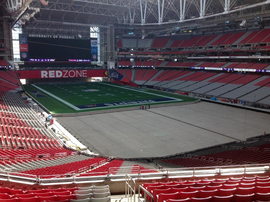
I agree, I hope they would fix the Patriots end zone.
I also think there is a possibility of the Super Bowl logo at the 50, with the NFL logos at the 25, a la Super Bowl XXV.
-
This season is the Colts 32nd season in Indianapolis.
The Colts played 31 seasons in Baltimore.
-
 1
1
-
-
The name, "Super Bowl."
Its got history now, but it just sounds really corny when you think about it.
-
At least put the alternate NE logo there.
-
It looked so unfinished.

-
This can't be happening. Who approves this garbage????

-
It never ends....LoL.
Flying Elvis is under the wordmark. Notice how Elvis is missing beside the wordmark?
Will there be a couple Elvi?
https://twitter.com/mattpep15/status/560482015758532610/photo/1
-
Looks like everything will NOT be back to normal.
https://twitter.com/john_kucko/status/560226787121061888/photo/1
https://twitter.com/GeoffBakerTIMES/status/560196645267054592/photo/1
-
I usually do some concepts, but your work is such top notch, I don't need to do them!
With that said, this will be the first Super Bowl, with the boring generic Super Bowl logo on grass.
I wasn't aware of your thread, but I consider myself to still be new here, so you'll have to cut me some slack. But I'm interested to see how they excite the logo on grass. They did a good job for Super Bowl XLII with the logos. I'm also interested in seeing what they do for the pro bowl, and if they will remove that paint somehow, paint over that, or re-sod.
Your time here has nothing to do with it. Your contributions are greatly appreciated. I know there were quite a few people who asked many a time for a Super Bowl field Database, and you sir, knocked it out of the park! The "alternate" thread is probably my favorite. Thank you again!!!!

-
I usually do some concepts, but your work is such top notch, I don't need to do them!
With that said, this will be the first Super Bowl, with the boring generic Super Bowl logo on grass.
-
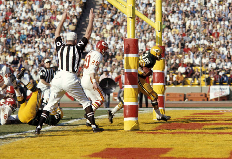
Here's a correction to Super Bowl I. The only necessary changes were the field dimensions and centering the endzone logos and wordmarks.

I knew this, but just remembered it from watching the Super Bowl I highlights, each endzone had a slightly lighter yellow border, maybe a foot or foot and half wide, inside the endzone. This is the best pic I could find without taking a picture of the TV with a cell phone.

-
The trick with the helmet end zones is to not use the alternate color for the background. Like the Eagles for Super Bowl XV. The gray end zone makes it hard to see the out of bounds border. Really, the end zone should have been green. But then the helmets would blend in too much.
Super Bowls XXXVIII and XXXIX used too small of a helmet to make them pop. Maybe because of the modern facemasks? I wouldn't think so.
I always thought in the more recent Super Bowls, that the Steelers should have had black instead of yellow.
-
How tacky would it be to put the Super Bowl logo at the 50 yard line?

I kind of threw this together quick, but I'll let you decide the level of tacky.

That isn't as bad as I thought it would be. The 50 at the 50 doesn't look too bad!
-
How tacky would it be to put the Super Bowl logo at the 50 yard line?

-
Bright and colorful! The way a Super Bowl is supposed to look.
I am really looking forward to Super Bowl L. ( I refuse to use Arabic.) It has been since Super Bowl XXXVII since a game started in the daylight.
-
Maybe replace the team logos in the endzones with the NFL logos since they are already on the field helmets.
-
NAILED IT! Great work!
Imagine the media blowup if the Redskins made it to the Super Bowl. It would overshadow the game.
-
Super Bowl XXIV was pretty bad. As was Super Bowl XXVII. I assume Super Bowl XVIII was bad, but I was only 3 and probably didn't watch it. And probably Super Bowl VI. ;-)
-
Here is my concept thread from Super Bowl XLVIII. I agree with you 110%. This field was a disappointment.
http://boards.sportslogos.net/topic/96732-super-bowl-xlviii-field-concepts/
-
I can see that. The current Atlanta script is also very similar. So it also would have been about the same as well. Everything about the endzones for this game where very proportional!I think it had more to do with keeping the script look like it is supposed to be without getting stretched or shrunk.
If you look at the Broncos wordmark from Super Bowl's XXXII and XXXIII you can see how they stretched the lettering vertically to make it big.
The actually Broncos wordmark is actually short.
http://www.sportslogos.net/logos/view/mvxsk3btmpewzxzovglilwc4w/Denver_Broncos/1997/Wordmark_Logo
The Seahawks and Cardinals wordmark is similar, so instead of distorting it, they added the full wordmark that included city name to keep the proportions correct.
http://www.sportslogos.net/logos/view/998/Seattle_Seahawks/2002/Wordmark_Logo
http://www.sportslogos.net/logos/view/4609/Arizona_Cardinals/2005/Wordmark_Logo
Atlanta is another good example. And other examples that they DIDN'T put the city name in, mostly because it wasn't part of the word mark, the Ravens in Super Bowl XXXV and the Bears in Super Bowl XLI. They both had huge contrast in word mark styles with their opponents, the Giants and Colts who both have tall wordmarks. And the Colts one is pretty narrow.
-
I think it had more to do with keeping the script look like it is supposed to be without getting stretched or shrunk.
If you look at the Broncos wordmark from Super Bowl's XXXII and XXXIII you can see how they stretched the lettering vertically to make it big.
The actually Broncos wordmark is actually short.
http://www.sportslogos.net/logos/view/mvxsk3btmpewzxzovglilwc4w/Denver_Broncos/1997/Wordmark_Logo
The Seahawks and Cardinals wordmark is similar, so instead of distorting it, they added the full wordmark that included city name to keep the proportions correct.
http://www.sportslogos.net/logos/view/998/Seattle_Seahawks/2002/Wordmark_Logo
http://www.sportslogos.net/logos/view/4609/Arizona_Cardinals/2005/Wordmark_Logo
-
NVM. It was info included with the pic.
-
That season at Giants Stadium would probably have been with green grass colored end zones. I think the Giants script was either blue with a white outline, or just white lettering.
-
^^^^ It will be nice to see a Super Bowl in the California sunshine again. Well, for the first half anyways.
I totally thought the Buccaneers were going to get pewter end zones and red lettering. The red/black combination made it hard to read.


Super Bowl Field Database - Super Bowl LVIII
in Concepts
Posted
Looking like this one. I think you may be right on the black and gold conference logos from your alternate thread. There has been a heavy presence of them on TV.