


CS85
-
Posts
21,845 -
Joined
-
Last visited
-
Days Won
138
Posts posted by CS85
-
-
1 hour ago, DCarp1231 said:
Vikings WR N’Keal Harry switched from 28 to 85, but a new player is wearing 28-
A WR was wanting to wear #28?
-
 4
4
-
 1
1
-
-
I would have infinitely less issue with all of this if the conferences took the numbers and geography out of their names.
You can't even go with individual names at this point because if you named the Big 10, say, as the Nagurski or Grange conference, Illinois or Minnesota may leave for greener pastures in a decade, so why bother? Just sign each conference name over to major brands in 25 year contracts. Coca-Cola, Disney, Netflix, etc. Whore it all out, top to bottom.
-
1
-
1
-
-
23 minutes ago, aawagner011 said:
Notre Dame has fixed the navy numbers while creating a new, unwanted problem: green pants.
This looks fine to me, because at least there's not a jarringly matte mustard pant that makes the helmet look stupid.
-
8
-
-
1 minute ago, DCarp1231 said:
Arkansas State being the love child of the Patriots (striping) and Texans (numbers)
clicks Shuffle
"Ah, there's a uniform I like"
-
4
-
-
Guy doing a UIUC tour with his family was wearing a #80 Chicago Bears Bernard Berrian home jersey. I almost stopped to shake his hand.
-
4 hours ago, tBBP said:
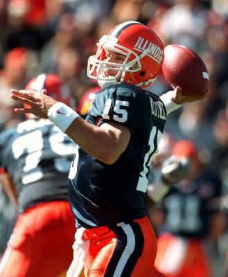
They do need to do something about those numbers, though...at least the 6 and the 9.
Did they and the Sacramento Kings shop at the same number font store or something??
Logo: block IAccents: solid rectangular stripes
Numerals: goofy rounded modern
-
5 minutes ago, 8BW14 said:
Illinois should essentially look like this forever:
The new jerseys suck (The helmet and pants are cool)
I don’t see how this is so hard, but here we are yet again.-
1
-
 1
1
-
-
53 minutes ago, ChiefIlliniwek13 said:
Illinois just dropped their new uniforms today https://twitter.com/IlliniFootball/status/1683493532886024193
These suck. They kept the awful number font and made the road uniforms too orange.Big whiff.
-
1
-
-
I'm a white-helmet Jets man, but if it can't be that, this is what they should be wearing, helmet-wise.
Also Aaron Rodgers is a piece of crap and I hope he fails.
-
14
-
 1
1
-
-
Illinois will reveal *some*thing tomorrow related to the football uniforms.
-
Washington CAPITALS, cmon, that is :censored: ing brilliant
-
3
-
-
"...So you see, I took this good uniform, made a lot of it black, because that's fire, and if you don't like it, you're old and should die, lol"
- Nike intern designer Zayton Bailey Hexton-Smith
-
8
-
9
-
-
6 minutes ago, DCarp1231 said:
Would’ve made a lot more sense if they trashed this idea and left their awesome brand well enough alone, sparing us all this abomination
Slight modification
-
8
-
 1
1
-
-
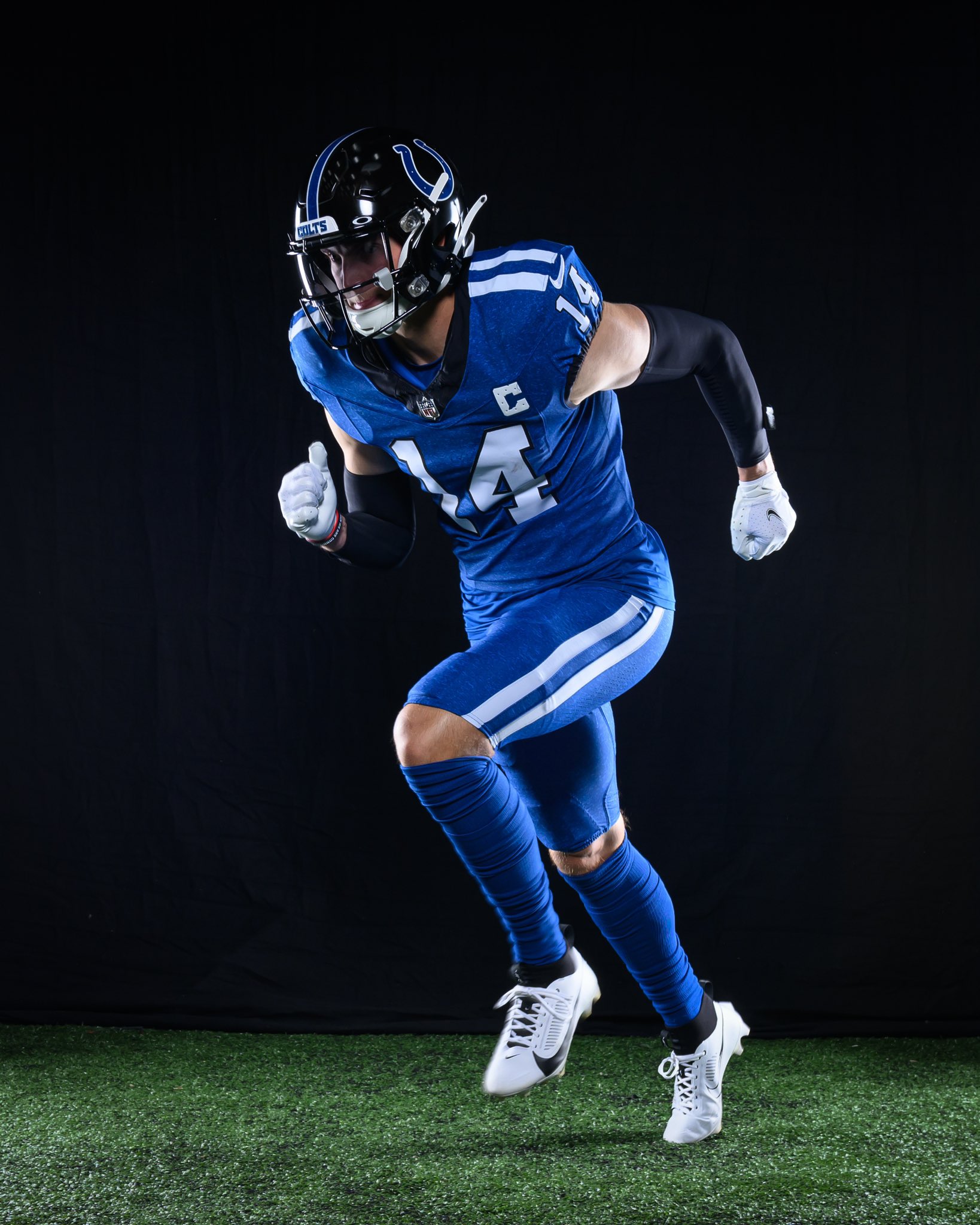
1 hour ago, DCarp1231 said:
I’m not disappointed in these? They’re fine honestly. I think they’d look better with the standard white helmet (and blue facemask), but these aren’t bad by any measure IMO
EDIT:
Wait… these things are TEXTURED??
“The inspiration for the alternate uniform comes from not only fan demand for a black helmet, but from the combination of black and blue that resemble and Indiana night sky. And through its black helmet and accents, "Indiana Nights" additionally draws inspiration from the strength, fearlessness and resilience the color black evokes.”
- eat my entire unwashed ass
- Indiana Nights are the same as anywhere else in the midwest: full of bugs, frogs, and busy emergency rooms
- any Colts fan who demanded a black helmet is not a Colts fan, they are fans of eating their own feces and saying it's butter
- black doesn't evoke a damn thing when you get your ass whipped 53-14 and "that dawg in ya" is vying for a top draft pick again
- I'm actually OK with the heathered uniforms I guess
- the Colts are a dumbass franchise, and this is stupid
- it's really stupid
- anyone who likes this is stupid
-
4
-
3
-
17
-
4 minutes ago, ruttep said:
The other weird thing about this is that no one has ever heard of this insurance company. How did they end up bagging the jersey advertising rights for the Yankees? Surely the Yankees could have chosen a more prestigious advertiser.
Starr Companies owns a swanky private golf course in Brewster, and this is 100% part of a stupid arrangement to get a handful of Yankees brass membership.
-
2
-
-
50 minutes ago, GhostOfNormMacdonald said:
Immediately what came to mind. The foundational pillar of uniform dignity has crumbled.
-
4
-
-
16 hours ago, deltarich87 said:
While I'm not a fan of the execution of it, I will say that it looks better in these pics than the one that was leaked the other day of just the uniform. Could do without the Sacramento wordmark atop the Kings one. The ad logo stands out in a bad way on this one compared to their Icon and Association uniforms
Another look at the set here
I'd probably get on board with this more if it was their City uniform, and they instead had something like this as their Statement uniform
credit for the mockup: https://www.instagram.com/jerseyxswap/
Tentatively I am supportive of the gradient here. Hopefully on the court they're not comically dumb.
-
28 minutes ago, Ferdinand Cesarano said:
I definitely have thoughts, none of which I can share by means of language that is appropriate for this forum.
The Black Speech of Mordor? -
This whole mess is a sham. None of these dopes have eaten a hot dog in years and years and years. They take a plain dog in a bun, soak it in water, and inhale it. Their expertise is in being able to deepthroat bologna tubes and wet bread in two bites.
If it was my contest, each dog has to have at least one condiment, and there is no water loophole. They'd get a can of soda or a bottle of water, none of this dipping cup bullcrap.
-
6
-
1
-
-
Suh-wing and a miss. This is like an SNL Celebrity Jeopardy-tier response to “Design a Mighty Ducks sweater.”
-
10 minutes ago, bowld said:
This uniform needs more Ps.
-
2
-
-
13 minutes ago, tigerslionspistonshabs said:
Love the helmet, hate the pairing.
As far as alternate helmets go, I dig it.
-
4
-
-
The ad patch really tells me the soul of the franchise is ready to take the next step into greatness. Actually, I'm going to order just the patch; I don't need the sweater otherwise, as it is nothing compared to the nucleus of championship glory that is that ad patch.
-
4
-
-
Hopefully it's a shiny chrome helmet so that way it doesn't match the gray uniform they wear it with whatsoever, because duh


College Football 2023
in Sports Logo News
Posted
But they do have that dawg in them now, however. Moreso than before.