


Hat Boy
-
Posts
1,833 -
Joined
-
Last visited
-
Days Won
1
Posts posted by Hat Boy
-
-
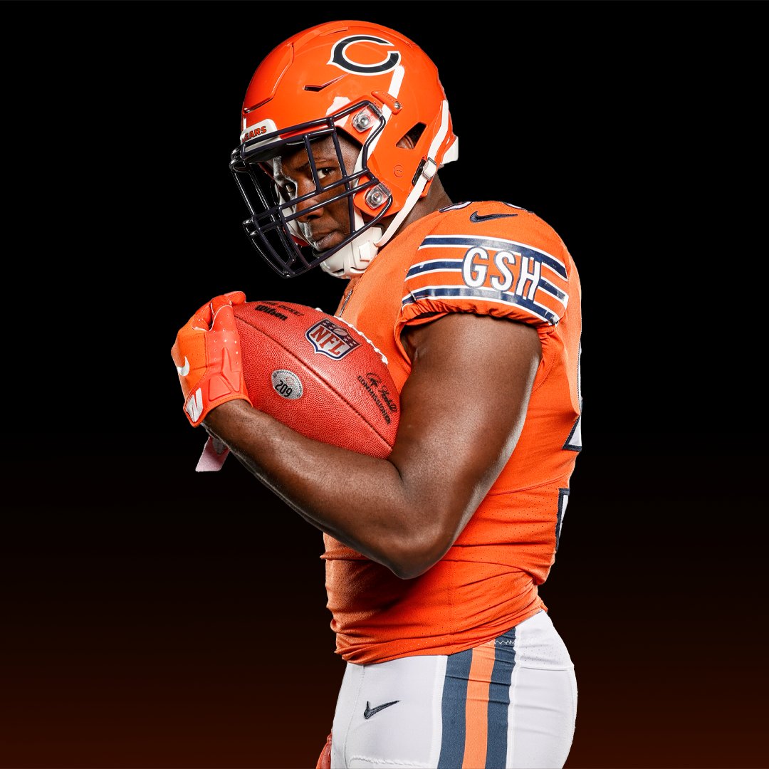
Is there any jersey manufacturer who still does a straight hemline? I will personally donate money if they are bidding on the NHL contract.
-
 2
2
-
-
10 minutes ago, ManillaToad said:
a well-loved look represented by the likes of Dan Marino, Don Shula, and the only perfect team in history
Miami's current uniform replaced this crappy uniform ("angry cartoon dolphin" logo and amateurish font with muddy drop shadow).

This uniform is post-Shula, the last few years of Marino, and was not around in 1972. Whoever came up with their current design was doing us a favor.
-
 9
9
-
-
42 minutes ago, Cujo said:
Introducing the alternate uniform nobody was clamoring for.
-
3
-
-
18 minutes ago, NH4 said:
“Stealth Black” I mean Jet Black is right there
This is more like "Smell the Glove" black
-
4
-
 1
1
-
-
54 minutes ago, Pyromania1983 said:
The logo sticker really gets shifted rearward due to the design of that helmet
-
 1
1
-
-
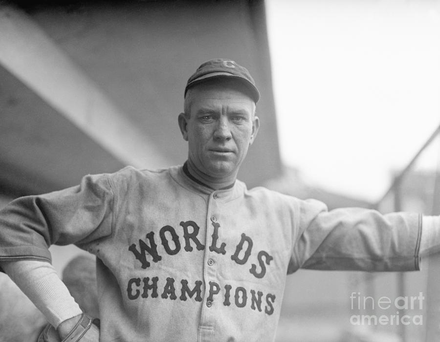
3 hours ago, adsarebad said:
Horrible All Star jerseys, leave the Gold theme for the WS champs....... for a couple of games that is.
For WS champions, I think we should bring back this beauty:
And while we're at it, I think we should bring back Dirk Richter. Kids will want to see the original Radioactive Man.
-
6
-
 1
1
-
-
2 minutes ago, jerrylawless3 said:
This alone should influence the NFL to reimplement the one-helmet rule.
Exactly. So, when people complain there is no Bucco Bruce or Pat Patriot helmet, we show them a meme of Cam Jordan wearing that abomination. "Thanks, Saints."
-
15 hours ago, Crabcake said:
And let’s not forget this gem:I can’t remember the last time someone described burgundy and black as a combination that “popped.”
Maybe he meant to write "POOP"?
-
1
-
3
-
-
2 hours ago, DCarp1231 said:
Did the Falcons red helmet always have the gold trim on the stripe?
According to Gridiron Uniform Database, it was for the first 4 seasons (1966-1969)
-
2
-
-
12 hours ago, DCarp1231 said:
Eagles uniforms would be Top 10 if they used a better font
I think the Eagles "1" may be the single worst uniform number out there.
-
2
-
-
7 hours ago, leopard88 said:
Yeah, that is pretty bad. They would be much better off just keep the wordmark and using a non-arched version of the L as the logo.
It would need to be straight instead of italicized to avoid looking like this Lafayette College secondary/helmet logo.
Four outlines plus a beveled edge? That is.....something.
-
3
-
2
-
-
8 hours ago, IceCap said:
That's the legal fiction the NFL says happens. But it's not what actually happened.
Yes, then we all agree it is an "Armin Tamzarian" situation.
Now, let's get back to discussing the Washington identity.
-
3
-
-
21 hours ago, MJD7 said:
Just out of curiosity, was that Bengals-Bucs game in the preseason? I don’t recall ever seeing them pair the white pants with the red jersey during that era, especially with the red “stripe.”
Pre-season 2017
-
1
-
-
15 hours ago, throwmesomepics said:
The first matchup was much less offensive imo
This picture contains the rarest of sights--the side panel and pant stripe actually line up (Cardinals lineman on the right). It's like getting a photo of Bigfoot
-
8
-
-
Games like this are worse, IMO, because these are the teams' primary uniforms. They are not alts, or "one offs", or color rush. Fans were forced to look at these eye sores every week.
-
23
-
-
11 hours ago, AFirestormToPurify said:
And to no one's surprise, they're just as underwhelming in action. The red outlines are barely visible. Too many thin stripes. It's a shame cause they were about two or three red stripes and a classic NJ logo away from being decent
I know it is a tiny sample, but I do not see anyone in the stands wearing the Jersey sweater. If it is a meme jersey AND isn't selling, that should put an end to it pretty quickly
-
5
-
-
3 hours ago, MJWalker45 said:
The NFL figures if the logos are on the sleeves they'll always be visible on camera.
Logo visibility is a Nike concern, not the NFL's.
The logo is on the sleeves, because that is the placement that Nike/NFL negotiated and Nike pays accordingly. I believe that the front of the jersey is the prime real estate, because Nike paid a higher price to MLB to put their mark there vs. on the sleeve.
College football also has their mark on the front of the jerseys. If the sleeve placement were preferable, I am sure Nike would have it there, as they are in a more favorable negotiating position with these colleges than with the NFL.
-
2
-
-
51 minutes ago, JayMac said:
Why are the patch and the Nike mark on the same side? So much unused space on the other side.
Leaving room for the captain "C "and "A"
2 hours ago, colinturner95 said:I don't hate these for Team USA. but the double blue is dumb IMO.
The blue breezers do not match that shade of navy blue or royal blue. Why is there a third shade of blue?
-
That USA sweater is grotesque.
-
2
-
-
4 hours ago, DiePerske said:
Banners should be raised when you win a real thing.
Divisions are real things
Conferences are real things.
Titles are real things.
The President's Trophy is a real thing. Whether or not it is a real accomplishment is debatable.
-
3
-
-
4 hours ago, spartacat_12 said:
Sure, but he never transcended the sport and became part of the zeitgeist the way guys like Bonds, Jeter, or A-rod did.
If zeitgeist is your baseline, a lot of players never fall into that category.
MLB justr needs to promote Ohtani to convince people to put their eyes on the product and/or butts in the seats. According to Forbes, Ohtani has $6M in endorsements (Asics, JAL Airlines and Seiko Watch in Japan and Fanatics, Oakley and Topps in the U.S.). That is more money than Bryce Harper, Kris Bryant or Mike Trout. People like Ohtani, MLB can use that.
-
The problem lies with MLB, not Ohtani. Mike Trout speaks English and baseball does a lousy job promoting him.
-
8
-
-
20 hours ago, spartacat_12 said:
Calling conference championships & Presidents Trophies mediocre accomplishments is a pretty bold statement considering the Bruins have 1 Stanley Cup in the last 50 years.
You may want to check your math, but your point remains valid.
-
3 hours ago, Jezus_Ghoti said:
And underrated contender for worst uniform in the league. The Rams have so many stupid elements you can point to, but the Jags just have ... nothing. These are so incredibly boring in every respect that in totality they are utterly awful.
I don't think plain equates to ugly. I'd rather drive a stock Camry (Jags uniform) than this over-designed mess (Rams uniform)
-
5
-


/cdn.vox-cdn.com/uploads/chorus_image/image/58159387/873040968.jpg.0.jpg)


2022 NFL regular season through Super Bowl LVII
in Sports In General
Posted
I think the team may just be having some fun with this, as there is no IR for mascots.