


Hat Boy
-
Posts
1,833 -
Joined
-
Last visited
-
Days Won
1
Posts posted by Hat Boy
-
-
This looks more like a Saturday morning cartoon than a baseball logo. Thumbs down.
-
 1
1
-
-
16 hours ago, Gothamite said:
It's even worse than the "design a body around this head logo" Bengals full-body version. And that one is bad enough.
This is the undisputed king of that category

-
31
-
-
8 hours ago, gothedistance said:
All the Jaguars love deserves a jaguar roar.
I would not want to root for a jaguar tearing apart a man, but if that is how this scene ended, I would have to say, "dude, you were kind of asking for it."
-
1
-
 1
1
-
-
After BYU's press release announcing they will wear the Gifford Nielsen-era uniforms vs Houston, they need a press release explaining who Gifford Nielsen is. I don't think anyone outside of Utah knows.
-
3
-
-
I hope it is 24/7 rules so that if I pin Steven Stamkos at the grocery store or at the beach, I can become Stanley Cup champ
-
4
-
-
On 9/16/2020 at 10:38 AM, LA Fakers+ LA Snippers said:
These
I like this design. If they could add some more yellow somewhere (the neck and opposite arm hole?), I would be all for it.
-
At least one of their uniform sets is good, which means that is the one they will wear the least.
-
1
-
-
14 hours ago, O.C.D said:
At best I think it's a shallow PR move and at worst it's a heavy handed attempt to erase a time in history because it makes people uncomfortable.
Don't worry history buffs, I am fairly certain that changing the name of an annual football game between two schools in Oregon will not remove all traces of the American Civil War from our history books, museums, and collective consciousness.
-
21
-
-
13 hours ago, nickp91 said:
Digging the new logo
-
1
-
-
It is because Nike secretly worships Thulsa Doom
-
4
-
-
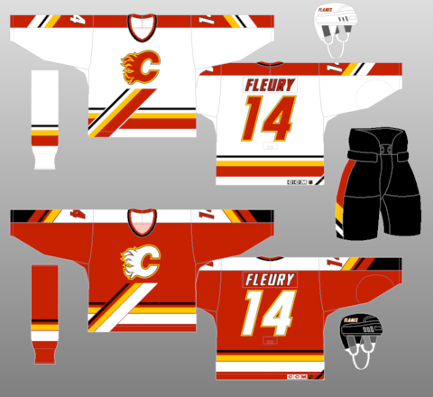
If someone described this uniform to me (added black trim, italicized number/name, horizontal and diagonal hem stripe) I would hate it, but liked this Flames set.
-
The NY Jets jacket from the Wonder Years
-
5
-
-
Is there any metric or statistical evidence that demonstrates one way or the other the impact of the Angels using "Los Angeles" in their name?
-
1
-
-
I like the Bills white helmet more so than the red one. The red "streak" on the buffalo gets lost against the red shell. Plus, the logo doesn't need the white outline.
-
9
-
-
The refrigerator is now my favorite anthropomorphic logo
-
1
-
-
18 minutes ago, Ferdinand Cesarano said:
The first time it happened was with the 1985 Blue Jays, for whom Al Oliver wore no. 0, and Cliff Johnson wore no. 00.
I didn't know there was a 0 or a 00 in baseball. That is still not baseball's craziest uni number:
-
9
-
-
14 hours ago, Mitch B said:
I’ll never understand the love for these white outlines. I wish the Yankees would ditch theirs as well. To each his own.
I am not passionate either way, but I always thought the white outline complimented the white LA mark on the hat. Otherwise, it is a tiny splash of white on a sea of gray/blue/red.
-
1
-
-
2 hours ago, monkeypower said:
That the jersey stripes dip to follow the contour of the hemline
-
1
-
-
5 hours ago, McGlinchey23 said:
I dont think Red Sox should wear colored jerseys at all. They should be a white/gray team strictly
Oh, I concur.
-
1
-
-
1 hour ago, WSU151 said:
I'm not sure how local events that made the news are the same as a nod to Family Guy.
Then let's make it the Boston Molasses Floods hosting the Cleveland River Fires. None of that enhances my MLB game-watching experience.
-
2
-
-
21 minutes ago, Brian in Boston said:
Spanish onomatopoeia, huh? I'd always had The Quiquiriqui pegged as an alien race in an episode of Doctor Who?
-
1
-
-
I thought part of the issue is that NBC doesn't get "credit" for the ratings in Canadian TV markets when they sell to advertisers. Even if 100% of Toronto televisions are tuned into Wings/Leafs, NBC can only charge advertisers based on the stateside audience.
-
1
-
-
15 hours ago, kroywen said:
The A's look so much better with forest green. I could go either way on the Jets. Probably slightly prefer kelly green on the current template, but both look good.
Unfortunately, the Jets are not forest green or kelly green. Theirs is some shade of olive drab that is not appealing.
-
3
-
-
1 hour ago, kroywen said:
Not sure high top cleats and high socks would really go together well, though. Not sure any player has ever really combined the two - I think almost every player who wore high cuff cleats also worse relatively low cut pants.
This may be as close as you get. Buckner had bad ankles, so the high tops provided some extra support.

-
1
-


Professional Lacrosse Changes
in Sports Logo News
Posted
We are now one step closer to a team going all in and calling themselves the Bazooka Sharks.