


Hat Boy
-
Posts
1,833 -
Joined
-
Last visited
-
Days Won
1
Posts posted by Hat Boy
-
-
53 minutes ago, DNAsports said:
Stripe inconsistencies on football uniforms aren't that important
-
 4
4
-
-
13 hours ago, Silver_Star said:
Another Giants uniform that is much better than what they got on right now!
Except this board would be flooded with posts about the helmet stripes not matching the stripes on the pants
-
3
-
-
10 minutes ago, ridenlow71 said:
North Dakota rings
You mean North Dakota STATE--they are sensitive to that kind of thing in Fargo.
-
Like crying, there should be no vests in baseball
Vests are good, but regular-cut jerseys with the sleeves removed are not.
-
1
-
-
The shank with the six Cups looks nice.
-
This was perfect for them in my opinion
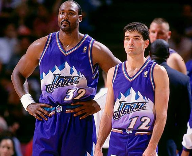
Purple, Light Blue & White with Copper accents
Favorite jazz uniform of all time right there
My sympathies to you both.

-
1
-
-
I like the continuity between this ring and the others (much like the Raiders have done).
It's the ring of CHEATERS, what did you expect.
Please save that for a different thread. Let's just talk rings here.
-
authorized and licensed by the Mantle family and was designed and made by Balfour shortly after his death.
Whom was this ring made/marketed for? Fans? This one must be only for the hardcore.
-
Didn't the steelers do something similar for one of their super bowl rings with the stars? I always found that strange for them.
The "stars" on the Steelers ring are astroids, which mimic their logo.
Hypocycloids
A hypocycloid with four cusps is called an astroid.
-
Didn't the steelers do something similar for one of their super bowl rings with the stars? I always found that strange for them.
The "stars" on the Steelers ring are astroids, which mimic their logo.


-
This thing looks huge!
and ugly--not a great combination
-
The way I see it, if an 8yr old can't draw your NHL logo, it's a bad NHL logo.
I think an actual 8-year old drew this logo and that didn't work out well for anybody

-
1
-
-
What bugs me about this (not that I'd love it anyway) is that this guy just looks annoyed.
I think he is meant to look ornery. He doesn't like you or any other school tresspassin' on his land. If it's a fight you want, you gonna git it.
-
I did not realize players received a ring when they won the Heisman.
Sims' ring is really nice. Are all the rings of a similar design or have they grown bigger and more flashy over the years (like championship rings)?
-
great their boring jersey stripes even replace the storm flags when it comes to banners as well. hope they bring back the storm flags before they win a division championship or something.
The storm flag pattern is at the bottom of the team banners and the top of the player banners.
-
Sweet Georgia Brown, that font is awful. Steve Carlton never wore a "32" that looked like that.
-
The 2003 Miami Marlins World Series ring.
As ugly today as it was when it was issued.
Years ago, I was chatting it up with a scout for the Braves who was wearing his '95 WS ring. As we talked rings, he said that his friends on the Marlins' staff didn't wear their 2003 ring because it was so unwieldy. I guess bigger is not always better.
-
Surprisingly hard to find a pic of this. Sorry it's so big.
Is this on campus or in Hartford?
-
pretty sure 00 use to be allowed in the NFLI like that the NBA & NCAA Basketball allows players to wear number 0 (single zero). I wouldn't mind seeing that spread to the other major sports leagues (if it hasn't already done so). Double zero (00) could be used for mascot jerseys.
Jim Otto

-
After a while, you won't even notice them.
Perhaps, but right now it is all I notice. Last week I saw a guy wearing a red soccer jersey that had AON as the sponsor. I have seen these jerseys before, but I have no idea which team it is (I don't follow soccer, so maybe the rest of the world knows). I guess AON is getting their money's worth.
-
I'm not so sure about that. If for no other reason than the universal concerns about weather, I suspect they'd seriously consider the opportunity for a do-over.
That extra $5M was to build one of these:

Weather problem solved.
-

If they bring that uniform back, that sweet hair and mustache have to come back too. This is not optional.
-
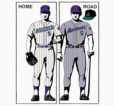
The design is terrible?
DIAMOND
BACKS
That wordmark is atrocious design.
It is tough to get it right using the keyboard, but would you want the Knicks going with this:
K N I C K
erbockers
-
I do not like the Diamondbacks original uniform. I think the design is terrible and the colors are '90s tacky. I thought everyone knew that, but the "what sports identities do you miss" thread now leads me to believe otherwise.
-
2
-


Unpopular Opinions
in Sports Logo General Discussion
Posted