

kmccarthy27
-
Posts
1,487 -
Joined
-
Last visited
Posts posted by kmccarthy27
-
-
15 hours ago, insert name said:
It's been over 2 decades since the Oilers name was retired. In that time, the Texans have grown to be a natural NFL brand. Do people even wear Oilers as a nostalgic retro brand? They don't seem to even carry that retro cash grab the Expos, Nordiques and Whalers got. The brand is dead.
Its enough that NFL/Fanatics has a section for them:
https://www.nflshop.com/?query=houston oilers-
 3
3
-
-
20 minutes ago, MJD7 said:
The logo feels like a bit of a downgrade, if only because there’s no longer anything to signify “baseball” in it anymore. Now it sort of just looks like a variation on Google Photos.
I’m curious to see if Nike will end up taking over most of the uniforms, though.
It looks like an app icon probably because an app will come out with that as the icon during the competition to stream stuff on that is separate from MLB
-
On 6/23/2022 at 11:24 AM, Luigi74 said:
The biggest reason GM kept Buick was due to the brand being tied at the hip with GMC Trucks, plus Buick fit nicely between Chevy and Cadillac, while Pontiac and Saturn were on par with Chevy.
In my area all the GMC stuff was tied with Pontiac. So I thought Pontiac/GMC was the equivalent to Chevy. The Buick and Olds were the semi-luxury brands and then it all funneled to Caddy.
-
This is the rumored cities and coaches for each city:
https://sportsnaut.com/xfl-teams-coaches/
-
Little background. Dunkin Brands (BR and Dunkin) got purchased by Inspire Brands. They own Buffalo Wild Wings, Arbys, Sonic and Jimmy Johns as well. I get the feeling this logo change was done of new overlords wanting to change something to put their mark on the company. I expect Dunkin to have some modified logo soon as well.
This is the exact same move that Keurig did when they took over DrPepper/Snapple and changed the Snapple logo for sake of making changes to put their mark on the company.
-
2
-
-
18 minutes ago, TBGKon said:
To this day (taking the colors into consideration), I still think the LA team was going to be called the LA Wildfire. The year prior to the team names being announced had some major damage caused by wildfires, so I suspect a name change happened last minute.
It was also rumored they swapped Houston and Dallas' names too.
-
1
-
-
Its just the intro to the new logo set to stock footage of XFL 2.0 games
https://twitter.com/XFL2023/status/1511735486825390080?s=20&t=OiJ0JbL896FzwT-JJYBT1gReverse color image on the website:

Media Assets page: https://xfl.photoshelter.com/galleries/C0000OKu6bQBZ4OY/G0000uqVSqWlSPmM/XFL-2023-Brand-IdentityMarketing Speak for logo:
New Logo and Visual Identity
The new visual identity centers around the idea that the XFL is the intersection of opportunity and captures the essence of the league’s vision: the XFL is pushing football forward. To do that, the brand needs to be modern, dynamic and inviting.The “X” represents those intersections, the point at which everything comes together: sports and storytelling, players and fans, partners and a passion for innovation. We elevate it to unlock the opportunities that will push football forward, so that together, we can build tomorrow’s league.
As a platform for co-creation, the XFL’s new identity seeks to elevate the stories and communities that enhance the game. Built as a platform, the league’s black-and-white color palette ensures the individual personalities of the teams are able to seamlessly coexist and stand alongside the league as partners versus separate organizations.
-
Did The Rock just tease a new league logo:
https://twitter.com/TheRock/status/1510875912509689859/photo/1
https://twitter.com/XFLNewsHub/status/1510958500461092865/photo/1
-
5 hours ago, SilverBullet1929 said:
I like them except for the WSH, which is kind of a big part of it.
But I'm curious is there any "reason" said for choosing the gray and the off-white color?
My best guess the Gray was the call back to the Negro League team, and the off white is the color of the monuments
-
48 minutes ago, WSU151 said:
Yeah my only gripe is the WSH. Nobody really refers to that...it's just something you see on scorebugs. DC would have been better. The pink, gray and the blossoms are fantastic
I dont mind it, I am surprised that DCA was not used, as much as its the Airport code, I recall that being used a lot in the area growing up there.
DC I think is too common for what they were trying to do as Nats had DC branding at somepoint, and I miss the interlocking DC logo.At least they did not go with WAS
-
I really like that WSH on the jersey, wonder if they could adopt that block letting for a normal looking alt in the future.
-
On 3/16/2022 at 10:01 PM, Sodboy13 said:
My belief is that they were placeholder names with MLB intending to sell the naming rights to each league like the NBA did to its minor league. But then MLB found out that the market price for branding a regional league that they had turned into damaged goods by stripping out its history and massacring a quarter of the product wasn't what they'd hoped for.
I still think this is happening in some form like:
GEICO Eastern League
or
Eastern League sponsored by GEICO
And if not the leagues totally whatever AllStar/Championship games that eventually come to MLB Network (not that they already are not there) -
Jersey on this one:
-
-
1 hour ago, Cujo said:
Possible ballcap leak??

#UnlockTheWashingtonFootballTeamThread
The cap itself looks like one of those generic brand caps from a website where you upload an image and get it embroidered on to something, and not Fanatics, 47, or New Era
-
22
-
-
Whatever was planed for the Bowie Baysox got delayed on cancelled because they got new ownership:
https://www.milb.com/bowie/news/attain-sports-and-entertainment-acquires-bowie-baysox-and-frederick-keys -
Ironbirds new logos:
-
On 11/4/2021 at 1:22 PM, Dynasty said:
I don't know how fans in the area will react if it's a permanent name change. I've lived pretty close to the Baysox for over 20 years and they've been known as that for even longer. The logos could use an update though.
They posted another image a few days later and then have since delayed the announcement
-
Bowie Baysox teasing a rebrand and/or logo change?
-
22 hours ago, dont care said:
New era would never lose the mlb contract, they’d rather put so much money into keeping it they go out of business rather than lose that contract.
People thought the same about Topps. We see how that went.
-
2
-
-
1 minute ago, Chromatic said:
Fair enough. I know the history, popularity and cultural importance of soccer in Europe and South America has lead to riots, but the US doesn't have that so it sounded strange. Especially over indoor soccer.
Let's just say it had nothing to do with soccer.
-
11 minutes ago, Chromatic said:
Hard to imagine Americans rioting over an indoor soccer match.
The Capital Centre was in a really really bad area, bundle that with free/dirt cheap tickets .....
This was all before FedEx Field showed up down the road, and things got better
-
1
-
-
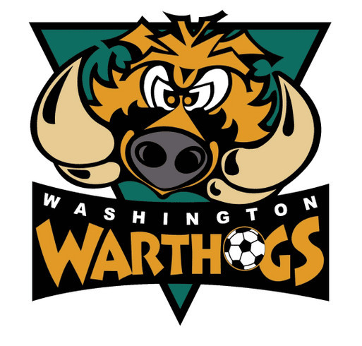
3 minutes ago, GriffinM6 said:
This makes me think that Washington Warthogs would've been a good team name. You have alliteration and a name that ties in well with the franchise's history, plus you could have a pretty cool logo set that would still differentiate itself from other pro sports team in North America (And hopefully not draw comparisons to the Arkansas Razorbacks).
Edit: Just look at those tusks! They're practically perfect to make a W logo out of.
This was tried with an indoor soccer team in the 90s. From what I understand a riot or something broke out, and the team folded up.
-
1
-
-
1 hour ago, DenverKing said:
Is this old news? I thought it looked more like a concept at first, but the designer’s website shows that he worked for the NFL previously and worked on the Jaguars and Dolphins rebrands as well.
https://thelibertyline.com/2021/07/08/eagles-almost-changed-their-uniforms/That almost looked like a rejected Jet's uniform with Eagles Branding on it.


XFL 2023 Logos, Names and Uniforms
in Sports Logo News
Posted
I am curious if they will even get team names and identities this season other than being Washington XFL team in Red, and San Antonio XFL team in Yellow/Gold. You can see here each team is color coded:
https://www.xfl.com/teams