


leopard88
-
Posts
7,901 -
Joined
-
Last visited
-
Days Won
3
Posts posted by leopard88
-
-
-
11 hours ago, Geoff said:
Marshall and Southern Miss have temporary restraining orders against CUSA right now. ODU is working on one too. This just makes it seem what we've all known: the most likely outcome will be financial compensation. Which is what the schools wanted anyway.
That is the most likely outcome. Courts are very reluctant to require a person or entity to perform what is essentially a skilled service, so the CUSA will likely have a difficult time keeping them in the fold for another season.
The only way the CUSA might be able to keep them around is if a court enjoined them from playing in the Sun Belt in 2022. Without knowing the specifics of the contracts, that seems unlikely to me, especially since Marshall and Southern Miss would have to have shown a "likelihood of success on the merits" to obtain temporary restraining orders.
-
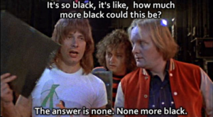
On 2/27/2022 at 8:54 AM, oldschoolvikings said:
I think that's what Spinal Tap used on their"Smell the Glove" album.
I immediately thought of Spinal Tap too. Great minds . . . or showing our age.

And that fact that this exists is awesome . . .
-
 1
1
-
-
Agree to disagree. I think being able to use a stadium with these markings lends an air of credibility to the league by making it seem as if it's endorsed by the Hall of Fame and has more history than it really does. It's not like the Salt Lake Stallions playing on a field with University of Utah logos everywhere.
Meanwhile, they can cover every inch of the concrete walls around the perimeter with USFL logos.
-
5
-
-
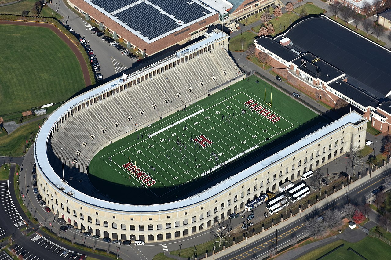
14 hours ago, 4_tattoos said:
That looks good to me, but I have a feeling they wouldn't go to a stadium with just one side of seats. Think the optics of it might matter to Rabil and company in the PLL .
I had the same thought. It might work if they can set up the cameras on the open side so only the other side is visible most of the time.
The Patriots played there during part of their AFL run and the Boston Breakers played there during the first season of USFL 1.0. However, there were still seats on the other side and the total capacity was somewhere around 20,000.
I also forgot about Harvard Stadium, which seats 30,323 according to Wiki. The Cannons played for a large part of their MLL tenure.
-
On 2/9/2022 at 6:15 PM, 4_tattoos said:
PLL tour went there last season. Besides the permanent NFL markings sewn into the turf it was a nice facility for them. PLL should stick to small stadiums for the time being. I know they need to go to Boston/New England every season, but Gillette is way too big of a venue for what the PLL is right now. To my knowledge there are not any suitable alternatives in the Boston area as far as small stadiums go. Maaaaybe the place where the rugby team (Freejacks) plays. Even though that's not on par with other PLL venues.
In Baltimore, they play at Homewood Field, which only holds 8,500.
Wiki says Nickerson Field at Boston University seats 9,871.
If's that is too small, Alumni Stadium at Boston College seats 44,500. That's pretty big, but not as overwhelming at Gillette.
-
22 hours ago, WSU151 said:
I really like Michigan's uniforms (as many do) but I've been trying to think where I've seen that home sleeve stripe design.
Then it came to me (back when CU wore its best shade of gold):
I'm not sure from your post whether you're suggesting that Colorado wore that look first. In any case, the original Panthers jerseys had the same stripe pattern.
-
1
-
-
8 minutes ago, oldschoolvikings said:
And here I was thinking what an amazing advantage this was in delivering 8 uniforms that range from at worst, acceptable to at best outstanding.
Good luck with the idea that the next 8 NFL teams to redesign have this good of a percentage.
I meant "disadvantage" solely in the context of generating color scheme diversity. Having a solid starting point and only needing to update uniforms that already looked good is most definitely an advantage.
-
5 minutes ago, Sport said:
I'm not talking about this Nu USFL. I wasn't around for USFL 1.0, but as a sports uniform nut who grew up on this website I'd go back and look at the old uniforms and I've always wondered why so many of the teams looked so similar. Just a question I've always had.
. . . and it's a perfectly valid question.
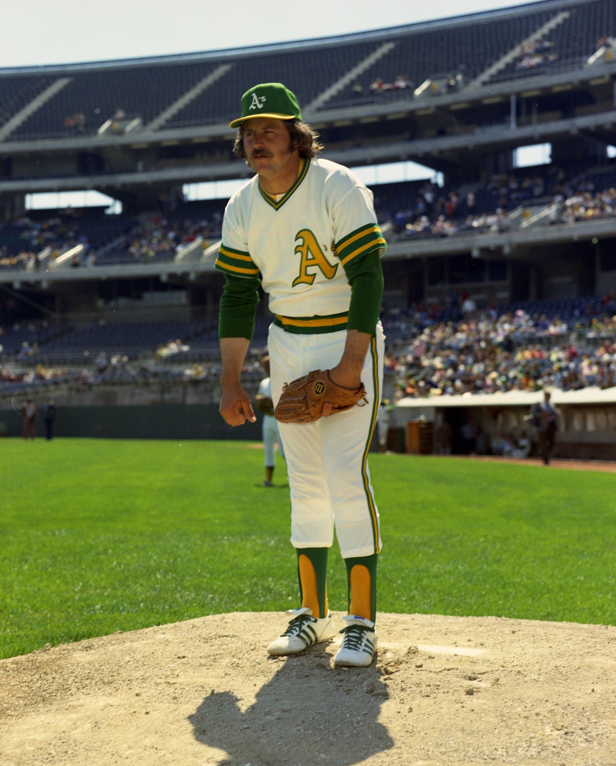
I was around for USFL 1.0 (I was born in 1967) and loved it. I'm also a uniform nut (or else I wouldn't be here), but the three red and silver teams never bothered me in the least. That may be because the Blitz and Bandits used decent amounts of blue and red, respectively, while the Showboats just used red and silver.
I will say that it bothered me that the Stars and Stallions were basically twins. The Stars' white facemasks (which looked terrible) were the only thing distinguishing between the two at a quick glance.
-
3
-
-
1 hour ago, Sport said:
Just seems like something you'd try to avoid if you're starting a brand new league so your new team brands can stand out from one another. I know sports branding is a different animal now than it was then, but with standard definition television why would you want to invite any chance for confusion? There's only so many colors to choose from, but there's also way more possibilities than the original USFL used. Did the league need 3 different teams in red jerseys with silver pants and helmets? One of the Memphis Showboats, Chicago Blitz, or Tampa Bay Bandits could've and should've done something different. (My vote is the Bandits because they were nearly identical to Ohio State's uniforms except for 3 or 4 little differences.)
The disadvantage this incarnation of the USFL has is that it is attempting modern updates to existing looks. That left less room for change without knocking the nostalgia train off the tracks.
The issue could have been mitigated by reviving different teams. However, I assume they didn't want to bring back the San Antonio Gunslingers or Washington Federals just for the sake of having a green team.
It seems like the more recent spring leagues (AAF, XFL 2.0) have made a concerted effort to provide color variation. I have no problem with that as long as it doesn't result in forced combinations that don't look good. I also have no problem with 1/6th of the 1984 USFL having teams with silver/red/silver looks because they all looked good.
-
2
-
-
I don't get the concern over multiple teams using the same color. There are only so many colors to choose from.
By my hasty count, the NFL has 16 teams with a shade of blue in their color scheme if we count aqua and teal as shades of blue. There are also 13 teams with at least a black jersey, including alternates (assuming the Niners still use their black Color Rush jersey). However, I don't recall any discussions about there being too many blue or black teams in the NFL.*
I know there is a greater chance for diversity among 8 teams than among 32. That said, I don't see it being that big a deal.
* -- This is separate from the BFBS discussion, which has substantial merit.
-
5
-
-
12 hours ago, BJ Sands said:
Among the many many problems of this identity, the roundel really clashes with the rest of this jersey because of the small amount of gold. The white really sticks out, and not in a good way.
At that distance, it vaguely reminds me of this logo . . .
-
2
-
-
3 hours ago, WSU151 said:
the bottom left quadrant features three stars, representative of the stars on the D.C. flag and the team's position within the Nation's Capital.
what
If they were really showing their position within the Nation's Capital, that space would be blank and there would be a mark outside the circle at around 2:00 signifying the location of Landover/Raljon.
-
13
-
-
4 minutes ago, -Akronite- said:
- The introduction of black detracts from everything else their doing. There is pretty much nothing cohesive or redeemable about the white jersey and nobody asked for a Steelers color rush set from Washington (the number font doesn't help the Pitt comparison).
Very good comparison . . . and one I hadn't thought of.
-
5
-
2 minutes ago, gosioux76 said:
The immersive nature of that original helmet was what made it so unique. It would be a huge miss if they end up doing a truncated version of it.
Also, I've said this before, but I dislike how they've left the inside of the panther head hollowed out rather than filled in like the original. It comes off, to me, as far less substantial.
Agreed on both counts.
The original is still one of my favorite all-time helmets.
-
3
-
-
Quote
Inside the numbers, there is a perforated diamond texture, which is a nod to the diamond shape of DC's district boundary.
. . . which hasn't existed since the retrocession of the Virginia portion of the District in 1847.
-
20
-
-
13 hours ago, Geoff said:
JMU is going FBS in 2022.
Just in time for my daughter to (maybe) be a freshman there.
-
1
-
-
5 minutes ago, Red Comet said:
Get me the catfish with brown rice and hushpuppies.. . . or perhaps you prefer a mudcat . . .
-
3
-
-
On 1/14/2022 at 8:47 PM, RyanMcD29 said:
Well, the CAA having the two Long Island schools (with respect to my grad school of LIU they aren't really at the same level as the other two) would be something
This is officially official now.
Colonial Athletic Association adding Hampton, Monmouth, Stony Brook to conference
-
18 minutes ago, tBBP said:
How about the Memphis Grizzlies??

FedEx Forum? FedEx Field. It's almost too much on topic.
That said, we could discuss how they reworked the branding after the move from Vancouver without changing the name.
-
10
-
-
*JUST SITTING HEAR THINKING OF WHAT OTHER TEAMS WE CAN DISCUSS*
-
5
-
-
16 hours ago, Cujo said:
Using Denver Broncos logic:
For having borrowed #7, Haskins must now be immortalized at WFT stadium
This is what the Broncos get for retiring the number of a guy with this career stat line in Denver . . .
Bronc-Jacked!
-
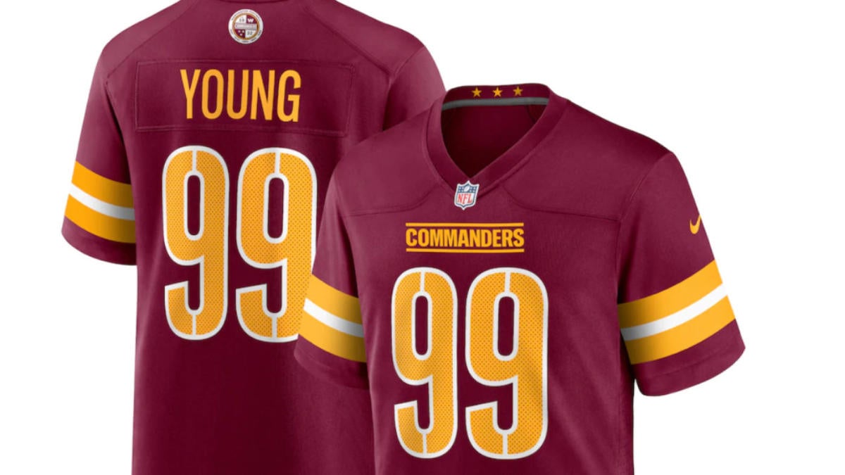
14 hours ago, TenaciousG said:
Annnnd let’s throw in a star and a silver helmet because Houston loves the Dallas CowboysI'm with you on the star, but there is precedent for a silver helmet in the Oilers history.
-
9
-
-


USFL 2023 - Uniforms and Logos
in Sports Logo News
Posted
Offer to settle now and forward a check for $3. That way you can avoid interest on the judgment.
I believe the NFL wound up paying approximately $0.67 in interest by the time it wrote a check to the USFL.