


leopard88
-
Posts
7,898 -
Joined
-
Last visited
-
Days Won
3
Posts posted by leopard88
-
-
19 hours ago, DCarp1231 said:
Maryland fan here!
I hate the current uniforms. Always have since they were introduced.
Same. Like the uniforms, hate the helmets.
-
On 3/19/2023 at 5:25 PM, Ted Cunningham said:
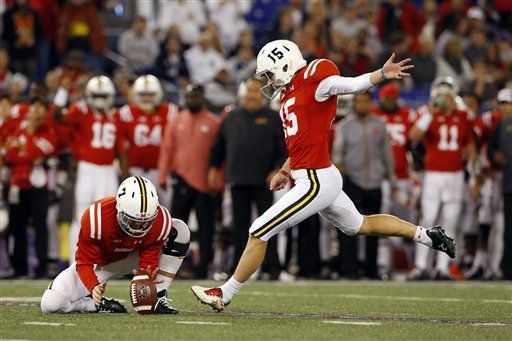
I applaud Maryland for going through so many iterations of their uniforms combining red, white, black, and gold. And I am generally on the side of using the flag motif, as they are the flagship state university (so why not) and Maryland's flag is memorable and popular. But the helmet design shown above highlights something that I think Maryland has done fairly well when they've employed it: using two pairs of colors somewhat separately and in parallel.

This is the ideal example of this concept: black and gold elements on the helmet and pants, red and white on the jersey (and if they had socks, red and white could carry to the socks as well). I really like this tandem approach. It employs all four colors without becoming overly busy (e.g. multiple outlines on the numbers just to fit three of the four colors in, etc.).
My ideal Maryland uniform would employ the state flag imagery, the general idea of running these color pairs in tandem, and the Terps script. (Typing all that makes me realize how dumb the idea sounds, but I think execution works):
Forgot to include this in my multi-quote (which may be a good thing because it would have made for a reallllllllyyyyy long reply.
If I can tell on myself, in the mid-late 70s, being a wee lass of around 10, I always thought of Maryland as a red and white team. I always thought the helmet logo on this uniform was just a sort of washed out red. Instead, it is actually a good example of the parallel use of the colors, like the throwback posted by @Ted Cunningham.
-
 1
1
-
-
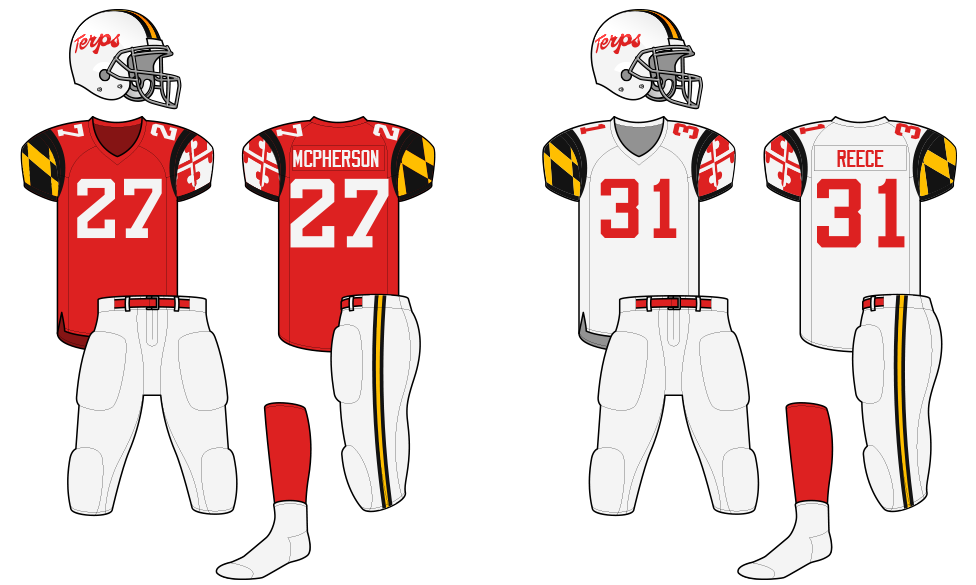
On 3/18/2023 at 10:30 AM, colinturner95 said:
i came here to mention those or
modernize these
These updated with the UnderArmour M would look really good.
On 3/19/2023 at 10:46 AM, burgundy said:At least that logo has Testudo holding the flag. They haven't used a logo with Testudo since 2012, and the turtle shell helmets were back in 2011. A whole decade of nothing but flag imagery across all their sports. They may as well be the Maryland Marylanders at this point. They've been so focused on the state's unique flag that they've forgotten about the school mascot that is also incredibly unique.
This logo still gets used a lot*, though not on uniforms that I can recall. My assumption has always been that it doesn't show up on the uniforms because it uses the old Aachen Bold M instead of the UnderArmour M.
* -- My son (junior at Maryland) and I (Maryland fan since the 70s) have plenty of swag to prove it.
That said, I've always been a bigger fan of the logo on the 1970 helmet or this one if we're talking about logos using a terrapin.
-
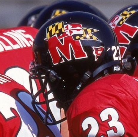
On 2/25/2023 at 4:14 PM, 4_tattoos said:
Another off season hoping Maryland finally changes their helmets.
I would be up for that.
The rest of the uniform is actually fairly subdued. It's the helmets that push it into "overly garish" territory.
In practices and the spring game they usually(?) wear white helmets with numbers on the side and a Maryland flag stripe. I would be more than happy with this.
-
8
-
 1
1
-
-
2 hours ago, Carolingian Steamroller said:
I understand we're nearing the 'Aughts period of the nostalgia cycle.
As someone who suffered through the Eighties nostalgia cycle, can we please, please not do this with the Nationals?
Seconded.
-
2
-
-
8 hours ago, Bmac said:
Speaking of navy+red teams who should do something unique with their identity...
The Nationals have some of the worst uniforms in MLB.
Washington should've been the navy+red team with gold, not Minnesota. It could easily be added back into the identity. Plus they have the unique monument-inspired lettering to revisit, a welcome deviation from the standard script or arched block lettering everyone seems to have. Personally I'd love to see red lettering with beveling, outlined in navy with gold trim. I also always loved the uniqueness of the red at home + navy on the road setup.
I didn't mind that color scheme, but I hated that wordmark.
-
7
-
-
1 hour ago, TrueYankee26 said:
Also congrats to Northern Kentucky, Oral Roberts and Gonzagaon winning their conference tournaments along with Merrimack, who are sadly ineligible
I always wondered if Colgate's rivals use Crest toothpaste to brush their teeth with lol
In reverse order --
Absolutely!
My son went to high school with Ziggy Reid, who was tournament MVP for Merrimack. It sucks to have that be the end of the line after winning the conference tournament.
-
1
-
-
In case it isn't obvious, I will be rooting tonight for the 11-22 Lafayette Leopards to upset Colgate and punch their ticket.
-
Springfield Rifles seems to get a lot of play in youth and amateur sports. That isn't necessarily Civil War related, but there is at least some connection.
https://en.wikipedia.org/wiki/Springfield_Model_1861
You could also just go with Blues and incorporate a soldier's hat or uniform into the logo. That would probably work for just about any city in the northeast.
-
18 hours ago, McCall said:
How is that different than a school competing only in football in one conference while keeping their other sports in another?

. . . like Georgetown and Fordham being associate members in the Patriot League in football only.
-
16 hours ago, McCall said:
Dildo? Dildon't.
You may laugh, but my boss still tells the story of when he was about 70 years old and the term came up in writing during a divorce case . . . and he and the similarly aged male judge both thought the word was pronounced "DILL-doo".
-
 2
2
-
-
On 2/24/2023 at 6:35 PM, WestCoastBias said:
While most people do say "I'm a {college name} fan", I can only think of two schools (Roll Tide and War Eagle) that don't say "Go {team nickname}!" as their main cheer/slogan/whateveritscalled
"Fear the Turtle" might qualify too.
-
Am I the only one who thinks the Italia script reads more like Ttalia?
-
51 minutes ago, WSU151 said:
So many colleges have great team names though and are strongly associated with the school
Terrapins
(and kudos to the Big 10 for arguably the most unique set of team names)
. . . and you didn't even include Fighting Illini and Boilermakers.
I'll also throw in Gamecocks so both of my kids are covered (the other being a Terrapin).
-
3
-
-
I've never seen that White Sox one before. The rest of the script is generic, but the Florida outline as an F is clever.
-
1
-
-
4 hours ago, BBTV said:
Those are great!
I wonder if any "Phoenix Eagles" merch exists from when the owner basically lost the team gambling and a Phoenix group was a whisker away from taking it.
Apparently so.
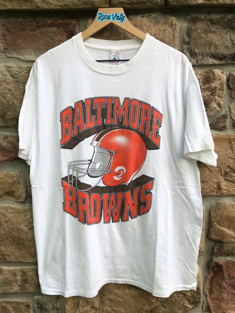
There is always someone looking to make a buck in those situations. The only reason I don't have a Baltimore Browns t-shirt is that the helmet on the shirt looked really wonky.
I'm pretty sure this was it . . .
And apparently there was also this . . .
Also, if memory serves me, the Eagles near move was right after the Stars announced their move to Baltimore . . . so they wouldn't have to compete with the Eagles if/when the USFL moved to the fall.
-
3
-
-
I don't have pics readily available, but my list would be:
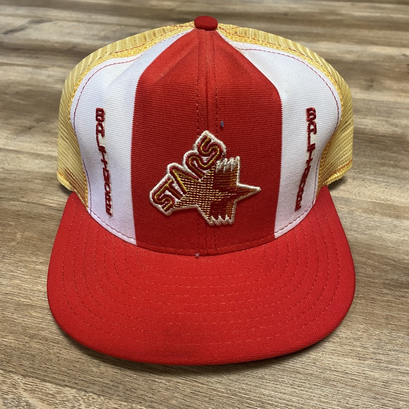
1. Philadelphia Stars windbreakers (team issued to stadium employees circa 1984)
2. Baltimore Starts AJD hat (image below, but not actually my hat)
3. Baltimore Cardinals t-shirt (from when the Cardinals were rumored to be moving to Baltimore, prior to the move to Phoenix)(image below, but not actually my shirt)
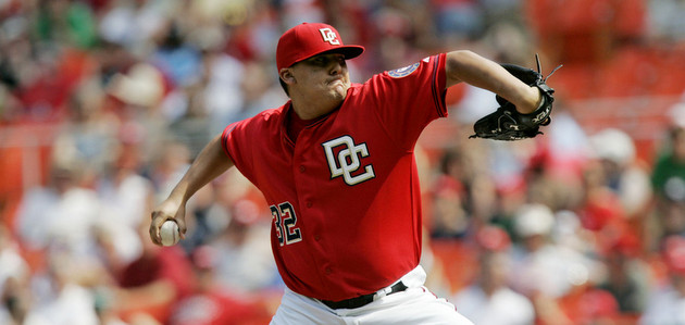
4. Baltimore CFL Football Grey Cup t-shirt (before the official adoption of the Stallions name)
5. Baltimore CFL Football Grey Cup button (image below, but not actually my button)
-
3
-
-
Sentinels, please.
-
2
-
-
On 2/11/2023 at 6:01 PM, WideRight said:
4. I find the design, the look of the teams, in the XFL too WWE/Monster Energy Drink. Now, I am in my mid-50's and fall into the "football was better before 2000" crowd, so I prefer the nostalgia and style of the USFL to the XFL, but maybe millenials or Gen-z want their pro sports teams to look and feel like e-sports or something Red Bull invented. I don't so I prefer the USFL.
5. I am also a huge, HUGE USFL geek (the real USFL: 1983-1985) so the new USFL hits me where it counts.
Honestly, for me it is similar to two new soda companies coming out, one selling a version of a classic root beer or classic cola, the other selling some form of Mountain Dew with CBD and Sriracha in it. I know where my preference lies, but others may prefer the 2nd soda, and perhaps one of the soda companies simply has more capital behind it, or better management, or hits an untapped market better than the other. I just cannot say. I can only say that I prefer the one over the other purely as a matter of taste.
Old guys, unite!
I agree with this completely.
-
1
-
-
15 hours ago, RyanMcD29 said:
My alma mater is the Blue Dragons, but we mainly used a block varsity D for all sports. The baseball team's jerseys usually mimic the Dodgers and we had a Tigers style D for much of the time I was in school. The lacrosse and soccer teams had a logo that had Drexel's dragon in a shield, but I think that was more from the supplier we got it from than it actually making it onto any other school branding.
Now the school I teach at is completely eccentric in copycats. We're the Tigers with colors in yellow and black and sometimes purple, and primarily there's a lot of merchandise using, of all teams, the Hamilton Tiger-Cats' standalone head. Also have seen some use of various logos like Missouri, Princeton, Clemson, and LSU.
I am totally picturing this . . .
-
1
-
-
1 hour ago, bowld said:
Someone have an explanation of why LAS VEGAS is using a Fleur-de-lis?
Nothing says Las Vegas Vipers like a Fluer-de-lisThat is my question too.
It also looks vaguely like a top view of a scorpion (with a few legs missing), which could be fitting for Las Vegas . . . but has nothing to do with the team name.
-
2
-
-
I'm old (as in graduated from high school in 1984).
The Detroit Lions old helmet logo, recolored in red, was used from time to time.
-
21 minutes ago, gosioux76 said:
I agree. I think it's a smart and probably financially efficient transition into playing in "home" markets. The schedule on the USFL website also shows that they'll typically play in a given market for two consecutive weeks rather than just jumping around.
This is sort of like the type of hybrid model that I've been advocating for the PLL for a few years now.
-- Assign home city/region names to create some local bonds (however limited at first)
-- Ease into a model that includes primarily neutral site/touring games and some home games
-- Eventually settle into a schedule that leans more toward home games, with continued neutral site games/doubleheaders to continue tapping into other markets
In this case, there are only a few markets being used for games at this point. For football, I think the end game should be almost all home/in-market games. The PLL would be fine with perhaps a 60-40 home/neutral split since lacrosse hasn't saturated the overall market the way football has for decades.
-
3
-
-
On 2/1/2023 at 6:02 PM, LogoFan said:
They were my favorite. VERY sharp.
Ditto. Those were great uniforms.


/cdn.vox-cdn.com/uploads/chorus_image/image/69181975/_big_042421fball27.0.jpg)


MLB 2023 Uniform/Logo Changes
in Sports Logo News
Posted
I think you're confusing Pigtown with Federal Hill.