


leopard88
-
Posts
7,898 -
Joined
-
Last visited
-
Days Won
3
Posts posted by leopard88
-
-
48 minutes ago, Silent Wind of Doom said:
Huh. I didn't even think there was that strong a relationship as I just grasped at straws.
It does make sense to go nautical, but... If there's one thing we've learned looking at this whole project it's that we have absolutely no idea what teams will pick as the theme they use to rep their city.
That connection almost came into play with NFL expansion.
QuoteIn their proposal, the potential owners of the team had settled on the "Baltimore Bombers" as the team's nickname in honor of the B-26 Marauder, a World War II bomber designed by the Glenn L. Martin Company, and produced in Baltimore from 1941 to 1945
https://en.wikipedia.org/wiki/Baltimore_Bombers_(proposed_NFL_team)
The factory is just east of the city, but close enough.
. . . and you're absolutely right about having NO IDEA.
-
 1
1
-
-
5 minutes ago, Silent Wind of Doom said:
Hmm... Is this a common format on Twitter or used by the team? Or can something be gleaned from this? Any chance they're tapping into their old days as the Capital's team by leaning into a military aeronautics theme? Are there other aeronautics links in Maryland? Or are they just being silly?
I haven't seen anything like that on Twitter, but I think they're just being silly.
Glenn L. Martin/Martin Marietta/Lockheed Martin is/was a huge aircraft manufacturer located just east of the city. However, I wouldn't expect that to be part of the City Connect series. It would be more likely that some sort of maritime theme would be incorporated.
-
14 hours ago, M59 said:
I hate that fookin' hat. And frankly, I really miss the white trim on the Orioles script and numbers on the black jerseys. That jersey peaked in 1999.
https://goldinauctions.com/1999_Cal_Ripken_Jr_Baltimore_Orioles_Game_Used_Alt-LOT96150.aspxI don't mind the loss of the white trim. I always thought the double outline made that jersey look a little busy . . .
. . . but I also HATE THE HAT!!!
-
3
-
-
The font on the sleeve patch reminds me of this.

-
1
-
-
3 minutes ago, AdobeDesignBG said:
The eye and beak on the grey logo look different than those on the red one. They both look more elongated.
-
I think this is our guide --
Grey helmet with red on front and eyes, like an actual bird head
Orange facemask to emulate the beak
All grey jersey and pants
Grey socks with an orange stripe to emulate the legs.
It's just so obvious!!!!!!!!!!!!!!
-
3
-
 1
1
-
-
7 minutes ago, tBBP said:
Oh wow. I don't know how I've never seen those before (what team is that?), but that color combo actually looks pretty nice!
Jacksonville Bulls. USFL 1.0.
-
18 minutes ago, ramsjetsthunder said:
Alright, everybody. Take one last look.
I'll say it.
I actually like the number font and the helmets are tastefully simple classics . . . so there was that.
-
8
-
 1
1
-
-
2 minutes ago, the admiral said:
I have to agree with you on this one. I wouldn't say the Cardinals have played in Busch Stadium for however many teams. They've placed in a Busch Stadium. I'd even be more generous than some and treat the old Stadium as one continuous building despite all the renovations. But no, the Yankees moved across the street. It's a separate edifice.
I'll second this.
-
13 minutes ago, oldschoolvikings said:
I’m happy they’re dumping the over done flag stuff, but I wouldn’t have just gone back to the throwback uniform. It looks more like a tribute uniform than a regular look.
They should used that uniform as the basis for something new, something that closely references that uniform but has a better color distribution and updates the clunky elements.
As glad as I am that they pulled the trigger, I don't disagree with this.
EDIT --
After further thought, I also get the case for going full throwback. The risk with using the throwback as a starting point is getting backlash from people who complaint that you've just created a fauxback and wondering why you didn't go all the way. There is enough nostalgia for these at Maryland to justify taking the easy route of just replicating the original.
-
1
-
-
9 minutes ago, DCarp1231 said:
I’m sure they’ll have a white uniform, but it’s interesting that it wasn’t included in the release. Almost makes it seem like the red jersey will be worn exclusively for all games.
They have worn the white version recently. The question to me is whether they'll mix and match the pants.
They also wore a black version of that jersey at least once back in the 80s (against Clemson or Penn State, if memory serves me), so I wouldn't be surprised to see a black jersey too.
4 minutes ago, BJ Sands said:Unpopular opinion: the script Terps uniforms suck and going back to them is a severe over-correction.
In a vacuum, maybe. It's certainly not perfect and the sleeve stripes are from a bygone era.
That said, the script Terps logo harkens back to Maryland's too most recent periods of sustained success, the Bobby Ross and Ralph Friedgen eras. It is a good PR move on Maryland's part to tap into the positive feelings that most alumni and fans have for those uniforms.
I am 55, so I was 15-20 during the Bobby Ross era (i.e., right in the heart of one of the target demographic groups) . . . and I am glad to see they pulled the trigger.
-
3
-
-
-
On 4/5/2023 at 4:49 PM, leopard88 said:
I'm not sure if this what you have in mind, but I keep seeing the video for their "Flip the Script" season ticket campaign on FB and Twitter. I hadn't made the connection about that being a possible teaser until about five minutes ago.
For what it's worth, in the video, Mike Locksley is wearing a white pullover with the script Terps logo. On the other hand, the tag at the end of the video is a black screen the UA M logo.
Yes, I know I'm quoting myself.
In any case, if we're still trying to read the tea leaves, I just saw a "Flip the Script" commercial a few minutes ago during the Maryland-Rutgers lacrosse game. During most of the commercial, there was an image of a player in the uniform above.
-
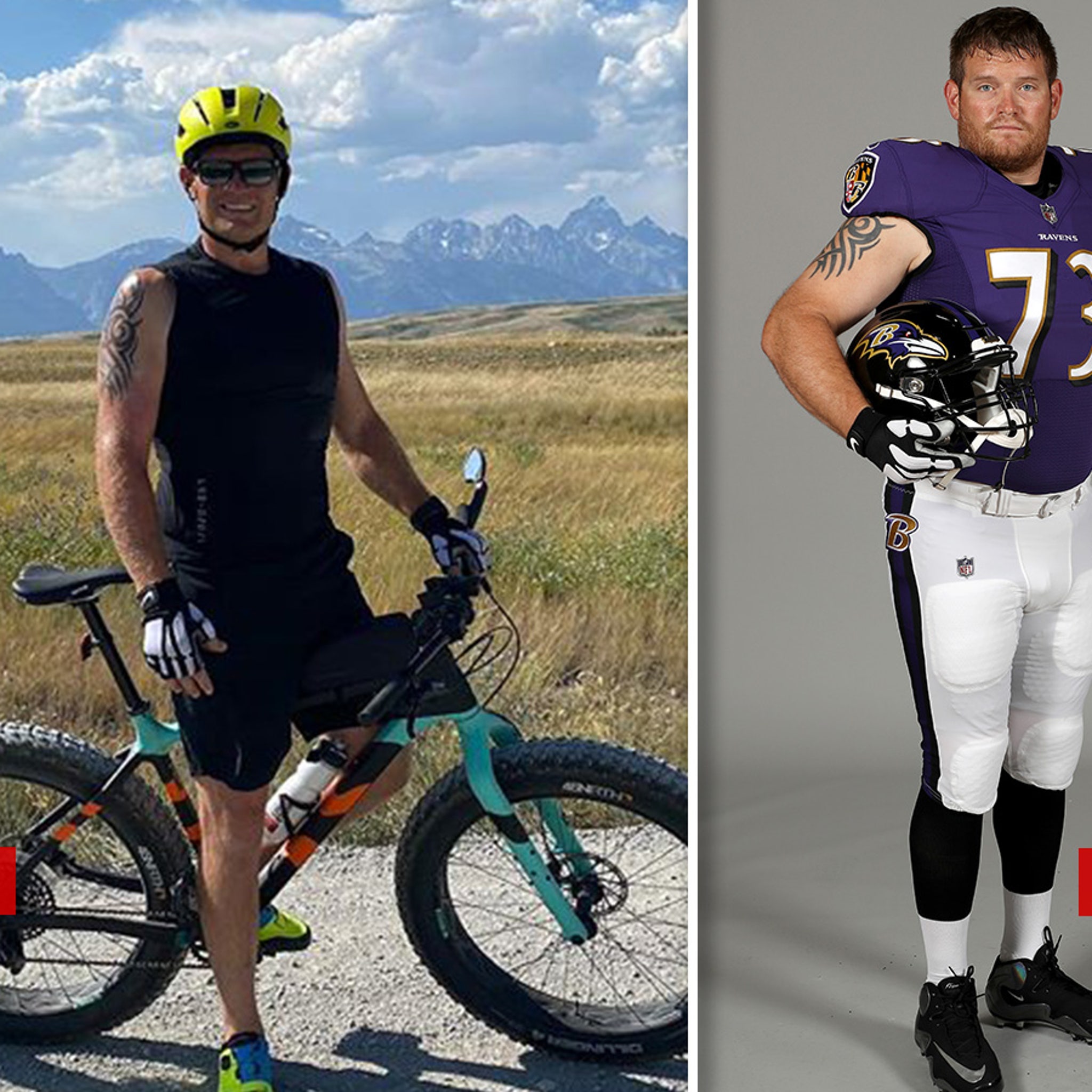
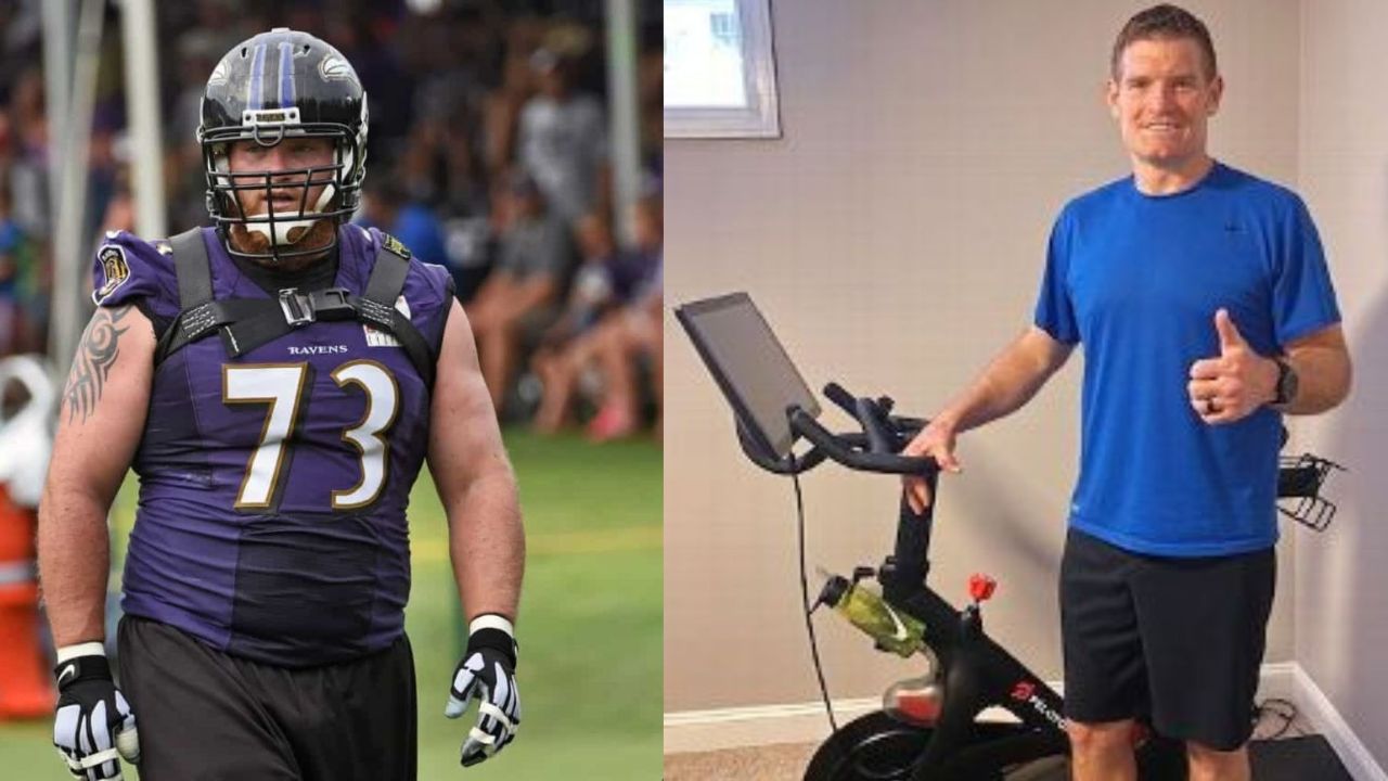
8 hours ago, GDAWG said:
This is former NFL Offensive Lineman Russell Okung:
Similar transformation. Marshal Yanda.
-
1
-
-
On 4/8/2023 at 4:26 PM, dont care said:
You like that they do the same thing every BBQ place does?
I like the option, but I prefer when the meat is cooked in the sauce so the flavor is infused in the meat.
From the website of local favorite Andy Nelson's BBQ (founded by former Baltimore Colt, Andy Nelson) --
QuoteAndy’s not famous just for his championship years with the Baltimore Colts; he’s also famous for his hickory smoked BBQ. Ask Andy and he’ll tell you that one of the secrets is slow cooking. “Our BBQ is smoked for many hours over hickory logs until it falls off the bone, and then it’s simmered in our own heirloom sauce”.
-
2 hours ago, BBTV said:
That's probably my favorite gif in board history.
Little did we all know, that turned out to be an (unintentionally) life altering event for Tnak.
-
1
-
-
5 minutes ago, DCarp1231 said:
Food wise, I went there once and was not too thrilled with the experience. I did love the fact that they had Cheerwine to drink.
I like that they give multiple sauce options. The downside to that is that the sauces just feel like last second add-ons to smoked meats. I much prefer BBQ that has been marinated in the sauce and really absorbs that flavor.
-
13 hours ago, Bmac said:
Thank God . . . as in "Thank God this won't be the Orioles City Connect theme!"
Slight off topic . . . from that angle, that M looks a lot like the UnderArmour Maryland M.
-
2
-
-
13 hours ago, DCarp1231 said:
Wow that’s actually pretty slick. All I see now is that “M”
On the patriotism, I’ve heard they play the national anthem at exactly Noon sharp every day over the speakers and have the customers stand and join in.
Also, there was a thread you were looking for. Started by yours truly-
That's sort of how it looked to me driving by this morning. I definitely can't unsee it now.
You are correct about the National Anthem. The same coworker and I were there for it once. He loved Mission BBQ and was pretty conservative, but after that he timed any carryout runs for 11:30 or 12:15.
As for the thread, I searched in this forum using "hidden". I'm surprised that didn't come up somehow.
-
1
-
-
2 minutes ago, BadSeed84 said:
Yea I never noticed this either, very cool.
This makes me feel better.
-
I thought we had a hidden letter/image thread in this part of the forum, but I couldn't find it so I started a new topic.
In any case, I'm embarrassed to admit that I just noticed the M in this logo about ten minutes ago . . . even though I drive by a Mission BBQ every day on the way to work.*
I always just looked at the logo as another way to play up the patriotism angle, which is BIG at Mission BBQ (to the point that a former co-worker used to call it the "One America News Network cafeteria").
* -- For the record, I also didn't notice the MB in the Brewers' ball-in-glove logo until about ten years ago . . . and I was alive when it was introduced.
-
4
-
-
On 4/3/2023 at 8:34 PM, FTRPresentation said:
Sounds like Maryland is going to Terps script - or at least they are teasing it through social media channels and adding a bunch of gear to their store.
Would love black, white and red helmets. Jerseys and pants in all four - black, gold, white and red colors.
I wonder if they make the recent “throwback” uniforms their full-time thing, use the Terps script helmets with the current sets of uniforms or if they have some sort of new design all together.
I'm not sure if this what you have in mind, but I keep seeing the video for their "Flip the Script" season ticket campaign on FB and Twitter. I hadn't made the connection about that being a possible teaser until about five minutes ago.
For what it's worth, in the video, Mike Locksley is wearing a white pullover with the script Terps logo. On the other hand, the tag at the end of the video is a black screen the UA M logo.
-
1
-
-
14 hours ago, MCM0313 said:
The white-helmeted script look, circa Shawne Merriman’s time there, was phenomenal.
Also, because I’m pedantic - it’s yellow, not gold. Their colors are from the Flag of Maryland, and that color is specified as yellow, or at least used to be.
Interesting. I've never actually checked that before.
QuoteThe design of the flag comes from the shield in the coat of arms of the Calvert family, the colonial proprietors of Maryland.
George Calvert, first Lord Baltimore, adopted a coat of arms that included a shield with alternating quadrants featuring the yellow-and-black colors of his paternal family and the red-and-white colors of his maternal family, the Crosslands.When the General Assembly in 1904 adopted a banner of this design as the state flag, a link was forged between modern-day Maryland and the very earliest chapter of the proprietorship of the Calvert family.
For printers: The red and yellow colors in the Maryland flag should conform to the following Pantone Marking System colors:- red on coated stock-PMS 201
- red on uncoated stock-PMS 193
- yellow on coated stock-PMS 124
- yellow on uncoated stock-PMS 124
Meanwhile . . .
QuoteThe University of Maryland's core brand colors are red, white, black and gold. Inspired by the Maryland state flag, these colors reflect our role as Maryland's flagship university. The university encourages the use of all four colors as they represent a core element of its visual identity.
Core Palette
Maryland Red
- Hex #e21833
- RGB 227/25/51
- CMYK 0/100/84/4
- PMS 186
Maryland Gold
- Hex #ffd200
- RGB 255/210/0
- CMYK 0/16/100/0
- PMS 116
White
- Hex #ffffff
- RGB 255/255/255
- CMYK 0/0/0/0
Black
- Hex #000000
- RGB 0/0/0
- CMYK 0/0/0/100
- PMS Black 6
https://umterps.com/sports/2018/6/7/school-colors.aspx
QuoteThe four official colors of the University of Maryland are drawn from the striking and distinctive Maryland state flag. The red, white, black, and gold represent the shield in the coat of arms of George Calvert, first Lord Baltimore and original colonial proprietor of Maryland. The shield features alternating quadrants of yellow and black colors from his paternal family, the Calverts, together with the red and white colors of his maternal family, the Crosslands. The Maryland General Assembly adopted a banner of this design as the state flag in 1904.
The University of Maryland did not always have four official colors, however. Early athletic uniforms were simply gray or maroon and gray, and it was commonplace for each graduating class to select its individual colors.
The transition to black and gold occurred in the early 1920s and these two hues dominated until 1942, when then football coach Clark Shaughnessy switched the team uniforms to red and white. Black and gold remained in the mix as accents and occasionally returned as the predominant colors, as in the case of the men's basketball uniforms of the mid 1980s. Today, all four colors are proudly featured in Terps' athletic uniforms.
-
3
-
Yeah, those are fine too.


/cdn.vox-cdn.com/uploads/chorus_asset/file/16498233/1157626861.jpg.jpg)
_(cropped).jpg)


MLB 2023 Uniform/Logo Changes
in Sports Logo News
Posted
Buzzkills!