


leopard88
-
Posts
7,898 -
Joined
-
Last visited
-
Days Won
3
Posts posted by leopard88
-
-
49 minutes ago, ruttep said:
Rich Kotite won a playoff game in 1992
Discussion over.
-
 5
5
-
-
On 1/13/2024 at 3:31 PM, ORLMagic86 said:
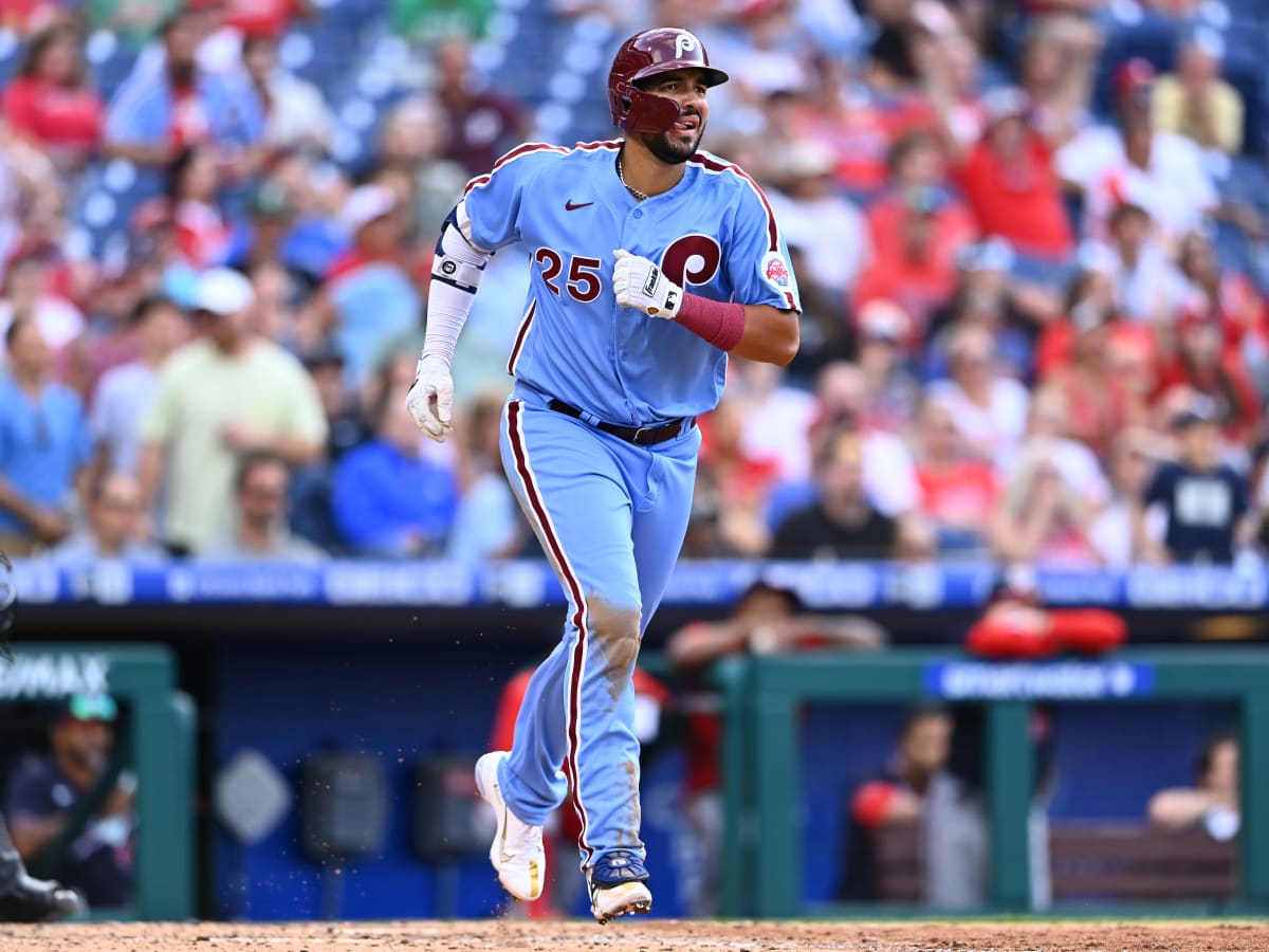
Maroon and light blue are such a great color combination that I'm surprised more teams don't use them. The Philadelphia Phillies are the only other team that I'm aware of that utilizes those colors.

I'm fairly certain that back in the 70s (which I lived through, for the record), nobody considered light blue/powder blue a Phillies team color. It was just the base color of their road uniforms (just as it was for the Cardinals, Twins, Brewers, Expos, Mariners, Rangers, Royals and others that I'm forgetting off the top of my head). Now, the team and the fans seem to have embraced maroon/light blue as the retro color scheme.
EDIT: TruColor seems to agree with me. Throughout the powder blue road uniform period, the team colors are listed exclusively as Red/White, Maroon/White or Crimson/White.
-
6
-
-
1 hour ago, TheBigFiz21 said:
I'll take it.
With black socks, please.
-
4
-
 4
4
-
-
47 minutes ago, TrueYankee26 said:
Ravens are 3-0 all time in black jerseys/purple pants per
. . . and clinched playoff berths in that combo twice (2018 and 2022).
-
4
-
-
I was looking at the line of scrimmage and didn't even see Toney in the picture.
My bad.

-
2
-
-
40 minutes ago, infrared41 said:
Is that even a picture of the same play?
I may be missing some sarcasm here.
-
So, ummm . . . what do we make of the Philadelphia Stars signing players for 2024?
https://usflnewshub.com/usfl-news/the-philadelphia-stars-refuse-to-go-quietly-into-the-night/
https://pfnewsroom.com/news/philadelphia-stars-sign-free-agent-wr-dontay-demus-jr/
-
On 11/26/2023 at 12:59 PM, Seadragon76 said:
FCS
Only two road teams won their games - Sacramento State and Chattanooga. Otherwise, it's all about the home teams. This includes Delaware making a big comeback to hold off Lafayette.
That was a tough one. Maybe a different result if Lafayette doesn't lose its starting QB and TE to injuries before halftime.
-
On 11/17/2023 at 2:12 PM, MCM0313 said:
Only time I’ve ever been to the Grand Canyon, it snowed enough that I couldn’t see to the bottom. I was kinda bummed about that.
We were driving from Phoenix to the Grand Canyon at the time. The snow hit us driving through a forest north of Sedona.
The added bonus to the story --
The forecast high in Phoenix that day was 90 degrees. Being East Coast tourists renting a car for the day and assuming naively that all of Arizona has the same weather, we splurged for a convertible for an extra $15. We were swiftly disabused of our notion about the weather when the radio station in Phoenix said the Flagstaff high for the day was going to be 45.
The snow hit on a windy one lane road with nowhere to pull over . . . so it snowed on us for about ten minutes while we had the top down. We finally had a chance to put it up when we stopped for lunch in Flagstaff.
At least it wasn't snowing at the Grand Canyon..
-
2
-
-
1 minute ago, TheBigFiz21 said:
Nice to see this again after a long home stretch, but given that the Bolts committed to all-navy, I would've rather seen the Ravens in all white and save this uniform for when they go back to see the Chargers next year.
I was typing when your post popped up.
I agree it will make the game look a little dark when paired with the Chargers' all navy combo.
-
On 11/19/2023 at 1:10 PM, Seadragon76 said:
It's time for the FCS Playoffs!
1st Round
-Gardner-Webb at Mercer (Winner at #1 South Dakota State)
-Duquesne at Youngstown State (Winner at #8 Villanova)
-North Carolina Central at Richmond (Winner at #5 Albany)
-Nicholls State at Southern Illinois (Winner at #4 Idaho)
-Sacramento State at North Dakota (Winner at #3 South Dakota)
-Drake at North Dakota State (Winner at #6 Montana State)
-Chattanooga at Austin Peay (Winner at #7 Furman)
-Lafayette at Delaware (Winner at #2 Montana)
Go, Leopards!
-
20 hours ago, Ark said:
Why is a team from Arizona concerned about being icy LOL
I got snowed on once driving from Sedona to Flagstaff . . . in April.
-
I find it interesting that most of the primary wordmarks emphasize the city/state name over the nickname. I guess that makes sense for trying to build local ties, but it's definitely not the norm in professional sports.
-
13 minutes ago, GDAWG said:
Thanks. I haven't seen any news about this locally, for what that is worth.
I like it. It has a whimsical MILB quality to it.
Come to think of it, the script reminds me of the Atlantic League's Southern Maryland Blue Crabs . . . perhaps a little too much.
-
57 minutes ago, McCall said:
And straightening/de-italicizing the script some.
I noticed that too, but thought it might just be the angle of the photo.
Assuming it is an actual change, it is a huge upgrade despite being fairly subtle. I can't/couldn't stand the old(?) version of the script.
-
2
-
-
20 hours ago, SSmith48 said:
Ah yes, they are debuting this against... Nebraska. Well, it's a solid look, but the wrong team to wear it against. It's almost going to look like a team scrimmage out there. Would have liked to have seen Black/White/Black instead.
My thoughts exactly. I really like these, but it would be better to at least wear the red helmet this week.
-
Opportunity lost with St. Louis. The bear(?) should be "strumming" a lacrosse stick held like a guitar . . . maybe with tuning pegs at the end.
I'm now curious to find out what the Baltimore name and logo will be.
-
On 11/1/2023 at 9:24 PM, BBTV said:
Disagree there. I grew up watching Seth Joyner, Jerome Brown, Reggie White, Eric Allen, Clyde Simmons, Andre Watters, Randall, Heath goddam Sherman, Keith Byers / Jackson, Jimmy freaking Giles, Arkansas Fred, and so on and so forth. So those were the uniforms of my youth and I originally hated the switch to midnight green. Not that they're perfect by any measure, but I think the 2003 update fixed all of the major issues, and I now find them superior, with one exception: The helmet wings.
The current wings are too cartoony, and would look better either being solid silver inside the black, and going back to the angled style. The white and silver combo inside the rounded wing outlined in black is just too much.
I'm fine with them going back to kelly green (though their older shade, not the oversaturated version they wore last week) but with a different look. Simple... but different. Minimal black, just silver, green, and white. Something like the Chargers, but with silver and white numbers (or green and silver on the white jersey) and no lightning bolt (duh.)
This helmet is better than both the current and the 80s. There's a second photo which is the same helmet (mini version) but the lighting is different so it looks like it would if they put those awesome wings on a midnight green helmet.
Silver-only wings on a midnight-green helmet would look great. Either way, just get me the same deep green as before.
I wholeheartedly agree with the first bolded part. I think the current wings look terrible.
I disagree with the second bolded part. The white outline on the 70s-80s helmet looks much better than the plain silver, IMHO.
-
1
-
-
4 hours ago, oldschoolvikings said:
I’ve always been a lone genius, true.Not on this issue. I would have chimed in to the same effect if you hadn't beaten me to the punch.
-
20 hours ago, MJWalker45 said:
Maryland's throwbacks, on the same template.
These are great . . . and pretty true to the early 70s originals.
-
3
-
-
4 hours ago, TheBigFiz21 said:
Well...the reactions to this should be fun considering Arizona is already set to wear all-red in the desert.
The post doesn't specify the sock choice, but I assume they will be white given the three
 emojis.
That would be a shame. I love the white jersey/white pants look, but it is sooooooo much better with black socks.
-
1
-
-
It looks like the name on the mailbox in front of old man Bugatti's house down the street.
What a ridiculous downgrade . . . which probably cost an exorbitant amount of money.
-
2
-
-
On 10/16/2023 at 8:08 PM, aawagner011 said:
Don’t think it has been confirmed but someone from the Mariners made a comment suggesting they may update. I can’t find the quote but it had to do with the font on one of their jerseys (either the name or number, maybe both) not matching the rest of their set. The person said something to the extent of “it would be fixed next year.”My guess would be that they are changing to block numbers on the navy jersey. They currently have a font somewhat similar to the Ravens number font.
-
7
-
-
13 minutes ago, Lights Out said:
Maryland's uniforms just look cheap now. And they're using the same stupid halftone effect on the numbers that the Commanders use on their infamous road jerseys.
It's meant to mimic the holes in the numbers on the original screen printed jerseys. I'm not sure why they didn't use that effect on entire surface of the numbers.
-
1
-
 1
1
-


2023 NFL Season week by week uniform match-up combos: From HOF Game to Super Bowl LVIII
in Sports Logo News
Posted
. . . at the end of a lost season in a game in which they were expected to (and did) get pasted.