


DC in Da House w/o a Doubt
-
Posts
3,867 -
Joined
-
Last visited
-
Days Won
6
Posts posted by DC in Da House w/o a Doubt
-
-
I've flown through Portland and never noticed their airport carpet. I guess I don't have an artistic eye.
Trying to make it out as something special and worthy of honoring on a uniform seems kinda... dumb. Really scraping the bottom of the barrel in terms of Portland landmarks and civic pride.
Can't wait for the Wizards alternates that honor DC's pee stained Metro carpets!

-
 2
2
-
 3
3
-
-
Thanking my lucky stars that the Caps won their Cup without GEICO on their uniform.
This news sucks, but it seemed inevitable. Only a matter of time for the other leagues as well. Pretty depressing. I legitimately have watched the NBA less because of their ads, probably will do the same with the NHL. Hell, I come on this site less solely because the ads became outrageous.
-
11
-
-
I won't lie, I come here way less now because of the advertisement overload.
-
2
-
-
The ads have gone from NBA uniform bad to Mexican soccer league uniform bad
-
2
-
-
13 hours ago, _DietDrPepper_ said:
I like the horn design on the sleeves of that USF uniform, but that's the only compliment I can give it.
Feel like the horn design would work better on the helmet. Can't recall cause they've had so many, have they done a Vikings-esque horns helmet look?
-
Too early to put future Hall of Famer Randy Arozarena's time on the Cardinals on here?
-
Re UGA :
Love love love the 1980's throwback. If Georgia is ever gonna not wear silver britches, this is the way to do it. The pants stripe is a tad wide, but I assume that is staying true to the 1980 set.
Not crazy about the dog collar shtick, seems a little tacky, but I'm sure recruits will eat it up. Also the bulldog logo on the sleeve, to me, felt like them trying to explain the collar, like really drive it home. Definitely not awful, just not my cup of tea.
With that being said, just great colors and identity overall for UGA, really hard for them to ever have a bad look.
-
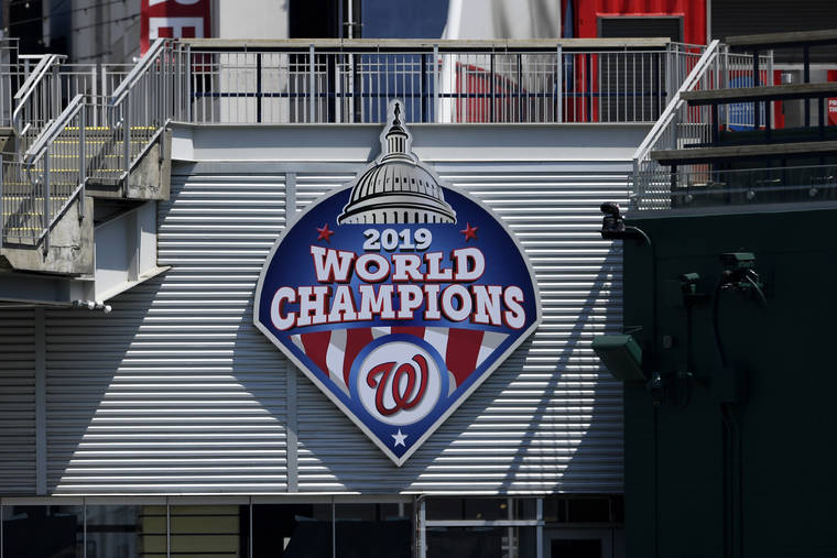
I assume the Nats will act like they've been there before for their next title.
As for now they have the following, what I assume to be permanent, additions marking the 2019 World Series title:
- A pennant over the scoreboard
- A sign next to the division title signs on the RF overhang
- A sign on the area formerly known as the Red Porch
(The big sign marking the 2018 All Star Game remains in CF)
Possible temporary additions:
- Sign on the OF wall padding in the RF corner
- A sign over the entrance to the home clubhouse from the field
- A flag flying next to the US and DC flags on the CF plaza
- A logo atop the home dugout
I'm sure I'm forgetting some. I'm not complaining, just observing. Hell yeah, milk this one for all we got.
-
Adrian Peterson as a member of Washington Football Team
-
2
-
-
I made this monstrosity years back in some all city sports logo thread in Concepts I think. Some low end blogs or sites or whatever use it sometimes I guess. In a weird way I'm flattered. I remember it got like no feedback or likes in that original thread, so I'm glad someone liked it

https://godandsports.net/2017/12/24/hope-for-the-best-plan-for-the-worst/
https://www.logolynx.com/topic/dc+sports
Those 2 sites for example use it. Those sites are seeing their click numbers go off the charts today! 5 clicks in one day, a new record!
I remember seeing it used more like a year ago, possibly on some t-shirts but can't find those now. Anyways, just thought it was kind of funny. I went like years without seeing it, and forgot about it, and then stumbled upon it.
-
7
-
-
Christian Yelich as a Florida Marlin:
-
2
-
-
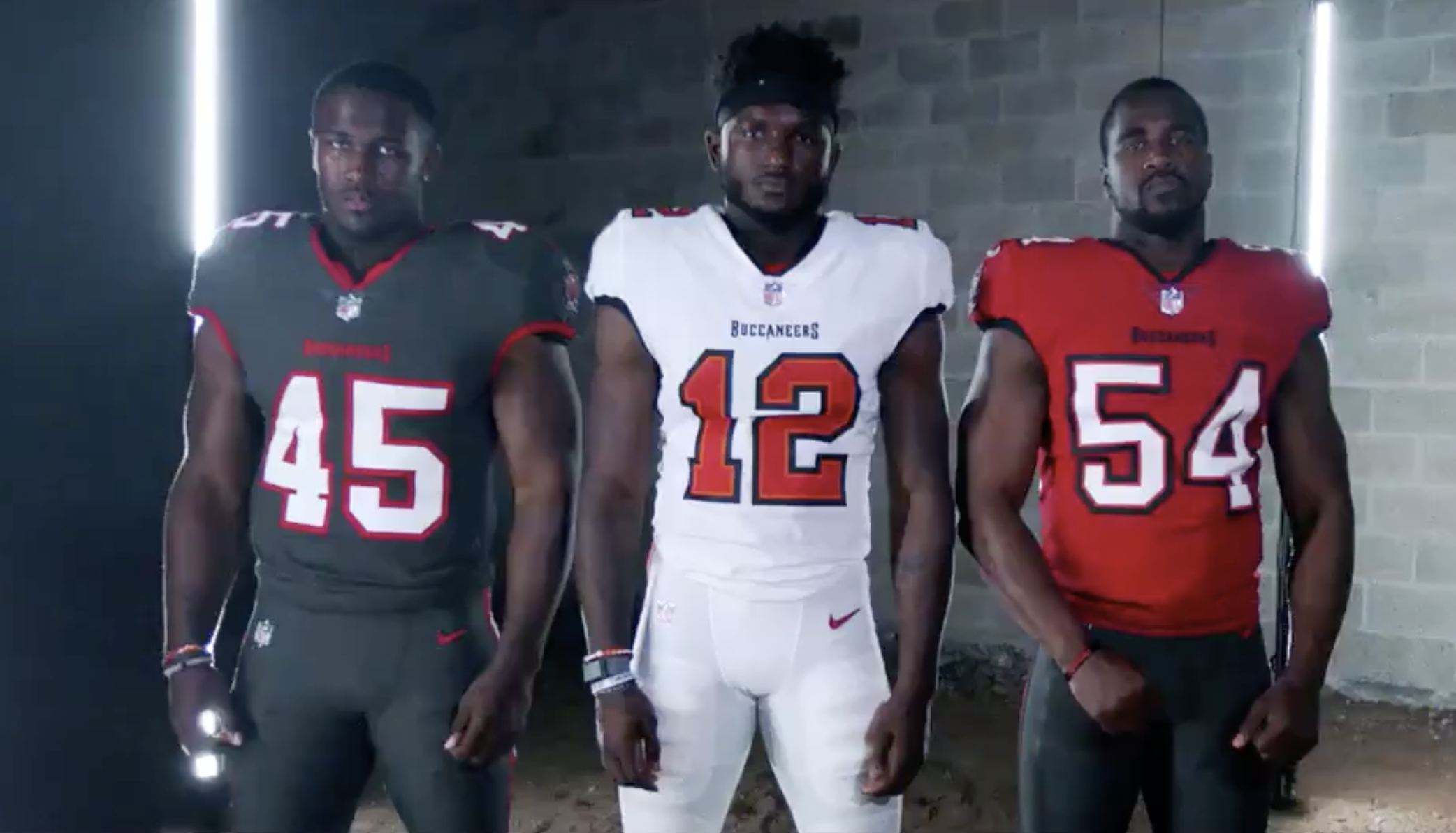
Chris Godwin wearing #12 in the Bucs new uniforms before giving it to Brady
-
4
-
-
Harambe jokes in 2020? That the best we can do?
-
7
-
-
The new cavalier alternate is pretty cool.
But the V update looks like an unnecessary downgrade
-
4
-
-
Yeah that Bucs one is literally wrong
-
5
-
-
Not only is this my favorite Padres uniform set, it's one of my favorite baseball uniform sets everrrrrr
-
8
-
-
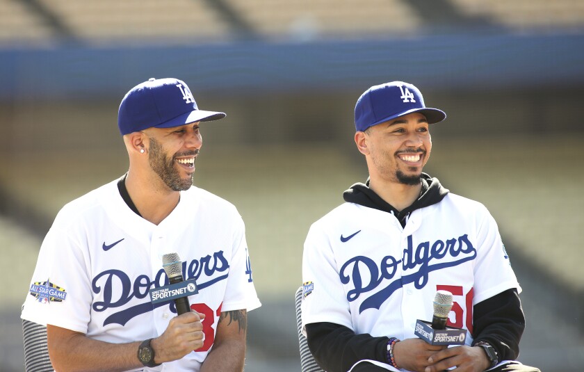
It could be right one day, but as of now Mookie Betts in Dodgers gear looks odd:
Price too I suppose. Rays is his "right" look to me still, but overall he's bounced around
-
2
-
-
5 hours ago, CherryMX said:
The logo on the lower NY player's helmet looks pretty cool here. It seems to line up really nicely with the curve of the helmet at this angle. Almost looks like the lion gargoyle guy is making the tackle.
-
2
-
-
Wow most of those uniforms look surprisingly sharp. The only one I don't care for is the Vipers. LA's aren't great either. Overall tho, this actually doesn't look like a clown show by any means.
-
3
-
-
An article about how the George Washington poppin champagne logo was made for the Harrisburg Senators.
-
1
-
-
Not bad, but it could have been better. Not sure why they stopped doing the conference logos in the end zones. Also it's a little strange that the niners will be wearing a different helmet than the one in their end zone. I know they've been doing that at Levi's Stadium, and 99% of the country won't notice anyways, but still to me it seems a little strange.
-
and of course this comes to mind
-
1
-
-
Chiefs wordmark is down in red, yellow endzone seems to be correct
-
44 minutes ago, Pleepleus75 said:
I dig this! Especially with the old school face masks. I think this is plausible, especially if the Niners endzone is already confirmed.
I'd like them to still include the conference logo either on a helmet or not, but overall this is solid.


2022-23 NBA Logo & Jersey Changes
in Sports Logo News
Posted
That's fair. I guess its not any
lessmore* stupid than the rest of them.EDIT: Meant to say more. Looking in the mirror, now who's stupid. I'll show myself out.