


DC in Da House w/o a Doubt
-
Posts
3,867 -
Joined
-
Last visited
-
Days Won
6
Posts posted by DC in Da House w/o a Doubt
-
-
RIP to these awesome alternate logos:

-
 7
7
-
-
Do the Heat still have banners for Michael Jordan and Dan Marino?
-
I think I LOVE this logo
-
2
-
-
Needs black
-
1
-
-
Hey guys,
After seeing the Mint Julip hats back on the last page, I just wanted to take this time to give a quick shout out to the Montgomery Biscuits. The Biscuits were so ahead of the curve on the anthropomorphic local food item logo. The logo below is from 2004. Now? The shark has been jumped over and back again. The horse has been mercilessly beaten into the ground. Montgomery Biscuits, I'm sorry that so many teams are infringing on your territory. I'm sorry now that you may unfairly get lumped in with the other unoriginal food logos. Your logo was great and clever. It made me laugh. It still does. Stay strong.
-
17
-
-
A banner should stay up regardless of who is playing. I was watching that game and thought it was an odd place to put the banner as there's obviously only enough room for one.
-
3
-
-
12 minutes ago, Discrimihater said:
Huh, I didn't even know they'd changed their colors.
They have a new affiliation with the Nats, but apparently the colors were going to get changed regardless and they did not want a Nats esque look. Here's an article about it if anyone cares:
-
Fresno Grizzlies, now featuring red pants
Hard to tell but looks like that's supposed to be cream colored rather than white -
1 hour ago, RayFinkle said:
Wow the spacing in the Rams endzone is brutal looking. As bad as it was for the Eagles last year.
Also, the Patriots wordmark looks so close to the top of the endzone.
No helmets anywhere. This field stinks. At least its not the navy and white Rams logo, thats the one saving grace
-
1
-
-
Baby Cakes always seemed like a bridge too far. To me, it was funny/quirky/cute for the first day I heard about it, but after that it was too much. It had no staying power. Who in New Orleans would take pride in reppin Baby Cakes gear? Who would want a hat with an angry Tommy Pickles on it?
Wichita Wildcats. That's my vote. Boring. But safe
-
8
-
-
Any word on if the Frederick Keys are moving to a red, white, and blue color scheme? Not sure why they would, since they're an Orioles affiliate and these colors look rather Nationals-esque. But their twitter profile has a red and blue Keys logo, and you can see their ASG logo for 2019 below
https://twitter.com/FrederickKeys

-
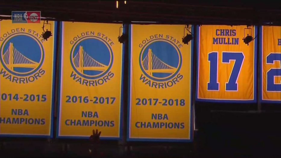
Another one for Golden State
-
10 hours ago, Bradbury said:
I'm a Preds fan, but this is ridiculous, borderline embarrassing.
IMO, the only acceptable banners are:
- Stanley Cup
- Conference (PLAYOFF) Champs
- Presidents' Trophy
- Retired #'s
Put all of the Division titles on one banner. Anything else is superfluous.
Other than the weird and unnecessary grey banner, these do look good.
Definitely dumb. The Caps did this same thing for the 2009-10 season. 3 banners to commemorate a first round loss to the 8 seed Canadiens. Thankfully, these are gone now. And they've moved division titles to one banner and Presidents Trophies to one banner.
Regular season conf champs is really lame.
-
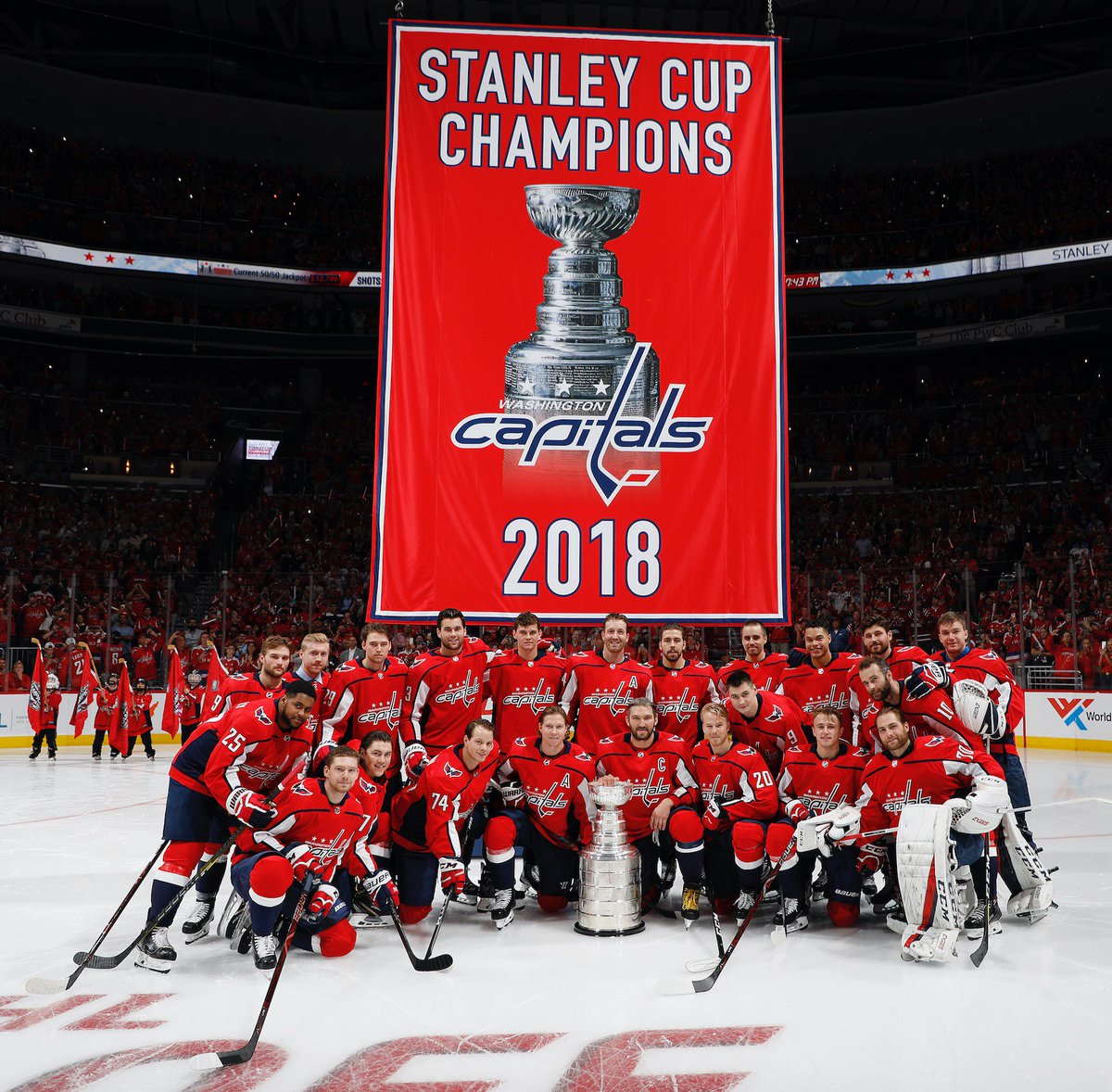
7 hours ago, Evil Doctor said:
Man, that thing is freakishly monstrous. I guess they're assuming they're not going win enough Cups which might cause them to run out of room...
Strangely it doesn't look quite as big when its hanging way up in the rafters
Caps have also updated their Eastern Conf champs banner, no more flying eagle:

-
-
On 8/29/2018 at 12:34 PM, DNAsports said:
.jpg)
Speaking of Peterson, what is that stuff that always gets on his numbers? I've only seen it on his jerseys. Happened all the time when he was on Minnesota, and I've never seen it on a Redskins jersey until he suited up
-
1
-
-
Zorn's correct uniform:
Stay medium
-
Who is the player in the first pic?
Also who is Stacey Augmon. And what would be his correct team?
-
-
Love the Brooklyn options for Seinfeld night next season. My opinion, gotta go Marble Rye.
-
2
-
-
On 7/15/2018 at 7:40 AM, DNAsports said:
Speaking of patriotic, they used to have logos incorporating an eagle.

Featuring Jayson Werth pre long hair with some sweet sideburns @DC in Da House w/o a Doubt
I think it would be a good idea to bring back that eagle logo, but try to modernize it.
Another idea I have is maybe they should try to incorporate music imagery into their logo.
Keys are definitely due for an upgrade. I just hope they stay black and orange, which I assume they will as long as they're an Orioles affiliate.
As for the Werth picture, I have a small story on that. When I was like 8 or 9 maybe I went to a Keys game and got a pack of cards of the entire team. I was interested in them for like 20 minutes and then they sat in my closet for 15+ years. Fast forward to a year or two ago, I find those cards and flip through em. No name player after no name player. And then sure enough, there's a face I recognize, young Mr. Werth. Really cool stumbling upon that. Funny how the world works. That's the best part about MiLB to me. Being able to look back years later and say oh wow I saw that guy play
-
The flying rocking chair is terrible. Also, the colors hurt my eyes.
-
1
-
-
George Costanza night would be better. Make the uniforms out of cotton

-
1
-
-
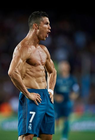
I think this is Ronaldo's correct uniform
-
7
-


XFL 2023 Logos, Names and Uniforms
in Sports Logo News
Posted
Enough red, white, and blue teams for DC. We get it, it's the nation's capital. Hell, do black and red ala DC United since you're gonna be roughing up their grass.