


DC in Da House w/o a Doubt
-
Posts
3,867 -
Joined
-
Last visited
-
Days Won
6
Posts posted by DC in Da House w/o a Doubt
-
-

I actually like this and am surprised at all the hate it gets.
+1
Agree completely. It's not the best in the MLS, but it's Top 5. Compare this to the other original MLS logos and it looks magnificent.
-
Sadly, the Atlanta Braves are celebrating being the best 2nd-place team in the National League for the 2010 season. The pocket schedule mentions being the "2010 NL Wild Card Champions", and they've even hung a banner at Turner Field to commemorate the occasion:

The Braves should really be above this.
Agreed, I was mildly disappointed when I heard that news. I mean, it's good that they're recognizing it, but it just should've been a section in the yearbooks, the Wild Card isn't banner-worthy.
In a sport that is, for now, the most difficult to make the playoffs, I am OK with such a banner. Maybe it would make more sense for, say, the Brewers, who have very few appearances compared to ATL. But in MLB, where getting in is the key, I am OK with this.
What I cannot stand, however, is the phrase "Wild Card Champions." That is not a championship any more than "NBA Western Conference 7th Place Playoff Birth" is a championship.
Agreed, I would just say "Wild Card" or "Wild Card Winner"
-
Washington Capitals
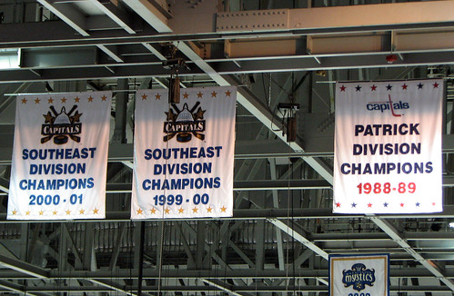
The Caps and Bullets have gotten new banners... everything is red, white and blue now...
Have they replaced the old white/blue/bronze 1999-00 and 2000-01 banners with red/white/blue or just added new red/white/blue banners for 2009-10?
Every banner now looks like the 2 Red one's in the picture I posted... The Bullets banners you can see in the background of that same picture have been changed also, each one now looks the same as the new Capitals one's but they are white instead of red. I couldn't find any pictures of the new Bullets banners.
-
Photos from my albums
Washington Capitals
Washington Bullets
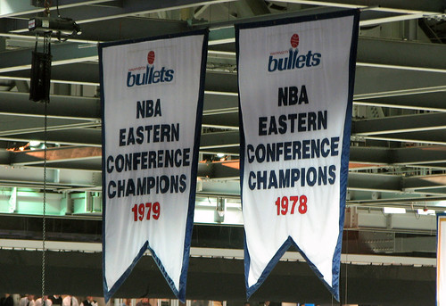
The Caps and Bullets have gotten new banners... everything is red, white and blue now...

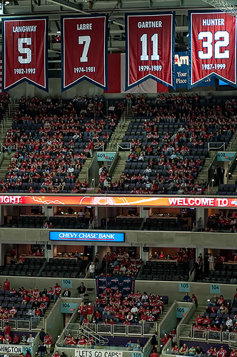
Oh and thankfully, all the Mystics "Attendance Champions" banners have been removed.
-
Idk if this is unpopular, but... The Raptors current uniforms look sooooo much better in purple in my opinion...
Also, I love their original look. I can't wait until 10 years from now when 90's throwbacks become the preferred look of the league again.

Arena Rafters & Banners
in Sports Logo General Discussion
Posted
In honor of the Final Four today here are some Final Four/National Championship banners...