


DC in Da House w/o a Doubt
-
Posts
3,867 -
Joined
-
Last visited
-
Days Won
6
Posts posted by DC in Da House w/o a Doubt
-
-

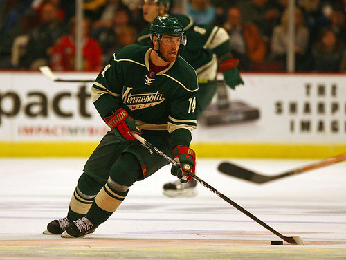
Off topic, but my god, look at those jerseys! I can't believe we're only like what, 6 years removed from those? 7 maybe?
I mean look at them! Plain is fine, subtle is fine, old school is fine.... But these? Yikes. These are too much. It kinda fascinates me honestly, that something this plain and this terrible could exist in the 2000's.
Raiders?
True. But their colors alone make theirs much more unique than these.
-
Off topic, but my god, look at those jerseys! I can't believe we're only like what, 6 years removed from those? 7 maybe?
I mean look at them! Plain is fine, subtle is fine, old school is fine.... But these? Yikes. These are too much. It kinda fascinates me honestly, that something this plain and this terrible could exist in the 2000's.
-
I think that the current Pacers uniforms are by far the best they have ever looked.
If they keep wearing the gold uniforms on the road, I'll agree with this.
-
Houston Oilers vs Baltimore Ravens in 1996, twice. Ravens first season and Houston's last season.
The Oilers also played Jacksonville twice that year and Carolina once, both in their second year of existence.
-
I honestly have no idea why everyone hates this set so much:

I'd even go as far as saying they are a top five or top ten look in the league.
I really preferred the black jerseys. That's my main gripe with that set.
-
He's playing a top draft pick of the Browns in a new movie.
Is he actually going to act? Or are they just using him for shooting in game scenes? I assume the latter.
He most likely will have a few lines in the movie. I read and article a while ago talking about how he wanted to get into acting. I didn't hear that he would be a top draft pick like selby56 has stated. I figured he was traded or something.
For what's its worth IMDB doesn't have Foster listed on the cast for the movie. So I don't think his role is too big. He might have a few lines tho I guess.
Looks like the dude who played Jackie Robinson in 42 is the second lead, so in thinking he might be the #1 pick Cleveland is trying to get.
-
He's playing a top draft pick of the Browns in a new movie.
Is he actually going to act? Or are they just using him for shooting in game scenes? I assume the latter.
-
The new Dolphins uniforms are the worst of the 3 new uniforms debuting in the NFL this season. The more I see em the more I don't like em. The logo is decent but the uniform is so bland.
Where's the heart?? Anyone can slap 2 logos on the helmet and logos on the sleeves. At least the previous set had some unique striping.
Down with the new Dolphin uniforms.
(And PS, they totally ripped that font for their wordmark off from the Capitals. Yeah I said it!... Am I crazy? Possibly. Or maybe just sane living in a world of crazies.)
-
 1
1
-
-
Wrong uniforms for AP!!!!

-
Northern Illinois gets an Orange Bowl ring even though they got spanked in it? Seems kinda lame. That's like a participation trophy. They should have gotten a MAC champs ring and that's it.
-
1
-
-
The MLS is on the up and up, definitely isn't a failure... The logo itself is though. Heyooo
-
-
Random question: Has anyone wore #8 for the Lakers since Kobe switched to 24? I was just thinking that I'm sure 24 will be retired for Kobe, but he did win more titles wearing 8.
-
Right or wrong?

Right... I think Ray Allen is a player who has multiple right uniforms.
-
1
-
-

Was this a pre-draft work out type thing? Nice find
-
Terry Crews on the Redskins

I think his right uniform is having things explode out of his muscles in Old Spice commercials
-
Here's one that no one will agree with me about.
This right here is one of my favorite Buffalo Bills looks that I think they ever had...

The away look wasn't too bad (other than the side stripe inconsistencies). I actually like that jersey
-
This is his correct uniform, penalty box included.

Wrong uniform for Carrie Underwood
-
1
-
-
One of the ugliest uniforms of all time:
Well, of course you think that.
Lights Out is spot on with this one.
-
Wrong uniforms, not necessarily wrong teams:
Deron Williams
JaVale McGee

Blake Griffin

Steph Curry

-
And the Lightning uniforms have always blown. Those logos above are terrible. And I absolutely HATE royal blue and black together... tried over and over, never suscessfully IMO.
Even Duke? I can't stand the team, but I think this set looks pretty smooth.

-
Is that black diamond? If not they should have used black diamond. The black in the logo looks plasticky or something.
-
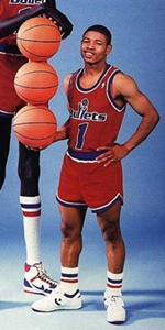
Muggsy Bogues as a Bullet (might seem less wrong because the pic of him and Bol is so familar now)
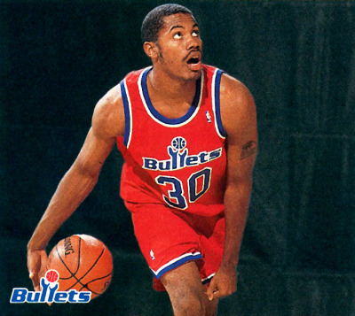
Rasheed Wallace on the Bullets
-
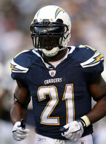
Always will remember LT in the set before these.


Ask A Moderator
in Forum Policies and Announcements
Posted
Not a question, but a suggestion. The mobile version of the site really needs a way to jump to the last page of a thread, or jump to any page for that matter.. I'm sure this has already been touched on, but I'm just friendly-ly suggesting it again.