


DC in Da House w/o a Doubt
-
Posts
3,867 -
Joined
-
Last visited
-
Days Won
6
Posts posted by DC in Da House w/o a Doubt
-
-
Is that sharpie on the back of his jersey???In light of tonights game, anyone else remember this?

Yep. Twas a pretty wild story: http://www.uni-watch.com/2007/11/02/in-which-your-humble-narrator-misses-the-biggest-story-of-the-year/
If they went to all that trouble to draw on the Nike logo, why would they do it backwards? It couldn't have been an accident right? I mean everyone knows the nike logo, even kids in Tibet would probably recognize it.
Eh, maybe whoever was drawing it on looked at their shoe for reference and they happened to focus on a swoosh that was facing that way
-
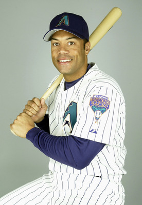
I give you.... Roberto Alomar, as a Diamondback in 2004.
I've said it before, but I love this uniform.
-
Amare Stoudemire on the Heat
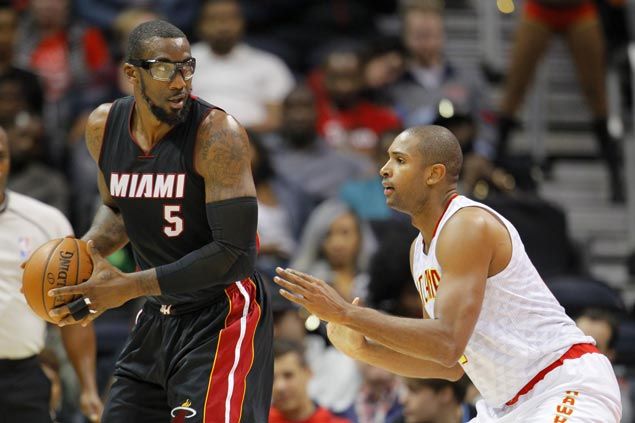
And I suppose you could say that's the wrong uniform for Horford too
-
-
Still hard to believe a team with 2 championships in just over 20 years of existence can't draw a consistent fan base.
Yeah, that is strange. Especially since that area is a hotbed for baseball. I think Miami is just one of those towns where the "they have better stuff to do" theory applies.
-
Blue Jays are anxious to tout that division title it seems. Will be unveiled before their first playoff game I would assume.
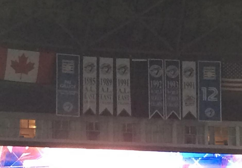
https://twitter.com/sportslogosnet/status/651496026742870016
Also, as our site creator has pointed out, they are now being hung organized by title, rather than chronological order, as was done in the past:
-
 1
1
-
-
Mike Green as a Red Wing

Also Mike Green and Brooks Laich in copper/blue/black (superior look the current Caps look, btw. Siggghhhh)

-
1
-
-
Maryland football has great (not good, great) uniforms. The current set has the potential to be worthy of staying untouched for the next 25+ years (okay, maybe an edit or 2, such as removing the dopey bars on the red pants).
BUT. They instead choose to muck up their look with their Spring Break 2009 at Ocean Cityesque airbrushed helmets. My god those things look cheesy. When they first unveiled them two years ago as a one game alternate, I was all on board. But to wear them every single game? They are unbearable. They deserve to be thrown in the same bottomless pit that the Jaguars' helmets should be thrown into.
(thumbs down):

(thumbs up):

/cdn0.vox-cdn.com/uploads/chorus_image/image/46934436/usa-today-8238227.0.jpg)

-
Monochrome red or not, they'll still get obliterated on national TV.
https://youtu.be/6-tqLG__Al4To me this is one of those "So bad it's good" uniforms. I know there's too much red, but I still like it.
EDIT: Looking back, I realized I have a ton of unpopular opinions.
I feel like they've gotten obliterated on national television every time they've worn these. They just remind me of the darkest parts of the Jim Zorn era (as opposed to the oh-so-magical times we're experiencing now). Hopefully this combo never sees the light of day again.
This is true

-
1
-
-
To me this is one of those "So bad it's good" uniforms. I know there's too much red, but I still like it.
EDIT: Looking back, I realized I have a ton of unpopular opinions.
I feel like they've gotten obliterated on national television every time they've worn these. They just remind me of the darkest parts of the Jim Zorn era (as opposed to the oh-so-magical times we're experiencing now). Hopefully this combo never sees the light of day again.
-
Banners looks so much better with the standardized logo. You can tell right at a glance that it's a Super Bowl banner, and at least there's consistency from year to year. With the older ones it looks like they won something different each year.
Right... right. But then you could just read it and see what it's for. I realize the standardized logo may save someone .0005 seconds of brainwave action before they realize what the banner is for, but nonetheless the standardized logo looks terrible. The unique logos may conjure up, you know, actual memories. For example, a Pats fan could look at the banners and think: "Oh hey when I see the XXXVI logo up there, I remember Vinatieri sealing the incredible win" or "Oh wow, that XXXIX logo reminds me of Jacksonville, and our dynasty and Donovan McNabb vomiting."
But hey, that's just me
-
2
-
-
Had no idea this even happened, hopefully it hasn't been posted yet.

Iverson in jersey #6, for the 2002 All-Star Game.
Que significa? Why did this happen
-
Michael Vick

-
Oh man, I wouldn't wish that upon poor Peyton.
And I don't think the cap penalty would have mattered. Peyton is a smart guy, there is no way he honestly would have thought that he was a better fit in Washington than in Denver. The only players that come to Washington are free agents looking to get PAID so they can coast the rest of their career comfortably. Peyton isn't that.
And last part of my self-deprecating rant: If that picture above was real and Peyton did sign with the Redskins, is there ANY chance he'd still be playing right now? I say, none whatsoever and his legacy would be tarnished. You'd have to remember his career in spite of what he did as a Redskin. If that picture was real, realistically we'd all be talking like: "Wow, can you believe it's already been 2 years since Peyton Manning died? Remember him?"
-
2
-
-
John Elway - Baltimore Colts
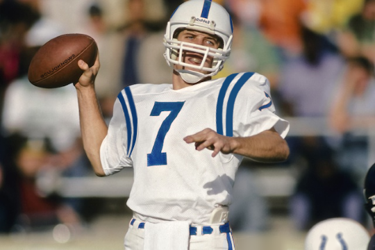
Nice. Where's Eli on the Chargers
-
For some reason I like the Bills old uniforms. Don't get me wrong, I actually like their current uniforms. I just really like these for some strange reason:

(I know that nobody agrees with me.)
Maybe if the pants stripe meshed a bit better with the jersey. And if the helmet didn't have about 15 helmet stripes. And if the numbers weren't double outlined
-
And now Dan Haren's a Cub. Does he even have a "right" uniform?
Oakland.
If he does have a "right" uniform, I'd say it's Arizona. He made the All Star Game twice while there.
Meanwhile...
News to me:
Lorenzo Cain was once a Brewer

-
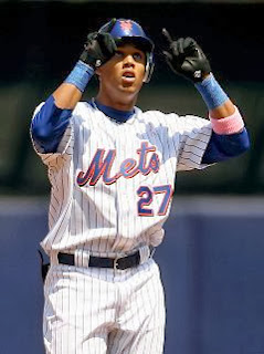
Jonathan Papelbon

Jose Reyes

And Carlos Gomez on the Mets... still wrong
-
Keith Hernandez in a Cardinals uni is wrong? 10 years, a batting title, an MVP, World Series ring. Certainly not. If he made it to the HOF it would be as a Cardinal.
This on the other hand...
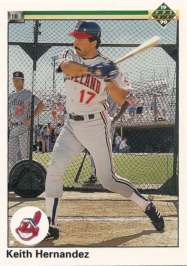
Yeesh, how embarrassing. I have much to learn about Keith Hernandez. I only know him from the Mets and Seinfeld.
-
1
-
-
Paul Konerko on the Dodgers and Reds

Also...

-
The Jazz have the worst color scheme in sports
Yeah, it really is terrible. Should have gone back to purple instead of adding navy blue.
-
1
-
-
The Reebok-engineered new-look Seahawks met the old-style Atlanta Falcons for the only time in 2002, two years before the Falcons changed their uniform. I am unable to find pics.

(Found it on Google... sure enough it was from CCSLC and a similar thread: http://boards.sportslogos.net/topic/84264-jerseys-you-didnt-think-were-used-at-the-same-time/?p=1695713)
-
JR Smith the New Orleans Hornet


Players in the "wrong" uniforms
in Sports Logo General Discussion
Posted
Some more for Baltimore...
Joe Carter as an Oriole:
Kordell Stewart as a Raven:
Snoop from The Wire in a dress: