


DC in Da House w/o a Doubt
-
Posts
3,867 -
Joined
-
Last visited
-
Days Won
6
Posts posted by DC in Da House w/o a Doubt
-
-
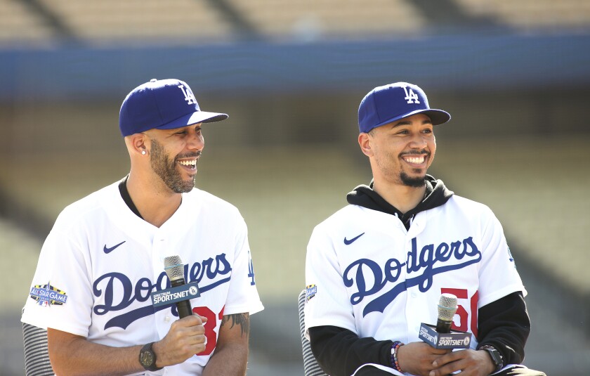
It could be right one day, but as of now Mookie Betts in Dodgers gear looks odd:

Price too I suppose. Rays is his "right" look to me still, but overall he's bounced around
-
 2
2
-
-
5 hours ago, CherryMX said:
The logo on the lower NY player's helmet looks pretty cool here. It seems to line up really nicely with the curve of the helmet at this angle. Almost looks like the lion gargoyle guy is making the tackle.
-
2
-
-
Wow most of those uniforms look surprisingly sharp. The only one I don't care for is the Vipers. LA's aren't great either. Overall tho, this actually doesn't look like a clown show by any means.
-
3
-
-
An article about how the George Washington poppin champagne logo was made for the Harrisburg Senators.
-
1
-
-
Not bad, but it could have been better. Not sure why they stopped doing the conference logos in the end zones. Also it's a little strange that the niners will be wearing a different helmet than the one in their end zone. I know they've been doing that at Levi's Stadium, and 99% of the country won't notice anyways, but still to me it seems a little strange.
-
and of course this comes to mind
-
1
-
-
Chiefs wordmark is down in red, yellow endzone seems to be correct
-
44 minutes ago, Pleepleus75 said:
I dig this! Especially with the old school face masks. I think this is plausible, especially if the Niners endzone is already confirmed.
I'd like them to still include the conference logo either on a helmet or not, but overall this is solid.
-
The Tarp Skunks. I don't think this name has much staying power
-
2
-
-
-
1
-
-
Not sure if these will see the field but the Harrisburg Senators are now selling the following cap featuring George Washington celebrating the Nats' World Series title
-
8 hours ago, Silence of the Rams said:
First off i may have a solution, Second in case y'all wanted a head Start
Missed opportunity not putting Super Bowl LV in Las Vegas
And yes, that absolutely looks like LIV
-
Don't think Beltran wore this particular uniform when he played on the Mets
-
2
-
-
Jean Segura played one game for the Angels in 2012
-
The Defenders look pretty good with no monochrome
-
3
-
-
http://news.sportslogos.net/2019/12/05/connecticut-tigers-rebrand-as-norwich-sea-unicorns/
EDIT: Ive been beaten to it.
Definitely has the brandiose mouth. Not bad, but just feels very familiar. Most of MiLB's different little logos all look the same
-
1
-
-
57 minutes ago, Ferdinand Cesarano said:
Ah, maybe you are right. I was going by memory without researching, and could very well have been mistaken. On second thought, perhaps the swastika allegations came up with respect to the Los Angeles logo (which was never changed.)
Even given the sloppiness of my memory, for which I apologise, I will reiterate my assessment of Las Vegas as the best-looking team in the original XFL.Yikes, yeah definitely this logo. Those allegations seem pretty just. Although I'll admit I never noticed it before
-
4 minutes ago, Ferdinand Cesarano said:
Most of that was garbage. But Las Vegas looked superb, which is amazing considering that the helmet logo was the team's second, after the first one was thrown out for highly dubious reasons.
I don't remember this, what are you referring to
-
For the Defenders I think I see a hidden DC in their logo, but it might be a stretch. What do you guys think:
-
9
-
-
Luis Urias, now a member of the Brewers
-
1
-
-
He looks really twisted up in this one. I know they tried to emulate Ted Williams and Big Papi, but a bit of an odd pose
-
1
-
-
Any guesses for the soon to be ex- Pawtucket Red Sox? Something with gritted teeth? [Adjective] [local cuisine]s?
-
2
-
-
13 hours ago, the admiral said:
Did they put up a blank pennant to signify the one they hadn't won yet but were intending to?
As for the Senators' championships, they have the right to put them up there, it's fine, as long as they denote that they were won by the Senators and not the 2005-present Nationals.
Who knows why they left the pennant blank, but yes I remember watching Nats games a while back where they explained how it was a blank placeholder pennant or something like that for when the team wins its first pennant. There’s no denying this is dumb. Nats used to do all sorts of off the field fave Palm decisions: This was the same team that couldn’t consistently get the analog scoreboard clock working. Rather than fix it, they took the hands off so now there’s a random curly W within a circle with 12 unexplained stars surrounding it.
And I agree with your Senators point, but I believe they just say 1924 WS Champs. No indication that it’s a different franchise. Maybe they’ll overhaul all these now that the Nats have actually won something, we’ll see
-
Lastly, UMD is refreshing their banners at Xfinity Center, so the ones on their way out are available for auction or purchase:


/cdn.vox-cdn.com/photo_images/8027704/149197953.jpg)


Unpopular Opinions
in Sports Logo General Discussion
Posted
Not only is this my favorite Padres uniform set, it's one of my favorite baseball uniform sets everrrrrr