


Silent Wind of Doom
-
Posts
1,862 -
Joined
-
Last visited
-
Days Won
1
Posts posted by Silent Wind of Doom
-
-
So... as I mentioned, we've got three uniforms left missing. I was able to find on Twitter mentions of the St. Louis blues being delayed until June. I knew I'd read that on here somewhere. I also found mention by fans that the Brewers are awaiting their City Connects.
Then there's the Cubs. I've had the Wikipedia page for the City Connect program up because it has the dates and days for each so I don't have to keep reopening other pages. Looking at it a second ago, I just realized that it says the Cubs wear their City Connects on Friday home games "June-September". That... seemed... odd. So I went back through the Getty galleries for their games. In June 2021, the uniforms were revealed. Since then, it appears (unless a couple slipped through out of the 486-ish games) that they have every year started wearing them at the start of June and then gone back to home pinstripes the last few Friday home games. I can see wanting your fans to see the traditional look at Wrigley at the start and end of the season. It's just odd to see that it seems a concerted effort to hold them off until two months in. I've never heard this mentioned before.
-
2 hours ago, WSU151 said:
Definitely off-white. White pants would be pretty stark white in the same setting and would be much closer to the white jerseys the fans are wearing. The field doesn't reflect that much on polyester.
That orange glow... I wasn't sure if it was tainting my perception or not.
3 hours ago, coco1997 said:I watched the game on Friday and the pants and cap front panel were definitely off-white.
I will take your word for it. It seems to be a subtle shade. I didn't look to the highlights because I knew it wouldn't be too high quality compared to the Getty shots. It's stuff like this look at them in the full sun of the outfield that boggles my mind.

But, I defer to outside eyes, especially ones who watched for hours at full HD.
4 minutes ago, PlayGloria said:I'm a bit surprised people don't like the Cardinals CC hat a bit more. Yes, the sleeve patch would have looked great, but the STL that they went with reminds me a lot of the St. Louis Stars Negro League hat. I'm surprised the Cardinals didn't even try to ty that connection into the hat.
There was a lot of talk just recently about three-letter initials. I expected if they were separated at all, the relative size and format of the letters would be modeled after this:
Or just a throwback version of the current insignia. Either way, I did talk myself into hoping for a dark cap. What did come seems to be the least imaginative option, but it's inoffensive.
-
 2
2
-
-
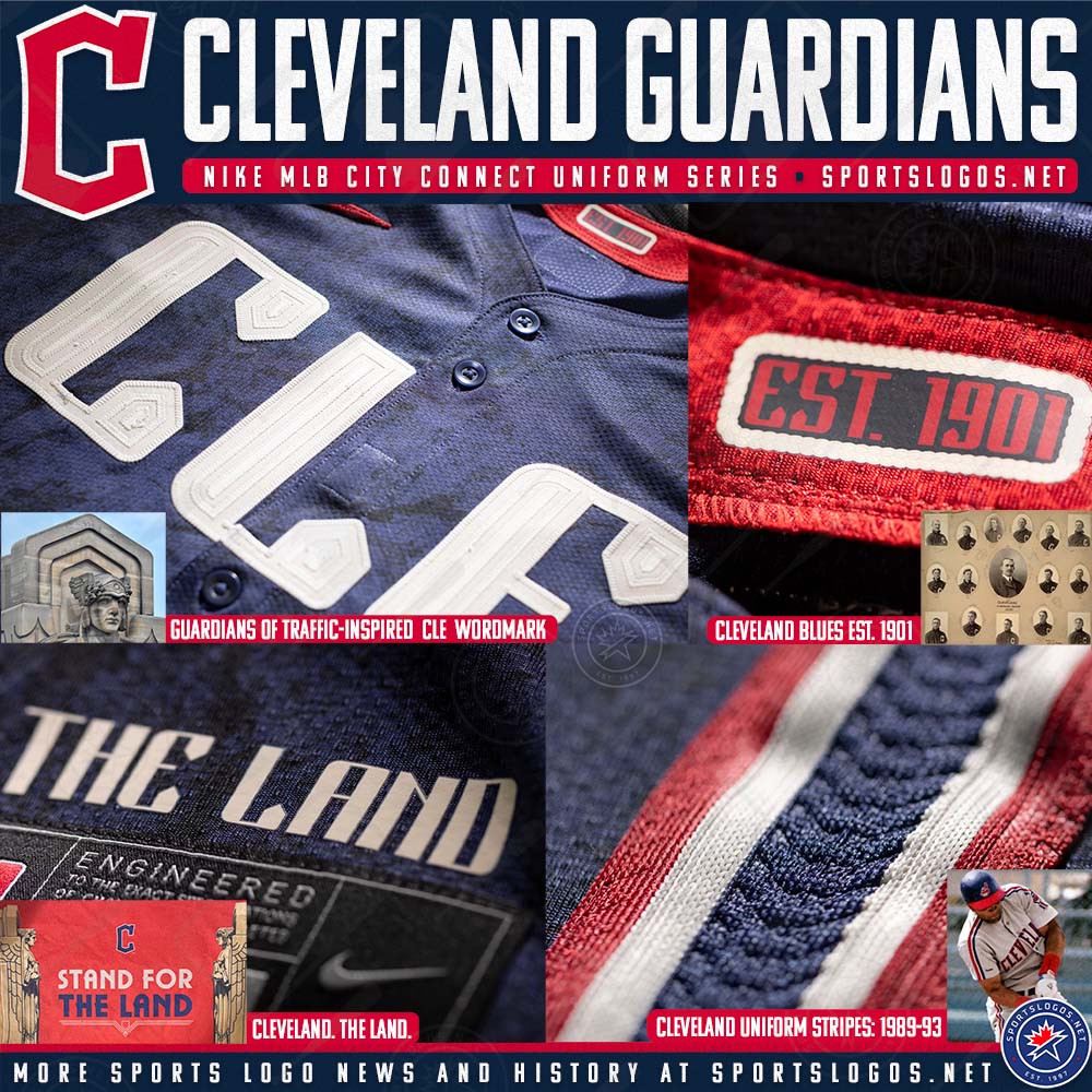
Two things. Firstly, the St. Louis cream is back!
And it was in seeing this that I realized the Cards have a memorial patch! I was confused, at first thinking that a player was wearing one of the Musial ones from last year and shamefully ditched for the ad patch. But in tracing the number I realized it's a Whitey Herzog patch. Haven't seen this mentioned anywhere. I do wonder how this affects the City Connect, as they seem loathe to put the ad patch and a memorial patch on the same sleeve. Will they replace the Fleur and Arch patch?
Also, quite frustratingly, another '24 City Connect to leave the socks out of it. Except for Cleveland, it seems they've been leaving that part out of all the reveals.
Secondly, the Cleveland City Connect is confounding me a bit. At first, I thought that the pants were cream in the reveal. It's subtle, but the seams seem a clear cream. But then there are other shots where they seem clearly straight white, so it seemed it was a trick of the lighting. The lettering, front panel, and pants all look different colors according to different color lighting. The detail shots look white. The article about it on the mothership says the front panel of the cap is "sandstone".
Meanwhile, their first time wearing them was during the afternoon. In every shot, these features are mostly in shadow, and the coloring can be easily seen as reflecting the bright light off of the dirt.
But what is shown in the light above the waist and far from the dirt looks pretty bright white for the most part.
I'm completely lost. Features look deep cream or fluorescent white depending on the lighting. I can't tell. And if the lettering does have a sandstone element, I'm unsure if it's the detail atop white lettering, or if the lettering itself is also sandy.
EDIT: Let me just add the additional wrinkle that the stripes look white under almost every magnification and and lighting. If the pants are cream, are the stripes as well, or are they white on sand?
-
4 hours ago, tBBP said:
Well, on one hand, yes, it is. But it's not widespread. I know what a lot of that issue is, but I don't want to set off too many trigger warnings in here.

Funnily enough, the Australia-based fandom podcast had a dozen-or-so weeks straight where people from Virginia, Delaware, Maryland, and Pennsylvania wrote in a letter accusing one of the other states of having the worst drivers.
It was easy in the Northeast. It's all Floridians as the worst. Although for some reason nobody with Jersey plates understood the concept of the slow and fast lane system.
31 minutes ago, coco1997 said:I would be happy with this, but am surprised how little arch and black there is. Anyone have any idea what that is on the sleeve?
-
1 minute ago, Survival79 said:
I... for one... am shocked that the people behind this design have never skateboarded.
-
2
-
 1
1
-
-
4 hours ago, AnPheitseog said:
In a sport with a Baltimore team, you'd need to exclude BWI because that's Baltimore. Despite being a popular choice for people in the region. Point stands though.
I was just listing the airports one would use to fly into Washington, and the W is "Washington", but I'd mentioned how few airport codes are actually used, and it makes sense since so many of the most famous ones don't line up with the city name at all. It's unlikely. Better to just go with DC.
2 hours ago, GhostOfNormMacdonald said:I'll recognize the Guardians as a different team when the Wild gets its North Stars history back
The voice I read this in:
-
1
-
 1
1
-
1
-
-
1 hour ago, Marlins93 said:
I feel you are misrepresenting what I said. I don't believe I ever insinuated that most of the CCs use airport codes. I merely said that I am surprised by the appreciation for certain CC renditions, such as Cleveland and Milwaukee, because their designs heavily incorporate those poor choices.
In one of my other posts, I listed various other reasons why the CC concept is failing miserably. Fauxbacks too reminiscent of throwbacks, excessive use of black/charcoal, and some that are just flat out ugly.
You'd brought it specifically up as being a problem multiple times and said they'd "gone heavy into" them. It seems a much less a problem than it sounded as though you were making it. It does make me chuckle thinking now about how the most famous airport codes haven't been used, but they're mostly not congruent with the city name.
Actually, Washington's airports are DCA, IAD, and BWI. That makes WSH even more off-putting. I've always seen Washington abbreviated as "WAS" for the most part, although everyone has already covered that locals would prefer DC. But everyone loved the rest so much they wound up embracing them anyway.
Ironically, being reminiscent of throwbacks often makes them more objectively aesthetically pleasing.
But to me the only outright failures (both unpleasant to me and failing the assignment) are the Dodgers, Giants, Phillies, and Tigers. I want to put Boston here, not because of the rivalry as I believe their other uniforms to be a top-5 set, but because I think they're gaudy and like the Giants I think they're too narrowly focused on a small piece of a city with so much to work off of, but natives keep telling me I'm wrong.
Others have stupid aspects. Wrong color pants. Wrong wordmark. Wrong cap. But they're either hit the locals in their hearts, fit with the team's identity, or just look objectively good.
-
2
-
-
7 minutes ago, coco1997 said:
Man...I would like those Giants City Connects so much more if there was something else on the front of the jersey. Either front numbers or a "San Francisco" script would make such a difference. I also wish they had used International Orange (the actual color of the Golden Gate Bridge), which is a much more reddish shade.
They're definitely one to whiff bad on theirs. So much culture and they go for the thing a housewife in Peoria would go with. Even so... there's a bit of a feeling you get looking at these considering that they took one team color (not the same shade, but still) and left the other off that it's incomplete. If they had gone with black outlines that also faded out, it would have been an improvement. But they went with a light shade of orange (and not even the bridge's shade) and the base color of the jersey, which makes it look like a printing error.
-
Oh! And we had some returns on a random Tuesday night!
And then there were four. Weird that with only two City Connects not returning yet otherwise (Cubs and Brewers), the other two remaining missing unis are the Cardinals alts.
2 minutes ago, adsarebad said:So if the New York Yankees changes name and uniforms, they are still the same team?
You mean the Baltimore Orioles/New York Highlanders?
-
5
-
1
-
-
26 minutes ago, Marlins93 said:
I respect this opinion. I'm just speaking from the perspective of a fan of a different team (with a universally-praised CC and one I also like), looking at the 20+ others around the league in terms of general design aesthetics.
But I don't think I need to be from Milwaukee to think that the three-letter airport code emblazoned on the cap in big letters is lazy and hideous. (yes, I know about the area code too and find that equally lazy/dumb).
I'd warm up to some of these designs of they expunged some of the trite/lazy elements. The Marlins CC is great because the hat logo is something rather unique and kind of historically-inspired. I think everyone was fearful that Nike would do the obvious and incorporate 305 very loudly. I'm glad they resisted that, but they've really gone heavy into the airport code thing, which I will never understand.
As I mentioned earlier, five teams use a three-letter code. 1/5 of the program. And I still don't think NYC should be lumped in there considering the city name is actually three letters and it's not a contrivance. It's a huge part of the city's identity. Three of the last 13 and four in the last two years have used airport codes. They've not gone heavy into it. It's not overwhelming. It's barely a whelming part of the entire thing. It's just not true. And funnily enough, I actually think if they'd shortened to "DET" on the Tigers' cap, I'd actually consider it an improvement.
-
2 minutes ago, PlayGloria said:
 Well played sir. I want to leave a thoughtful reply, but I think I'll just tip my cap
Heh. Just a funny observation. It is a bit much for Cleveland, Pittsburgh, Milwaukee, and Washington, but "NYC" is probably of equal iconic status as StL. I did not realize with all the talk of three letters in the last few pages how few overall actually use it.
The CLE does allow the detail to show and am unsure how (besides a large C in the style on the chest) to show it off as well. But it's a small issue with what is overall otherwise an appreciated burst of sanity.
-
3
-
-
3 hours ago, PlayGloria said:
I 100% agree. Stop with the three letter abbreviation already.
Ironic that your team (at least I assume because you popped up focused on their City Connects and assume your name is a Blues reference) that is upcoming is already using and comes from a city perhaps most famous for their three-letter abbreviation.
-
7 hours ago, PlayGloria said:
Now I wouldn't hate that. That being said, other than the Braves, we haven't really seen one of these uniforms get based off of a throwback, so I'm not holding my breath. Something like this would be best case scenario probably.
I've been thinking more about this. The Braves went with a throwback that they love. The Dodgers went with essentially an alternate steeped in their own identity. The Yankees have thus far sat everything out.
The Tigers have been similarly conservative to the last two teams with their identity, but they've also seen limited success. They've had a few very bright spots in the last 20 years and also some very lean years, so I can see them going gimmicky.
The Cardinals have been conservative with their uniforms, have a large history they're proud of, and have had sustained success over the last 20 years. I'm unsure if they have anything in local culture they could go with like Boston (the other one to fit this profile) did. The arch is a tough thing to base an entire uniform on. Their identity as a franchise feels like it fits for them to go conservative here as well. It may not turn out this way... but they feel like the perfect team for it.
Cleveland also went this route for the most part, but that's just because it's Cleveland. They have rock and everyone's been yawning at the idea of an identity based on that for years. They can't really dip into their past. They could only lean on the statues and their colorset.
-
2
-
-
18 minutes ago, coco1997 said:
Eh, the previous design with white is still way better. The new version is made even worse by the fact that they removed the white from the script and numbers but kept it for the swoosh.
No doubt, but the current design looks a hundred times better than I ever expected it to.
-
4 hours ago, PlayGloria said:
Now I wouldn't hate that. That being said, other than the Braves, we haven't really seen one of these uniforms get based off of a throwback, so I'm not holding my breath. Something like this would be best case scenario probably.
Boy, I really hate city nicknames and abbreviations on uniforms. I even hated it when Tampa Bay did "BOLTS" in the NHL or Carolina did "CANES"
Yeah, I was just being hopeful based on your mention of the color scheme having a historical precedent, leading me to go in search for it. I'd sworn they had a black cap as well, but I guess not.
Honestly, I had this vision of THE LOU with the arc over it. In picturing it just now I remembered where I got that from.
But a good chunk of the hope of going with something similar to my mockup is hoping that they wouldn't leave the bat and birds off of a uniform after a century.
-
2
-
-
52 minutes ago, PlayGloria said:
Looking at all of the Cardinals recent X posts and other media, everything is in red and black. I have a feeling that is where this CC is headed.
Brutal. I would much rather them lean into navy blue. At least that is a team color and part of their history.
It seems rough to me, but if they pair it with a black version of the sorely missed navy hat... it would at least have one half-redeeming quality. Although getting a "The Lou" version of this retro logo would be interesting.
Another random thing I keep forgetting to mention until I'm the latest message... The Padres last year got an allowance to breat the 4+1 rule with two different patterns of camo for their uniforms. Thus far there's been three camo days and all with the same pattern.
Have they ditched the forest in favor of just sticking with the desert, or is it just another uni waiting for Nike to get off their duff?
EDIT: Silly, simple, MSPaint The Lou mockup.
-
9
-
1
-
 1
1
-
-
Just now, LMU said:
Hence my stating that we need the Nike-speak. I’m sure there’s some three-dimensional chess reasoning for it but right now we have nothing. If it wasn’t for the red I would have thought it was the iconic seat colors.
Man... With all the disparate parts of the fandom, that would have worked. Making a jersey based around the one thing that unites the entire community: Dodger Stadium.
-
1
-
-
2 hours ago, LMU said:
The hashtag is the one thing that’s obvious considering it references Vin Scully’s most famous catchphrase.
Yes. That one's on me. Knew it the second I came up with that wrong one. Hadn't seen it abbreviated like that before.
-
35 minutes ago, coco1997 said:
Dodgers City Connect leak? This is from the same guy who leaked the Mets and Tigers caps.
I feel dumb for trying to make sense of that hashtag and my brain's first pass at it being "It's The
 in' DiamondBacks" before immediately realizing what it actually is.
What's with the birthday cake ice cream speckles? I'm honestly shocked they just haven't gone the way the Clippers went.
Do they have a large segment of the fanbase that would be alienated by such a design?
It just seems like Los Angeles has so much culture and the Dodgers are on their way to whiffing again, but there may be references here that go over my head because I'm not a local. I do like the LAD logo.
-
2
-
-
45 minutes ago, 655321 said:
I think you need to look at merch sales before you can call anything related to the City Connect program a failure.
I honestly enjoyed the Nike scarcity of the first month as it forced a lot more white vs gray matchups than it feels like we've seen in years. I don't want to program to come anywhere near my team. But it really seems like the vast majority of the designs have really caught fire in their markets. They've... connected with the city. And getting bought up by the fans are a record of how successful it's been.
Plus, you know, the entire point of it being "Hubba hubba hubba, money money money."
-
6
-
1
-
-
We have a sighting of the Brewers pinstripes last night!
With that, this is all the regularly worn uniforms that have yet to appear.
Angels City Connect (Which they wore seemingly a scattershot of Sundays, Mondays, and Fridays)
Cubs City Connect (Which they wore home Fridays)
Milwaukee City Connect (Which they wore home Fridays)
St. Louis Cream and Powder Blue
San Francisco City Connect (Which they wore home Tuesdays
A lot of City Connects. I can't tell if they're just waiting on the factory for those or if the teams dropped them. Angels would be weird to drop so quickly, but I don't know if the team wants to forget anything from the Ohtani era. Of course, that would be a mistake, but... hey... it's the Angels.
-
1
-
1
-
-
29 minutes ago, M59 said:
the numbers look lighter than the script.
It is indeed the lighting. As the jersey rumples out at the bottom in that shot, the numbers catch more of the lights from above, and since the blue fabric is shiny, it brightens up. You can see it below in instances where the wordmark catches more light in the top and they're both getting the same amount in the bottom.
-
1
-
-
Well... Two past opinions I had have changed drastically.
While I believe the full retro replica is the right way to go and don't care about the difference in drop shadow as I believe every single one of us on this board is in full agreement that black is okay quarantined as a throwback rather than a modern piece of the identity... I'm shocked seeing it in action that the shininess of the blue fabric actually causes the blue and black to contrast quite well under the lights at night. I thought it would all blend together like the Marlins of the last few years or the original Braves' navy alt. I can't believe it, but it seems to actually work.
Meanwhile... I'd stated that the Tigers' City Connect objectively looked pretty cool, but actually seeing it in the flesh and on the field... We throw around the term "softball" a lot around these parts, but I did not realize just how distracting the fact that the jersey pattern just stops at the belt would be. Given that the pants just look like a pair of slacks with how simple they are, it does look like someone screen printed a shirsey for nine guys and they're wearing them with their work pants. Not to mention that it really looked like the jersey design would be shiny, almost glowing, but I'm getting none of that. Perhaps it will look better under lights instead of during the day.
-
2
-
-
If Tampa Bay taught us anything, it's that we can't even try to glean anything from these previews of future City Connects.
Watch the Twins go with a representation of their home field. Full Kasota Gold!!!

-
1
-


MLB 2024 Uniform/Logo Changes
in Sports Logo News
Posted
You don't think he is?! I have a friend who breaks into Country Grammar every time his name is mentioned.
What on earth do those letters mean?