


Silent Wind of Doom
-
Posts
1,828 -
Joined
-
Last visited
-
Days Won
1
Posts posted by Silent Wind of Doom
-
-
On 2/24/2024 at 5:36 PM, NickSixers said:
Teams are PREPARING for ads. The preparation isn't connected to their ad sales team finding an acceptable deal. But you have to prepare so that you can introduce the ad patch when you find an acceptable deal.
I'm sure all teams are looking. But whether patches are switching sides or not means nothing in terms of whether ads are immediately coming, as last year proved.
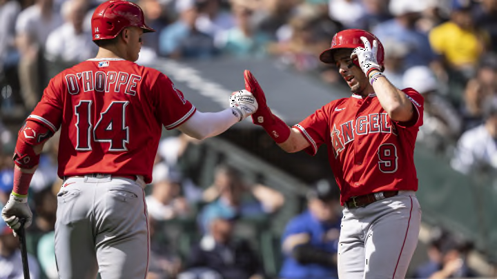
I have to say, watching two teams that didn't have names on their back under the sun yesterday, the change really didn't seem noticeable. The collar cut is obvious, but I mean the drop in quality/transparency. Dunno if we made out due to our design practices or it was just looking from a distance during the day. I wonder if there's any chance someone inside thought the old roads would look stupid with the new sleeve design and that was behind the update.
The Twins navy today looks all right except for that stupid arching of the name. Santana's name has plenty of room to fit with a less dramatic curve. But red lettering on navy is hard to read in any manner of shade on a good day.
-
3 hours ago, tBBP said:
(In other words, an ad patch is definitely coming...)
This actually proved false last year, but I can't for the love of me remember the exact examples. I watched carefully through every team's patches because I gotta show something in the Wikipedia uniform images. I decided to go with every example being right-handed, and so for teams with switching patches the patches showed on the left sleeve, but there were a number of teams who did not switch patches. I know Minnesota and Kansas City were two , and indeed did not get an ad patch last year.
But I do know for sure there was at least one team who switched patches without getting an ad... or had fixed patches but then got an ad. Unfortunately, my memory is failing me. I do know for sure that Philly ditched their sleeve numbers to seemingly make way but never did.
-
1 hour ago, aawagner011 said:
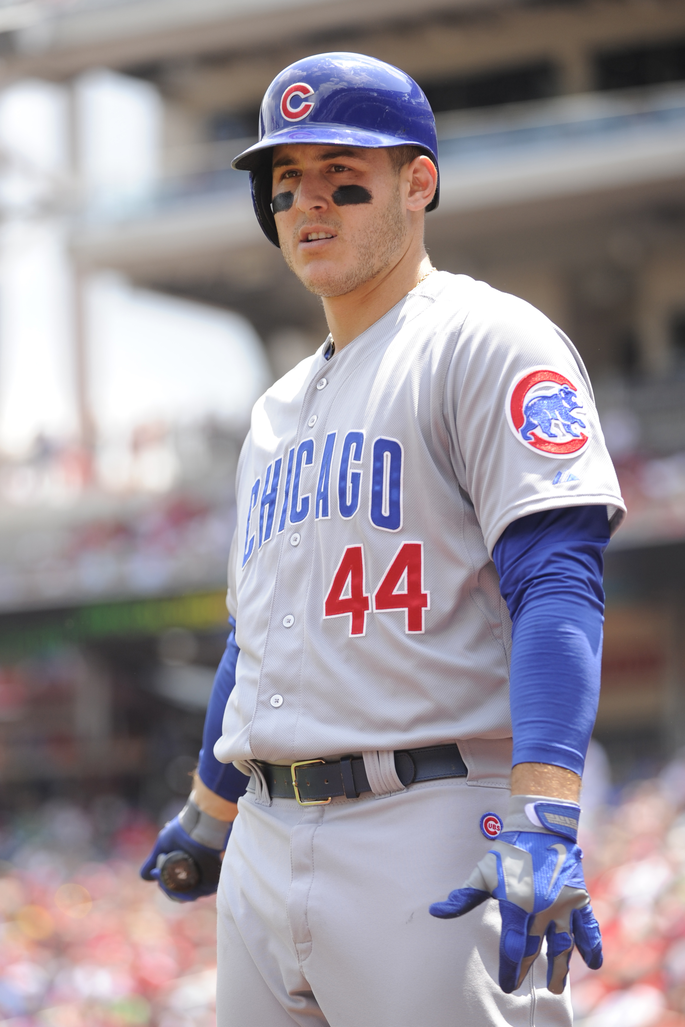
Paul mentioned this on Uni Watch today, but man, the slightly see through pants need a total rework. You can see the jersey material under the pants, including the silhouette, jock tags, and pinstripes. This is not the move, Nike!
Apparently the see through pants are not a new thing, though. Here are some images from the Majestic era (check out #70 and #63) where you can see the jocktags just as easily as the 2024 Nike pants.
I should not be able to know the type and color of underwear of my pitcher.
-
 5
5
-
-
Does anyone know what causes some sleeves to bunch up and shrink and others to stick out? Sometimes they look like an elastic band tighter than the rest and others like that Reds sleeve seem the opposite.
-
Just now, OnWis97 said:
...and the upside helmet logos???
You know, there's no other teams in the state, the upside-down trident is bad luck, and the DC natives keep saying they don't want the name.
Screw it! Washington Mariners!
-
17 hours ago, MJD7 said:
- I really don't think the smaller player names look bad at all. If anything, I think it illuminates that the former player names were at least a bit too big.
Honestly, I'm not too worried about the size, although the size is causing finer details to get really messed up.
The thing that's messing with me is the odd arching. It feels like all the names are being kerned over the same space and arc and it looks like it doesn't fit with the numbers AT ALL in many instances.
-
1
-
2 hours ago, monkeypower said:

Have... have I never seen a 4 on the team all these years? That looks so wrong and I thought it was part of what people were complaining about, but apparently that's the way it's always been. The extra serif at the top looks like it's off a completely different team's font. It's all just so weird looking.-
1
-
-
@maxwasson, the top level finally got too long so I had to shift things around a little. Hope you don't mind. But congrats!
@thebutkiker, not only did it all fit, but it all fit exactly on one line! Any more wins and it's two lines for you.
-
1
-
 1
1
-
-
1 hour ago, VampyrRabbit said:
Hrm... I can see them not wanting to feature the pinstripes on the road, but having a grey alt cap only to have a bright white logo? I'd had rather they gone grey crown with navy brim, button, and logo.
-
2 hours ago, Sport said:
Can't get over how dumb and bad the names look on these.
There's an easy solution to that.
1 hour ago, TrueYankee26 said:This is their flag:
If they do it right I can only imagine how beautiful it would look.
Imagine the old gradients using these colors. I... can't decide whether that would be awesome or the ugliest thing ever.
I think using a gradient of these colors in a 70's fauxback style would world really well for the team's identity and history. Dunno if it would be good, but it would be fitting.
-
1
-
-
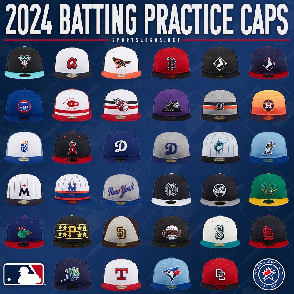
12 hours ago, CC97 said:
Wow... I really thought they'd roll out 5 and 5. Could this actually mean... Dare I hope?
-
On 2/9/2024 at 8:31 AM, BBTV said:
Rocky is a goddam movie character and that stupid statue is just a prop, I don't know.
Given your thumbs down, I'm not sure if you didn't see the progression of the joke or you think Rickety Cricket should be on the Phillies' batting practice hats.

-
10 hours ago, Ferdinand Cesarano said:
The real real answer:
10 hours ago, Ferdinand Cesarano said:The building is so grandiose that it cannot adequately be captured in pictures. You really have to go there and just marvel at its splendour. From all angles — including from within, in the passages to the internal courtyard — it is breathtaking. I've never been so awed by any other work of art.
It and the layout of the city with the central streets and the grand diagonal to the art museum are works of art. I love the city. And considering my other favorite is Notre Dame de Paris (the third is the Forbidden City but wear and modern photography and other issues are dulling my taste for it), I regard it highly.
-
1
-
-
2 hours ago, SFGiants58 said:
I would say the giant William Penn statue, but that's a bit too esoteric. Independence Hall or City Hall (with the Penn statue)?
Joking answer:
"You don't have beef with me? I was a priest before I got involved with you guys. Unbelievable."
Admittedly, I do think the Penn statue is a reeeeeeally good call. The team did reference it in past logos, and if the City Connect series have taught us anything, screw the idea of things being "too esoteric". Go with what clicks with your people. Although I may be biased in that Philadelphia's City Hall is one of my favorite buildings of all time.
But the real answer?
-
1
-
 1
1
-
 1
1
-
-
3 hours ago, MJD7 said:
I noticed this in the earlier renderings, as well:
Yeah. I wasn't sure if that was, much like player names and numbers often are, an inaccurate photoshop. The seam seems completely missing on them, so it's hard to tell, but those photos make it super clear.
I wish the Mothership would do an article on it. I would love to see an aggregate of all the photos out there of the new unis.
-
1
-
-
After redoing all uniforms with the new placks and collars, I did not expect the sleeve issue. I've been trying to figure out how to best render them. But while looking at all the different new unis, I came across something that confuses me. I wasn't watching like a hawk, so this may have come up earlier.
The Rangers have the same number of stripes on their sleeves as a few other teams, but they're clearly bigger. Yet the seam is still in the same location above the top stripe. Are the Rangers getting more material below the seam? Are their sleeve seams higher? And either way, why are they getting a different treatment than others? So many issues could be fixed with this extra space. Did the other teams just not care enough to even ask? Is there something that would make the Ranger special in this respect?
-
I... have... always been in the camp that finds the block W to be in the same camp I find the old and now new Yankees away gray. Not retro, but archaic and far too simple for modern usage.
But the one used on the ST cap has enough weight and volume and texture that it is making me rethink the possibility.
I don't know if going to white or red and losing one of the outlines will cause it to look less impressive and it obviously isn't workable as is, but it does intrigue me for possible future application in future identities.
-
7 hours ago, rwaters1221 said:
Based on their retired numbers? I dig it for what their use is.
1 hour ago, WSU151 said:It’s a poorly rendered logo by New Era. Compare the state outline to the logo on the mothership and it’s obvious.
Feels like it was rendered based on what parts of the state the average local feels is most important.
But in all seriousness, for this application I don't mind the outline to be so stylized to fit in the halo and not be too large and unwieldy.
-
On 1/31/2024 at 9:18 AM, ptay said:
Seattle? Is that you?
My immediate thought was Milwaukee. That might just be the roundel.
40 minutes ago, Sodboy13 said:Cripes, Philadelphia, the local minor (now indy) league team managed to do it better.
Yeah, what the heck is the font? This uni seems to use it for their numbers?
-
On 1/26/2024 at 10:52 AM, FiddySicks said:
I love that Billy Gil is dropping Marlins news now in the same manner that Roy does for the Panthers and Mike Ryan does for U of Miami football.
Meek Bill
22 hours ago, MNtwins3 said:According to the Washington Post:
Red curly W cap with the home script uniforms
Navy blue cap with red brim with the greys and navy blues\ uniforms
Capital W hat with the pullover
The one good part of the new look. Putting together looks that go together. The manifest destiny of the Capitol Dome cap was a horror.
19 hours ago, SFGiants58 said:The Marlins reveal makes me wish management brought back the home run sculpture rather than letting it rot outside the stadium.
I'm reminded of those times, but because seeing the wordmark in white makes it just look like the previous set to me. Its brightness hides the other colors, so I barely even see a difference between this and the last black alt (besides the font)
18 hours ago, BBTV said:Nobody says "oh, that Joey - now that's a fine national if I've ever seen one."
I... think that might have more to do with team quality than anything.
-
1
-
-
On 1/23/2024 at 10:12 AM, McCall said:
The white trim and sleeve cuffs were straight out of the 70s
Yeah. That's why I loved them. The Yankees uniforms felt like a representation of the team's history and high times. The home represented the old days of the guys on the monuments and the road greys represented the Bronx Zoo and 90's dynasty. With pinstripes, I see pastoral grass in the afternoon summer sun and Ballantine. With the road greys I see bright lights, wild crowds, and Nobody Beats the Wiz.
On 1/23/2024 at 11:17 AM, crashcarson15 said:New Yankees road threads are basically a tweaked version of what they wore in the Field of Dreams game a few years back, which looked phenomenal, IMO.
It did look really cool for a game harkening back to that time. Same for the Red Sox 100th Anniversary of Fenway game, but I wouldn't want them to switch to a plain white cap full time.
At least half of the crowd were severely disappointed with the Astros new set for being old-looking and lifeless. For years as Cleveland tried to bury their old identity and go early days in their uniforms, I felt the same way. Single-line dark colors just feel old to me, not retro. Boston should've never left from their Reverse the Curse grays. The Dodgers at least have a the red number.
18 hours ago, aawagner011 said:For the most part, almost all road jerseys should omit white trim, particularly where the white outline is against the gray.
The same can be said for these.
The Cubs is slightly less egregious because the white is so thin.
However, there is no denying this is immensely better.
The lack of white outline makes these designs look much more retro. They are timeless in their style, whereas the white outlines seems like a feature from a bygone era. There are no contrast issues with dark text on light gray, so I’d argue there was zero reason to add the white outlines in the first place.
I'd mentioned above that I feel that the lack of an outline seems much more "of a bygone era" The Cubs isn't a bad move considering the bright red outline would have the same effect. Detroit doesn't have white elsewhere on their uniform (the Meijer logo, I imagine, would also be changed) and orange is a nice outline.
But I wouldn't want to see the White Sox, Angels, and Reds to lose their outlines. Definitely not the Phillies, which were mentioned earlier, with their outline keeping consistency with their logos and home uni.
12 hours ago, aawagner011 said:You can tell it’s the new template and not the Field of Dreams because of the extra collar trim, batterman below the headspoon seam, and the letters are slightly taller than the FOD set. I’m loving the simplicity. Long overdue.
I'm glad they're at least going with the modernized lettering, which is a major part of the team's identity. It evokes something... I'm not sure what. "Art Deco" is the first thing that comes to mind, and the only, but I don't think that's the right word. It feels uniquely of the team and city.
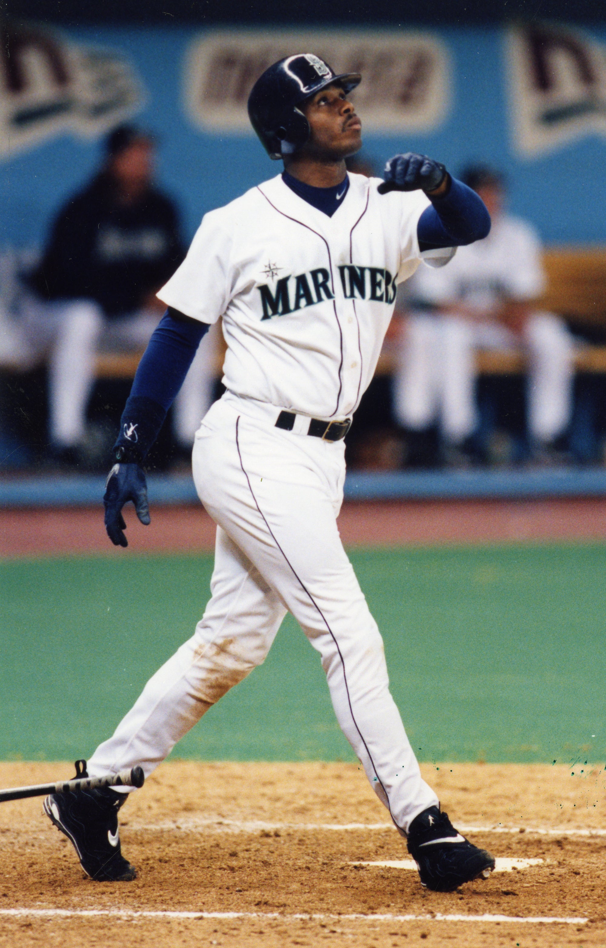
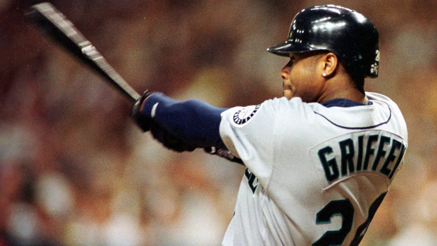
21 hours ago, LMU said:The Mariners are a team that has a brand that had the potential of being absolutely timeless but they can't stop tweaking it. All they have to do is rewind the changes to the Griffey era (with the compass on the road wordmark) and call it a day.
These pictures really show why I love the new version with the extra outline so much more. The navy and green bled into a dreary mess. The current wordmarks are brighter, stand out more, and you can see all the colors.
-
2
-
-
On 1/18/2024 at 9:19 AM, AstroCree said:
I've seen the replicas in person and they all look so awkward. I'm all in for moving the batterman logo somewhere else because the back is so bad right now.
Perhaps under the sleeve patch? I dunno but they need to fix that asap.
Heh. And we're right back to the old Majestic logo.
-
1
-
-
I know we've done this before, and I've realized that my love of the Twins' pullovers have more to do with how good-looking I find thick red and blue/the fun of the switched cap color than the actual template (same for California for the former and Boston for both), but whether or not one thinks it's better than the button-down I still think Toronto's deserves some recognition alongside Oakland, Pittsburgh, and Chicago.
-
5
-
-
@The Easter Beagle, I was worried at first, but once everything was cut down to just the championships and championship appearances, it was a tidy little package. I imagine that's what you meant by "pennant", but if you want more I can expand. I also assumed you didn't care about the Boston or Milwaukee Braves. Lemme know if you do want them.


MLB 2024 Uniform/Logo Changes
in Sports Logo News
Posted
I've never really found this odd and the Reds having the number up at the same level seemed unique and different. But I just realized looking at it why it is the way it is. Front numbers came into existence on uniforms with wordmarks across the chest.
When they were put on uniforms with just a logo on one side of the chest, I imagine no one thought to switch the numbers from where they originally were even though there now wasn't a wordmark in the way of higher placement. It just felt like the natural place where front numbers go. Probably why until you asked I never thought it was an oddity in any way.