


Silent Wind of Doom
-
Posts
1,828 -
Joined
-
Last visited
-
Days Won
1
Posts posted by Silent Wind of Doom
-
-
4 hours ago, JerseyJimmy said:
crap, sorry, could've sworn I responded; I'd prefer the HC, yeah.
Heh. No problem. Here ya go!

-
@AnPheitseog, I was worried given that your old sig is bigger than the current limits, but fortunately you've cut out a lot of extra. I also added the new wins for the Outlaws and the Pen's new division championship. We'll see if I have a new addition for tonight, but as a Phins fan I hope not. I also decided a while ago to change the Pens to black to better fit their actual appearance. Lemme know if you prefer the all-gold.
@Burmy, speaking of size limits, you've officially gotten two long for one line. Hope this isn't too disruptive to you. I also added the other Milwaukee wins that hadn't gotten updated yet.
@maxwasson, here ya go!
Also, @JerseyJimmy, I gave you two options and you liked the post but never actually answered me.

-
47 minutes ago, marlinfan said:
A personal contact within the Marlins FO indicated they were workshopping new colors over the summer as part of a City Connect refresh. They weren’t sure if this was for 2024 or 2025.
The team with an upper-half City Connect and an identity that throws away a clear slam dunk with their original colors is looking to change... the former.
Unless they're going to teal-ify the City Connect as a test balloon.
Or they could just be planning on making the throwback their City Connect so they could add another alt in their current scheme.
-
I have very little familiarity with their work elsewhere and... am really failing to look up a comprehensive collection of their jerseys. Do they make raglan sleeves for pinstriped uniforms? I see, like, racing stripes, so I'd think it would be possible, but am not sure. I doubt they'd tell the Yanks, Cubs, and Brewers to kick rocks when it comes to this touch,
-
We saw that Rangers uni on the new template. Is every uni on every team switching come the spring? Or a slow roll out with new unis/as old stores empty out?
-
10 minutes ago, coco1997 said:
Do we know if any other teams are rumored to be getting new uniforms for 2024?
I know at least a tweak of Seattle has been mentioned by management and... wasn't there some rumblings about Colorado? Or did that wind up being their City Connects?
-
4 hours ago, MJD7 said:
The only reason I'd drop the all-black hat is that I really prefer the Diamondbacks to be a red-heavy team. I think having the all-red hat is a good addition, but I like the black-brimmed hat too.
Oh, I wasn't making a call based on my preference. But the red A cap is only shown as an alternate home cap to go with alternate red accessories and teams time and time again have fallen back on black, including the Diamondbacks since the introduction of Sedona red to last year. I can see it being a designer choice that the players rather immediately abandon.
-
 1
1
-
-
5 hours ago, ruttep said:
According to the article on this site, it's a cream color.
I don't doubt it. I just didn't realize it until you said something. If it weren't for the Serpientes alt, I would have been all for them going sand full time on the road or at home. I also wouldn't be averse to a graphite away since they've lain claim to that before and it would probably allow the turquoise outline to pop better. Is there any reason besides changing their minds for being so outside the box that they dropped those?
-
On 11/17/2023 at 11:26 AM, crashcarson15 said:
Moving to a consistent color scheme (and one that shifts them away from their mid-2000s Astros dress-up scheme) is a big win.
The execution … I do not love.
21 hours ago, gosioux76 said:I'm glad they leaned into the turquoise look, and I like almost this entire set with the exception of the off-white home jersey. The black piping gives the whole thing a generic teamwear feel, and it's the one set in which the turquoise feels forced. The contrast of bright turquoise outlining the logo next to off-white is unpleasant.
Same notes too.
Have they finally darkened the turquoise, or is it just the difference in the use of it, the concentration of it, and the lack of white bordering it?
The black stands out to me as the best. But it's the most uniform in its use of the color scheme. The only color to touch black is turquoise: the piping, Nike logo, and outlines of the logos.
Meanwhile, the red alt mixes black-on-red with the piping and number and turquoise-on-red with the cap, wordmark, and Nike logo. I don't know if the D would work switched, but switching the wordmark colors would go a long way to cohesion. (The Nike logo takes turns on different uniforms across the league matching the outline or inside of wordmarks depending on balance and whim of the designers.) The new wordmark looks lovely, although I have no idea why instead of going with the established outer-K fang and the I they came up with a new K to go with the A.
The away gray does seem the weakest, the turquoise not looking good against the gray and not seeming to fit with the entire rest of that uniform. The easiest remedy is to just remove it, but then you've got the exact problem they've been having with different color schemes on different uniforms. I do think that the plack piping makes no sense and instead they should have gone with piping like the red alt. Have the two wordmark uniforms look alike and cut down on the disjointedness.
And the home has the same problem of the outline washing out against the base. The problem is that it seems they do not under any circumstances want to change the logo. I think they'd be better served switching it up depending on the application, something they did in their 98-07 sets. Switching the black and turquoise on the chest could be given a try.
But I wanted them to go red and purple, the purple replacing the black on the A. The two tones aren't used in the majors and go well together. Purple belongs in the Diamondback's identity, but Sedona Red fits so well. Someone mentioned earlier the disparate identities of the two colors, so why not both? They may have been birthed a primarily purple team, but I think with the long time off the Rockies should really be the ones in the division to lay claim to that color, but as a secondary to red it wouldn't feel like having too much overlap.
On 11/17/2023 at 12:35 PM, ruttep said:Still feel like off-white was unnecessary, as were vest jerseys.
I... didn't even realize it wasn't white. It looked like a lighting matter, save for the buttons. The old creams seemed more like a sand thing than a retro thing, although famously the region was full of old-time NL fans leading to them joining the NL instead of the AL like every previous expansion so it may have been with that in mind/old-timey minor-league teams in the region I assume existed.
So are all the pants cream, or are we doing the ol' extra white pants for the alternates even though we don't wear whites with our "home whites" thing?
23 hours ago, coco1997 said:I argued that they should have added front numbers to all the jerseys in this set. The more I look at the new home jersey, the more naked it looks without them.
If it were wordmarks across the board, that would have been one thing, but having the split Nationals or Reds style chest logo on one side and numbers on the other feels like it would make things feel even more jumbled.
18 hours ago, MJD7 said:
I immediately saw this and thought that that red A hat would be the first to completely disappear (see the orange Astros hat).
-
They have a history of absolutely refusing to spell their whole name out without making it two lines, but I am really shocked that nowhere in their identity, even off their uniforms and just put on a wall in the BOB somewhere, there isn't one instance of an arched "DIAMONDBACKS" with the I as the right fang to mirror the K. It seems like a slam dunk.
I guess since they won't put the full name on the uniforms they don't want to put it anywhere to show what could be? I dunno. "San Francisco" has been on uniforms plenty of times.
-
2
-
-
14 hours ago, leopard88 said:
My guess would be that they are changing to block numbers on the navy jersey. They currently have a font somewhat similar to the Ravens number font.
They've always been a weird outlier. While everything else changed and updated, they stayed the same with their front number and weird font. The uniform limits that prompted the ditching of gray may have happened quicker than the allowed time for new uniforms, and the differences were probably a lot more noticeable when they were getting so much more play.
But I wouldn't mind a little freshening of things. Not too big, but the 2015 addition of the silver really made the home wordmark pop while the two hues touching made it become a drab blob. I wish they could do this for the Seattle wordmark, but I'm not sure how that would work, unless the navy outline were replaced with teal and a white outline like the pre-2015 grays were added?
-
Worse, they're there to make room for ads and if the Phillies win tonight there will be empty real estate on the arms of both teams.
-
1
-
 1
1
-
-
On 7/20/2023 at 2:18 PM, GriffinM6 said:
Looks good, but something feels off about the cream colored font. Would look better in white.
I wholeheartedly agree. I assume this is a sign of sticking with the City Connects for the long-term to the point of wanting to represent them somehow in the identity. It's the one place in their... anything that features the color.
Well, besides the stone in Globe Life Field. Oh lord, we just got away from Kasota Gold. WE CAN'T GO BACK!!!

-
2 hours ago, tohasbo said:
Nah they're pretty reliable as far as tracking goes. I wish that there was a full database going back to before 2012 for things like this
It doesn't seem to be 100% complete, but it looks like almost every game back to 2007 is on Getty. Early in the season before any other sites update I use Getty to track uniform use and appearance since it's updated every day for every game.
-
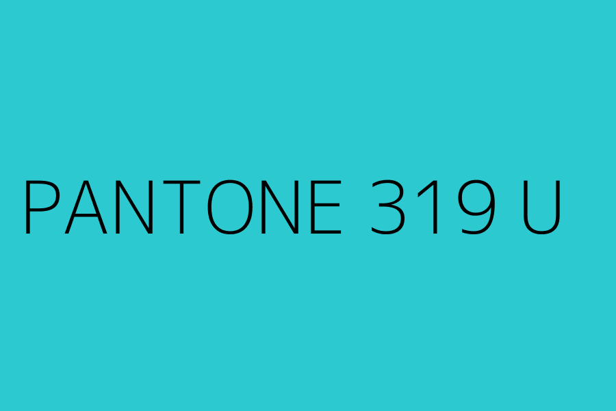
3 minutes ago, McCall said:
It's literally NOT Irish Spring green.
 Their current turquoise (pms 319) is 1 point below the Marlins original teal (pms 320). Their original turquoise was pms 323, which is closer to the greens on the pantone color chart. 319 is on the bluer side of teals/turquoises.
And just for good measure...
Yeah, I don't know why I said "Irish Spring". Perhaps because it's one of the more famous brands in popular culture, at least in my lifetime. Honestly, I've never seen a bar. I personally use Dove, but the brand I've seen everyone else use is Coast, which is what I meant.
Nevertheless, that's a far difference between two shades. It looks so washed out compared to the original hue. Those two colors look so different side-by-side I kinda would like to see a team run with those as an identity.
It is crazy, tho how it does look darker as a swatch than it seems to me looking at the thing. I wonder if it's a matter of materials or lighting.
-
On 10/5/2023 at 12:17 PM, fortunat1 said:
I don't like the Diamondbacks' current home jersey (and previous red & teal jerseys) for a few reasons. I generally prefer their sand color because it complements the red and black color scheme much better than their current teal imo. It also doesn't help that the current teal is so bright. Contrast is good, but the current shade feels offensive to my eyes, kinda like a highlighter.
On top of that, their jerseys that use(d) that shade of teal always had really poor color balance, and leave red and teal as secondary colors that do nothing but clash with each other. Even with teal numbers on the front, the jersey seemed almost entirely black and teal, which isnt how I envision the Diamondbacks. If they really did want to go red + black + teal full time, I feel like it would need to be with a red-dominant identity with black and a more muted teal as the secondary colors. Even then I'd much prefer the red + sand scheme or the 90s colors before that.
Outside of all that, they would benefit from committing one way or the other. Not a red + teal home jersey with a red + sand road jersey. Just choose a color scheme and embrace it.
When the "turquoise" was introduced, I was crying to the heavens over it. It's not a throwback. It's Irish friggin' Springs. It's soap. It's a literal pale imitation. The color is sapped out of it and it's never looked right.
When they said they were introducing an old color to the existing set, I really expected it to be purple. I'd love to see how they'd look in a red/purple/copper set. Sedona red is nice, and it would be a shame to see it go fully. Doing some very shoddy mockups (too shoddy to share) using the below pic does show the chest logo looks sharp in those colors.
But the problem is if you're going to reintroduce the old set with one color difference, it's going to be a hard sell to not just go all the way. Although it did work for Milwaukee...
(And then there's always going with all five like the Coyotes have in their history. Anyone up for kachina D-Backs?)
13 hours ago, BBTV said:No uniform should ever say "D-Backs". If the name needs to be abbreviated, it's a bad name.
This is a perfect uniform (though uniforms with only a chest logo and no numbers should always be on a raglan template - no exceptions):
I could take or lose the number font, but this is a classic look that's appropriate for Arizona (not saying that the current scheme isn't) and could be worn for decades without feeling dated.
If you want to recolor the current road then that's fine, but I think they'd end up like the Cubs used to be where they had a relatively-untouchable home uniform but tinkered with the road every 3 or 4 years. And that's fine! Just keep the home the same forever*
*in this case, forever means "until they relocate because nobody cares"
Unless it's in huge print and gradient. Then people love it.
(EDIT: Whoops, for some reason I thought you said any name that necessitates being broken up into two lines, like their old roads, shouldn't exist. Well, I referenced this pic above, so I'll leave it.)
13 hours ago, bbush24 said:Rough job but it's something
Wow... I don't know if it's the shades that are being used, but my immediate thought on looking at this is that this is how Colorado should look.
-
1
-
-
I wonder whether or not the Dodgers would riot like the Giants did over "their" territory if the A's had an interlocked LV in their set at all, given that it would essentially be the same logo, just with the two legs of the A flipped.
-
XFL (2023) Western Division
Arlington Renegades
Referencing the Styx song "Renegade"
Houston Roughnecks
Referencing the city's previous oil-themed team and the team's undefeated 2020 iteration
Orlando Guardians
Referencing the words of Frederick the Great
San Antonio Brahmas
-
1
-
-
There's rumors of the two spring leagues merging ahead of the upcoming season, and we'll see how it goes then, but for now, this is the new upgrade, the third version of the XFL. Hopefully it sticks this time!
XFL (2023) Northern Division
DC Defenders
Referencing the fans' infamous reaction to their beer snake being taken away
Seattle Dragons
Referencing the Peter, Paul, and Mary song "Puff the Magic Dragon" and Seattle's aquatic location
St. Louis Battlehawks
Referencing a motto used by fans
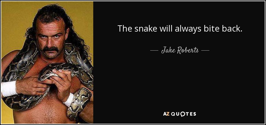
Vegas Vipers
Referencing the words of Jake "The Snake" Robert
-
I was so focused on the XFL and then baseball that I completely missed this season of the USFL, but with three new home hubs and two years under their belts, I wanted to update the venue pics for each team and replace what was the few pics I could find of players pre-season 1 with pictures of the actual stand outs of each team. (Pittsburgh also changed their color scheme to fit their neighbors)
Then there's the Bandits, who were contracted and replaced with the Memphis Showboats
-
Okay. There's been some updates I've been negligent on, and seeing that surprised Bear face stare me in the eyes every week has finally pushed me to get it done!
Firstly, the aforementioned replacement of the old Bears logo for their new one:
The San Diego Wave have opened Snapdragon Stadium and set a record while there!
And there is a new MLS team I didn't get to, and I decided to add Team GB of Olympic competition alongside the English National team!
USFL updates and XFL3 coming in a sec! -
Here ya go, @maxwasson. This work for you? I applied the multi-outline of those black uniforms to the modern logos that didn't already have outlines.
@JerseyJimmy, I found the HC logo, but it's a bit busy to make legible at the scale. Funnily enough, shrinking the C down to make it fit causes the C to lose its distinctive look that it already has. Here's how it worked out.
-
2
-
-
59 minutes ago, JerseyJimmy said:
@Silent Wind of Doom another year, another Carolina League championship for the Charleston RiverDogs. I'd also appreciate if you could use the HC monogram instead of just the C, but I understand if that'd be illegible or whatever.
Ayyyyy!!! Congrats!!!
I.. don't... see a monogram that's not a C. Unless you mean something I don't understand. What do ya mean?
-
2 hours ago, tBBP said:
Unrelated, but what is up with that housebroom mustache??
-
2
-


Silent's Sports Signatures Shrunk Once More - All Sports Championships & "Where I Come From" (USFL & XFL Updated!)
in Concepts
Posted
Well, Michigan has won so many things that it's officially the first team to have their achievements be too much for the length limit of signature images on this board. You mentioned "add", but you're currently not sporting your old sig, which was already straining the bounds of the image limit.
This is what you asked for...
Do you want more on top of that?