


Silent Wind of Doom
-
Posts
1,851 -
Joined
-
Last visited
-
Days Won
1
Posts posted by Silent Wind of Doom
-
-
3 hours ago, Carolingian Steamroller said:
Here's the rub. The Twins jerseys are not limited to a single color because there's also a number.

If you don't like the new Twins set, that's fine but I don't think any kind of universal maxim of baseball design is being violated here.
With all the talk of past examples, there's a biiiiiig difference. The Houston and Cleveland examples worked, but they were THICK BLOCK letters. The Twins logo tapers and dances across the jersey and without the outline looks a bit slight in places because of it.
But the BIG thing in terms of why this doesn't look right to me, and I think I just figured this out finally, is because the Minnesota Twins never, ever, EVER went without an outline. That's why this looks like it's a throwback to an identity that never existed. I originally said that in referring to how some throwback brands clean things up and thus make a retro-looking but very tightly manicured look. I think that's also a problem here. When the Twins came into existence, they had a much more chunky wordmark. This is a wordmark even more modern than any they've ever used being presented in a very retro style, and it doesn't work for me.
The Washington Senators didn't have an outline for much of their existence, but they also used thick block lettering (as anyone who's debated the Nationals' identity knows well). This doesn't work as a modernizing of an old look, because from the very start the Minnesota Twins have always used an outline. I don't think the league has ever had a team with a cursive wordmark this large without an outline. Dodgers and Royals are longer names, and thus the lettering is smaller. The Mets have always had an outline.
Of course, new almost always looks weird and we get used to it, so... we'll see? But I think the Twins' identity lives in two different eras: their 60's, Killibrew, birth era with the navy trimmed in red and TC cap that they've leaned into with the googie style of Target Field and the 80's/90's, Pucket, Homerdome era with the red trimmed in navy and M cap. This fits into neither and doesn't even go fully into the Carews which I think are a beautiful jersey and should be a regular throwback.
I guess it just doesn't feel Twins to me.

-
 2
2
-
 2
2
-
-
Still haven't gotten used to the new Twins look yet. Without the outline, it looks like a throwback soda brand or something, trying to evoke the past but in an overly done way that never truly existed.
-
2
-
-
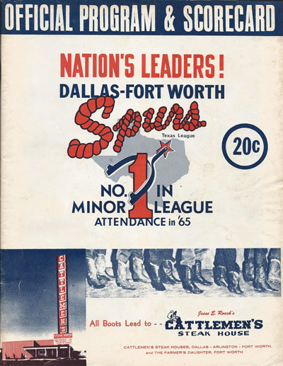
56 minutes ago, NYCdog said:
Whoa... Wait... Cattlemen's actually existed and is not a fictional steakhouse run by Randall Park?
-
3
-
-
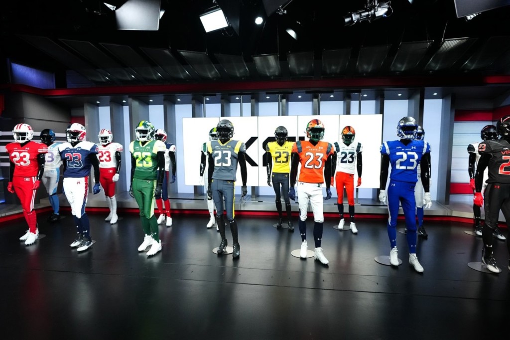
I was very busy working on something yesterday, but as I was looking at the graphic and thinking about how Orlando's numbers were unique, but not terrible, and I suddenly realized that every single team has a unique number font. And I don't think any of them are bad. That's kinda impressive, although I don't know if it's sustainable for more than 8.
-
5
-
-
25 minutes ago, BJ Sands said:
Gimme these:
(Tobacco notwithstanding)
The slipping in of red accessories by players has really made me realize that if they do feel like making changes to the team identity, I would be perfectly fine with them either replacing silver with red or having red be the tertiary color and shuffling silver to fourth.
-
2
-
-
26 minutes ago, Carolingian Steamroller said:
So it's a general East Coast thing to Memory Hole 2005.
I thought it was just ESPN.
Honestly, the way the power dynamic seemed to be even before 2017, I thought the sad truth was that it was that way in Chicago.
Also, no. I'll never forget watching you guys sweep Boston on the Diamondvision at the Stadium... before watching Randy Johnson and a relief spot by Al Leiter cough Game 2 up to the Angels.
-
1
-
-
1 hour ago, the admiral said:
I really do like the old 1910s logo but the '70s/'80s stuff needs to die in a fire already.
Eh, it represents the high point of the franchise in the modern era. Maybe they'll get over the nostalgia when they pick up a World Series win.
Wait...
-
1
-
 1
1
-
-
Just now, ralphz said:
1. I thought the bright green DID work.
2. I don't think it matters that the mascot isn't city/region specific. Detroit Lions. Chicago Bears. Boston Red Sox. I know those are legacy mascots but I doubt people had a problem with them.
I think their colors and identity are fine. The application is just weird. A weird logo cobbled together by tweaking an identity meant for elsewhere and then looking tiny on the helmet. light grey mixed into their home uniforms with no dark color between it and the lime.
Also, I really want them back. C'mon. We'll take care of them. You can even put them in Red Bull Arena and name them "New Jersey".
And okay... Now looking at them, the red lines in the Renegades' does help a lot. Even if it does make them reeeeeeeeeeeally look like the league is being petty over the Oilers lawsuit.
-
2
-
-
48 minutes ago, IceCap said:
Nothing about "Guardians" really says "Orlando" or "Florida" though
Perhaps the thinking was "Orlando doesn't have an identity besides oranges, swamps, and theme parks, so let's give them the generic name"?
Now seeing the Orlando homes... those shoulders a bit rough. A secondary color stripe and a tertiary/light-colored shoulder can work, but when that secondary color is a light fluorescent lime? I don't know about that.
Save for the helmet stripe and the color scheme (I do think two-tone green can work in certain markets), the Guardians' identity is a bit of a clunker. I know the Citrus Bowl is a good feather to have in your cap and is open. Can't they just give us back our team and expand a new team into Orlando if this league stays this time?
San Antonio, on the other hand, does look a lot better at home. I would love to see them make yellow their primary color and change the grey to black.
-
19 hours ago, 4_tattoos said:
So DC has 2 pairs of red pants? Last week their pants had white stripes. This week their pants are plain red.
Wow. I thought it possible there was a mixup and they wore some cheap practice pants or something, but no.
That's so weird. I've seen baseball teams do this, but only to match the piping on their jerseys. The DC uniforms are the same, just palette-swapped. Why would they do that?
Also, looking at this pic, I am not looking forward to the Renegades on the road. That may be my least favorite uniform in the league. All light colors on white.
-
2
-
-
The jagged stripes on the Guardians logo really messed me up. Looked like a badger's stripes on a big cat. Someone in this thread finally pointed out to me that it's just a panther. The lines on the old logo were stone embellishments on a gargoyle, but they just copied them over and stylized them without care for whether they made any sense or not. Kinda says a lot about the 2.0 to 3.0 rebrandings.
-
1 hour ago, coco1997 said:
Thanks, I didn’t realize that. I guess I must’ve just been picturing spring training games.
Honestly, when I think of the blue top I still picture Carlos Zambrano, so I think my perception is a ways behind. I always picture it with pinstripes too.
-
5
-
-
19 minutes ago, tBBP said:
I was just thinking that as I'm sitting here kinda half-watching this game. Orange isn't the first color I think of when I think "Seattle"--then again, I don't think orange at all when I think Seattle. But perhaps that'll play in their favor.
St. Louis on the other hand...yyyyeeeaaahh no. Not really working for me. (And lookie here...Bruce Gradkowski of all people is their OC. Not sure whether to chuckle at that or...)
I'm not even so much talking about the association between the color and the city. There are plenty of random pairings there through sports history. I'm more concerned with the colors being associated with other locations that serve as rivals. Like if there's a distaste for Denver.
I don't mind St. Louis. I'd normally be against skipping white, but I think grey works with their metallic aesthetic.
Just now, Cujo said:Much like
DallasArlington, they could've put more of an effort into matching Seattle's helmets and jerseyJust now, CDCLT said:I think that's due to finish, and not due to material matching. That Seattle helmet is really nice.
Yeah, I give them a pass because of the shine. It doesn't look like they just screwed up and got the wrong helmets.
-
3
-
-
The Outlaw identity was beautiful. Whenever I played around with creating teams, I would use it. Not sure why they went the way they did on that.
Looking at the Sea Dragons tonight... I don't hate the homes as much as I thought I would. I don't know if the orange fits the city, but with them going white pants at home, they look better than I expected. I think this color scheme really works and I like how the green pops off of the orange. But navy jerseys probably would have fit better.
-
3
-
-
I thought it was always a predominantly Sox thing given the large Irish populations in Boston and Chicago.
-
1
-
-
Could there be some sort of legal reason to necessitate all the changes between the three leagues? Many of the decisions seem odd and change for change sake.
I do believe the most shocking decision from XFL 2 was ignoring the Las Vegas market. And now they have an NFL team. Although they were able to catch the same fire in St. Louis. I can only guess the decisions made were in line with Vince's attempt to rebrand as the squeaky clean league and traditional. But it's not like "Outlaws" is much different from "Renegades".
-
1
-
-
When they said that the Diamondbacks were bringing back one of their old colors, I was really looking forward to Red/Purple/Sand. Purple is the color of the flag of Phoenix and seemed like an obvious mix in that isn't actually utilized well within the league.
Teal is a cool addition, but we've already covered the ground that they didn't even go with their old shade and instead went with a soapy Ivory Coast that isn't mixed with half the set and is just an odd jamming in half the time.
I think both the original look and the second identity of the team look great, but they've just gotten weird with trying to include some things sometimes and not in others. I've no idea why.
-
1
-
-
5 minutes ago, MJWalker45 said:
I think the yellow is enough that going with black wouldn't be stepping on another team's toes, but I do think it would look better when it's all monochrome.
The two would be easily distinguishable. That was just building off the previously mentioned thought that perhaps the reason no teams share a base jersey color is because it was league-mandated.
The matching tops and pants may be a making it a thousand times worse. Probably meant to emulate the monochrome outfit of the character. But I am of the opinion that save for one historic standout (Colts whites), no football team should ever wear the same colored pants and jerseys.
-
1
-
-
Just now, MJWalker45 said:
San Antonio is just the Rock's personal logos and Black Adam smashed together, to include the color scheme.
Wow. Black Adam came and went so fast and I'm not doing theatres still, so I didn't even think of that connection.
Shoulda just gone black. But if indeed only one team was allowed each color, that would step on Vegas's toes. I think sand would fit their home better, but the yellow does look much better.-
1
-
-
On 2/18/2023 at 4:43 PM, VampyrRabbit said:
I wouldn't mind adding orange or pink as an accent colour for logos, but teal and black should be the main colours.
Stripes of both, whether bright like used in the past of pale like that hotel would work well on the primary in emulation of the iridescent shine of a fish's scales in the sunshine.
The Pensacola Blue Wahoos were probably what made this idea pop in my head, so there may be problems with overlap there. But it would look cool and offer extra colors they could play with in their identity. The Marlins usually use all the colors in their logo set, right?
-
1
-
-
Fun weekend. Now that we've seen everything in action...
Darlington looks better than I expected to find them. The helmet stripe is unique and it all looks good together. White on powder without an outline is stupid and the use of the DR logo is moreso. I understand all of the bad decisions made involving the Arlington identity. It was a sacrifice to get good deals with the city. It still sucks. And I know they've got XFL, Under Amor, and sometimes Brahma Bull logos, but couldn't they have had a space for any of the secondary logos they made a big deal of on the logos themselves? Especially since a lot of them look so good.
Vipers look awesome. The more and more I look at their logo, the more I like it. It's cool. It looks like a logo for a cool car, but it's still cool. And it may be the only time I've had one of those overly-thought-out explanations of a logo's inspiration actually give me better appreciation of it, since I see the fangs and think it works. They might be the best pure identity in my book, but for me the Black/Red/White color scheme is always a winner.
Orlando's logos look tiny. There has to be a middle ground. The stripe is cool, but much like the animal that looks like a mixture of things, I'm left wondering if there's meant to be some specific reference. I'm getting Cow Tools'd. They should have taken the three-claw swipe stripe from the Los Angeles Wildcats.
Houston looks like a CFL team. I don't know if that's because they specifically looks like the Alouettes, or if I associate the different-colored shoulders like that with the league. The helmet doesn't help, but I don't think it would look too bad with a solid uniform.
St. Louis looks like the last St. Louis, and that's all they had to do. Classic-looking but unique color scheme. The center stripe should probably more clearly evoke the sword from between the wings, but the Titans may throw a hissy.
San Antonio looks... weird. The greyish is drab and I have absolutely no idea where this color scheme came from. It looks like it should be a color scheme for an Army alternate, but just because it would be based off of an actual military uniform. I actually really dig the helmets. I feel silly that I didn't realize it was a negative space B on the back and instead thought there was a little design I couldn't see between the horns. But the horns themselves look 1,000% better in action than they did on the graphics packages/on a mannequin.DC looks beautiful and classic. The pattern is a bit weird, but I like to believe the marble interpretation. The D looks great, and honestly I'd be perfectly fine with them just putting a backwards D on the other side because it looks so much better moving forward.
Seattle looks good on the road, but I don't know how much I'll like the more orange homes. Such a weird decision out of all their colors to go with orange primarily. Actually, looking at the league... were the teams forced to go with one major color that didn't match everyone else so that they could put them all together and be distinct? Powder, Black, Green, Navy, Royal, Gunmetal, Red, and Orange. No two are the same. That's so stupid. Orange seems ill fitting. The new logo is not nearly as bad as it looked when I first saw it. It felt then like the Suns alternate, but in practice it looks much less weirdly chonky. Although that may half be the way ESPN added features in the embossed logos they used for the broadcast. But it definitely would have been better to go with the previous forward-facing dragons. Even if you had to turn the S around, it would have been better.
Actually, hold on. Seattle has just the head on their shoulders. Just like everyone could do with their great alts. WHY ISN'T THAT ON THE HELMET?!?!-
1
-
-
@bob95, here's the sig you requested in pm's. Figured I'd just post it here to keep the thread going.
-
On 12/7/2022 at 4:16 PM, Indigo said:
This screams "Mountain Dew at 5 AM playing Call of Duty" energy.
So... the league truly has paid tribute to its roots, hasn't it?
-
16 hours ago, Will94 said:
 looks beautiful thank you
The first post in this thread explains how to add it to your signature so all can see your alma matter!


XFL 2023 Logos, Names and Uniforms
in Sports Logo News
Posted
A funny thought that popped into my head looking at the pics posted of the 2020 Seattle helmet. I think what they were going for was one of two things:
1. The logo has a lot of features and details and colors, and making one of those many colors the background may have caused it to disappear or detail to be lost or the colors to meld.
2. (My favorite, which I hope is real) The white is meant to be a transparent layer of sorts. The navy jersey is meant to be the sea, and the white isn't supposed to be there at all, representing negative space as the serpent rises up from the sea and roars.