


Silent Wind of Doom
-
Posts
1,828 -
Joined
-
Last visited
-
Days Won
1
Posts posted by Silent Wind of Doom
-
-
7 minutes ago, SportsFan12 said:
Don't forget these:
Oh! Yeah! I kept track by what uniforms I couldn't be sure the look of in the new template, but we got plenty of coverage of exactly the differences there, so I didn't mark it as something I was waiting for.
-
Updated list of things that showed up regular by the end of last season but haven't popped up yet:
Angels City Connect
Cubs City Connect
Milwaukee Pinstripe and City Connect
St. Louis Cream and Powder Blue
Atlanta Navy (although it was worn as Spring Training)
Mets Black
Washington Pullover
San Francisco City Connect
Also, the White Sox just randomly broke out their City Connect. Any locals know if there was a reason for this?
Also also, the Dodgers seem to have worn the LA grays every away game since they gained possession of them. No idea what they're doing at this point. Last year it seemed only for games in Oracle and PETCO.
-
 3
3
-
-
On 4/27/2024 at 7:10 PM, NOLAPelicans23 said:

Honestly, good on them for going the full nine yards. I really would have expected them to cheap out on the helmet. Love when a helmet matches the cap.
On 4/28/2024 at 12:27 PM, TheBigFiz21 said:With our first official look at the postseason logos, am I the only one slightly put off by the base of the LCS trophies touching the C in ALCS/NLCS?
Just a nitpicky thought that came to mind after seeing that.
I'm still put off by the new Backyard Baseball-looking trophies.
On 4/28/2024 at 4:14 PM, The_Admiral said:Non-binary create-a-player having the time of their life wearing the bad Mariners logo!
I thought it was Steph McMahon.
On 4/28/2024 at 8:06 PM, BBTV said:Interesting that they specifically call out the pants zipper. Out of all of the complaints, hadn't heard that one yet. I have questions.
Someone got the bean above the frank.
On 4/28/2024 at 8:11 PM, VDizzle12 said:I don't understand the hate for the smaller NOB. If anything the old lettering was way too big. I mean we saw players with long names practically having a full circle of lettering around their number. Remember Saltalamacchia?
When the small names are put on a huge arc with giant gaps between them, it's absolutely terrible. A six-letter name doesn't need to be spread to arc over two numbers.
On 4/28/2024 at 10:15 PM, udubfan19 said:second that from seattle.
On 4/29/2024 at 11:53 AM, TBGKon said:The team plays in a dome.....I think they'll be fine.
On 4/29/2024 at 12:33 PM, Dynasty said:Not entirely what I was expecting for the Rays tbh. I knew they were going to find a way to incorporate their inaugural look into this. Although, I didn't know themes like skateboarding, hip-hop, and punk rock were that big there (first place that comes to mind for that stuff is Southern California). I don't know if I like how dark the set is... really thinking there will be eligibility issues on the field. However, the logo set is fun. I love how ridiculous the skating ray one is and I would totally buy something with that on it. The "skyray" is clever as well.
That's honestly the one great joy of the City Connect uniform. Except for San Francisco, Los Angeles, and Philadelphia, they've really either hit on local culture or the team identity.
On 4/29/2024 at 7:07 PM, DCarp1231 said:Teal hats have been spotted
This was the first thing I saw and I was absolutely flabbergasted by them going teal when it should be worn across the state. But then I saw the real look and was much more happy. I absolutely dig the identity. Easily in the top 10 of the program.
On 4/30/2024 at 12:00 AM, MJD7 said:- I love the mountain on the front of the jersey for Colorado, I think it works great as an alternate look. The forest green could afford to be included in their main set, too, it's definitely better than black.
It was not until this moment I realized... I really want to see that mountain jersey in purple with a purple cap and white pants as an alternate.
-
3
-
-
6 hours ago, cemps said:
Dodgers are wearing the "Los Angeles" greys for what I believe is the first time tonight. Sleeve striping is, in fact, still there. So the Fanatics website had it wrong earlier. (SHOCKER!)
Placket break is pleasantly not through the A or the N. So that's nice I guess.
Son of a... I JUST GAVE UP ON IT COMING BACK AND UPLOADED A NEW DODGERS UNI IMAGE WITHOUT IT!!!
I did the exact same thing last year, but with all these missing uniforms, why would they bring back a random alt gray days after again.

-
1 minute ago, Old School Fool said:
You know what? They should wear it more often because it looks really good with the cream alternates. I never would have guessed but it absolutely works.
Honestly, an entire uni set to go with that hat would have been MILES better than their actual City Connect.
-
14
-
-
1 hour ago, MrAstrodome said:
The definition of the the 90's.
Be looking like two teams on Wild & Crazy Kids.
-
6 hours ago, Sodboy13 said:
We haven't seen the 1983 White Sox Sunday throwbacks, though I did see an unconfirmed tweet that they've been flat-out dropped. Also not sure if their City Connects have been worn or not, because that would require watching White Sox baseball, and I've got enough problems right now.
Yeah, someone did earlier state in the thread they seem dead, so I didn't list those. Last year the White Sox broke out the City Connect for one or two day as opposed to a regular rotation. Not sure what their deal is with them.
-
Today crossed a lot off the list of still-missing uniforms.
Boston Red (although it was worn as Spring Training)
Toronto Powder Blue
Angels City Connect
Seattle Cream
Texas City Connect
Cubs City Connect
Milwaukee Pinstripe and City Connect
St. Louis Cream and Powder Blue
Atlanta Navy (although it was worn as Spring Training)
Washington Pullover
Dodgers Los Angeles Gray
San Francisco City Connect
What's interesting is that a number of the alts that have popped up have been worn on the usual City Connect night for clubs (Friday nights). Are teams dropping the City Connects, or are a number letting them be delayed in favor of regular unis in an instance Nike couldn't have all five done and made the clubs choose?
Also it's really weird to have the Nats pull out a brand new uniform and laud it in the off-season then not have it ready for the season. How do you reveal a new look and then not have the stock to wear them? Or are whoever makes the choice just not deciding to wear them any of the days yet? Maybe they needed to have one uni not ready by the start and they elected to go with their home and new road, an alt that could be worn both (you can't wear a white alt on the road), and the City Connect they said they're wearing for the last time now? Still a bit of an embarrassment.
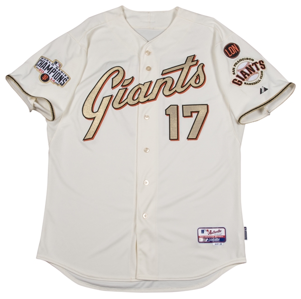
PS - Looking back at the Giants' orange unis, the outline seems to match the cream of the home rather than more of a metallic gold that I remember. Is that lighting, a Nike change, or was it always matte beige?
-
Might be the shade of the quick mockup, but too much of the color gives me special event vibes. Like Mother's Day.
26 minutes ago, CaliforniaGlowin said:Well the Yankees aren't doing a CC so the Mets are claiming it.
-
The tweets and Mothership article don't show the socks, but they're on sale.
EDIT: Wow, they actually are visible in one shot, but the details are so dark that they're nearly indistinguishable from plain black socks.
-
 1
1
-
-
Full graphite at home has got to be against some rule since the traditional away is gray. While we've gotten some stupid same-color matchups in the past, I can't imagine the league would let a team wear full-gray at home.
-
1
-
-
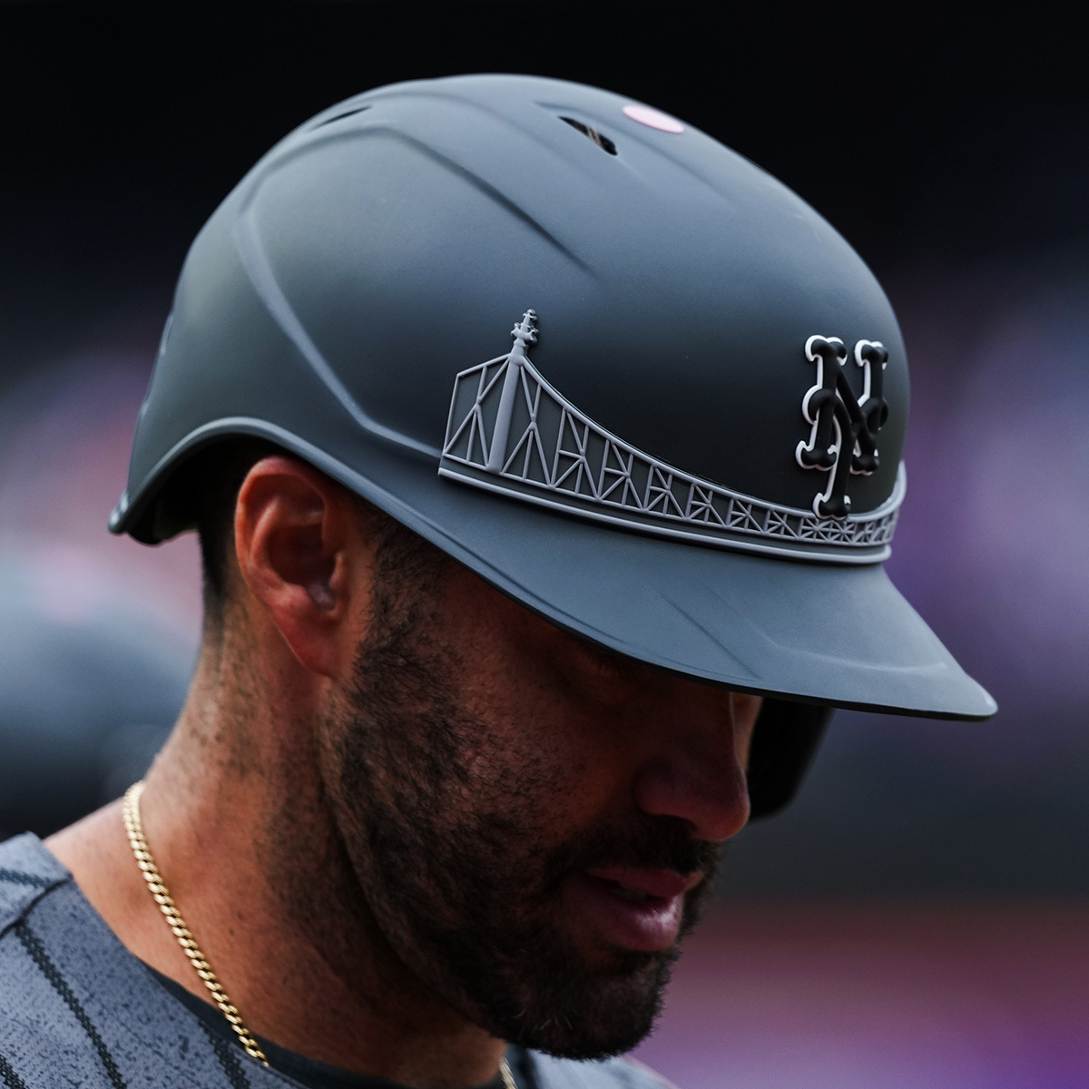
I suppose the most famous bridge in the borough and is contains the borough's name, but... am I the only one that associates the team more with the Whitestone? I suppose the Queensborough bridge is also much more visually appealing and you don't want to use a bridge with "Bronx" in the name. But it feels like the Yankees ditching the Macombs Dam Bridge or even the GWB for... well... the Whitestone Bridge.
But besides that little block in my mind, these are largely inoffensive to me.
-
12 minutes ago, CardsFan79 said:
Yeah, that’s the “catch phrase” this season.
Oof. That makes if even worse. If it's just started now, then it sounds like they're ripping off Cleveland. But, if you're going to keep changing hashtags every year, eventually you're going to run out.
-
5 hours ago, CardsFan79 said:
The Cardinals are unveiling their CC on May 20, and debuting them May 25. This is going to be bad.
https://www.facebook.com/share/fBXVbGh2vr94qhDe/?mibextid=WC7FNe
"For the Lou"? Is that a thing?
-
Whoa! It looks like the Texas Flag only goes one way. The Rangers have their ad patch and flag patch on the same sleeves for every player no matter the handedness.
(Also, I forgot to list the Pittsburgh City Connect and Seattle Cream we've already been told is delayed to the earlier list.)
-
3
-
-
25 minutes ago, TBGKon said:
Rays throwbacks are in use and worn on home Fridays, and have been worn twice so far.
Huh. I went through every game on Getty two days ago. How the crap did I miss that?!
Well, the first had this as the thumbnail for the game and I didn't realize that wasn't the regular home white.
And the other I just must have accidentally not clicked thinking I did. The thumbnail for that is a Giants player.
-
22 hours ago, Sodboy13 said:
Diamondbacks' City Connects are certifiably banana yellow.
Come on... Those things are clearly butterscotch.

I've been watching the uniforms to update the current lineup for each teams. Here's the jerseys still MIA at the moment...
Boston Red (although it was worn as Spring Training) and Navy
Tampa Bay Gradient
Toronto Powder Blue
Angels City Connect
Seattle Cream
Texas City Connect
Cubs City Connect
Milwaukee Pinstripe and City Connect
Pittsburgh City Connect
St. Louis Cream and Powder Blue
Atlanta Red and Navy
Washington Pullover
Dodgers Los Angeles Gray
San Francisco Orange and City Connect
Obviously, this early in the season there's plenty of chance some teams just haven't gotten the day to line up (usually home Friday) for them to wear their City Connect uniform and we've gotten direct word that some are delayed, but anyone heard any news on the rest of these? And inside scoop or official word I've missed on any of these being trashed?
-
5 hours ago, SilverBullet1929 said:
Marlins blue jerseys are for home day games (except for Opening day) so every Sunday but also any weekday day games.
Home Friday games are the black alternate. Home Saturdays are the City Connect.
Gray is obviously road with black as the road alternate. They tend to use gray for road night games and black for road day games but they don't always stick to the road jersey schedule for various reasons.
They're very consistent with their home uniform schedule.
Wow. Everyone else is having trouble and the Marlins seem to have gotten every single one of their uniforms. They wore everything, like, within the first week.
-
3
-
-
On 3/29/2024 at 12:39 PM, Krona said:
I'm old and probably thinking of 2K14

All-Star Baseball 2000
On 4/1/2024 at 10:28 AM, floydnimrod said:I'm not sure what I think of the New Yankees gray uniforms. As someone who values parallel looks between homes and roads when possible I guess it's good that both and home and away uniforms have no cuff stirpes.
More of an overall question: not considering the new template, are there any teams whose road grays are better, or at least on par with the home whites? I can't think of a single team where the road gray isn't just a worse uniform design than the home uniform
I much prefer the Bronx Zoo away grays, but I do have to admit that the change has been... okay. I just kinda don't notice.
On 4/3/2024 at 4:00 PM, burgundy said:I expect it to be an all-navy uniform mixed with elements of away uniforms from three World Series winning seasons.
Gray hats from 1935
Sleeve numbers from 1968
Arched script style from 1984, but probably "Motor City" instead of Detroit
I wonder what the chances are that we'll see a "Motor City Kitties" somewhere?
On 4/6/2024 at 12:26 AM, tBBP said:Yeah, um...the readability of this thing is off. "City of Brotherly"?? I know that's supposed to connect (ha--"connect") to the LOVE, but the execution of this concept is...nah, man.
They'd have been better off surrounding it with either 26 or 40 stars...of course then it'd look even more like the Union, but whatevs.

Man, that LOVE logo is the only local reference that wouldn't be put together by people on the West Coast who've never visited the city (bell, skyline, nickname), huh? I know we have a lot of natives of the area around here. Are we missing something?
4 hours ago, coco1997 said:
Apparently this art has been on the MTA for years, but it would be funny if this more or less wound up being the Mets' design.The weirdest part of this is that this is a ballgame between the 7 train and the Staten Island Railroad in Corona, but that's clearly the Bronx Courthouse on the right that stood in the outfield of the old Yankee Stadium. Perhaps an easter egg by an artist who's a rival fan.
I honestly expected for the Yankees' CC to be the home pinstripe uniform with NEW YORK across the chest in dripping graffiti and a white cap insignia in the same style. (I know I've seen a spray painted interlocking NY somewhere, but I can't for the life of me remember where) I was wondering, though, as the Mets were coming first whether they'd go with that idea. Looks like I was wrong.
-
7 hours ago, Old School Fool said:
Still the best champion uniform that ever existed.
-
7
-
-
On 3/4/2024 at 2:44 PM, Bmac said:
From that article:
“But what of the Yankees! Think of the Tigers!” I hear the commenters tapping away. Both the Yankees and Tigers used their two available uniform slots on a set of home and road Spring Training jerseys, and yes, Spring jerseys count against the four.
Wow... That is very stupid, but at least it does confirm for us that most of what we're seeing is officially new on-field in-season alternates.
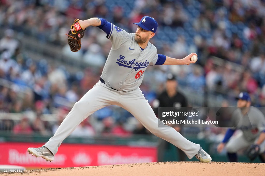
On 3/7/2024 at 10:56 AM, namefornamesake said:How did they manage to get the LA script break right if they couldn't with the regular Dodgers script?
On 3/7/2024 at 11:38 AM, cemps said:This is a replica jersey, so keep that in mind. The home white Dodgers replica also shows a well-placed script break. So don't count out the on-field jersey having a terrible one!
Or, excuse me, not a replica, but a *limited* jersey! (Calling it limited makes no sense to me, but what else is new)
Those shop images have looked 110% computer generated from the start to me. I'm not trusting a thing on them until I see them in photos or video.
3 hours ago, SilverBullet1929 said:I can't tell the difference in the Dodgers helmets.
2 hours ago, Sec19Row53 said:I *think* it's more of a stitched style logo rather than a puffy sticker. More like cloth and less like foam.
PS - You clearly weren't the only one who wasn't sure on the difference.
3 minutes ago, Survival79 said:
One of the articles linked mentioned that, while the Japan link is the application of the logo, the true identity change that is happening here is that the helmet logo and cap logo now match. The helmet logo has always been wider. One of those little quirks, likely not a purposeful design choice like the Detroit D.
I remember the Yankees having a similar situation, with the cap logo seeming to be the "print logo" but much chonkier. Sadly, I believe that went away with the change from the lovely shiny helmets that reflected the grand circle of lights around the Stadium.
-
Also I didn't think that or the White Sox because it was high enough to at least overlap whereas I thought we were specifically talking about severely lower numbers. Although that Oakland example may be just as low and the A is just huuuuuuge. It seems taller than the usual chest logo.
Besides the URL and the lack of alternates, what makes Dressed to the Nines obsolete, especially when it's still getting updated? I've always found it useful for finding trends. Set to the larges amount of unis per page and see what year a change was made in a few seconds/the rise of powder blue and pullovers/etc. Besides, alternates exploded in this millennium and I have my own records past 2007.
-
8 hours ago, BBTV said:
But historically, teams with chest logos never put the number low. It's actually a more recent thing.
Huh. You're right. I'd forgotten how far back some of those examples go.
I went to the Dressed to the Nines archive and unfortunately it doesn't show alternates and it turns out all of the examples nowadays seem to be alternates. But, it did show that those who do it nowadays wore them alongside or after wearing wordmarks with front numbers, so perhaps it was just a matter of one team saying "we put the numbers here, so keep doing it" and others following or just a number of people coming to that same conclusion.


MLB 2024 Uniform/Logo Changes
in Sports Logo News
Posted
Oh! One more thing I forgot that I found out watching Getty for uniform returns. The Texas Flag is not the only thing that flies one way. So does the Peagle!
The Peagle was originally on the right sleeve of the City Connects and remains there, the ad patches on the left no matter the handedness. Meanwhile, on all their other jerseys, the flag is on the left and the ad on the right no matter the handedness.