-
Posts
3,402 -
Joined
-
Last visited
-
Days Won
8
Posts posted by colinturner95
-
-
7 hours ago, Discrim said:
Late night 90s night special, as the gradient treatment took me a while...and I kinda overslept. Anyways, here we go. A sans-black version of the podium jersey with an equally black-free Blasty on the front, and I figured I'd go more gold-heavy to further differentiate this from the original...figured I'd put a bit of a twist on the Angry King jersey, with a modified gradient based on the LA flag's zigzag. Since I have a Clarendon variant installed, I used that. I'd initially considered using the coat of arms and the 2000s crown instead, but figured what the hell.
Not sure what I'll do for the 2000s yet...I just know what I know

someone tag Adidas, I know what I want for Reverse Retro 3.0 for Cal-Gary.
-
1 minute ago, DCarp1231 said:
I’ve never really thought much of the helmet as a good logo. The elf is a better option at midfield though.
However, I was pretty fond of the Browns using their stripe along the entirety of the 50 yard line last year.
Kinda reminded me of hockey teams doing something unique to their red line. Wish more teams would do it.
-
 6
6
-
-
Winter Classic logos dropped.


-
 5
5
-
-
6 minutes ago, FiddySicks said:
Early 2010s Boise State ripoff, which everyone thought looked like back then, too.

me sitting back watching this conversation unfold and loving Boise State's helmets
-
 2
2
-
 1
1
-
-
Our first stop in the Eastern Conference:

Hamilton Tiger-Cats - Home & Away - Hamilton, since 1954, and even earlier has loved stripes. Nothing wrong with that. I myself am a big fan of stripes. The problem is what do you do with stripes when the real estate to show off those stripes gets smaller and smaller?
- Helmet - The classic black helmet sticks around with the flying tiger on the sides. A new double gold stripe is added to the helmets.
- Jersey - The myriad of stripes returns to the sleeves, this time smaller and alternating in color. the stripes lead off with white, homaging the 60's era black jersey style.
- Pants - The pants mirror the helmets, with a single color - double stripe down the sides.
- Socks & Cleats - Either solid color black socks or fully striped socks. Full gamut of cleat color options as well.

Hamilton Tiger-Cats - Alternate & Heritage:
- Alternate - I think many of us on the boards here were not quite on board with "The Hammer" alternates, even though I had tried to salvage the Hammer H logo as an alternate logo, which did not work. But a completely different take on the alternates for the Ti-Cats, going for the gold, which I think is a first since the early 2000's(?). The stripes space out a little bit, going 4 on each sleeve, each stripe having the year of a Grey Cup Championship on the stripe. Hopefully they don't win one any time soon.
-
Heritage - I did my best to celebrate as much of Hamilton football as I could on this uniform, from the Tigers, to the Wildcats, to the Tiger-Cats.
- Helmet - switching gears to a gold helmet, worn up to 1964, with the number on the sides.
- Jersey - Crossing all eras here. the shoulder stripes come from the 1957 team. I doubled them up as an homage to the Wildcats throwbacks, which had a multitude of stripes on the shoulders. You'll notice a stripe on under the numbers. You'll also notice some subtler black stripes above and below them. This honors the Hamilton Tigers with their candy-caned jerseys.
- Pants - the pants get reined in a little bit, just a triple stripe down the sides like the helmet. Socks have the same style stripes as the jerseys.


Hamilton Tiger-Cats - Apparel - The regular apparel floats between the flying tiger logo and the full logo with the roundel. Otherwise follows along with the pattern. The throwback apparel further homages the team's history, with a Tiger-Cats wordmark that is based off the Wildcats old wordmark. The throwback apparel also uses the old tiger head. If I had to pick: I'd choose the gold long sleeve from the regular apparel and probably the hoodie from the throwback apparel.
C&C welcome!
-
 5
5
-
 1
1
-
It feels very much like a change for changes' sake. And not a good one.
-
On 10/28/2022 at 8:20 PM, PERRIN said:
I completely agree with this take. With the block, it's a classic look and still a top-tier look in the NFL, but the futura works better. It's unique without being too modern or too bland. Block numbers, while classic, are boring, especially when most of the league uses them. Plus, it's the only thing setting them apart from Iowa, though I'm well aware they modeled their uniforms after the classic Steelers set.
I can see sticklers for tradition preferring the block numbers, and that's perfectly understandable. But I don't see why people out there downright hate the futura numbers like I've seen some on the boards do.
I like the Bears' number font for the same reasoning. It's timeless like a standard block font, yet more tasteful for the modern day. It's interesting that they began using a sans serif font over 50 years ago compared to the Steelers introducing the futura in the late 90s.


The Steelers' uniforms are more than just their numbers, and it's not like the Futura numbers completely ruin the uniforms.
BUT
In my opinion, the Futura numbers don't belong on the jersey and should be replaced by a block font.
-
 3
3
-
 1
1
-
-
-
-
4 minutes ago, neo_prankster said:
Just catching up on the thread.
How did you guys like the Patriots' new silver pants?
A much needed addition.
-
 14
14
-
-
We've reached halftime of this series, and before we move onto the East, I had some apparel updates for West. I realized that I was putting these Heritage Throwback uniforms out there, with no apparel, completely forgetting how well throwbacks and their accompanying merch sells in most cases:


Still following the previously established pattern of merch: hat, quarter zip, long sleeve, polo, sweatshirt, t-shirt. The athletic shorts have been replaced with a pom beanie, which I felt portrays more of a throwback vibe.
-
BC Lions - Black and orange, with the paw print logo combined with the interlocking BC the team trademarked in 2021, but have yet to do anything with that I've seen.
- Personal Choice - I like all of them, but the long sleeve speaks to me.
-
Calgary Stampeders - the 40's era logo, on red and white backgrounds.
- Personal Choice - It's a tie between the hoodie and the beanie for me.
-
Edmonton Elks - I resurrected the team's first real logo and replaced the Eskimos with Elks on the larger banner.
- Personal Choice - None of these really jump at me, maybe it's the color combo, but the t-shirt is pretty classic.
-
Saskatchewan Roughriders - classic green and white with the 60's era logo.
- Personal Choice - The polo shirt is super nice, just clean and no frills.
-
Winnipeg Blue Bombers - Winnipeg has a unique approach, given that their alternate is so different from their Home & Away uniforms that it can justify a second apparel set. Alternate set continues the RCAF theme, throwback continues with the royal and bright gold theme.
- Personal Choices - Either the quarter zip or the hoodie on the Alternate set, and either of the headwear choices for the throwback.
C&C welcome! East coming soon!!
-
 3
3
-
BC Lions - Black and orange, with the paw print logo combined with the interlocking BC the team trademarked in 2021, but have yet to do anything with that I've seen.
-

Winnipeg Blue Bombers - Home & Away - Winnipeg has looked good with all the changes in CFL apparel partnership in the last few seasons. The best part about it was the return to royal blue and gold. Just feels more befitting of the Bombers. Despite the already classic approach to the uniforms, I changed things up a little bit, with much inspiration coming from the all-blue uniforms.
- Helmet - Gold. No reason to switch from that. Single stripe, classic W logo on the sides.
- Jerseys - Based largely on the new alternate jerseys, the Bombers switch to a shoulder stripe set-up, angled a lot like ranking bars on a military uniform. More on that later. Big logo is nowhere to be found, wordmarks above the numbers.
- Pants - Venturing slightly away from the classic, are angled stripes towards the bottom of the legs, with the W on the hips.
- Socks & Cleats - first team to have different sock designs. Solid blue and striped white. I personally felt like the blue striped socks were too much.

Winnipeg Blue Bombers - Alternate & Heritage:
- Alternate - Took me 5 teams, but the soft two helmet limit was broken finally. I really liked the Signature Series uniforms for the Blue Bombers, but felt they could be better. So this uniform is very much inspired by RCAF formal dress, going all navy, with stripes on the sleeves in the fashion of ranking bars. W-logo on the shoulders, WINNIPEG and BLUE BOMBERS wordmarks above the stripes. Fonts are taken from RCAF aircraft standards. New patch-inspired logo on the helmet and front hip.
-
Heritage - Winnipeg had a lot going on in the early days. They also won a few Grey Cups before the CFL was formally formed, including the first under the CFL banner.
- Helmet - The helmet is a bit of a roundabout. A royal blue helmet is not new for the Bombers, but with a gold stripe. So a basic inverse of the classic helmet. Clarendon helmet numbers on the back, from the uniforms in 1960
- Jersey - Gold jersey, eschewing white for the most part. Shoulder stripes honor 1939's Grey Cup winning team. Sleeve stripes are the team's current and probably most iconic jersey stripes. Jersey font comes from the 1958-1959 teams.
- Pants, Socks & Cleats - Nothing crazy on the pants, gold with a solid blue stripe. Solid blue socks and cleats round us out.

Winnipeg Blue Bombers - Apparel - Not much going on here. Lotta blue and a lotta gold going on.
C&C welcome!
-
 6
6
-
 1
1
-
The Red Wings mixed in black unnecessarily and somehow still made a better RR than what they did in Round 1.
-
 2
2
-
 1
1
-
-
16 minutes ago, ManillaToad said:
Why do the Packers even have that uniform? They wanted a monogreen alt so they took their regular set, made everything worse from head to toe, then bizarrely claimed it was inspired by a throwback despite looking nothing like it.
What do you mean by this?

It's what the Packers wore in the mid-50's, so it is a throwback
-
 6
6
-
-

Saskatchewan Roughriders - Home & Away: The West's oldest continuously operated gridiron football team (emphasis on West) doesn't need frills and anything crazy modern to get involved in their uniforms. Now that doesn't mean there can be small little things added to give a classic uniform a small, modern feel.
- Helmet - classic green double striped helmet. the white helmet now also has the double stripe as well. Biggest change is Blitz Green now has a place on the uniforms full time, here it now serves as a non-offensive outline on the logo.
- Jersey - The classic shoulder stripes move to the sleeves pretty much as is, now with a subtle wheat pattern in the middle of the stripes. Contrasting collar, with the wheat pattern featured very small near the point of the collar.
- Pants - very classic, fitting the uniform, double stripes down the sides with the primary logo on the hips.
- Socks & Cleats - double stripes like the rest of the uniforms. cleat color options.

Saskatchewan Roughriders - Alternate & Heritage:
- Alternate - Blitz Green made its debut with the Signature Series uniforms in 2014. It now has its own uniform to itself. A simple recolor of the home/away uniforms, just with the greens trading places.
-
Heritage - With a deep history, the Heritage uniform celebrates the 50's and 60's, as well as the true classic uniforms the Roughriders have worn
- Helmet - classic green with the double stripes. Number on the sides from the early 60's. Championship era logo on the back of the helmet on the stripes.
- Jersey - 1966 has a lot to say here. The sleeve caps combine the 1966 uniforms with a white sleeve cap and a small northwestern stripe. The team's iconic shoulder stripes make their appearance here as well.
- Pants, Socks & Shoes - silver pants, with a single solid stripe, an inverse of the green pants from the era. The stripes on the socks more closely homage the teams uniforms in the 70's and 80's. Black shoes to round out the look.

Saskatchewan Roughriders - Apparel - wanted to mix in some of the blitz green into the apparel, leading to a bright polo shirt and pair of athletic shorts. Otherwise, the classic Sask. Green for the majority of the apparel and a white long sleeve for some options.
C&C welcome!
-
 4
4
-
29 minutes ago, JTernup said:
Wow, just seeing this. It’s a cool tribute and I know that means a lot to that program. But in a vacuum that has to be the worst helmet in the history of the sport right?
well...


Youngstown State and BYU did this in the same week as Utah, so maybe not?
-
 1
1
-
 1
1
-
-

Edmonton Elks - Home & Away - As I wrote down on my notes, "It's a new era in Edmonton" and I'm not talking about Connor McDavid. Unlike a certain football team based near the United States' capital, Edmonton really did a good job with the rebrand. The newest uniforms however, fell flat IMO. It's a new era in Edmonton, let's take some risks.
- Helmet - The first team to showcase 3 designs on just two shells, green helmet not currently pictured. But the antler helmet was abandoned too quickly and makes a reappearance here. Plus a classic style with the double EE on the side.
- Jersey - Using the double stripe from the 2021 and the new antlers, we get a combination of the Jets uniforms with a little more Canadian prairie added in. Plus a more classic number font. The new font just looks awkward.
- Pants - Earlier drafts had an antler design on the lower pants but didn't work out how I would have liked. So an offset stripe on the sides of the pants.
- Socks & Cleats - Green and white striped socks. Assortment of cleat options.

Edmonton Elks - Alternate & Heritage:
- Alternate - The alternate properly introduces the green helmet, yellow EE on the side. More classic stripes on the sleeves, Antler-Football logos on the sleeves, much like Edmonton uniforms of years and nicknames' past. Gold socks also introduced for this uniform and this one only.
-
Heritage - The Elks rich history leads us from the late 50's into the present.
- Helmet - A blank green helmet with a classic triple stripe using old gold in place of the current gold.
- Jersey - Green jersey with the old gold, with shoulder stripes homaging 1965. The iconic stripes on the sleeves from 1966 on, using the old gold. Number font comes from 1949, classic varsity serif font.
- Pants - Green pants with the same stripe as the helmet. Socks match the jersey stripes.

Edmonton Elks - Apparel - I have no ties to Edmonton or the CFL, but early contenders for my personal favorites. Big fan of the shirt with the Elks logo + wordmark, and the gold polo shirt. Honestly not a bad choice in the bunch here.
C&C welcome!
On 10/13/2022 at 10:26 AM, PERRIN said:Loving both teams so far! Both teams look classy yet modern enough to stand out. I'm loving that number font for Calgary and all of the alternates are tastefully done. Excellent job so far like always, looking forward to how the rest of the series plays out!
On 10/12/2022 at 4:13 PM, Djruggs said:great work so far!
On 10/12/2022 at 3:37 PM, the_grateful_ted said:Both have been excellent, good work Colin!
I always feel a sense of trepidation on trying to redesign leagues I'm not super familiar with, but I always appreciate your guys' comments!
-
 10
10
-
 1
1
-

Calgary Stampeders - Home & Away - Moving a little bit to the east and we end up in Calgary. Calgary had a similar problem to BC, but much less prevalent. Where BC has some issues with deciding between black and orange, Calgary somedays feels like they should go back to red and grey and leave black in the past. Much less of an issue than what BC had but I felt that grey suits Calgary better than black does.
- Helmets - red and white with the classic horse logo on the sides. Nothing crazy.
- Jersey - A classic northwestern stripe on the sleeves with some added spurs to give the whole uniform a more Western flair. Same applies to the numbers, which also use the spur idea, but they've been doing that for a little while now too.
- Pants - Like the jerseys, northwestern stripe on the sides of the pants, stripes also spurred.
- Socks & Cleats - Nothing crazy, solid red socks with all the cleat options.

Calgary Stampeders - Alternate & Heritage:
- Alternate - Same but different. The stripes from the sleeves move up from the sleeves to the shoulders, styling like shortened racing stripes. Also the jersey is grey and so are the pants.
-
Heritage:
- Helmet - White helmet with the throwback Stampeders logo on the sides. On the back on the helmet, player number contained in a horseshoe, honoring the 1960-61 helmets.
- Jersey - banking on the success of their recent throwbacks, we use the white version as the base. The stripes on the sleeves are deceptive, they look like the same weight all the way across, but in reality: they are not. This homages the 1987 stripe pattern on the sleeves. Numbers have a drop shadow like the 2001 team.
- Pants - Nothing wild, just a wide red stripe on the sides.
- Socks & Cleats - Socks come over from 1948 as is.

Calgary Stampeders - Apparel - Lot of red and a lot of grey. I did also change up the t-shirt from a generic wordmark to the team specific wordmark, the one that I completely forgot to mention is new. It borrows from old wordmarks from the team's past, with the drop shadow and a newish western font.
C&C welcome!
-
 5
5
-
funny the black/royal blue conversation has come up...

Boise State will be going black/blue/black for their game vs Fresno State... not a huge fan.
-
 1
1
-
-
I think you guys would call me crazy if you knew just how many projects I have in the pipeline at any given time. My wife thinks I have ADHD, just in the opposite direction of her diagnosis. I don't know about that but she might be on to something. Anyways, I'd been scraping the barrel for things to work on. I've got two projects that are somewhat on-going but pretty massive in relative scale. I needed something to fill in the gaps and not let my creativity lapse, which is how I get designers' block which is good for no one.
Anyways, I wanted to jump into the NFL for a third time, but I just didn't feel like it yet, but I was feeling football with college starting and the NFL starting up right after. So I turned my attention north of the border, and decided to take a stab at the CFL for the first time. With some deep history in the league as a whole and of course with the 9 teams, it felt like a good warm up to segway into an NFL series down the road. So for this series, I'll be using a Nike template, though like the New Era jerseys, the Swoosh moves to the back under the collar. Also playing around with a new helmet template after many successful runs with the Revo Speed.
Every team will have four uniforms: Home, Away, Alternate (that doesn't have to just be a color swap, looking at you NFL), and a Heritage uniform. Something between a straight throwback uniform and an NBA mixtape uniform. You'll also notice a CFL logo that you don't recognize on the uniform images. It was set to be a new league logo, but I didn't like it compared to what it would replace, but it will serve nicely as a good project logo.
We begin in the West, in Beautiful British Columbia (the CFL team I'm closest to):

BC Lions - Home & Away - the Lions seem to be in this constant struggle between being an orange first team or a black first team. They started off in orange. Then went to black. And back again throughout their history. I felt the team should continue to embrace the orange over black on their jerseys. For the design. I went back to stripes based around the uniforms around the time the team won their first Grey Cup.
- Helmets - Black and white. ( I couldn't see any verbage in the CFL's rules about helmet limits, akin to the now repealed one helmet rule in the No Fun League but found nothing, but self-imposed a two helmet limit that I'll try and follow as best I can). Iconic BC lion logo on the sides of both, with both helmets now carrying the triple stripe debuted a few seasons ago.
- Jerseys - Like I said above, back to a classic stripe on the sleeves, in a way, similar to the Cleveland Browns' stripes. Went with a pretty classic block font for the name and numbers.
- Pants - Mirroring their helmets, the pants also have the triple stripes down the sides, BC monogram on the hip.
- Socks & Cleats - The Lions have three sets of socks, all three striped. A rule I'm trying here is that teams can wear either: all white socks that MUST have a stripe or the classic color above white socks that CAN be striped but aren't required to. Plus cleat options for each uniform.

BC Lions - Alternate & Heritage:
- Alternate - For the alternate uniform, breaking away from the stripes on the jerseys and went with something similar to what Baylor football did some seasons ago, with the classic paw print logo becoming the feature of the jerseys, and also giving us a look at the team's black pants.
-
Heritage - Our first entry in the Heritage category. Let's break er down:
- Helmet - Comes over almost entirely intact from the team's first Grey Cup winning team in 1964
- Jersey - Jersey starts out orange, from the 1972 season with the northwestern stripes on the sleeves. You'll also notice the inverse colored TV numbers on the shoulders. Also of note are two smaller stripes both on top and below the NW stripe on the sleeves. Those homage the earlier 70's teams, who rocked a whole lot of stripes on their sleeves.
- Pants - Silver worked its way into the Lions uniforms around 1969 and stuck around for a long time after that. The pants celebrate that.
- Socks & Cleats - Black socks and black cleats. Felt classic for a classic style uniform.

BC Lions - Apparel - I had a lot of fun designing apparel towards the end of my PLL series, and thought I'd keep it going for, probably the foreseeable future. For the CFL teams and, right now, the BC Lions, just a small sampling of apparel. From a simple hat to things like coaches polos and quarter zip jackets, to player and more active gear like shirts of varying sleeve length to hoodies and shorts.
C&C welcome! Really excited for this one!
-
 9
9
-
3 hours ago, Mingjai said:
The more NCAA hockey teams the merrier. I just hope they aren’t a big of goons as ASU was when they jumped. Dirtiest team I ever saw… I’m also interested to see how long it takes St. Thomas, who jumped from D3 to D1, to become competitive. With their location in St. Paul, I fully expect them to surpass Bemidji in couple of years.
I still can’t believe the state of Illinois is a top producer of college hockey talent (outside of the 3 Ms of course) and yet there isn’t a D1 program in the entire state. Either U of I or UIC or both should have D1 teams. But I digress.
I know we're getting away from uniform discussion here a bit, but I think Illinois is the next Big Ten school to make the D1 jump. They were going through the process of a feasibility study starting in 2018, but I'm sure Covid played a hand in the university scaling back adding sports. I still think they're close to the jump though.
-
13 hours ago, WSU151 said:
This helmet looks great tonight. Needs to be in the regular rotation .
Very much agree. Would like to see it with a non-chrome facemask, but I'll take it.
-
 2
2
-
-
25 minutes ago, BoysClub said:
I know it is the "Sports Logo News" section, but I felt this was the most appropriate place for anyone interest. Since January I've had a gut feeling that UNLV will announce their jump to D1 NCAA this year. Originally it was based on loose context like:
- UNLV's ACHA program skyrocketing to unbelievable heights in a very tight timeframe (quality and funding).
- The US Hockey Hall of Fame Game is being hosted in Vegas this year, featuring North Dakota and ASU (a desert school that made the jump from club to NCAA in a similar way).
- ASU's D1 ACHA team will travel up with their big brother to play a few games against UNLV the same weekend.
Yes, I know the game always includes North Dakota and I know that it commonly takes place in Las Vegas, but it just feels like an event that UNLV could use as a spotlight. I also just learned that UNLV will be playing the defending NCAA national champions in a couple days. Could mean absolutely nothing, but Lindenwood stopped in Colorado to play an exhibition game against DU around the same time last year, and Lindenwood is now D1 NCAA.
Just throwing it out there to see if anyone knows anything or has similar suspicions.
I think it's a matter of when, but nothing seems concrete at this point. Plus they'll need a heavy influx of cash to make the jump. Difficult, not impossible.
When I played against the club team in 2016, they were a D2 ACHA club team and were already a formidable opponent. And they're slated to play against the UAA Seawolves this season, the NCAA Division 1 team. Again, I think its a matter of when, not if. But not sure "when" is coming.
-
 2
2
-
-





/cdn.vox-cdn.com/uploads/chorus_image/image/71188512/1192648144.jpg.0.jpg)


/cdn.vox-cdn.com/uploads/chorus_image/image/67753654/Cowboys_helmet.0.jpeg)




College Football 2022
in Sports Logo News
Posted
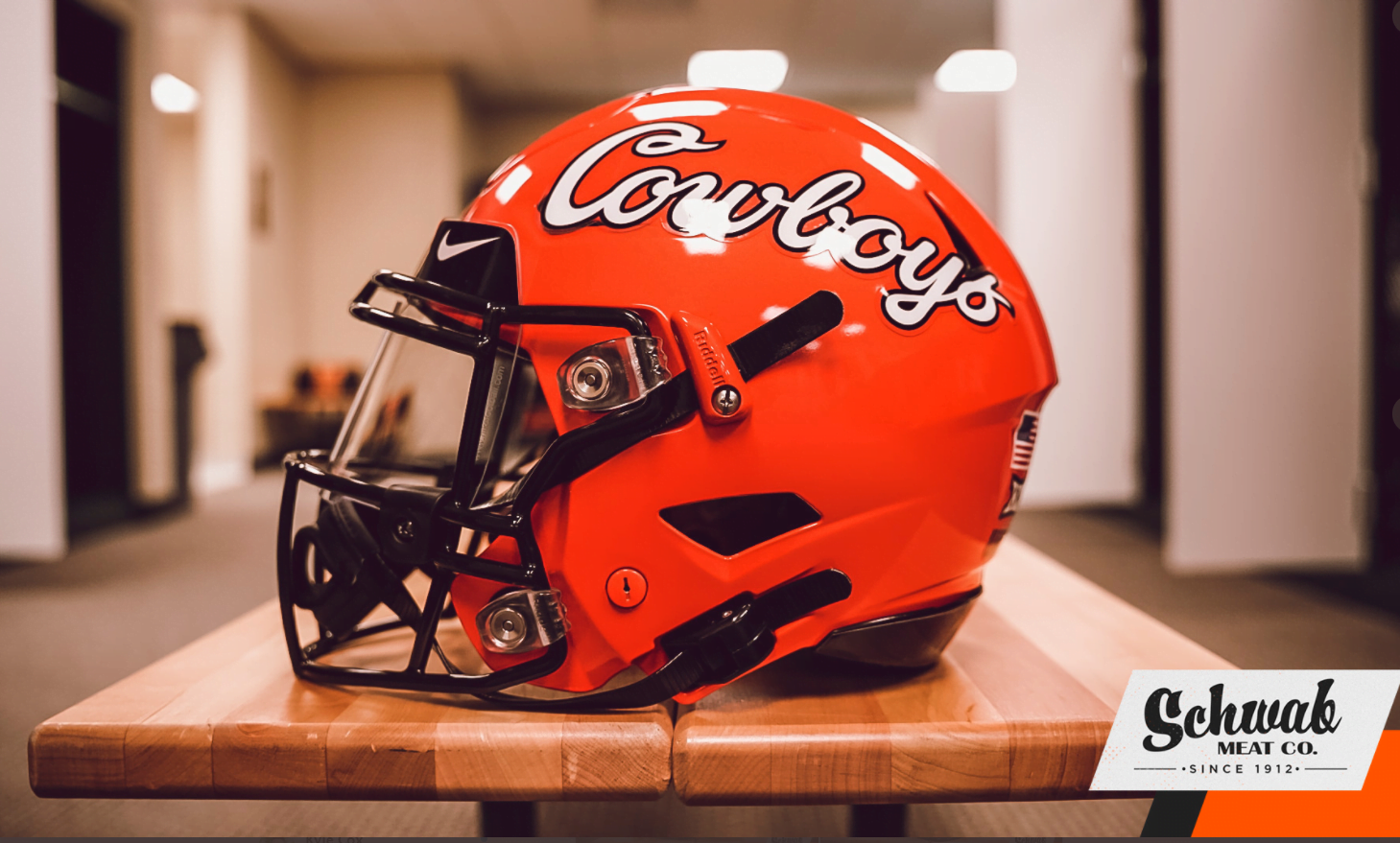
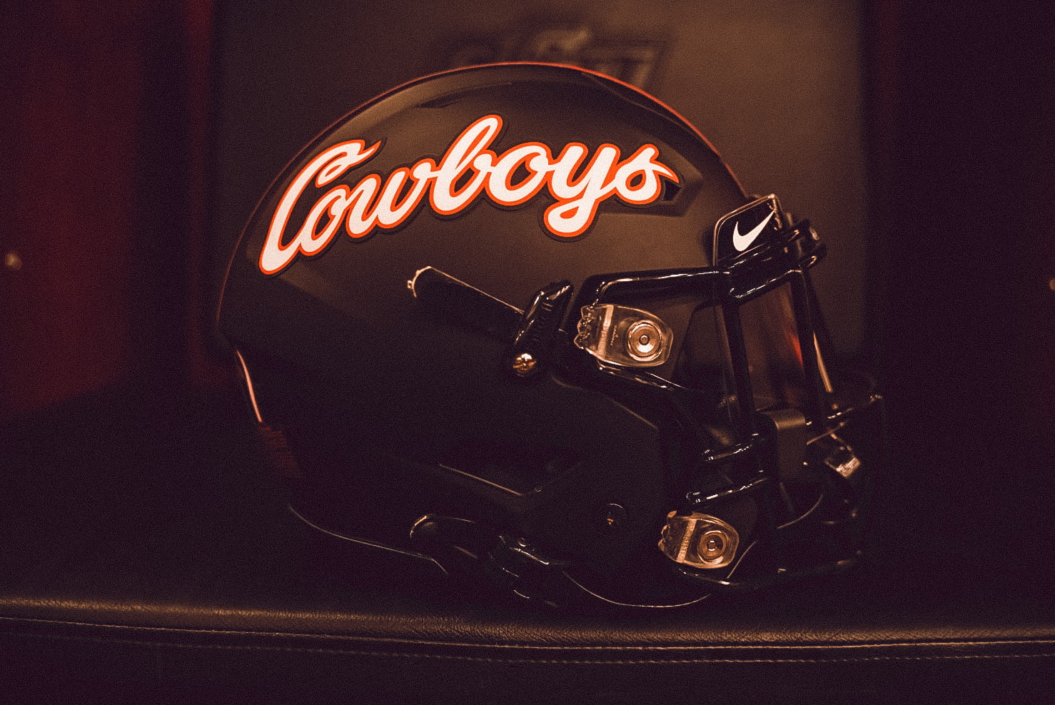
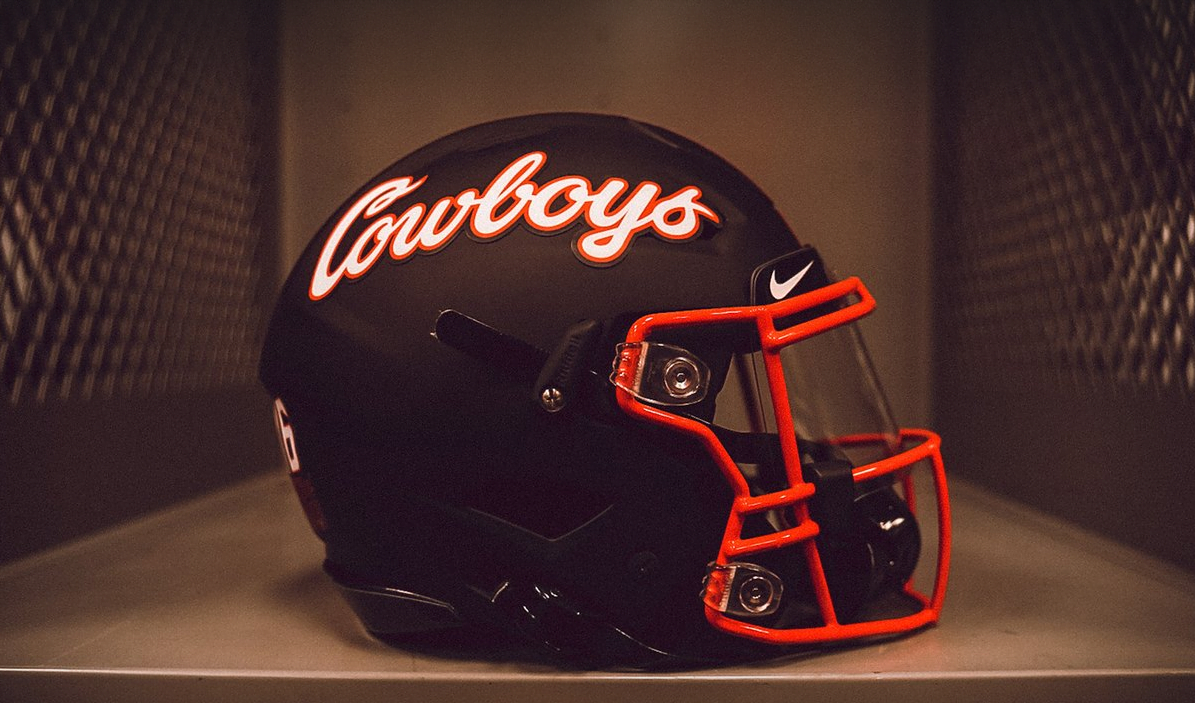
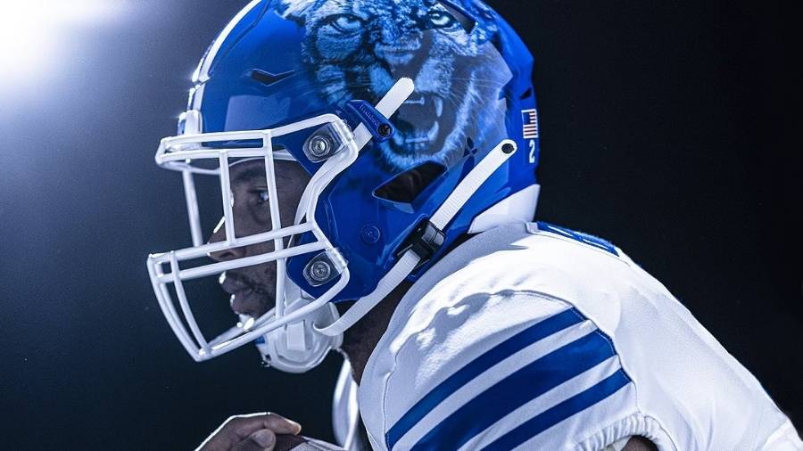
After losing to BYU (and I know this won't happen, but I can still dream) they should not wear those again. ever.