


colinturner95
-
Posts
3,402 -
Joined
-
Last visited
-
Days Won
8
Posts posted by colinturner95
-
-
14 hours ago, Kirill_The_Thrill97 said:

Extra points for Hellberg's amazing pad setup. Gustavsson has a nice Reverse Retro set as well.
Now I'm super conflicted between "let the North Stars rest in peace" and "the Wild should make the switch to these colors ASAP"
-
 7
7
-
 1
1
-
-
We'll start up in the panhandle of the state, in the AA Inland Empire League, which spans between Districts 1 &2.
First team up, the Bonners Ferry Badgers, probably the northernmost high school in Idaho.:
Bonners Ferry Badgers - Logos - Bonners Ferry currently kicks it pretty classic in all sports. Their colors are currently navy and silver, but a couple of their other sports use a lighter shade of blue, somewhere between royal and Chargers powder blue. They also use Bucky the Badger in his full body logo self, I scaled it down to just his head and created a sort of classic style HS/Collegiate wordmark for the team. Number font isn't anything special and a single color.
Bonners Ferry Badgers - Keeping it simple, the uniforms are what you'd get if the Red Wings decided to feel blue. The home and away uniforms are very much the Red Wings, with light blue sleeves and navy stripes, or just navy stripes when the whole uniform is light blue. LB helmets with navy pants and gloves for everyone. The alternate uniform doesn't stray from the regular uniform just opts for a collegiate style jersey front.
C&C welcome! Not the most visually exciting start but if you have anything, I'd love to hear it!
-
4
-
-
3 hours ago, DCarp1231 said:
I know LA’s uniforms aren’t exactly everyone’s cup of tea, but Rams-Raiders was a fantastic looking matchup
I still think the logos for the Rams are booty cheeks, but the uniforms have grown and continue to grow on me. Plus relegating bone to an alternate status helped immensely.
-
8
-
 1
1
-
-
23 hours ago, raysox said:
I'm back! I did start to do more exploration Friday, and here's what some of the stuff I came up looked like. I think D is the only one that may have legs, it makes the vertical line on the W stand out less, and gives a little bit of perspective on the letters. It does kind of give me Mountain Dew vibes though
Here is my take on @burgundy's suggestion to be asymmetrical. I studied the old logo and think they may have tried to hide a MW in a four peak range. I think this is SUPER interesting, but may be too abstract for it's own good. But I felt good enough to try it in team colors.
All of this has been wonderful. Much better than the Doctor Who a**-looking logo you called it. Personally, I like the current iteration, both in logo and with the wordmark under it. I do think, like others have said, there could be a W somewhere in the negative space on the right side.
-
1
-
-
I've mentioned this many times in many different areas on the forums here - I'm a hockey guy. I have been since I learned how to skate. Naturally, I worked my way up from Mite levels, Peewee, Bantam, up the age chain and up to my U18 days, even going to two National Championship tournaments. But for four years, I did my time at high school and by extension, high school hockey. And this is where the "wishful re-imagining" comes in.
[High school] hockey in Idaho sucks. That's as much as I can say with the words that won't be censored. When compared to areas and states like New England and Minnesota, it's just not even on the same page. First and foremost, hockey in Idaho isn't anything more than a club sport, meaning it doesn't get the funding or recognition like football, basketball or baseball. There's also a lack of quality leadership within the Idaho Amateur Hockey Assoc, which is a different conversation. It's the way the cookie crumbles, but doesn't mean that someone like me can wish that it was better. So I hoped to use my talents to imagine what a better hockey world would be like for the HS hockey players in the Gem State.
First things first, I'd like to acknowledge @Section30 because it was his Minnesota HS redesign that got me thinking about doing this project. And to that end, Minnesota's set up helped pave the way for what I'm about to present:
For starters, under this concept, hockey would fall under the umbrella of the IHSAA, the Idaho High School Athletics Association, and to that end, I felt that a new logo is much needed here. Not that the current logo is bad or hard to look at, but I felt that a more reflexive logo was needed. So the roundel disappears, the state shape persists with IHSAA cut out of the southern area of the state with the spelled out "Idaho High School Athletics Association" underneath, which would serve as the "global" logo to borrow from the NBA lexicon.
The reflexivity I mentioned comes into play here, with the first (and only) sports specific logo which replaces "Idaho High School Athletics Association" with the sport of choice, in this case hockey. Now next to that logo, is not a colorful version of the logo, but showing you the administrative districts and help segway us into the next part of this first post.
For those of you that aren't familiar with Idaho's athletics, which I imagine is most of you, this should help get you familiar with the teams you're about to see and how things are broken down:
- Like Minnesota HS hockey, teams are broken into two divisions: AA & A. AA for the larger schools (5A, being the largest schools, 4A and 3A) and A, which is mostly everyone else.
-
Where MN has 8 or so conferences/sections that make getting teams to the state championship easy, Idaho really doesn't break down that nicely:
- This results in 5 conferences per AA and A, meaning (hypothetically) 5 conferences champs to State, 3 at large teams.
Now for the purposes of this series, not every high school will be represented. Idaho's 1A division, its largest by far, has many high schools with an enrollment under 100 students. That right there is not conducive for something like this. Not to mention that some high schools would likely have to combine with others to field a team, but I'm not going to worry about that for this series.
In addition to all this, here's a link to a more basic breakdown of teams and conferences: IHSAA Breakdown
I'll leave you all with this, and have the first team up shortly.
-
5
-
2 hours ago, Ferdinand Cesarano said:
They are paying me the same that the various sports teams are paying me.
Alongside the hats of those networks, I have hats with the logos of shows including Seinfeld, The Office (and also a couple of Dunder Mifflin hats), Late Night with David Letterman, Late Show with David Letterman, and Curb Your Enthusiasm. Then there are the hats featuring Bugs Bunny's face and the Superman logo, and those with the logos of White Castle, Subway, and Popeyes. I have hats with the New York City flag and hats with the logos of various departments of the municipal government, hats with the name of the borough of Queens and the name of my section of that borough, a hat with the logo of the New York State MTA, and one specifically of the J train.
Of course I have plenty of hats with sports logos, as well as several relating to politics and to Esperanto, and many, many others, including a couple with the initial F in various styles, and one with my full name on it. At last count I have about 170 hats. Each of them says something about me that I am pleased to project.You sound like me with T-shirts. If it has a cool design on it, its hard for me to put it back on the shelf/rack.
-
1
-
-
Pretty good update. Nothing wild.
-
10
-
-
18 hours ago, Nordiks_19 said:
Pittsburgh vs Nashville and Pittsburgh vs San Jose can also go in the forgotten SCF category
I remember PIT vs SJS for Metallica playing the National Anthem. Honestly that's about it.
-
So four Nike schools (3 swoosh, 1 Jordan) in the playoff. I imagine we can expect the diamond stuff again?
-
On 11/28/2022 at 12:20 PM, CLEFAN94 said:
This has been an incredible series to follow. You did an amazing job on every set!
one question, would you be against doing the twice teased Atlantic Schooners? I’ve always wanted the CFL to be a 10 team league (ADD pet peave) and I think you’ve done the best representation of the league so far. I’d like to see what your take on them would be.
Why not?
Atlantic Schooners - Home & Away - The twice-teased Maritimes-based CFL franchise takes the field in a teal/grey/gold scheme, one that combines the power of the sea with the the might of the schooner (someone insert the Soldier Boy quote of him saying he sounds like a jackass). No, in all seriousness, teal was a popular choice for the team and to avoid comparisons to the US Naval Academy football team, I thought grey provided a good dark contrast color with the gold.
- Helmet - Teal, with a gold facemask and the revamped primary logo on the sides.
- Jerseys - Teal and white, both with grey sleeve caps and a captains stripe. The number font, I wanted something that looked "sturdy", like an old warship.
- Pants/Socks - Pants have the same style stripes as the jerseys. As do the socks, which come in grey-striped or teal-solid options.
Atlantic Schooners - Alternate & Logos - The Alternate uniform goes grey, save for the helmet which switches to white. The idea for the grey jersey was "a ship rolling through thick fog" which sees the sleeve caps change to a lighter shade of grey. And larger versions of logo, which uses the same style A from the 80's team's bid, cleaned up a little, with a new, more pronounced ship.
On 11/28/2022 at 12:06 PM, raysox said:The white heritage for the Argos may be my favorite of the entire series. Only small note is the Argos boat helmet sticker can face forward since the A is symmetrical. But like, if that's the only gripe you did extremely well.
I did not know that at the time. The ship looked weird when I flipped it to face the front but I didn't notice the A.
-
1
-
5
-
44 minutes ago, M4One said:
Brown gloves for Bruins.
I normally like the faux-leather gear for the Winter Classic, but those stick out like a sore thumb on those uniforms.
-
3
-
-
18 hours ago, Patchey13 said:
Even though it's not the traditional Wings look, the Reverse Retros actually look pretty cool on the ice in full unis
As a Red Wings fan ...
I actually like the full uniform. Its a fun diversion from the Wings brand.
-
23 hours ago, NH4 said:
Army released their uniforms for the Army/Navy game.
I like what they did with the pants more than what I did:
-
1
-
-
Toronto Argonauts - Home & Away - How fitting that this series ends with the champions, in quite the thrilling Grey Cup game. Despite the thrilling nature of the game, the uniforms of the Argos does not carry the same. They got really simple with the uniforms, and it just doesn't work for me.
- Helmets - Stripes return to the helmets, this time based on the stripes that return to the jerseys. Gave both an option for the full boat logo and the A logo.
- Jerseys - Like I mentioned above, the stirpes return to the sleeves, from the 2016 Adidas uniforms. I did keep the Argo Blue numbers outlined in white on the navy jersey.
- Pants & Socks - The pants keep the same stripe as the helmet, which is basically a chopped version of the full sleeve stripe. Socks are striped like the navy jersey
Toronto Argonauts - Alternate & Heritage:
- The Alternate uniform introduces us to the white helmet, designed like its navy counterpart. The jersey goes for the Argo Blue and pares down the stripe to something more like the pants stripe, sort of like the 2008 throwback uniforms. Pants are just like the previous two, socks match the jerseys.
-
the Heritage uniform celebrates the Argonauts as the "oldest existing professional sports team in North America still using its original name, as well as the oldest-surviving team in both the modern-day CFL and East Division".
- Helmet - The helmet crosses several eras, a Argo Blue helmet from around the 50's & 60's, with a faux leather pattern from the early days of Argonauts football/rugby, with a navy strip, also from the 50's/60's.
- Jersey - I felt like white would make this jersey work the best for what I wanted. Shoulder stripes from the 1933 uniform. The repeating stripes come from the 1955 uniforms, but use the 1983 style stripes. On the chest, the number moves up to the chest, with a big A now taking the place of the number, like the 1906 sweater. The numbers on the front and back, and the A have a faux-retro stitching pattern.
- Pants - With much of the attention going to the jersey, the pants just use a skinnier 1983 stripe. Socks match the sleeves of the uniform.
Toronto Argonauts - Apparel - The apparel for the Boatmen follows along with the rest of their CFL companions, for them navy and Argo Blue heather merch, using only the boat logo on this stuff. Have I ever mentioned that I love a good double blue scheme? The throwback merch sees navy take a backseat for white, the A logo taking center stage for the most part, with the oldest boat logo the mothership has for the Argos.
- Designer's Choices - The light blue makes everything look sexy as hell, so that long-sleeve would probably be my first choice. White hats are a pain to keep clean, but I'd take either of the throwback hats, or possibly the split long-sleeve.
Well that's a wrap. Thank you all for following along, and we'll see you again with something soon!
-
5
-
1 hour ago, aawagner011 said:
I don’t like the matchup in the Civil War. The shades of orange and green don’t compliment each other well and provide enough contrast. Each team’s primary colors are too bright. It would work if one of the schools was wearing black. I feel the way about this game that I did when Georgia and Florida briefly wore home uniforms against each other. I’m color blind and it can be difficult at a quick glance.
I was gonna say. Orange vs Green is just a stones throw from Red vs Green, which as we all know never ends well. At least the helmets would provide more contrast.
-
On 11/20/2022 at 5:13 AM, Chromatic said:
Edmonton's alternates tend to be drastically different from the team's regular branding. It's almost like they're trying soft rebrands and seeing which looks stick.
Despite the Saskatoon color scheme, a much better look than the Stars neon look.
-
-
I guess I forgot to mention this on here, but I recently was hired on with Fanatics to be an apparel designer. Super exciting to finally be doing (at least something similar to what I've done here for many years) that I've always wanted to do.
Ottawa RedBlacks - Home & Away - CFL football has been back in Ottawa for almost ten seasons now, but they haven't landed on a solid look yet. They've had bits and pieces of good, but an equal if not greater amount of bad. That doesn't quite add up to a winning uniform combination.
- Helmets - black and white helmets. The white helmet was a late addition but despite being the RedBlacks, I do appreciate the all-white possibility. Both helmets have the sawblade logo on the sides.
- Jerseys - In an effort for something simpler, the sawblade logo becomes the focus, being clipped on the sleeve caps, also creating an offset stripe look as well.
- Pants & Socks - The stripe down the side of the pants, ends about in the middle of the side in the same style as the sleeve caps, R logo on the hip. A few options for socks, black striped, black solid, and a white striped option.
Ottawa RedBlacks - Alternate & Heritage:
- Alternate - The plaid was one of the good things the Rouge et Noir have done well pretty decently I'd say, but it's felt somewhat haphazard in how it's been used. With new uniforms that featured plaid on away uniforms but not on the home uniforms...? Didn't make much since to me. So the alternate jersey goes red and leans heavily into the plaid pattern. Only change to the helmet in this case is the back bumper now has a plaid sticker. The sleeve caps now feature plaid. As do the pants, which have a plaid pattern down the side with the saw logo in the middle of the pattern.
-
Heritage - In a very similar vein to the Alouettes, Ottawa went through a quote "phase of non-participation". Nevertheless, like their Montreal counterpart, the RedBlacks celebrate their franchises past.
- Helmet - The RedBlacks have touched on this season, but the iconic triple stripe returns with the RoughRiders R back on the sides.
- Jersey - White jersey, with shoulder stripes inspired by the 1962 uniforms, with some changes to the stripe color and weight. On the sleeve caps, the I'd argue the "iconic" uniforms of the RoughRiders, with the NW stripes on the sleeves.
- Pants, Socks & Cleats - With the color scheme from the 1976 Grey Cup winning team, red pants, this time with repeating black and red stripes, homaging the 1940 team, also a Grey Cup winner. Socks have the full double NW stripe on a black sock.
Ottawa RedBlacks - Apparel - The everyday apparel for the RedBlacks follows the established path, Sawblade R on everything. Throwback apparel brings the triple stripe back to the hat and hoodies.
- Designer's Choices - The regular red long sleeve is probably on my short list for best of the best for apparel. The same could also go for the throwback hoodie, but I think my choice is on the black/red long sleeve shirt. I can't quite explain why, but I like it a lot.
C&C welcome!
3 hours ago, raysox said:Absolutely love everything in this thread so far. Can’t wait for more!
Much appreciated from a legend of the boards!
-
2
-
6 hours ago, DCarp1231 said:
Love the jerseys but not too thrilled about the helmets
What part(s) of the helmets?
-
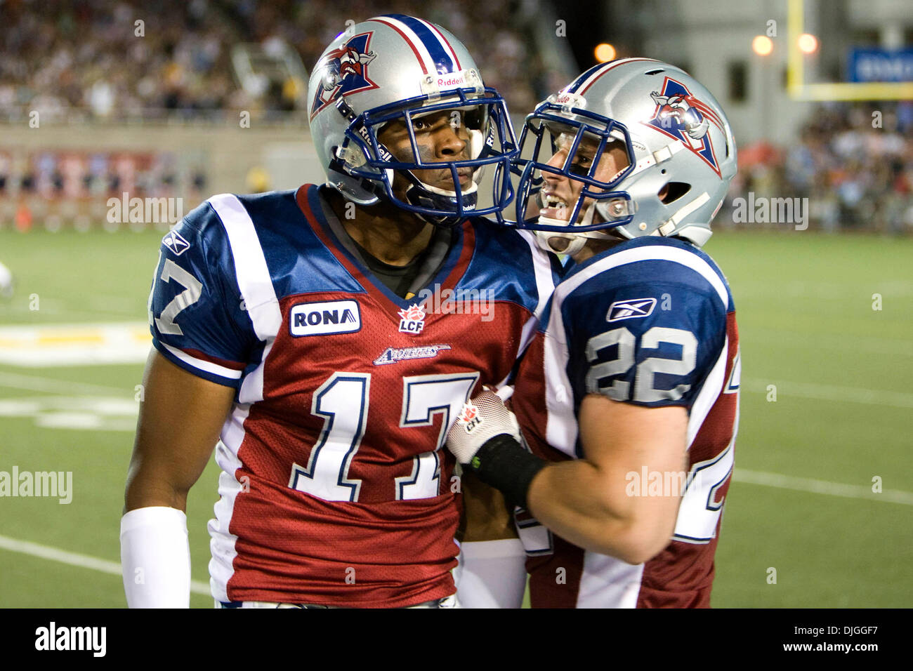
Montreal Alouettes - Home & Away - I don't know how the Als rebrand has been fully received, given that it's only been 3 seasons of the new look. I personally am undecided but I'm also not following the CFL super closely. One thing I am sure about is that the Als need different uniforms. The current ones are just meh.
- Helmet - Navy and white helmets, with the newer M logo on the sides, this time in 2 colors.
- Jersey - I was a big fan of the uniforms the Alouettes wore leading up to the rebrand, so that style returns in sort of a modified way, with some tweaks. Namely in the shoulder yoke flanked by two smaller stripes on the end of the shoulders. New number font that more closely resembles the wordmarks.
- Pants, Socks & Cleats - The pants have a shortened version of the shoulder yoke leading up from the bottom of the shorts and ends about in the middle of the thigh, with the roundel logo at the hip. Socks similarly match the shoulder design, all colors of cleats.
Montreal Alouettes - Alternate & Heritage:
- The alternate for the Als inverts the shoulder design to the sleeve caps, again similarly mimicking the previous uniform set, but doesn't deviate too far from the new design.
-
With such a heavy influence from the previous set in the main uniforms, the Heritage uniform for the Alouettes goes back further, celebrating the early days and dominance of the team in the 60's and 70's.
- Helmet - The 1960-1969 wings return to the white helmet, this time flanked with a blue outline. I also included the four logos from the 2019 rebrand on the rear of the helmet, just above the ridge. I was a fan of how it looked when they put it on the new navy helmet, and thought it would work on a heritage uniform like this.
- Jersey - the jersey (and red on the whole of the uniform) comes from the darker appearance of the red from the throwback logos used on the helmets in 2018(IIRC). Stripes come from the 1971 uniforms, when the team wore green and red. I did want to include green in some capacity, but I didn't like the end results. Double outlined numbers come from the early 2000's-2010's.
- Pants & Socks - Pants go simple, an asymmetric double stripe, coming from the aforementioned 2000's uniform cuff stripes. Socks match the jerseys.
Montreal Alouettes - Apparel:
- The everyday apparel for the Alouettes is a lot of "rouge et bleu". It was also a chance to see how the logo reflexes, with some of the merch going for the outlined approach, or the two-toned look, or the more "official" roundel logo.
- The heritage apparel for the Als, is the same but a "rouge et blue differents". This merch utilizes the 70's wordmark, slightly tweaked on the A and the S with the four single color logos above it.
- Designers Choices - I'd have to go with either of the shirts: I love the blue heather pattern, but I also love the wordmark over the logo look as well. On the throwbacks, the hoodie is my choice, the colors and stripes are the winner for me.
C&C welcome!
-
4
-
5 minutes ago, LA Fakers+ LA Snippers said:
I thought I would hate this, but surprisingly I don't. Though the whole number being chrome/reflective does seem like a bit much, maybe just the outline would suffice.
-
4
-
-
16 hours ago, Nordiks_19 said:
The Flyers brining Cooperalls back for warmups is cool. It would have been cooler still to see an approach like this, with the stripes down the sides of the pants and socks to simulate the look, something Burnsville HS did in Minnesota not too long ago:
-
6
-
-
1 hour ago, riccirulesall said:
I'm hoping that if the blue jackets can roll out two pairs of pants on a full time basis combined with all these reverse retro looks and regular throwbacks with different pant colors that more teams can follow suit for home and away pants. i know it's gotta be quite a bit more of a hassle for the equipment team, but we all know so many teams could benefit from it
namely, colorado, san jose (even though I don't mind the all-teal at all), carolina, a theoretical full-time anaheim look based on reverse retro. probably some more I can't think of
I think pant shells could also work in certain circumstances to mitigate bringing extra pants along on the road. orange shells that go over black breezers would work for the Ducks.
-
20 hours ago, upperV03 said:
I’ve grown really tired of Boise State’s current set. The black uni is obviously the worst of the bunch, but I just don’t care for the slanted stripes anymore and especially dislike the overemphasis of silver. Doesn’t help that the slanted stripes are one of the most commonly used catalog/Nike Team designs. Can’t tell you how many high schools I’ve seen using it, and even other universities like Bowling Green and Toledo (don’t think Toledo uses it anymore, but they did).
It was bizarre (to me at least) that it became a catalog option less than a year of BSU revealing the uniforms.
17 minutes ago, Brave-Bird 08 said:Boise State really needs to wear plain jerseys -- their horse logo and colors do enough. Even keep the number font, but take off the slanted sleeve stripes and drop silver.
Should wear all-blue at home and white-over-orange on the road with alternates sprinkled in every once in a while.
But alas, in this era, not being able to wear a different uniform every week makes you obsolete.
Unpopular opinion possibly:
The Pro Combat uniforms (not the grey ones. love them, but just a little too much going on for regular use) were a good starting point to go off of. The stripes were better than what they replaced but they've gotten stale real quick.
-
1
-
/cdn.vox-cdn.com/uploads/chorus_image/image/71751828/usa_today_19625613.0.jpg)


College Football 2022
in Sports Logo News
Posted
Hated it from the moment they announced it.
the inverse combo is more palatable ... even though its still BFBS