


colinturner95
-
Posts
3,399 -
Joined
-
Last visited
-
Days Won
8
Posts posted by colinturner95
-
-

I still have yet to figure out what was so wrong with these, not counting the unnecessary addition of anthracite. Did they have a San Jose Sharks moment and think the shoulder insets were weighing their players down? It wasn't helping them beat UW.
-
 15
15
-
-
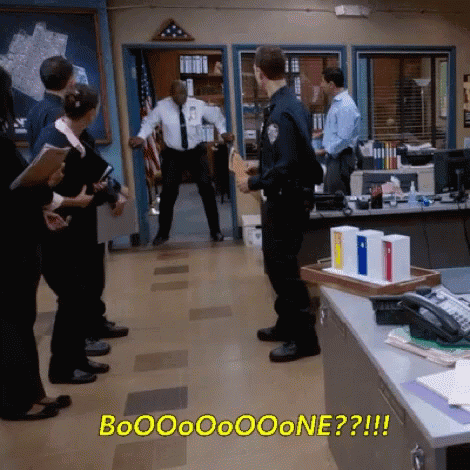
2 hours ago, Indigo said:
Bone.
-
2
-
 1
1
-
 5
5
-
-
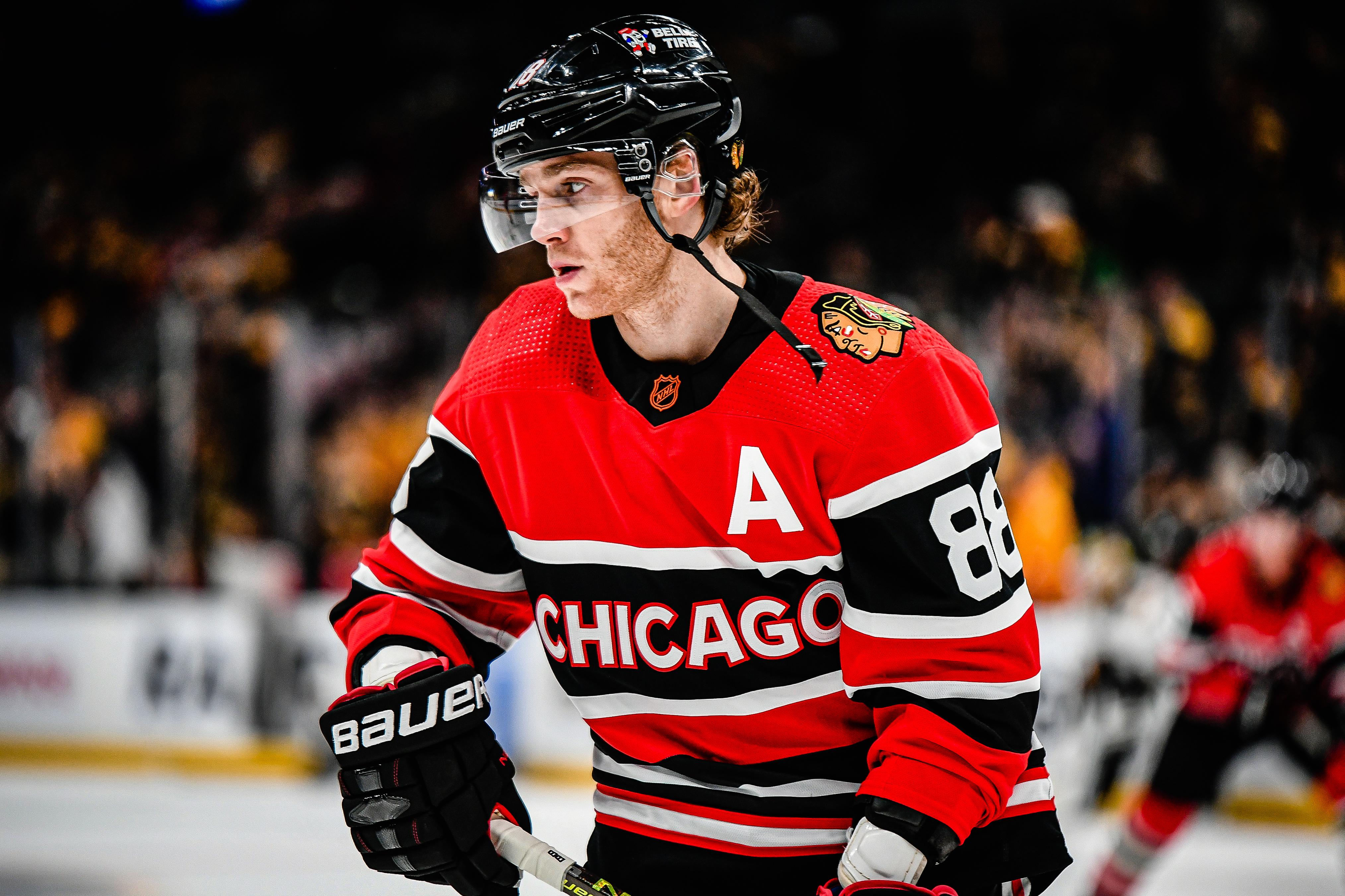
21. Chicago Blackhawks
In the time since I put my rankings together to now, these uniforms have grown on me a lot. And looking through the uniform history for the Hawks, they did the best that they could. HOWEVER, as a Red Wings fan, I'm going to let my homerism show and rank them lower because I think the two team's uniforms are similar and I'm gonna take the Wings over the Blackhawks any day.
In the last ride for the Captain, the Blackhawks go all the way back to the beginning. Taking the day 1 uniform, flipping it white and adding red to the uniform. In the crest, I went with the Winter Classic version, and added the feather colors from the modern logo to the detailing of the vintage logo. Also in the shoulder stripes, I reduced the number of stripes and it turned into the current white uniform sleeve stripes, which I felt was a nice tie into the current look. Otherwise, red gets added into the stripes, and the pants as well. I also went with a black helmet, something I liked from the 2017 WC uniforms.
C&C welcome!
-
6
-
-
11. Twin Falls Bruins - Est. 1907 - Twin Falls, ID - Classification: 4A
Twin Falls is the largest city in the Magic Valley, and correspondingly, hosts the largest enrollment among the schools in the Great Basin Conf. Before Canyon Ridge opened in 2009, they had an enrollment upwards of the 1300 benchmark, placing them in the 5A class, and have since moved down to 4A with CR splitting the city. Though now their enrollment is nearing that benchmark again, meaning a reclassification is likely on the horizon. Outside of their high school, my uncle has lived in Twin Falls for some time now, almost 25 years, even though the family warned him against it and he claimed it "would be a good change of pace and advance his career". It's been neither of those things.
Athletically, it didn't really matter in what sport, we always seemed to see Twin Falls in a state tournament. Especially baseball, when in 2014 they knocked us out in the semifinals, en route to a state championship. In recent years though, Twin Falls has been on the other end of the spectrum, feeling the pain of having their season ended by my high school. As for me personally, I think my only athletic interaction with TFHS was in lacrosse, which didn't go super well for them.
Twin Falls Bruins - Identity: Twin Falls makes use of a light blue and silver as a tertiary color, depending on which team you ask. The former is gonna conflict with two teams from the eastern side of the state, and the latter is too reminiscent of the teams up north. So I decided to take the Filer route and go simple and classic.
- Colors - Navy blue and white. Only two colors for the Bruins.
- Primary Logo - The baseball team lends a lot of inspiration, and as such, their TF monogram is the primary logo.
- Secondary Logo - While I wasn't initially planning on a Bruin logo, I caved and added on as a secondary logo, with Twin Falls spelled out above.
- Wordmarks - Baseball style wordmark.
- Jersey Fonts - A classic block font, with internal cuts for a vintage feel.
Twin Falls Bruins - Uniforms:
-
Home - Away: I liked the Bruins' baseball uniforms, and wanted to work the pinstripes/pinstripe mofif in there somehow without doing it very literally and avoiding a Notre Dame Stadium Series look.
- Jerseys /Socks - The result ended up with a lot stripes on the sleeves, simplifying out on the hem. I did try adding the secondary logo to the sleeves, but it looked very cluttered if you looked from the shoulders down. Socks get the full bevy of stripes. TF logo on the chest.
- Equipment - White helmet with the wordmark on the sides. Navy pants with the double stripe from the hem, secondary logo on the pant leg. Navy gloves with white cuff.
-
Alternate
- Jersey/Socks - In a similar situation to Filer, a fauxback style uniform, though Twin Falls eschews the idea of vintage white. This uniform was inspired by the Oshawa Generals teams of the 70's (very random, I know, but I was looking through CHL historical uniforms and it clicked for me). The lots-a-stripes goes away in favor of a northwestern stripe and sleeve caps, and the TF logo goes away for the Bruins script.
- Equipment - no changes to the equipment.
C&C much appreciated!
-
 1
1
-
1 hour ago, BJ Sands said:
Unpopular opinion: the script Terps uniforms suck and going back to them is a severe over-correction.
they aren't bad uniforms, but I agree with them being an over-correction.
MJWalker used this image already, but below the neck, this is a good look. If they sorted out the helmet, or used the pennant design again or the banner from the M logo, it would have been a good modern uniform.
-
1
-
-
10. Preston Indians - Est. c.s1940 - Preston, ID - Classification: 4A
You might be more familiar with Preston High School than you might think. Have you seen the 2004 film Napoleon Dynamite? Well, it was filmed at Preston High and written by Jared and Jerusha Hess, where the former attended high school! One of the more fun facts about cities in Idaho.
When it comes to athletics, Preston moved up to 4A in 2008 and surprisingly, when it came to state competitions, we never saw them against my high school teams, but they certainly have made a name for themselves at the 4A level, having won 4 out of the last 7 boy's basketball state titles.
Preston Indians - Identity: In a remarkable change of pace from the first three quarters of the Great Basin, a team not using red or orange as a primary color.
- Colors - Blue and gold are the main colors. Preston has been largely omitting gold in their athletic uniforms in recent days, and it needed to make a strong comeback.
- Primary Logo - Replacing their fairly non descript indian head logo is a letter P with feathers attached to the top of the letterform.
- Secondary Logo - A new non descript Indian head logo that IMO, is an improved version of the Moose Jaw Warriors old logo (closest comparison I could think of)
- Wordmarks - A western style font for INDIANS with a more classic block font for PRESTON
- Jersey Fonts - No frills, just a classic block font.
Preston Indians - Uniforms:
-
Home - Away: Preston football for a long while, had used a gold helmet with a recolored FSU spear. I didn't keep the spear but I kept the double stripe from the spear.
- Jerseys /Socks - Pretty straight forward. Double stripe around the sleeve and hem. P logo on the chest, Indian head on the shoulders. Double stripes also on the front and back of the shoulders. The nameplate does oddly obscure the back stripes. In my head, Preston isn't a high school that's putting names on the back of jerseys, put I'm just staying consistent.
- Equipment - Blue pants with the same stripes as the jerseys. Gold helmets, blue gloves with gold fingers and cuffs.
-
Alternate
- Jersey/Socks - It bears a resemblance to the Maple Leafs all-white Stadium Series uniforms from a few years back, but it strangely works for me. White is largely minimized, as gold takes over as the main color. Stripes pare down to one color and now run across the chest with PRESTON now on the chest.
- Equipment - no changes to the equipment.
C&C much appreciated!
-
1
-
I love the idea, kind of a blend of the Dynasty Pats and the Patriot Pat shoulder loop designs. I do agree that the template is a little dark, but I do love the presentation.
-
23 hours ago, TrevorBotting said:
I definitely understand the “why” behind name changes. Money, branding, etc. but the nostalgic part of my brain thinks that keeping the name just adds so much history to the entire franchise.
I am also well aware of being on the losing end of the discussion.
And I gave Dallas a pass because they kept Stars but dropped the North. But c’mon, the Dallas North Stars? That’s gold. It makes zero sense and is an automatic conversation starter/trivia answer. I say lean into it. Same with Colorado Nordiques. It just gives the whole franchise a layer of something completely different to that area. Suddenly, the fleur-de-lis is a symbol for hockey in Colorado!
Maybe I flip this over to the concepts boards. A current league where all teams kept original names when they moved.
In some cases the history does help keep names through a relocation.
Unfortunately for the Nordiques, they only won 1 championship in the WHA and in 23 years between the two leagues, 4 division titles.
Plus the fact that Denver =/= North and with the Fleur De Lis being a feature of the Quebec flag, keeping that around after the franchise moved would be a huge middle finger to Quebec.
-
2
-
1
-
-
13 hours ago, stm869011 said:
I'm not a new user. I've been a user on this board for 19 years, but my old account was locked so I had to make a new one. You know how annoying that is.
Anyway, have any teams announced if they will wear their alternate jerseys in the postseason? Unless I missed it, I haven't seen anything.
In surprising news from the Canes, they'll wear the throwbacks at home in the playoffs
-
7
-
2
-
6
-
-
5 minutes ago, TruColor said:
Keep in mind that I'm only saying this based on what has been described to me. I have not actually seen the uniforms. I have seen the helmets (with decals), but sans facemasks. The facemasks have been described to me by two different sources which described them exactly the same.
I do have the Pantone values (and the silly Nike-speak color descriptions) for the new color palette, but they also raise more questions in my mind.
I'm still adopting a wait-and-see approach with these for sure.
nothing about what you've said here gives me any hope for these uniforms. especially when you said their more out of the box than the Commies...
-
6
-
-
9. Mountain Home Tigers - Est. c.1900s - Mountain Home, ID - Classification: 4A
Good old Mountain Home. For me/family, on trips headed eastward, it was the first stop for food, drink, bathroom breaks. For everyone else, it's one of the ways go get up to Bruneau, home of the "tallest single structured sand dune (which I can say I have climbed), or Sun Valley, should you like that snobby tourist trap. Or like to ski. Mountain Home is most known for it's Air Force base, and for being the hometown of former NFLer Korey Hall, for you Packers fans.
Mountain Home athletics often got my classmates out of class 2-3 hours early, given the 45 minute to an hour drive it took to get there. Other than that, MH was never given much respect. They've won two state championships in their school history, which predate my time at my high school. Otherwise, it was often looked at as a free win or wins whenever Mountain Home was on the schedule. Around 2016,-17,-18 they were moved from the Southern Idaho Conference to the Great Basin, which I think was a good move because it put them in league with schools they have a better competitive balance with.
Mountain Home Tigers - Identity: It's the other black and orange team named Tigers! In a similar vein to Jerome, Mountain Home has used Towson's logo for longer than I can remember, which I also kept around here.
- Colors - Black and orange stick around.
- Primary Logo - Towson's recolored logo sticks around and actually sees use, unlike what I did with Jerome.
- Secondary Logo - A classic, varsity letter looking logo, an interlocked MH.
- Wordmarks - A simple Tigers script.
- Jersey Fonts - Mountain Home got a classic(ish) jersey look and a classic jersey font follows. Single color numbers and letters.
Mountain Home Tigers - Uniforms:
-
Home - Away: An idea I've had for a CHL team for some time now that might see the light of day one of these days, but for now, works well for Mountain Home's hypothetical hockey team.
- Jerseys /Socks - A pretty simple uniform when it comes down to it. Single color stripes around the sleeves and hem. Subtle tiger stripes down the sleeves. Tiger logo front and center.
- Equipment - All black pants, MH logo on the pant legs. Black gloves with orange cuffs.
-
Alternate
- Jersey/Socks - It is a color swap but the tiger stripes move to inside the stripes. Tigers script moves to the chest.
- Equipment - no changes to the equipment.
C&C much appreciated!
-
22. Tampa Bay Lightning
As I wrote on my notes for these: "unique does not always equal good". The "thunderstorm" uniforms, for lack of a better descriptor, worked when the base of the uniform was blue, but switching the blue for white creates a weird color balance that IMO does not work at all. Points for going for it though.
I personally think this is one of my better uniforms in my time on here, granted it was just a Reverse Retro but still. An all timer for me IMO. Most of you might have already seen the blue version of this one I've done in the past. In keeping with the real life Bolts, this time the uniform goes white, with blue and black stripes around the arms and chest, with a blue double stripe on the hem. This time, since I forgot on the last RR thread I did, the team's current logo on the sleeves as opposed to my reworked logo from the NHL Nike series.
C&C appreciated!
-
3
-
-
yeah i think the Tennessee hat works best in all orange. maybe try the all orange with the outline of the logo in the light blue?
-
1 hour ago, Pigskin12 said:
I could’ve sworn everyone on here hates gradients.
there's a fine line for when gradients work on a sports uniform. A razor thin line too often crossed too far.
-
8
-
-
On 4/2/2023 at 11:35 AM, edjb93 said:
I'm now weighing on which logo should suit the Montreal Maroons better.
Option A - Inspired by collegiate logos (e.g. Manhattan, Mississippi State)
Option B - Block M with a Rose of Lancaster (from the flag of Montreal) at the front, supposedly to represent the English population (original fanbase of the Maroons as to the French speakers for the Canadiens)
Option C - Block M with inner and outer outlines
Let me know which is better. Thanks in advance!
Option B is nice, but the rose does obscure a lot of the M, but the rose could function as a nice secondary. Is there a way we could see option A with a outline like option C?
-
1
-
-
8. Minico Spartans - Est. 1955 - Rupert, ID - Classification: 4A
Minico HS serves about 6 towns in Minidoka County, which is where we get the name Minico: Minidoka County. And for those of you familiar with history, the name Minidoka should sound familiar as the home of a Japanese American internment camp during World War II. In a much less macabre historical fact, the Minidoka Dam was a direct result of the first Bureau of Reclamation project in Idaho, which is directly responsible for a lot of the irrigation and by extension, farming economy in the south central part of Idaho.
As for the Spartans, they were a powerhouse in the early 2000's, winning a handful of state titles in various sports. One of their predecessor high schools (Rupert HS) won one of the earliest state basketball titles, way back in 1925.
Minico Spartans - Identity: While they are named the Spartans, it does seem like they phased out using Michigan State's logo. which resulted in something of a combination of Michigan's block M and Michigan State's wordmark. As a Sparty fan, it made me shudder.
- Colors - The red sticks around, but the gold changes to more of a USC/Michigan shade from its previous color of a more old gold/New Orleans/Purdue color.
- Primary Logo - They've been using this logo in conjunction with the UM/MSU combo logo. I liked it, and kept it as the primary logo.
- Secondary Logo - I don't know why they went away from this in favor of that combo logo, but I cleaned up the script and reshaped the M.
- Wordmarks - The script is nice, but I did want a wordmark set that wasn't script, and VTF League fit the bill of what I wanted.
- Jersey Fonts - VTF League felt good as a base to start and with some tweaks, also became the number font.
Minico Spartans - Uniforms:
-
Home - Away: Another case of some direct inspiration from a Minnesota high school, this time from Prior Lake, just with no navy and not so much in the overall uniform.
- Jerseys /Socks - I don't quite remember the direct inspiration, but I ended up with an angular stripe look that carries from the sleeve stripes onto the body of the uniform, where the stripes fill out onto the bottom of the hem. Spartan helmet logo on the chest, M-Script combo on the shoulders. Socks match their jerseys.
- Equipment - Gold pants! and Gold helmets! I felt like the gold was dark enough while simultaneously being bright enough to work as the primary pants color. Gloves are a bit more traditional, sticking with the red as the base with some gold thumb coloring.
-
Alternate
- Jersey/Socks - another color swap. I didn't like any of the stripe variations I had come up with. The only real change is the logos swap places.
- Equipment - no changes to the gloves and helmet. red shell covers are introduced, all gold was a little much.
Let me know what you guys think about these or any of their Great Basin conference mates!!
-
as a curious American, is the tape on the helmet a decorative thing among Canadian minor hockey or does it serve a larger purpose ?
-
15 hours ago, nash61 said:
New Grey Cup logo and template!
BEFORE:
AFTER:
The style is nice, but the GREY CUP font doesn't fit IMO
-
3
-
-
7. Kimberly Bulldogs - Est. 1916 - Kimberly, ID - Classification: 3A
Kimberly is another one of the smaller farm towns in the Twin Falls area, and I honestly couldn't tell you if I have been there or not. Though with as much family as I have in the Twin Falls area, I wouldn't be shocked if I have. Pretty similar story for a lot of these schools and me, they're a classification below, not much interaction, you've heard me say it more than a few times. Though I did have a coworker at Costco from Kimberly and apparently my high school's reputation was well known, even there. We'll touch on that in the next conference.
Kimberly Bulldogs - Identity: They're the Bulldogs, meaning they come with that g'durn bulldog logo every similarly named team uses! Spoiler alert, I did keep it.
- Primary Logo - Since I didn't want to use the Bulldog, I created a custom K letterform to serve as the primary logo.
- Secondary Logo - A bulldog logo. Yay.
- Wordmarks - Not the exact same as the primary logo, but a font that I felt captured a lot of the same essence I felt in the K.
- Jersey Fonts - A slightly wider than your standard block font block font, complete with the drop shadow the primary logo and the wordmarks have.
Kimberly Bulldogs - Uniforms:
-
Home - Away: The color balance was very much inspired by Duluth East's high school hockey team. There's something about a uniform set up where dark jerseys work over a lighter set of pants.
- Jerseys /Socks - I've liked a lot of classics for the teams in the Great Basin, and Kimberly is no exception, with a lot of inspiration coming from the NY Rangers. Most notably, in the stripes on the sleeves and hem and the shoulder detailing as well.
- Equipment - Red helmets. Red pants with a triple stripe up the side and the K logo on the front of the leg. Gloves are black, with a white cuff and red fingers.
-
Alternate
- Jersey/Socks - at it's base, it is a pretty straight forward color swap. biggest changes are the removal of the shoulder decoration, moving the K up to the shoulders and the baseball style logo treatment.
- Equipment - no changes to the gloves and helmet. black shell covers are introduced.
C&C welcome!!
-
23. Edmonton Oilers
I've been kind to a lot of these uniforms I ranked in the bottom 16. This one I was too kind on. For me, it was the timing of the switch back to the Dynasty colors, combined with keeping the navy stealth uniform, and the cherry on top was these. Now, I imagine that the plans for these uniforms were well in motion before Edmonton decided to switch home and roads. But having two navy uniforms, which IMO bear a strange resemblance to each other, even if one has way more white than the other, is not something I vibe with.
These are very much not from the Oilers history of uniforms. These come from the Edmonton Flyers of the WHL (the minor pro edition), who captured the Lester Patrick Cup in their penultimate season in the league. For the Oilers, a blue base uniform, with shoulder stripes, not unlike another Flyers hockey team. A reworked crest to say Oilers and a, lets call it, FU sized chest number. Fun fact about the Edm Flyers, "many future NHL stars passed through the Flyers organization. Among them were Al Arbour, Johnny Bucyk, Glenn Hall, Bronco Horvath, and Norm Ullman."
C&C welcome!!
-
2
-
-
6. Jerome Tigers - Est. c1920s - Jerome, ID - Classification: 4A
Finally, we're gonna start seeing some schools with some personal relevance to me. Jerome was in the 4A SIC (Boise Area) for a short period of time (for some random reasons I didn't know while I was in high school), which meant that if you played against Jerome, you got a half day of school because it was a 2 hour bus ride away. they weren't super competitive against us and they rejoined or joined the Great Basin and started playing Twin Falls area schools, which works out for the best for them IMO.
Other than that, my family has pretty long standing ties with the town. My grandma was born there, my great-grandparents lived there for a long time and are buried there. My uncle, whom we're barely on speaking terms with at the moment and things are getting better slowly, has lived in Jerome. So there's a little more history for me with Jerome all around.
Jerome Tigers - Identity: For as long as I can remember and to this day, Jerome had used a recolored Mizzou logo and to be honest, it felt weird to change it. But that doesn't mean it has to lead.
- Primary Logo - Pretty much what I said up above.
- Secondary Logo - I can't really explain why, but a Old English J felt like it was a good fit for Jerome.
- Wordmarks - Rather than a full gothic wordmark, something that bridges the gap IMO.
- Jersey Fonts - Classic block style numbers and letters.
Jerome Tigers - Uniforms:
-
Home - Away - Alternate: The impulse to go with tiger stripes was heavy, but in the end, I'm saving that for another team in the Great Basin.
- Jerseys /Socks - Very Canadiens inspired, with the chest stripe. Old English J on the chest, Tiger head on the shoulders. Stripe does not continue all the way around the back.
- Equipment - Black for the gloves and pants. Gloves have orange inset on the fingers, white helmets have the "Jerome" half of the wordmarks on the sides.
- Alternate - Just a color swap. I had an idea for a black and orange only uniform, but it encroached too much on another team's design that is forthcoming.
C&C welcome!!
-
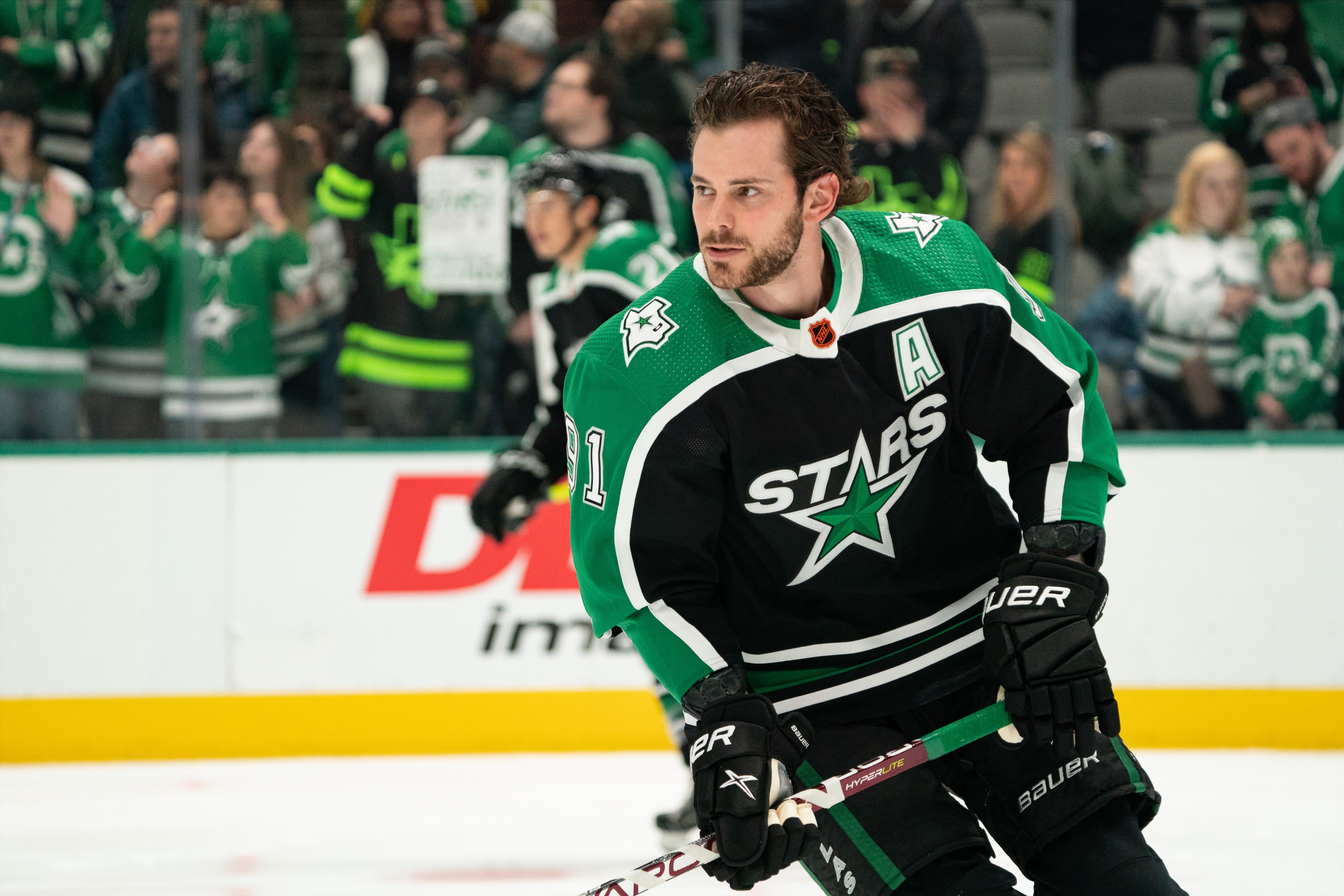
24. Dallas Stars
In my opinion, this jersey feels kind of lazy. Like, yeah it's something we've never seen, which is the whole point of the Reverse Retro program, but when compared to the uniform it's inspired by, idk, it just feels like we've seen this jersey before. I can't explain it better than that, it just feels like deja vu to me.
So for the Stars, I didn't deviate from the jersey choice, just the base colors. Went with green instead of black, flipping those colors. I also used the gold from the era just to give it a sense of retro, because IMO, the use of silver makes it feel more alternate than Reverse Retro.
C&C welcome!
-
4
-
-
The Idaho Hockey RV rolls on.!
5. Gooding Senators - Est. 1913 - Gooding, ID - Classification: 3A
Gooding, Idaho: known for being home to a barrel cheese factory, the home of the Idaho School for the Deaf and Blind. The town itself was named for US Senator/Idaho Governor, Frank Gooding, who lent his name and profession to the high school.
I've only ever driven through the town, so I can't comment on the town itself. The high school competed a classification below mine so there's no interaction there. But back when I was an athlete, I had a good friend and teammate that lived in Gooding and commuted about an hour and a half both ways for hockey practice.
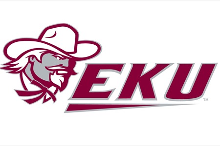
Gooding Senators - Identity: With one of the more unique nicknames in Idaho HS sports, I gave them, at least in my humble opinion, a much more befitting identity. They currently use a recolored version of EKU's logo. Unique, yes but doesn't fit with "Senators". Also, they use UA Falcon (or a pretty close variation) as a font, which clashes something fierce with the logo.
- Primary Logo - Rather than lead with a Senators logo, I chose the classic, high school route, with a simple extended G letterform.
- Secondary Logo - With some help from a D2 college in West Virginia, and despite personal reservations, I borrowed a more befitting Senator looking logo and fit it into a roundel, which to me, gave more of a sense of "late 1800's - early 1900's" which fit better with the namesake for the high school.
- Wordmarks - Nothing super crazy, just a nice set of wordmarks, one "Senators", one "Sens.
Gooding Senators - Uniforms:
-
Home - Away: With a nickname like the Senators, I felt that something similar to the NHL Senators would be befitting for the team. That said, didn't want to completely use their look, so it's not quite a barberpole look but it's something close.
- Jerseys /Socks - Like I said, barberpole but not quite. Skinny, repeating stripes on the sleeves, a simpler double stripe on the hem. G logo on the chest, Senator logo on the shoulders. Socks match the sleeves with the bevy of stripes.
- Equipment - Black for the gloves, helmets and pants. Gloves have red fingers, helmet has the SENS script on the side and the pants match the hem with the double stripe around the legs.
-
Alternate
- Jersey/Socks - A similar idea with the stripes, but definitely toned down some. The G is replaced by the Senators script, moving the G up to the shoulders. The stripes are pretty similar to the Stars' Reebok Edge 1.0 uniforms. Socks match like the sleeves.
- Equipment - matches the home and away
I personally think these are the best uniforms in the series yet, and definitely my personal faves so far. Let me know what you guys think!
-
1
-
1
-
Just now, WSU151 said:
That was before they had to design on-ice jerseys though!
they still let me in the door though. for obvious reasons I can't say a lot, and I know there's a lot of dissenting opinion on this move, but I'm at least excited to see the process through.
-
4
-


NFL 2023 Changes
in Sports Logo News
Posted
the Jets aren't great, but not the worst.
The rams, also not great, but minimizing bone and adding the modern throwback helped them suck less.
The Titans however, have no redeeming qualities. MDGP summed it up pretty well.