


colinturner95
-
Posts
3,398 -
Joined
-
Last visited
-
Days Won
8
Posts posted by colinturner95
-
-
11 minutes ago, GDAWG said:
So if Lacrosse was ever an Olympic sport, would the players from the Iroquous Nation be dispersed among USA and Canada?
https://www.cbc.ca/sports/olympics/iroquois-lacrosse-team-olympic-competition-1.5948810
They're trying to compete as the Iroquois Nation in 2028. The article mentions that they'd "have to prove to the International Olympic Committee that they represent a sovereign nation distinct from Canada or the United States."
I personally hope they get the chance.
-
 2
2
-
-
I feel like I've been away for longer than a week but I guess time would disagree with me there.
3. Emmett Huskies - Est. c.1930s - Nampa, ID - Classification: 4A
There are a lot of areas in Idaho that are growing pretty quickly, many of them are located in the Treasure Valley. Emmett is one of them. In fact a lot of my Costco coworkers were moving to Emmett from out of state or moving to Emmett from other areas around the valley. Emmett's biggest issue however, is that there is really only one way in and out of the town: Highway 16. biggest issue with 16 is that it doesn't connect to the Interstate and its intersection with Highway 20/26 is a disaster. However, they've since begun, probably the biggest road construction project in recent and probably all time, on widening/expanding and connecting 16 to the interstate with a whole gaggle of other improvements. Other than that, if you're ever in that area around early/mid June, Emmett hosts a wonderful Cherry Festival that is a lot of fun.
Emmett High School's enjoyed some modest success at the 3A level and within the last 10 years, made the move up to 4A. They had a few matchups with BK in that time, actually beating BK the year before I started going to school there. A couple years later they returned the favor. Now being conference mates, Emmett and BK square off more regularly. Emmett actually beat BK on the road for the first time ever in 2020 to secure their first 4A district title, en route to a state title game appearance.

Emmett Huskies - Identity:
- Colors - Blue and white. Nothing else. They've played around with black, but it feels very BFBS and I didn't like it.
- Primary Logo - I feel like this is a collegiate logo being repurposed but I couldn't find its owner (no pun intended).
- Secondary Logo - This logo started popping up since 2020, and while it's nothing more than a chopped up version of Boise State's B alternate logo, I think it works for Emmett as an E.
- Wordmarks - A script worked out well for the alternate jersey and so it stayed on as the wordmark logo.
- Jersey Fonts - Thicker than your average block font.
Emmett Huskies - Uniforms:
-
Home - Away:
- Jerseys /Socks - Emmett really sticks well to their blue and white, even with some occasional intrusions from black. The uniforms also stayed pretty simple, largely based on the northwestern stripe. That was a good place to start for me. So I brought the NW stripe over, and did a upper sleeve fill. Contrasting stripes on the hem and socks.
- Equipment - Blue gloves and helmet. White gloves. Felt like a good choice for our second team to rock the white gloves.
-
Alternate:
- Jersey/Socks - With no tertiary color, a second white jersey is my choice for an alternate. No contrasting sleeve colors. Stripes don't change. Huskies script and E logo now fill the chest. No changes to the socks.
- Equipment - It was bound to happen eventually. I know white pants are pretty taboo in hockey (I would know, my travel team wore white shells with our white jerseys for a couple seasons), but we got white shells on the alternate! I would hope that they'd only wear them with these jerseys and not mix and match if these were real, but we all know they'd get used with the blue jerseys eventually.
Let me know what you guys think!
-
On 6/23/2023 at 8:33 AM, TBGKon said:
Devil's advocate here....this may have something to do with the Adidas deal ending this upcoming season for production purposes.
based on the information I still think is accurate, we're still proceeding with the Military App & Hockey Fights Cancer designs at Fanatics, beyond that, that's all i got.
-
On 6/20/2023 at 8:51 AM, JohnnyCowboy5 said:
Alright I've sat back on these for a couple days now.
Things the new uniforms do right/good/better(?):
- The thicker shoulder stripe is a better look. The number not fitting inside the stripe always bugged me.
- I'm still not 100% sold on the new hem stripe, but the bottom of the jersey, from the sleeves to the hem feels much more cohesive now.
- The collar going all black also helps tie things together.
Things that maybe don't work as well:
- The single layer numbers on the sleeves I'm not sold on. Historical precedent, yes. Does it look good? I don't think so
- I know the gloves had a white cuff starting last season (I think) but they still don't fit the previous look and the new one.
- Keeping the Stadium Series alt. Just let it die already.
- Also, changing the hem makes the socks feel really out of place now.
I've already made my feelings known about the nameplates so not gonna bring those up. And I'll reserve final judgement until they hit the ice in them, which is why I didn't talk about the shade of orange.
-
3
-
15 hours ago, MNtwins3 said:
New uniforms for Washington
- Stripes added to pants
- Gold outline removed from home numbers
- Updated Adidas logos
- The tapered stripes suck.
- The tonal stripes suck.
- The single layer numbers suck.
It's actually making me miss these.
-
4
-
 1
1
-
 1
1
-
2 hours ago, Ark said:
Who likes the contrasting nameplates?
I mean, I do. It falls under the "little quirks in uniforms you like" for me.
-
4
-
 1
1
-
-
Since I'm here and I've finally shaken off the vacation rust, figured I'd give you guys the next team up.
2. Columbia Wildcats - Est. 2006 - Nampa, ID - Classification: 4A
If I didn't go to Bishop Kelly, I would have gone to Columbia. It was a close fight though with Skyview, as the dividing line for the boundaries was the greenbelt behind my house.
Columbia never really threatened athletically. By the time I was in high school, they were barely ten years old and still getting their bearings. Our football games with Columbia usually were double digit blowouts, and in more recent years, Columbia's baseball teams have been great, but ran into BK's teams in the state semifinals. However, they did make a early impact, by winning 3 wrestling state championships in a row from 2009-2011.
Columbia Wildcats - Identity:
- Colors - a darker than your average red, call it garnet? and gold. The school's colors since day one and no reason to change.
- Primary Logo - In the beginning, they used the K-State power cat as is and recolored. Recently, they've shifted to a modified version of it, with a little more uniqueness and dynamism. It also now comes with a Wishbone-C letter form as well.
- Secondary Logo - Removed the wishbone.
- Wordmarks - I wanted a font had some speed and motion and the old Army font worked well for that.
- Jersey Fonts - In contrast to the branding, I really liked a stout, vintage styled number font for Columbia.
Columbia Wildcats - Uniforms:
-
Home - Away:
- Jerseys /Socks - I don't really like anything Columbia does from a uniform standpoint. Too much BFBS. So a lot of this comes from scratch and the Edmonton Oilers to a degree. Triple stripes around the hem. On the white jersey, the bottom stripe extends out to the bottom of the sleeves and hem. Yokes have a stripe design. Adapted Power Cat logo front and center.
- Equipment - Garnet all around. Wishbone C on the pant leg.
-
Alternate:
- Jersey/Socks - I really had no idea what I was doing here. I didn't want to go down the BFBS road after I disparaged them. But I didn't want a simple recolor of the home and away. I ended up with something of a throwback look, with three bolder stripes on the sleeves and solid hem stripe. Ended up with an interesting chest treatment that splits the chest with the wishbone C and WILDCATS inside that.
- Equipment - no changes to speak of
Let me know what you guys think!
-
First off, it's nice to see at least one other person with a little bit of knowledge on these schools? I imagine you're living in the Treasure Valley or lived there for some time?
On 6/14/2023 at 1:24 AM, rknig1010 said:As someone that has worked at a lot of Idaho high school sports events in the past three or so years, this is a very interesting series, and I wish that some of these schools could take note of these design cues. With that said I have a couple of things that I want to note about the treasure valley schools, having spent most of my time around them.
Eagle has used the broncos logo for what seems like forever and it seemed like they were beginning to want to change it in the past year or so, because there were different Bronco-esq variations that were starting to be used. I distinctly remember the girls, and maybe the boys basketball teams, using a more rounded logo on some apparel, but it hasn’t seemed to catch on throughout the rest of the athletic department.
Eagle: That's interesting! I wish I'd have found that beforehand and tried to track down a more hi-res version of the logo because I'd have switched to that over the Broncos' logo. It actually looks like it was possibly rolled out around Thanksgiving '22 because the the Eagle girls bball switched over around the middle of December.
Makes me wonder if a full scale change is coming down the pipeline.
On 6/14/2023 at 1:24 AM, rknig1010 said:Funny you say that Meridian looks like if Michigan became a high school. I know of multiple meridian parents that have bought Michigan gear with the block M to wear to sporting events. The school is pretty shameless about using the block M in all sorts of athletic and non athletic use cases, especially as they have seemingly moved away from the warrior head in the past five or so years.
Meridian: funnily enough I used to work at a print shop and we did a lot of printing for Meridian Cheerleading, mostly their signs, stickers for their boxes, megaphone stickers, etc. From what I remember we were still using the Warrior head but that was back in 2019/2020 ish so I'm sure things have changed.
On 6/14/2023 at 1:24 AM, rknig1010 said:Mountain View is the school that I know the most about, for a number of reasons. Before I get into the design part, the school is only at about 2600 students as of last year, not 3500, but it still is a ton of kids and there has been rumors of another school being built on the south side of Meridian, but the school district has not even been able to find land for the potential school, much less build it.
The logo that is used as the primary currently throughout the schools athletics is somewhat like the Houston Texans as you mentioned, but unlike Eagle, there is a difference. Rumor has it that when the school was built in 2002 or so, the Texans were new into the NFL, so the logo was loosely based off of it. I personally like the MVHS version better but that is neither here nor there. The interlocking MV logo has really only been used by the baseball team and occasionally by the football team on helmets . The baseball teams has used it as their primary logo for as long as I can remember, so at least for the last ten or so years. It is a logo that does seem underutilized, but that is a decision that is above my pay grade. I am also not sure I have seen the Nebraska-Omaha logo being used before, but it could be something I just haven’t noticed.
The school as a whole has been pretty good at sticking with the kelly green, except for the football team which has a set of neon Seahawks style uniforms that they trot out every year for the homecoming game. They should remain in whatever storage closet they come out of, as it almost looks like they glow? They also come with reflective numbers, not unlike the ones Boise State uses.
I do think this uniform set fits with the school’s other uniforms very well, and would look great on ice, or off. Script is something all teams should implement, if used correctly, more often than they do, and it looks great with the triple stripe.
MV: I figured I was gonna get their enrollment numbers wrong. The IHSAA doesn't seem super quick on keeping things updated for the general public.
I see the differences in the logos now (MVHS vs Houston Texans). Should have seen that considering the Texans have a star as the eye on their logo. The interlocking MV does feel very baseball but IMO, it is strong enough to be a main logo or at least a secondary logo for all the sports. As for the UN-O logo, if I remember correctly, it was on a piece of apparel in a picture, possibly from a club sport parent. I'm not 100% sure. It also makes me think it wasn't commissioned by the school.
I couldn't agree more with you on the neon green. they should be buried and never seen from again.
On 6/14/2023 at 1:24 AM, rknig1010 said:This is a 100% true statement and I don’t understand how the school feels that old, with not actually being that old. They seem to have gotten a new gym in the past 10ish years maybe, and it is one of the bigger ones in the valley, but beyond that the school as a whole is just old.
I remember going to a football game that Capital played last year and there was no rhyme or reason to the helmet colors, except that there was more black helmets than gold. It just seemed to be random, which is something that I have never seen before, and agree that it might not be totally legal but they seem to be doing it with no issue.
With that said I think all of the other schools look great, and could most certainly take some design cues from this series. I especially think that the sets you made for Moscow, Post Falls and Mountain Home are really good and fit their schools well. Excited to see where the rest of this series leads!
I've never stepped foot in the school, and the closest I've been is the parking lot to meet up to drop off my brother so he could go with some friends on a trip to McCall. So I can't speak to how the inside looks and I'm pretty much judging a book by its cover here.
Yeah the biggest question I have is how they get away with the two helmet colors. I know its not like soccer where every uniform part has to have stark contrast due to what the refs have to see, but how does that affect the Capital players when they play schools like Rocky Mtn, Owyhee, and other schools with a black helmet?
I appreciate the extensive thoughts and glad you've been enjoying the series so far!
-
On 6/16/2023 at 3:10 PM, Germanshepherd said:
On one hand I'm glad that there's the potential that Boise State doesn't have to play them any more. On the other, I feel like BSU should be going with them but I understand that hoping and wishing don't mean much.
-
1. Caldwell Cougars - Est. 1901 - Caldwell, ID - Classification: 4A
Something I forgot to mention in the intro post, in stark contrast to a lot of the schools in the SIC East, the schools in the West have little to no hockey history of their own. Instead, most players who lived in Canyon County (where most of these schools are located) formed a large combined team called Canyon County, which for a time was one of the best teams in the state, winning a state championship in 2010 or 2011. Hard times fell on them after that, going seasons between wins.
As for Caldwell HS, the first team up here. They never really threatened BK at the athletic level, certainly not in football. I'm not sure that in the last 10-15 they've beaten BK, but I could be wrong. Caldwell's soccer team has seen a resurgence in recent years, after not having won the state title since 1985, have won it 3 of the last 5 seasons.
Caldwell has graduated a few famous alumni, probably most notably Joe Albertson, founder of Albertson's grocery stores, Randy Trautman, BSU I-AA National Champion and short lived CFL player and journeyman QB Cody Pickett.
Caldwell Cougars - Identity:
- Colors - Blue and gold have been Caldwell's colors for as long as I can remember and it works so no reason to change.
- Primary Logo - For a short time, they actually used the old Prince George Cougars' logo, recolored to fit their needs. They've since transitioned to using this line work logo, which works much, much better.
- Secondary Logo - I got vintage sort of vibes from the primary logo which led to a slab serif C logo as the secondary.
- Wordmarks - Same font as the secondary logo, spelling out the school and nickname.
- Jersey Fonts - Vintage block font, with a drop shadow (a lost art in athletic aesthetics today)
Caldwell Cougars - Uniforms:
-
Home - Away:
- Jerseys /Socks - Owning to the vintage feelings I got from the primary logo, that played a large influence on the jerseys, which are basically the Flyers' uniforms, just in blue and gold. Only difference there besides colors, is the double stripe on the socks and hem. I did something against the norm with the numbers and left it yellow on the white jersey, sort of like the Wild's first Reverse Retro.
- Equipment - Blue helmets, blue gloves and pants. Nothing crazy here.
-
Alternate:
- Jersey/Socks - Kept the Flyers influence present but shifted more to the 90's Lindros uniforms style. I guess these would be most similar to the black uniforms of that era. Outside of the change in shoulder decoration, and to the hem, the Cougar logo goes away in favor of the C secondary logo.
- Equipment - no changes to speak of
Let me know what you guys think!
-
 1
1
-
6 minutes ago, 4_tattoos said:
I hate the Waterdogs name so much. I know it's a real dog breed (which is not reflected in the logo), but I don't care. Out of all the dog breeds/names they could have gone with, they landed on Waterdogs? Seriously? I know they came into the league before the merger with MLL so they probably wanted to avoid anything too close to Hounds, but even something generic like Canines would have been a better dog name IMO.
since we're on the topic of names, I hope they don't rebrand a lot, or honestly, any of the teams when they settle them in cities. The original 6 teams have been growing a fan base for 4 years now.
Side note, some one pointed out that Cade Van Raaphorst had been released by the Atlas and it got me thinking that if a top level defender is getting cut, is it time for the league to consider adding more teams to spread the talent wealth out?
-
1
-
-
The other half of the Southern Idaho schools, this time we're looking at the 8 teams west of Ada County, in the aptly named Southern Idaho Conference - West. Crafty, I know. This is also the only conference with just 8 teams. There were a handful of 3A level schools that could have made the jump, but I decided against it.
- Unlike the SIC-E that was mostly 5A with a 4A member, this is the inverse with 7 of 8 schools being at the 4A level, with Skyview (bottom row, 3rd team) being the lone 5A member.
-
Not a lot of geographic oddities. A couple of clusters in Nampa with 3 schools, and Caldwell, with 2.
- Emmett does sit further out that most of the schools, being a 45 minute drive from Columbia. That highway you see next to Emmett doesn't currently connect to the interstate, but that problem is actively being fixed so that goes away.
- Middleton is also a little away from everyone, but is a 15 minute drive from Caldwell. So not that bad in all honesty.
First team up soon!
-
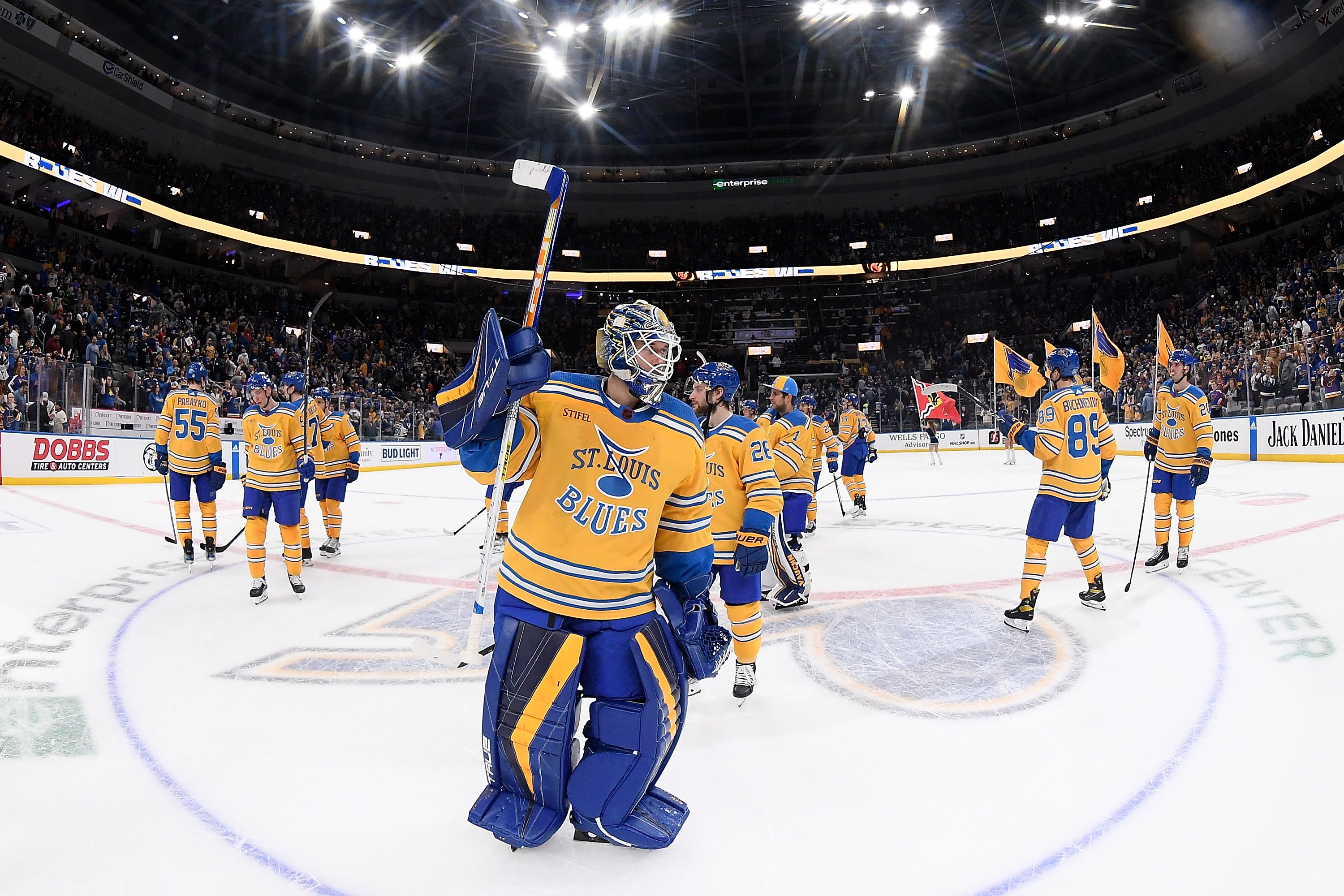
11. St. Louis Blues
These were so close to cracking the top ten. Taking a prototype jersey that never saw the ice and breathing new life into it. Crafty as hell. I really don't have anything against these, other than I felt there were ten better Reverse Retros in front of it in my opinion.
I didn't think I had a better option for the prototype jersey in terms of colors so I shifted to the first NHL franchise in St. Louis, the Eagles. While it might be better suited for an outdoor game, I took the Eagles' one jersey and flipped it blue and gold, using the Blues' original logo and the St. Louis arch from the prototype jersey logo.
Simple but elegant still.
-
2
-
-
We've reached the end of another conference, and that means it's time for another conference tournament!
Play-In Round:
- 2 really exciting games off the jump. #9 Meridian led 2-0 all game, Eagle clawed back to tie the game in the late 3rd period, only for Meridian to win the game less than a minute into OT. And Timberline upset their former partner in crime in another OT finish, capping off a hat trick effort to advance to the quarterfinals.
- Owyhee showed their youth against the establishment, posing no threat to Borah.
- The postseason edition of the Battle of the Mountains sees Mountain View end Rocky's season early with a resounding offensive output.
Quarterfinals:
- For the first time in these sims, the top seeds get some luck to go their way and seeds 1,2 & 3 had no issues, outscoring their opponents 17-2 en route to the semifinals.
- Centennial and Borah turned in the closest game of the round, needing less than 30 seconds of OT for Centennial to advance.
Semifinals:
- Top seeded BK wins one of the best games (that never happened) in IDHSAA history, winning 1-0 in an evenly matched game that was carried by BK's stifling defense.
- Here's the story about semifinal two: Kuna takes the lead late in the 3rd period, Capital responds to tie the game, Kuna then takes penalty and 14 seconds later, Capital scores the game winning goal in the dying seconds of the 3rd.
Conference Championship:
- For as good as the semis were, the Championship paled in comparison. Bk rode their stifling defense to a conference championship, only allowing 12 total shots on goal and their offense tuned up Capital to the sound of four goals to earn the auto bid to the State Championship weekend!
Designer's Notes:
- All in all, I felt it was a much more balanced conference aesthetically. Only color that was really missing was orange.
- Green makes a welcome reappearance, with 3 teams using it in some fashion.
- Gold also plays a large part, with 3 really distinct shades.
Southern Idaho West coming up soon!
-
12. Timberline Wolves - Est. 1998 (originally Les Bois Junior High, 1994) - Boise, ID - Classification: 5A
The final high school in the SIC East, and the most recent school to open in the Boise School District. This school serves the growing southeast area of Boise, which is quickly expanding into the Foothills of Boise, despite the concerns of building houses on the terrain. This is another area of the Treasure Valley that I'm surprised hasn't seen consideration for another high school. And maybe they are and I am not privy to the conversation.
The Wolves don't usually threaten athletically. My junior and senior year we did a "home and home", since we're in different classifications, and we clobbered them in our junior year meeting and blew it my senior year on a pick six and doomed 2 pt conversion attempt in overtime. Hockey-wise however, they were one of the dominant teams in the state. My travel head coach was the head coach there and most of my boys played for Timberline, and their combined team the T-Braves. They won the state high school championship in 2014 at my teams' expense. Was the cherry on-top to a pretty rough six month stretch.
Timberline Wolves - Identity:
- Colors - Blue and black are the primary colors. Silver is used as a trim color and a color primarily on the alternate jersey.
- Primary Logo - They've used this wolf logo as long as I can remember and I'm sticking with it.
- Secondary Logo - Another logo they've used in conjunction with the wolf head, and I just updated the T to match the font.
- Wordmarks - No nonsense block font.
- Jersey Fonts - Same as the wordmark, no nonsense.
Remember when Easton made hockey gear? for a time, they also made sublimated hockey jerseys and I guess the pro shop at the time got a discount on uniforms, because half the teams had horrible jerseys from them. Once they combined with Boise, if you remember from above, they went to the Rangers' template. They've since changed since then to a decent-ish look, despite the gradient jersey that I still contend is illegal.
Timberline Wolves - Uniforms:
-
Home - Away:
- Jerseys /Socks - So I mentioned the Rangers' look the combined team wore, and if Boise went back to their Devils' inspired look, the Wolves can take on the rangers look. Red is out, black is in. Wolf logo on the chest.
- Equipment - Blue helmets, three color gloves. I went back and forth on the pants option, seeing as I thought black and blue both were suitable options. Blue pants became the main option with the option for a black shell.
-
Alternate:
- Jersey/Socks - This is based on the current uniforms as the Rangers are out the window and more of a modern design comes in. Silver now has a more prominent place on the uniform, becoming the main stripe and taking on a dazzle like appearance, akin to VGK's gold jersey. T Wolf logo now on the chest.
- Equipment - no changes to the gloves and helmet. I showed it with the blue pants set, but I'd think the black shells would more likely be worn more often with it.
Conference Wrap up coming tomorrow!
-
4 minutes ago, bowld said:
Draft Hats are available and they used San Jose's old striping pattern/colors
 ... NHL really needs to step up their apparel game. They are by far the worst of all major sports when it comes to apparel
Hats don't fall under the creative stuff I work on at Fanatics, but with as far out as we try and get league stuff done, this probably was being worked on before they switched uniforms designs.
Still not sure who missed that though. Not my circus, not my monkeys.
-
1
-
-
Yoof. Overall, very underwhelming and bad.
The teams with new fonts feel goofy, mostly the Archers and Chrome.
The Whipsnakes went from top of the league to below last.
I'm disappointed that Chaos' jerseys got a lot less chaotic.
-
2
-
-
On 5/27/2023 at 2:02 PM, LMU said:
Member has been suspended for trolling, altering their username and profile to that of a known pedophile, and refusing to comply with the moderator team's demand to remove/request removal of profile changes.
The total length will be announced when all votes are cast.
That's a new one.
-
8
-
-
11. Rocky Mountain Grizzlies - Est. 2008 - Meridian, ID - Classification: 5A
Rocky Mountain opened in 2008 to help with the growth of North Meridian and help take some of the enrollment off of Meridian High which in turn helped to alleviate Mountain View all the way on the south side of Interstate 84. The result has been Rocky Mountain becoming the largest high school in the state of Idaho, taking the crown away from their Mountain mate.
In addition to being the biggest, they're also one of the most competitive schools in the state, usually appearing in the state semifinals or state finals, and either winning it or losing to one of the schools from the East side of state, whom we'll meet at as the last conference in the AA level.
As a hockey team, they combined with Eagle to be able to field a team and as a result were a very good team. Just not good enough to win a championship in my time. Or in my brother's for that matter.
Rocky Mountain Grizzlies - Identity:
- Colors - Purple and black stick as the main colors.
- Primary Logo - In the beginning, Rocky lifted the Memphis team of the same name's logo and in recent years have been using Central Arkansas' logo in place and I stuck with that.
- Secondary Logo - Full version of the primary.
- Wordmarks - RM interlock and a Grizzlies wordmark.
- Jersey Fonts - Modern font, less pointy than the wordmarks.
Rocky Mountain Grizzlies - Uniforms:
-
Home - Away:
- Jerseys /Socks - As good as a combined look can get I guess, Eagle and Rocky called their hockey team the "Eagle-Rocky Horse Bears", which is a pretty good amalgam of the two identities. Rocky's identity gets the colored jersey look and Eagle fills in the white jersey look. That however is not needed here. Rocky's football team wore Baylor recolors for the longest time with the paw on the sleeve caps. I took the paw off the caps and put it on the ends of the jersey sleeves with a stripe above them. Similarly weighted stripe on the hem. Grizzly logo on the chest.
- Equipment - Black pants with the paw on the side, black gloves and purple helmets.
-
Alternate:
- Jersey/Socks - This was the original idea for the home and away but was relegated in favor of the paw design. The sleeve decoration basically flips to the upper part of the sleeve and the full bear logo is now on the chest.
- Equipment - no changes to the equipment.
C&C appreciated!
-
On 5/27/2023 at 2:55 PM, 4_tattoos said:
Looks like there's new helmets this season in PLL. Not a fan of them changing the Archers' blue helmets.
I'm glad there wasn't a lot of wholesale change this season. I do like the mohawk stripe for the archers but the A on the side is weak, I agree.
The 'Dogs script on the side of helmet is nice. Now I hope they don't ruin the Chaos' uniforms.
-
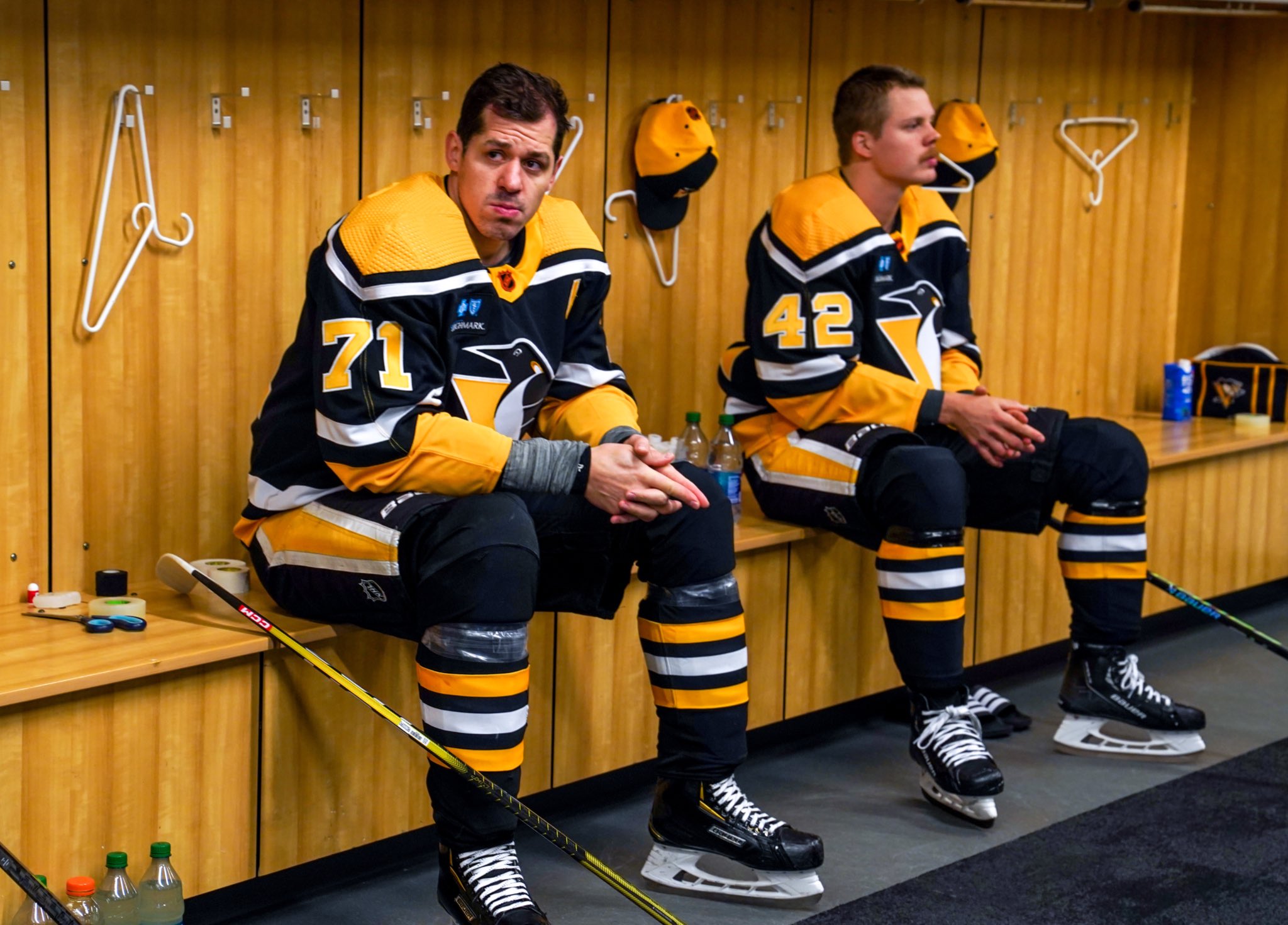
12. Pittsburgh Penguins
Robo Pen rockets this up the lists for me (and I personally think its the better logo, but that's is neither here nor there). What does this jersey in for me against the remaining 11 teams, is that it feels unnecessarily busy and that mostly comes from the pants I think, since the team opted for the same home and away pants instead of the blank pants worn with the original uniforms. Besides that, I just don't think it's better than the jerseys I have in front of it.
Rather than solve the easy problem and just go with blank pants, I shifted to the more unique uniform from the same era, going for the asymmetric, gradient jersey in some new colors:
- Option A sees the base go gold, which shifts the yellow and black around.
- Option B goes white, coming along with a darker gradient to offset for the lighter base.
- Option C was a late edition, going back to the day one colors, even giving Robo Pen a color swap.
C&C welcome!
-
7
-
2
-
10. Owyhee Storm - Est. 2021 - Meridian, ID - Classification: 5A
The baby amongst high schools in the Treasure Valley as well as Idaho at large. With Meridian's population continuing to surge, particularly on the north side of our main freeway, plans went in pre-pandemic for a 5th Meridian high school in the West Ada School District. Delayed by just a year, Owyhee (oh-why-hee) opened in fall 2021 with an enrollment of 1800 students.
The school's athletics nickname garnered some local attention. Originally the plan was to be the Thunder, and logos were completed and ready to go for opening. Until Eagle High School raised oppositions due to their stadium being named Thunder Stadium. This lead to the team becoming called the Storm and logos were reworked, and not necessarily for the better. Logo snafu aside, the Storm have made themselves known in the state, winning the state basketball championship in their first year and just completed a back to back in state baseball.
Owyhee Storm - Identity:
- Colors - Red is their primary. They've already floated between using grey or black as a secondary. I led with black as the secondary but greys show up in logos and uniforms as well.
- Primary Logo -Having changed from the Thunder to the Storm, new logos were needed and the one they went with... well, sucks. It's a weird combination of abstract hurricane marks and the Oregon O. Instead of that, a wordmark logo with a hurricane logo (I'm pretty sure its the Cincinnati Cyclones logo. One of their club teams was using it in a capacity).
- Secondary Logo - Pulled the hurricane logo out from the wordmark.
- Wordmarks - OHS with a gradient to the left of the letters.
- Jersey Fonts - Call it a modern font that fits the "stormy" vibe.
Owyhee Storm - Uniforms:
-
Home - Away:
- Jerseys /Socks - With no hockey history to build off of, or any history for that matter, I went from scratch on these. I thought that with a wordmark-built logo, a chest stripe was a good way to accent that, and so a Florida Panthers looking jersey is born. Socks have the same stripes.
- Equipment - Navy pants and helmets, both with the OHS logo on them. Red gloves felt better than back did.
-
Alternate:
- Jersey/Socks - A completely different spin. I took the gradient from the alternate logo and blew it up to fit on the sleeves and on the side panels, because everyone loves side panels on hockey jerseys! OHS takes center stage on these jerseys.
- Equipment - no changes to the equipment.
C&C appreciated!
-
19 minutes ago, monkeypower said:
There aren't great?
They're supposed to be oars I gather, but Oregon Argonauts.
So they abandoned navy?
-
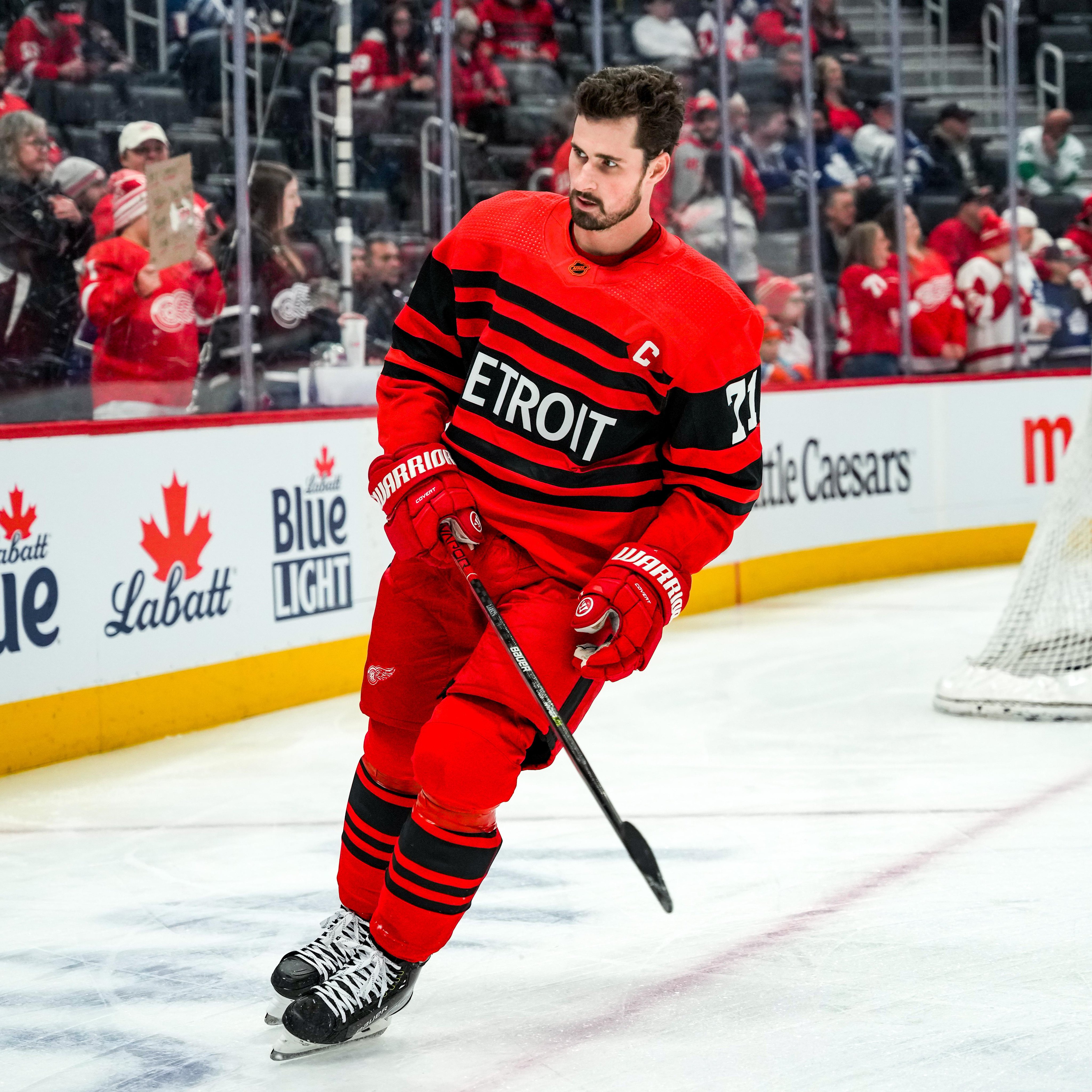
13. Detroit Red Wings
My homerism is about to shine bright like a diamond. I wasn't sold on these at first but after seeing them in action, I think their better than people gave them credit for. If they didn't use black and just went with a straight color swap, easily top-5 or best in show. But since the black is there, more middle of the pack. Even I couldn't justify putting them above most of the Pacific Division uniforms.
- Option #A is the logical choice, just eliminating black and going for a color swap.
- Option #B is the unhinged option, going for an all-black look with red stripes and white numbers
The new option, which isn't that new since it came from my Nike NHL series goes back to the 1928-1929 Cougars uniforms, this time going red with a retro Red Wings logo and the fonts and script from the 2014 Winter Classic uniforms.
C&C appreciated!
-
2


Idaho High School Hockey - The Conclusion
in Concepts
Posted
Yeah it was after looking at it again. I did the suggested fix and moved the E to the shoulders.