


colinturner95
-
Posts
3,402 -
Joined
-
Last visited
-
Days Won
8
Posts posted by colinturner95
-
-
Just now, WSU151 said:
That was before they had to design on-ice jerseys though!
they still let me in the door though. for obvious reasons I can't say a lot, and I know there's a lot of dissenting opinion on this move, but I'm at least excited to see the process through.
-
 4
4
-
-
1 hour ago, WSU151 said:
I would guess that Fanatics put sales data in front of the league that showed them to reputable.
Fanatics sells a
 ton of replica jerseys, especially WC/Stadium/RR versions.
Nike probably didn’t want to get involved with hockey if it couldn’t make (or put its mark on) replica jerseys (and let’s face it, Swingmans are made with ultra cheap materials these days so there’s no guarantee hockey replica jerseys would be any better (unless you love really thin, single-layer-no-stitches-except-fake-stitches heat-pressed twill))
This change seems like a pretty decent opportunity for the prominent hockey concept guys on here to badger Fanatics for a design job.
I mean I applied 3 times for a Fanatics job before they finally got sick of seeing my name pop up.

-
3
-
-

4. Filer Wildcats - Est. 1922 - Filer, ID - Classification: 3A
Filer is a small town, in the Twin Falls metro area (if you can call it that), just west of the Junction for Highway 93. For those that don't know, if you want to shave an hour off of a trip to Vegas, and drive through the desolate parts of Nevada too. My uncle also lived there for some time, never finished the playroom upstairs in that house. As for athletics, they played a classification below my high school, so outside of personal reasons, Filer was just another town on the Idaho map for me.
Filer Wildcats - Identity: For starters, I'm gonna try and flesh out schools more than I have been. So that should mean 2 logos and a wordmark, 3 logos, or something like that. For Filer in this case, they keep things very simple. They list blue as a color they use, but their teams barely use it all. So Filer is our first team to just use two colors exclusively. They also use a Wildcat logo sparingly but I liked it in place of the block letter F, because the Great Basin is full of letter logos. The Block F does stick around, as well as a script Filer wordmark.
Filer Wildcats - Uniforms: Sticking in line with the classic theme, very simple uniforms for Filer. Northwestern stripes around the sleeves and hem line. Wildcat logo on the chest, F on the shoulders. While nothing is inherently throwback about Filer, a throwback uniform did feel very fitting here. Still very on brand, northwestern stripes all around on a vintage white base, slightly offset chest stripe, Filer wordmark on the front.
C&C welcome on these and any of the other Great Basin teams!
-
1
-
-
Not crazy about the wordmark and number font, but this is already better than what they actually have
-
1
-
-
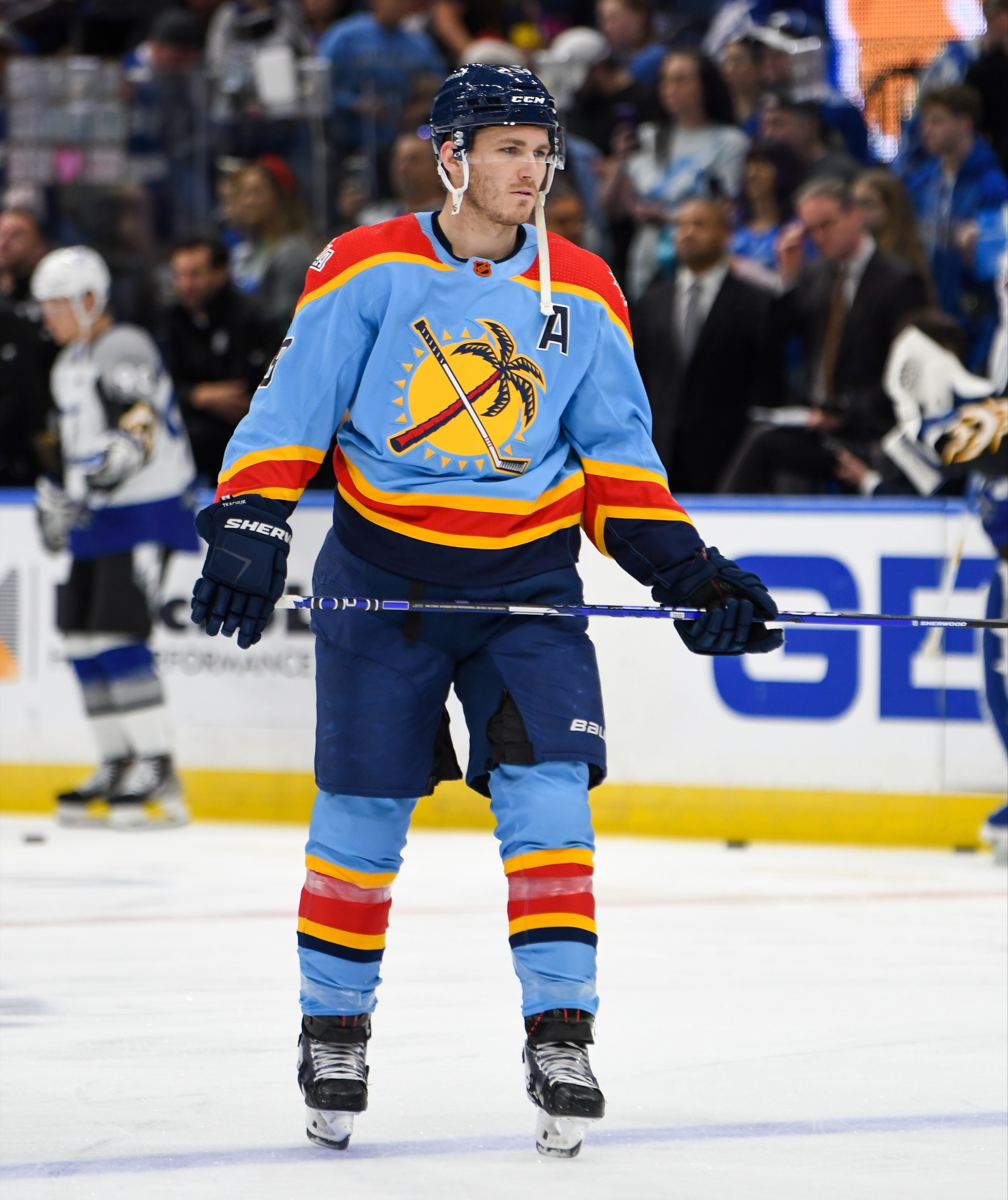
25. Florida Panthers
Boy am I unsure about these. On one hand, I absolutely love the light blue. So much so that I think Florida needs to find a way to get this color in their uniform repertoire ASAP. But at the same time, I don't know if I love it as it's styled on their 2.0 uniform. Maybe I'm being too critical on these Reverse Retros, it's also a little unfair to Florida, given their relative youth in the NHL. So them being #25 on my list might be lower than they should be but i don't know. After all, it is just my opinion.
So with what I said in mind, I kept the basics of the IRL uniform intact, navy helmet and pants, light blue socks and jersey. Where I shook things up a little bit is I took the stripes and some logo inspiration from the Suncoast Suns, an EHL team that played for a couple seasons (technically in the Tampa area, but it's Florida so that's enough justification for me). The stripe pattern is pretty close to the Panthers uniforms as it was, but the Suncoast uniforms stripes were big and bold and so are these uniforms' stripes. Also included are some retro inspired logos from the Suns as well.
C&C welcome!
-
5
-
-
16 hours ago, WBeltz said:
I think I’d be fine with that. Or they pull out the pennat style ones again on a black or white helmet and call it a day
i came here to mention those or
modernize these
-
6
-
 2
2
-
-
3. Canyon Ridge Riverhawks - Est. 2009 - Twin Falls, ID - Classification: 4A
The youngest high school in the Great Basin, serving to take the heat off of Twin Falls HS' enrollment, I know nothing about this school. Another case of little overlap with my school, but I do, or did, have quite a few coworkers that were from the Twin Falls area that went to Canyon Ridge.
Canyon Ridge Riverhawks - Logos: Right off the bat, I had an innate sense of the Atlanta Thrashers. So the school's existing logo sticks around, with a wordmark and number font set that was really similar to the old Atlanta Thrashers look. The school's football team has also been floating between using a medium shade of grey and a pretty dark shade, probably black. I chose to use a middle ground of that, combined with a not-quite shade of crimson.
Canyon Ridge Riverhawks - Uniforms: Some of the Riverhawks' athletic teams have used a pointed, single color stripe. I turned that into a slanted, two color stripe on the sleeves of the three uniforms. On the home and away uniforms, the stripe looks like the Mighty Ducks uniforms hem stripe does in a way, Riverhawk logo on the chest. On the alternate uniform, it took me 15 teams, but we finally have a roundel logo. the hem stripe becomes a chest stripe, moving the Riverhawk to the shoulders. Socks match their sleeves. Grey helmet and pants, with a slanted stripe on the sides, crimson gloves.
C&C welcome!
-
1
-
-
Font ID's aren't helping here. Anyone have any clue what the ARIZONA font is or is damn close to?
-
26. New York Rangers
I don't hate these. Lady Liberty looks really good on royal blue. My problem overall with this being the Rangers 2.0 choice, is that it came 2 years after they somewhat lazily brought it back for the first go round. Now, I get it, the Rangers don't have a million choices to work with. But come on, a little effort never hurt.
Going outside the family for the Rangers wasn't my first choice. I already tried a reverse of a uniform deep in Rangers' history, the college wordmark style jersey, which flipped to white. But beyond that, nothing else IMO was different enough to reverse (though now that I think about it, a blue version of their current white's might not have been a bad idea). Anyways, like Philly, we look outside the team's history and use something from another NHL New York team: the long gone Americans.
The uniforms go royal blue, with a reworked Amerks crest on the chest, scaled down to 4 stars for 4 Stanley Cup championships. To keep it Rangers, the era appropriate shield sits on the shoulders. White sleeves, red trim at the ends. Kept the pants pretty much the same as they currently wear. Socks are a bit goofy, but its a solid color flip.
C&C welcome! I'm gonna try not to be a stranger next time! (plus it would have helped if I hadn't packed my team list on accident
 )
)
-
5
-
-
\
After a week long drive, longer weekend stay with some friends, my wife and I are now technically Florida residents! And it took a lot longer than I would have hoped to have WiFi again. But all that is in the past and I'm back to posting here!
2. Burley Bobcats - Burley, ID - Classification: 4A
Burley is a great truck stop town. Like in all seriousness. It's the last major stop before you decide if you're going to Salt Lake City or eastward to Pocatello and Idaho Falls. But a great, growing place to stop for gas and lunch. And my old graphic design coworker's dad lives and drives truck from there. So that's cool.
Burley Bobcats - Logos: Currently, Burley makes use of the Ohio Bobcats logo, which works, but I personally don't love. Rather than go with another bobcat logo, I opted for a scratched B logo, with three claw marks through the crossbar of the B. Ended up with a font pretty similar to the new NOB font for the Blue Jackets, which also extends to the number font.
Burley Bobcats - Uniforms: You could call these a modern take on what the Flyers will be departing from after this season, okay, that's a bit of a stretch. But you get the idea, shoulder length stripes with a smaller stripe underneath it. B logo on the chests of the three jerseys. Socks match their jerseys. It was bound to happen eventually, white gloves for the uniforms, black helmets and pants.
C&C welcome! I'll try not to be away as long this next time!
-
1
-
-
On 2/22/2023 at 2:22 PM, WestCoastBias said:
I don't think desperate is the right word, maintaining a presence in the most populated region on the West Coast is just an absolute necessity. That being said if SDSU was UCSD they would be in the Pac-12 already. It was always a Cal and UCLA didn't want a CSU in their conference issue for SDSU. Los Angeles and San Diego are two different places just in the same region, USC and UCLA already accounting for the San Diego market was always just an excuse.
I view adding SMU as the more desperate move. Is a small private school with limited football success located in a very crowded CFB market really going to "capture the Dallas market and open up Texas recruiting pipelines" for the Pac-12? Nope, but hey they have rich alumni! I doubt people in Dallas will even care that Pac-12 teams are playing in their city and why would they.
Here's the Pac-12's options based on football success, research status, and market size.
Football Success (Past 10 Years) R1 Research Desirable Market
Boise State (3 MW Titles, Six 10 Seasons, 1 NY6 Win) Colorado State San Diego State (3.3 Million)
Fresno State (3 MW Titles, Five 10 Win Seasons) New Mexico SMU (7.7 Million)
San Diego State (2 MW Titles, Five 10 Win Seasons) Nevada UNLV (2.2 Million)
SMU (One 10 Win Season) UNLV
Utah State (1 MW Title, Three 10 Win Seasons) Utah State
If the Pac-12 is going off football success then you're absolutely right, Boise State is in along with Fresno State or San Diego State. Or add all three plus one more that's probably based on market, so either UNLV or SMU. This probably should happen.
If they're going strictly off R1 research status then UNLV, Utah State, and Colorado State are probably the top 3. They could continue with the travel partner thing they already have established and add Utah State to pair with Utah and Colorado State to pair with Colorado but that adds no new markets. So UNLV would probably be in for sure here plus one more off that list. No way this would happen.
Or they go based on market size which SDSU and SMU are the obvious winners here, or they decide against SMU since it isn't in the West and go with UNLV. This is what's going to happen.
Honestly, no one will be happy because every option kind of sucks. It all feels lackluster and definitely not Power 5, kind of like the new Big 12 but they had some better options. The only way to get the best of all worlds and make everyone in the Pac-12 happy would be if UC Davis and UC San Diego (or even UC Irvine ) somehow had near Power 5 level football teams/athletics and large fanbases. Both bring very high level academics in large metro areas (Sacramento 2.3 Million for Davis). But that's not reality.
It would certainly be nice to see Boise State finally get the jump. But it's not all about football, though BSU's basketball program seems to be on the rise. What sucks is Boise State finally brought the baseball team back, just for Covid to shutter it again. If they had the baseball team, I feel like it would help athletic matters. As for the academics side, we certainly aren't Truck Drivers University anymore but there's still a lot of work to be done, and Boise =/= huge market.
Though I have seen some reports the Big XII has interest in Boise State and Memphis but I don't know how true that is.
-
On 2/22/2023 at 7:02 AM, Jer15 said:
This championship series thing still rubs me the wrong way.
The NLL changed their schedule to (mostly)be done in time for PLL after years of overlap with the MLL.Now PLL is deciding to just run an indoor tournament in the middle of the NLL season?
I admit, despite trying to get into it (especially when the Toronto/Hamilton Nationals were a thing in MLL), I'm not much of an outdoor fan (despite being a very big NLL and MSL fan) so maybe I'm missing something but it still feels like these 2 were getting along nicely and then this came to be.I don't think its about NLL vs PLL. The Championship Series is played with Olympic Sixes rules. If anything, its a test drive to see what kinks need worked out before 2028 when lacrosse will be at the Olympics
-
4
-
-
1. Buhl Indians - Buhl, ID - Classification: 3A
I'm going to be honest with you. I was mentally getting Buhl confused with Bliss, ID. Bliss is a truck stop town, about hour and a half from where I live (for the next 3 days at least). They just recently got a McDonalds and I have to say, freshest French Fries i've ever had. But that is not Buhl. I should have known it wasn't Buhl. And after looking at a map, I can say that I've never been to Buhl. So that is the extent of what I know about Buhl.
Buhl Indians - Logos: So Buhl will be the first of a few high schools in the south central section of Idaho that use the non-descript Indians as a nickname. So navigating that was certainly interesting but Buhl came prepped with their long-time logo which stays on unchanged, and a new wordmark joins the brand, along with a similarly styled number font.
Buhl Indians - Uniforms: As for the uniforms, I used the repeating nature of the headdress from the logo to create a striping pattern, found on the sleeves and shoulders of the home and away uniforms, with secondary, single color stripes on the hem and bottoms of the sleeves. Logo front and center on the home and away jerseys. The alternate gets a little more wild, if you wanna call it that, A larger solid stripe, with the same stripes, just now in single color underneath them. Logo moves to the shoulder, BUHL in the big chest stripe. Socks match their respective jerseys, solid black pants for all 3 uniforms, black helmets and black gloves with orange fingers.
C&C welcome!
-
3
-
-
So one last bit for the Inland Empire and this is something I decided to do after I started this
After completing the IEL and seeing there's a lot of color overlap, and in one case, teams with the same basic color scheme, I wanted to track the color schemes across the conferences and divisions, just to see most used colors and things like that. Plus its a fun looking circle! So that's something you can now expect for every conference. and speaking of conferences:
Next up is the Great Basin Conference! Mostly settled in the south-central region of Idaho, the majority of these teams fill in from the 4A and 3A classifications, and largely settle in around the Twin Falls metropolitan area. There are some notable geographical outliers in this conference:
- Mountain Home sits just 45 minutes away from Boise so logically you'd think they'd play against the Boise area schools. While that did happen for a time, the Boise schools grew into the 5A classification and MH did not, and with the majority of the 4A schools in the Nampa area and further out, 45 minutes becomes closer to an hour 30 or longer. Plus the Boise area has added 3 high schools in the last 10 years so more and more competition is added closer, Mountain Home just fits better IMO in the Great Basin
- Wood River HS serves the Sun Valley area which is the biggest town in the area. The closest competition in the area is 2A or lower which doesn't serve a 4A school well. But they do have a quick route down into Gooding and Jerome via highway 75/93.
- Preston is a curious case for me. Logically, they should play against the Pocatello/Idaho Falls schools. However, that metro area suffers from a similar problem as Boise: it's growing at a rapid pace. Because of that, Pokey and IF have both added new high schools in their districts. With that area's conference (High Country) already sitting at an even 12 teams, Preston gets sat in the Great Basin.
First team up in the Great Basin coming up shortly!
-
1
-
13 hours ago, Lights Out said:
If I didn't know better, I'd wonder why BYU was wearing the letter K on their helmets.
I know the checkerboard era has been divisive for Kentucky fans, but it's been a net positive for their football program, which finally has a look to call their own.
they just needed to tone it back or make it much more subtle
-
27. Colorado Avalanche
I don't have an issue with the colors, which I love honestly. For me it's a similar situation with Carolina, the jerseys are too similar (or don't qualify as retro) to the current look. Plus I wouldn't have gone with the C on the chest, even if it is technically a recolored alternate logo and fits with the theme.
That being said, it feels weird flipping a Reebok Edge alternate, but with the Colorado down the chest, it just worked better in my head. So like I mentioned, the Avs blue Reebok jersey gets the reversal here, sticking with the Colorado flag theme. Biggest changes from the original uniform, since Reebok wasn't a fan of hem stripes, added a hem stripe, similar to the style of the yoke stripes. Also used the C logo on the shoulders opposite the recolored A logo.
C&C Welcome!
-
4
-
-
We've reached the end of the Inland Empire, with the last team up, the Timberlake Tigers:
Timberlake can be found in the Lakeland school district, and to be completely honest with you, I didn't know anything about this school until I started doing this project. They've been open for close to 25 year now and are the smaller high school when compared to Lakeland.
Timberlake Tigers - Logos: I like the use of the Detroit Tigers old "tiger-wrapping-around-a-letter" idea the school borrows and rolled with that. In a bit of an odd decision, I went with a more forward moving and futuristic wordmark, which doesn't get a lot of use but I liked the duality between the classic logo/font and the wordmark.
Timberlake Tigers - Uniforms: So in a departure for me, but not anything unexpected, I don't remember my influences here for Timberlake. I originally had them in a recolored Mighty Ducks uniform, but I didn't like how it was turning out, and so I flipped it, going for the popular upper sleeve fill with stripes underneath them, a single color double stripe on the home and away uniforms, which is matched on the hem line. Main logo on all three uniforms, and the only real difference on the alternate is the double stripe becomes a full triple stripe. Gold helmets, navy gloves and pants.
And as a bonus, in the spirit of things, I thought I'd run through a hypothetical district/conference tournament for every conference, ending with a hypothetical state tournament. mostly for fun for me and maybe someone here will get some enjoyment out of it:
With some help from wheel spinners randomly assigning teams to high schools and NHL 23, we have our first conference tournament. (left score corresponds to top of bracket, right to bottom)
- First Round - With the exception of Lakeland/Timberlake, all chalk, as the higher seeds advance in some exciting games.
- Quarter Finals - First round bye beware! None of the top seeds make it to the semifinals.
- Semi Finals - Timberlake's luck had to run out eventually, and Moscow tames CDA Charter
- Finals - In a championship game with no scoring until the 3rd period, Moscow gets one more and claims the Inland Empire and the trip to Boise.
C&C welcome!
-
3
-
28. New York Islanders
Look, I'm of the opinion that the Fishsticks uniforms should never have existed. The Islanders feel like one of those teams that should have worn the same uniform style since day one and never deviated, think Red Wings, Blackhawks, Canadiens. But I digress. That isn't how it worked. But these uniforms are complete bastardizations of uniforms that have oddly grown on a lot of people.
In keeping with what Lou has wanted and done for the team's Reverse Retros, I kept it largely still in the current colors, but added in the teal from the actual fishstick uniforms. Beyond that, it's a much truer take on the reviled uniforms of the 90's.
C&C welcome!
-
5
-
-
On 2/13/2023 at 7:09 AM, heavybass said:
So now let's take a visit to a university that's like 5 minutes from @colinturner95's house.
NORTHWEST NAZARENE NIGHTHAWKS (NNN)
He went into very good detail for his set for his second meter and I decided to keep it modest yet sort of traditional.
Hey hey! Looks great. Love the classic feel
-
Figured I could get one more team up before Super Bowl Sunday:
Sandpoint is way up north in Idaho (though not as far up there as Bonners Ferry) and is a 4A powerhouse, though there's only a couple other 4A schools within 200 miles (in Idaho) so they fill their schedule with Washington and the occasional Montana schools. That aside, they were on the losing end of the state football championship during my last year in high school which is about the end of my interaction with the Bulldogs.
Sandpoint Bulldogs - Logos: oh how to deal with the Bulldogs problem. You know, how every high school with the bulldogs nickname has had this as their logo? Yeah, and while I don't normally condone high schools using pro/collegiate logos, I did that here, using Gardner-Webb's recently rebranded Bulldog head as Sandpoint's new logo. Along with a sans-serif wide athletic font with a paw print replacing the 'o' in Sandpoint.
Sandpoint Bulldogs - Uniforms: The Bulldogs keep things pretty simple when it comes to their uniforms in their respective sports (football | basketball | baseball) and I kept that trend intact. Opting for a Red Wings Winter Classic style uniform with a bold chest stripe and matching stripes on the jerseys, pants and socks. As for the alternate, which does break the trend a touch, that one is actually inspired by the building (I think its the school itself, could be the gym). With that in mind, an adapted stripe pattern makes its way around the uniforms, the full pattern on the chest and socks, an abridged version on the sleeves. All the uniforms use red helmets and gloves, home and away use red pants, alternate uses black shells.
C&C welcome!
-
2
-
1
-
-
I always appreciate the feedback!
On 2/7/2023 at 3:07 PM, vtgco said:Would prefer to see the Spartans with black hems and the Greek pattern in the hem stripe. Besides that, the set is gorgeous! Love that third jersey.
I personally had thought it would have been a little much having the Greek pattern on the hem, but I think it ties together much better now.
On 2/7/2023 at 3:07 PM, vtgco said:Idk I'm not a diehard hockey fan or anything but I don't get the hate you're talking about for that Trojans alternate, it's really nice! I prefer that to the Rangers styling of the primary set, even though it's solid too. Would be fun to have the script appear on one of the jerseys too.
So here's the full set based on the alternate. Honestly might be better than the initial set I posted. In this case, the orange jersey gets the Trojans script on it now.
For reference, this was my concept I based Post Falls' (original) alternate on. Much better executed almost 6 years later now.
On 2/7/2023 at 3:07 PM, vtgco said:I really love that Lakeland set; makes me wish the North Stars had had a sleeve-length yoke jersey. Only suggestion would be to ditch the outermost white logo outline.
I'm gonna stick with the outline on Lakeland. It brings the logos off the colored jerseys just a touch more, even though the black does contrast pretty well enough.
On 2/7/2023 at 3:07 PM, vtgco said:Not about the lack of hem striping for Moscow. Also feel like the logo, which is excellent, might be better served by having the "Bears" text replaced with Moscow on the road, and ditching the text above it altogether. Lastly, I do think the MHS monogram is a bit of a downgrade from the original.
In this case, the stripe was too busy for the hem, so IMO the solid color hem works better here. Did change up the logos though, which looks good. And the MHS was pretty good beforehand, but it thought it would have looked a little too out of place compared to the logos and the number font.
On 2/7/2023 at 3:07 PM, vtgco said:Same thought for Lake City; the set is completely gorgeous except for the mismatched hem stripe on the alternate (which is so good it could be the primary, IMO!)
Oh all right. Changed the hem stripe to match on the grey alternate.
-
1
-
-
29. Ottawa Senators
Ottawa ranks lower than some jerseys on this list mostly because of my personal disdain for the team's choice to full send back to the inaugural look when there were better options and concepts available. Plus the Sens 2.0 attempts come off as lazy to me. As I have written on my rankings/notes, "white would go a long way here"
White goes a long way here, and takes over the whole uniform. The stealth idea of the IRL uniform initially dissuaded me from reusing this uniform, but it realistically was one of the few options I felt I had left. The OG Sens don't provide anything other than a barberpole. The 1.0 uniform was basically just an alternate uniform. So the swooping alternate was the last plausible choice. If you think I'm leaving out the laurel leaf uniform, you can see my previous stab at that here. Plus as a bonus from my 3 Acts, what the Sens could have done with 2.0.
C&C welcome!
-
4
-
-
My alma mater, Bishop Kelly HS (Boise, ID), sometime within the last 5 years unveiled this clip art/stock masterpiece:
a quick reverse image search doesn't pull it up for a pro team or college team, but other high schools use it so it's not unique to BK.
in the past, various teams at BK have used recolored versions of these:
http://www.underconsideration.com/brandnew/archives/ucf_variations.gifnothing wild. If it were up to me, i'd have stuck with the UCF knighthead or gone with the updated Rutgers logo:
-
 1
1
-
-
30. Philadelphia Flyers
In all honesty, the bottom half of my rankings of RR 2.0 feel interchangeable. A lot of teams ended up down here due to laziness or lack of true options. Something Philly ends up with, which is unfair given the true lack of options the Flyers had to work with. But the Cooperalls in warmups really should have moved them up a little.
So instead of sticking within their NHL history, the Flyers reach out to a team that lasted for just one season in Philly, the WHA's Philadelphia Blazers. In Reverse Retro fashion, the Blazers wordmark now reads Flyers, with a slight change to the shoulders which now have the Winged P logo and move the numbers down from the shoulders. I did offer up a second option just because, going more for an orange heavy look, with orange pants and gloves, similar to what Edmonton did with RR 1.0.
C&C welcome!
-
6
-
1
-

 ton of replica jerseys, especially WC/Stadium/RR versions.


 \
\


Idaho High School Hockey - The Conclusion
in Concepts
Posted
The Idaho Hockey RV rolls on.!
5. Gooding Senators - Est. 1913 - Gooding, ID - Classification: 3A
Gooding, Idaho: known for being home to a barrel cheese factory, the home of the Idaho School for the Deaf and Blind. The town itself was named for US Senator/Idaho Governor, Frank Gooding, who lent his name and profession to the high school.
I've only ever driven through the town, so I can't comment on the town itself. The high school competed a classification below mine so there's no interaction there. But back when I was an athlete, I had a good friend and teammate that lived in Gooding and commuted about an hour and a half both ways for hockey practice.
Gooding Senators - Identity: With one of the more unique nicknames in Idaho HS sports, I gave them, at least in my humble opinion, a much more befitting identity. They currently use a recolored version of EKU's logo. Unique, yes but doesn't fit with "Senators". Also, they use UA Falcon (or a pretty close variation) as a font, which clashes something fierce with the logo.
Gooding Senators - Uniforms:
I personally think these are the best uniforms in the series yet, and definitely my personal faves so far. Let me know what you guys think!