


colinturner95
-
Posts
3,393 -
Joined
-
Last visited
-
Days Won
8
Posts posted by colinturner95
-
-
3 hours ago, slats7 said:
Why did Modell have to leave the team name and colors behind but Bud Adams didn't?
Modell got hit by a lawsuit which resulted in the "Cleveland Deal" where the Browns ended up as a continuation of the original franchise, that had a period of inactivity, that retained the branding, uniforms and history and Baltimore (while being made up of the moving Browns team) would be considered an expansion team beginning play in 1996
Bud Adams moved the Oilers because he felt less and less confident in getting a new stadium in Houston.
-
 5
5
-
-
4. Highland Rams - Est. 1963 - Pocatello, ID - Classification: 5A
The middle child of Pocatello's high schools, but probably the most competitive and successful of the bunch. Highland is usually in the final four when it comes to 5A football in the state of Idaho, and there are a number of Highland alums that have gone on to play college and NFL football, including but probably not limited to Meril Hoge, Taysom Hill, Dirk Koetter, and Tommy Togiai.

Highland Rams - Identity:
- Colors - The first of a couple black and red schools in the conference.
- Primary Logo - I believe this is Fordham's old logo, but it works for them.
- Secondary Logo - Gave the Rams' old letterform a second lease on life with an accompanying H.
- Wordmarks - Arched RAMS with Highland above it.
- Jersey Fonts - Fairly standard athletic block font
Highland Rams - Uniforms:
-
Home - Away:
- Jerseys /Socks - A familiar story with me, but the alternate design was the original home and away design, based on the weight and details from horn of the ram, but after looking at some images of the current football uniforms, I liked the double stripes better for the primary design.
- Equipment - The white helmet is a bit of a surprise given the uniform design, but I didn't like the way a red or black helmet looked with everything. Pants have a single stripe down the side, gloves are black with a red cuff.
-
Alternate:
- Jersey/Socks - The alternate design I talked about above stays how I imagined it, offset sized stripe, now on a red base. the HR monogram takes over on the chest, Ram head to the shoulders.
- Equipment - Nothing changes.
C&C welcome!
-
3. Century Diamondbacks - Est. 1999 - Pocatello, ID - Classification: 4A
Century is the youngest of Pocatello's three high school, and they burst onto the scene pretty quickly, winning 3 consecutive state football championships within a season of being a high school, as well as adding 2 basketball state titles in 5 seasons. And despite the Pocatello area having a noted lack of hockey (for now, Idaho State is currently in season 1 of fielding an ACHA D2 team), they've had quite a few run-ins with BK over the years:
- Football has had more than a few postseason meetings, 2013 BK snuck by with a one point win to advance to the championship. 2015 BK blew them out to the tune of 5 touchdowns to again make it to the championship. 2020 was the year Century struck back, beating BK by 19 in the quarterfinals.
- Boys Basketball - Century has had more recent luck, beating BK in the first round in 2018. So far the only postseason matchup between the schools this century
- Girls Basketball - BK's girls have done better in the post season than their counterparts. They claimed their first and only state title at Century's expense in 2013 & beat Century in round 1 in 2017. Century got back at BK in 2016, beating them in the state final.
- Girls Soccer - BK's Girls soccer team is probably the best team historically (9 state titles in 20 seasons, 14 straight conference titles, only 2 conference losses since 2008, and a 70 game win streak) and Century was usually on the wrong side of that. 2012, BK won their 3rd straight title over Century. 2015, Century got BK in the 3rd place game 3-1. 2016, Century lost 2-0 in the semifinals.
If you're the best team on the Eastern side of the state, in a lot of cases, you're gonna meet up with the best team in the West.
Century Diamondbacks - Identity:
- Colors - Purple and black, with gold as a tertiary accent.
- Primary Logo - A bit more generic, but was a better option than reusing their modified Arizona logo.
- Secondary Logo - A block C with a diamond back pattern along the back of the letterform.
- Wordmarks - Did reuse Arizona's old wordmark set.
- Jersey Fonts - Chunky and angular block font.
Century Diamondbacks - Uniforms:
-
Home - Away:
- Jerseys /Socks - Century's sports uniforms are largely uninspired across the board, which I think is a shame, given how unique their mascot is. A simple look but a unique one at the same time. Diamondback stripe with a few different shades of gold making up the pattern.
- Equipment - Purple gloves and helmet, black pants.
-
Alternate:
- Jersey/Socks - I was going to go a lot more insane on the jersey, like a pattern coming up from the bottom to the middle of the jersey, but I instead went with a chest stripe of the design from the home and away jerseys, with a more stealth edge, flanked by purple stripes.
- Equipment - Nothing changes.
C&C welcome!
-
 1
1
-
9 minutes ago, Carolingian Steamroller said:
It's not the NBA...
IT'S 1994 BABY!!
Oh man, the brands are so diluted. I can't recognize these teams /s
-
2
-
 1
1
-
-
10 minutes ago, RyanMcD29 said:
To back up my point earlier, those are also Syracuse rip-offs with the number font!
sure. except for the part where I mentioned adding the helmet stripe to the pants and outlines on the numbers.
-
1
-
-
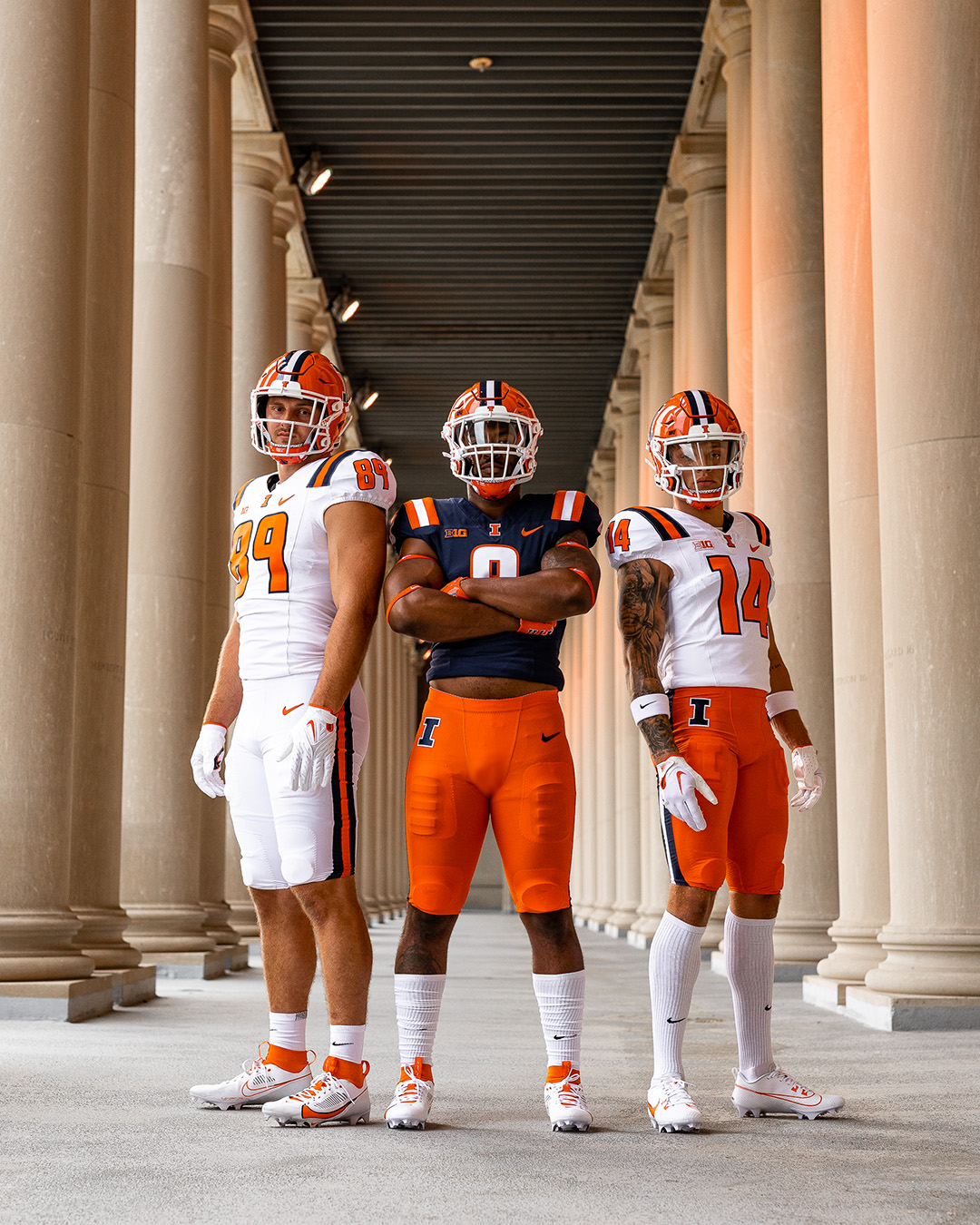
The shoulder stripes don't feel like Illinois:
They could have slapped outlines on the numbers and a matching stripe from the helmet to the pants and that would have gone a long way:
Not perfect, but better than the Syracuse rip-offs
-
9
-
-
2. Bonneville Bees - Est. 1951 - Idaho Falls, ID - Classification: 4A
The first of the 5 schools in or around Idaho Falls, Bonneville serves the northeast districts of Idaho Falls, and originally served the nearby suburb of Ammon, until Hillcrest HS opened in 1992. Bonneville has a modest athletic history, capturing a handful of titles in the early 2000s, while their volleyball team was dominant in the 90s as well, winning 7 championships in a 20 year span, adding one more in 2016.
Hockey-wise, Bonneville normally was found in a combined situation with their neighbors, Hillcrest, creating the "Bonni-Crest" combined team. I don't remember if they had a nickname to go along with it and my photo references aren't clear enough to answer that. They were largely overshadowed by Idaho Falls and Skyline in their own backyard, never really posing a competitive threat.
Bonneville Bees - Identity:
- Colors - Dark green and gold.
- Primary Logo - Their current logo borrowed from MSU-Billings and IMO, a better option than using Georgia Tech's logo. The B gets updated and I'll talk about that in a second.
- Secondary Logo - The B behind the Bee used to be a block letterform. I updated it to a more academic style letterform, I guess you could say, but I liked the way it looked and it felt less generic than the block version.
- Wordmarks - Nothing crazy, just a Bees script.
- Jersey Fonts - Classic styled, sans serif block font.
Bonneville Bees - Uniforms:
-
Home - Away:
- Jerseys /Socks - I've had this idea from the beginning for Bonneville. a very vintage style look, almost reminiscent of the NHL's first ASG uniforms/1992 uniforms. Biggest differences is the stripes follow the Flyers jersey stripe pattern. With the multitude of stripes, the numbers move to the front chest. Hem stripes are a simpler version of the sleeve stripes. Socks match the hems.
- Equipment - Blank pants, green like the helmets, gloves have white thumb padding, gold fingers.
-
Alternate:
- Jersey/Socks - A much more traditional look, based very much on their football team's gold uniforms. The multitude of stripes is pared down to just a triple stripe. Green yoke with a smaller version of the stripes under it. Bees script takes on the front chest duty.
- Equipment - Nothing changes.
C&C welcome!
-
5 minutes ago, oldschoolvikings said:
Oh, sure. Nike has a good template, but no one wants to use it.
Makes sense.
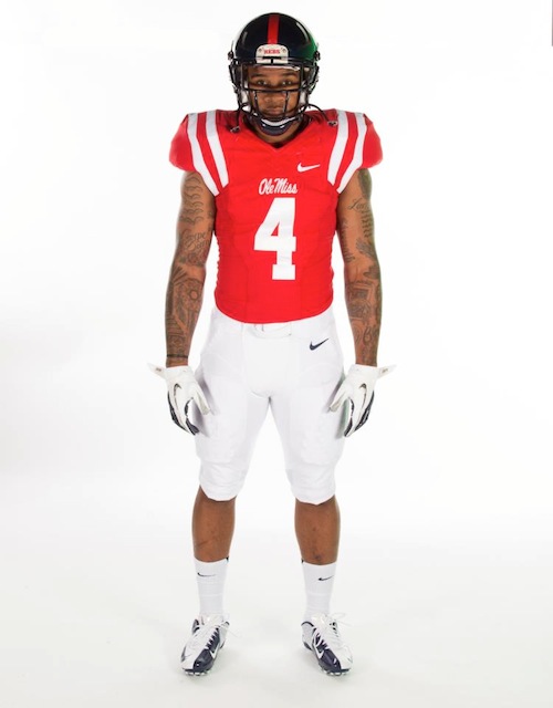
i mean they did. but since the Vapor Untouchable and Vapor Fuse templates have come out, the stripes reverted to the shortened version and the LSU/Ole Miss options aren't offered anymore.
-
2
-
-
13 minutes ago, DCarp1231 said:
I’m not disappointed in these? They’re fine honestly. I think they’d look better with the standard white helmet (and blue facemask), but these aren’t bad by any measure IMO
EDIT:
Wait… these things are TEXTURED??
I'm a sucker for racing stripes or as close to you can get on football jerseys so that's pretty good. The black helmet is less than ideal, would have rather seen the blue helmet return
The heather pattern is interesting to say the least...
-
1
-
-
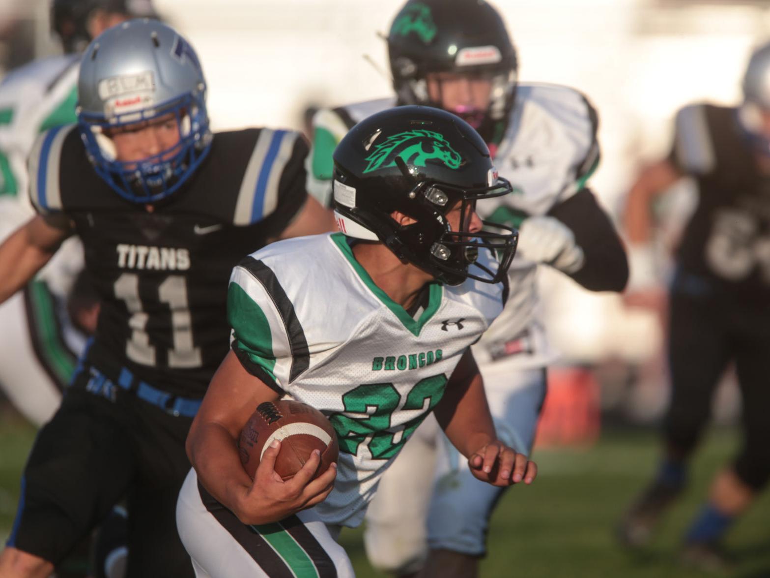
1. Blackfoot Broncos - Est. 1894 - Blackfoot, ID - Classification: 4A
First up in the east, a team that sits quite in the middle of the conference. Blackfoot sits just miles away from the boundary of the Fort Hall Reservation, and as a matter of fact, the school actually teaches the Shoshoni language. I personally don't have a lot of experience with the high school in terms of sports, owning to the whole "lack of sports I played they sponsored".
However, the lone bit of connection I have, was my senior year of high school. Blackfoot was playing in their 3rd state football championship game in 4 years, BK had just won the previous year and the two schools were meeting in Pocatello for the 'chip. (a 4 hour drive for us, a 30 minute drive for them). Naturally, Holt Arena (ISU's home stadium) was a sea of Blackfoot supporters, but BK made a modest effort at having a good crowd. The game was a defensive slugfest. The game was tied 7-7 into halftime. Nothing changed going into the 4th. Blackfoot kicked a field goal with 3 minutes left, going up 10-7. My best friend from childhood, who had lost his dad just a few months before the football season, locked himself into a zone I don't think you can ever replicate, took the ball on almost every play on that last drive and rammed the ball down Blackfoot's defense and scored the game winning touchdown on the literal last play of the game to give BK their second consecutive state championship.
Blackfoot Broncos - Identity:
- Colors - Black and a nice light green, pretty close to Eagles' Kelly Green but not quite.
- Primary Logo - Their current logo is Western Michigan's old Bronco head. that gets replaced with a cleaned up version of this
- Secondary Logo - A letterform B from their wordmarks. There's a second version I have of it in a horseshoe, and not wanting to look repetitive, I just used the B.
- Wordmarks - AE Curveball worked well for a "modern Western" font
- Jersey Fonts - The LA Angels lend their font which has a more athletic feel to it than AE Curveball.
Blackfoot Broncos - Uniforms:
-
Home - Away:
- Jerseys /Socks - The first idea I had was more akin to the Penguins' 92-95 uniforms with the angled sleeve stripes. It then transformed into more of their socks stripes from the Reebok days on the sleeves and the angled stripes migrated to the hem and sides. Horseshoe logo on the chest. You might also recognize the massive collar from the 2015 Stadium Series uniforms. The story there is that this was originally supposed to be for my Web Design class, and I had a whole thing planned around a high school hockey website. Well my appendix had other plans, and I had to find something less labor-intensive to get the project done in time, but I had the bones of the jerseys done and I kept it as a little quirk.
- Equipment - Black all around, gloves get a green cuff.
-
Alternate:
- Jersey/Socks - A little bit of a more traditional look, Northwestern stripes on the sleeves, a look sort of derived from the football team. The stripes are bigger on the sleeves and socks than the hem. On the chest, is a bit of a basketball inspired look, BLACKFOOT arched above the number, BRONCOS underneath.
- Equipment - Nothing changes.
11 more teams to go!
-
1 hour ago, raysox said:
Colombia 6/20
For Colombia I looked at a a lot of kits for inspiration, but ended up doing something different and introducing a top split torso and navy sleeves. This might be more Ecuador than Colombia, but I thought the color blocking look nice. I made a gradient-ish look made by skewed bars. For the clash kit, I took the colors from the main kit and changed the hue and tone slightly for all of them and designed from there.
Love the subtle diamond/squares on the red top
-
https://www.cbc.ca/news/politics/nike-permanently-ends-hockey-canada-support-1.6909029
Nike announced it's ending its partnership with Hockey Canada.
-
We've reached out last conference! Ironically it was the first conference I had gotten ready, but after I got everything formally organized, I pushed them to the end:
The High Country Conference gets it's name from the drastic elevation changes you get as you move west to east across southern Idaho. Boise's elevation sits at roughly 2700 feet above sea level and in stark contrast to that, Pocatello sits at 4462 ft and Idaho Falls further up at 4705 ft. In fact, this past spring sports season, most of Eastern Idaho's spring sports teams couldn't practice outside until mid April because they still had feet of snow that deep into spring.
There's a good amount of hockey history on this side of the state, in decent contrast to the Great Basin and the Inland Empire up north. Idaho Falls, both their high school and travel team have competed well over the last 20 years. Most of the high schools in the Idaho Falls area have a degree of hockey history. Idaho Falls was also granted a USPHL franchise, the Spud Kings, so hockey is growing on this side of the state.
Geographic Notes:
- No real crazy outliers here. From top to bottom, basically Rexburg to Pocatello, is an hour drive, so teams are pretty close to each other. Teams in this conference are pretty localized around two major cities: Pocatello and Idaho Falls hosting 3 and 5 of the schools respectively, with Blackfoot splitting the difference, and a the remaining 3 a short distance from Idaho Falls.
Designer's Notes:
- Overall, a pretty balanced conference in terms of colors. A good mix of the usual suspect colors, red, blues. Orange is a welcomed sight. Grey will make its strongest appearance here.
First teams will be up this weekend, possibly sooner!
-
Our rapid conclusion to the SIC West is here:
In our only 8 team conference tournament, the field feels more evenly matched than our previous three conferences.
Quarterfinals:
- Nampa completely outclasses Columbia, with a 6-1 win. At the end of the sim, where I tried to collect relevant stats and formulate a storyline, it showed Nampa shot the puck 80 times. For context, the recognized NHL record is 73...
- In the lone shocker of round 1, Emmett takes the opening OT draw down the ice and ends Middleton's tournament.
- The teams traded goals in a flurry in the first period, then Skyview began to play undisciplined and Caldwell capitalized on PP chances and netted the go ahead and an insurance tally.
- And in the battle of the Vues, it was Vallivue skating away with this one.
Semifinals:
- Nampa led the game 3-2 going into the 3rd period and despite a rush of shots from Emmett, Nampa netted a goal in the middle of the frame to extend the lead to to and wouldn't look back en route to the championship game.
- In a crosstown derby, Caldwell led 5-2 entering the 3rd period. Vallivue would respond with a valiant effort, scoring 3 goals in a 6 minute span forcing overtime, but it would be Caldwell advancing to face Nampa after a PK winner with less than a minute left in OT.
Championship:
- Neither team wanted to take control of the game, with the score staying tied 3-3 going into the 3rd period. Nampa would net 2 quick goals early into the frame and Caldwell couldn't recover. Nampa wins the SIC-W and joins Bishop Kelly for a weekend trip to Boise and a chance at the state title!
The color story of the SICW isn't as fun as previous conferences IMO
- Lot of blue being represented, with 5 teams using it in some capacity.
- Gold/yellow is a lot of the same, featured on 4 teams.
- No green/purple is a bummer, but orange makes a fun appearance.
- Brown is also a welcome guest, making its first appearance as a color.
A bit quicker than we've gotten through the conferences but we're down to one left and the state tournament!
-
If I can get over my fears of :censored:ing up iconic soccer/football brands and identities, I'll have the template to try it on.
Looks good as always!
-
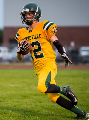
8. Vallivue Falcons - Est. 1963 - Caldwell, ID - Classification: 4A
The last team in the western side of the Southern Idaho Conferences, Vallivue served to alleviate Caldwell High School in the early 60's and now it has its own school district. Other than driving by it to get to my grandparent's ranch out in farm country, I don't have a lot of anything to do/have done with Vallivue. They didn't offer any sports I played when I was in high school, though their lacrosse team has gotten better, though if you ask my brother, who actually got to play against them for 4 years, he equated their play to "an NHL team full of goons with one guy that can actually skate". So there's that.
Vallivue Falcons - Identity:
- Colors - Brown and gold. It used to be more of a Wyoming shade of yellow, but changed either in the 90's or early 2000s.
- Primary Logo - A clever tweak of Virginia Tech's logo turns VT into VF
- Secondary Logo - A logo that I'm some degree of sure once belonged to the Air Force Falcons but couldn't confirm.
- Wordmarks - This falls into the category "I was looking for a font by scrolling and found this one and loved it"
- Jersey Fonts - IIRC this is Nike's catalog font "Vapor Strike" with an slight shear applied to it.
Vallivue Falcons - Uniforms:
-
Home - Away:
- Jerseys /Socks - The original idea was Flyers style stripes for Vallivue, but then I ran into the problem that their crosstown rival has that design already. So I switched it up to a double stripe built around the shape of the Flyers sleeve stripe. Simpler single stripe around the ends of the sleeves and the hem line.
- Equipment - Brown pants with a double stripe on the sides. Gold helmets and gloves.
-
Alternate:
- Jersey/Socks - Took the double stripes from the home and away, spaced them out around a solid brown stripe and put them on the jersey in a more traditional style. Bird logo also goes front and center.
- Equipment - Nothing changes.
That's a wrap on the teams, conference wrap up coming later today!
-
I don't normally make a habit of rushing myself through a project, but I have some things in the pipeline I want to get out to the world, so I've decided to move through the remainder of this project a little faster than I would have previously thought. So today will be a rapid fire conclusion to the SIC West and we'll get to the last remaining conference and state tournament pretty quickly.
7. Skyview Hawks - Est. 1996 - Nampa, ID - Classification: 4A
The high school I would have rather attended if BK wasn't my option. But the boundary line would have something to say about that, though with as close as I lived to it, it wouldn't have been a hard appeal. Anyways. Skyview is approaching 30 years of educating high schoolers now, which makes me feel old because I'm a year younger and just puts time into perspective a little. Skyview is one of/was one of/might be again, Bishop Kelly's biggest rivals. With their changes in classification over the last 10 years, Skyview has come and gone from the 4A ranks a lot, but with the changes to the overall structure coming, it looks like they'll be reunited once again.
Skyview and BK have turned in some great games across a wide range of sports over the years. I already mentioned the senior night massacre and BK's repayment from my senior year. BK baseball used to have some good matchups with Skyview, basketball not so much, Skyview usually had our number there. When I was dating my high school girlfriend, a volleyball player at the time, I'd stick around for the varsity games and Skyview's varsity team was indomitable. though her JV team stole the district title that year so that was cool to see. But Skyview's volleyball team is usually the front runner for the state title every season and is usually in the game, plus they send a girl or two every season to play for BYU, it's insane how good that program is.
Skyview Hawks - Identity:
- Colors - Navy and silver. Been the scheme for years, not in need of a change. Though they've been working in light blue over the last couple years and this is one of the few times I don't like a good double blue color scheme. Like it works, but not when put up against other schools in the state, especially the few from the eastern side of the state that already use the color scheme.
- Primary Logo - I flipped the position of the primary and secondary logos. The hawk head is their current primary, but I felt like the S in the talons logo was more unique and better serves as the primary logo.
- Secondary Logo - See above.
- Wordmarks - Squat block font.
- Jersey Fonts - I liked a good, classic varsity font, so the Cowboys throwback numbers fit the bill well.
Skyview Hawks - Uniforms:
-
Home - Away:
- Jerseys /Socks - When the Oregon Ducks unveiled the 2009 uniforms with the wings on the sleeves, Skyview was quick to jump on that trend and really stuck with it for some time. While it was "fresh" and "fire" then, it wasn't something I wanted to roll with here, at least as the primary. So the northwestern stripes from the football image I linked above worked well for a good, classic style hockey jersey.
- Equipment - Silver helmet. When I was in high school, that was the only option for the football team and I liked it for their hockey team. Pants have a triple stripe, gloves with a white cuff, silver fingers.
-
Alternate:
- Jersey/Socks - while I didn't want the wings on the primary uniforms, I didn't say they couldn't be on an alternate. Took the updated Ducks wings and put them on a white stripe, with a navy hem stripe filling on the hem.
- Equipment - Nothing changes.
Let me know what you guys think!
-
Hope my fellow Americans had a good holiday weekend and made it through with all 10 digits on their hands!
6. Ridgevue Warhawks - Est. 2016 - Nampa, ID - Classification: 4A
The youngest high school in the SIC West. Ridgevue opened in 2016 to help address the growing Vallivue School District (located in Caldwell but servicing the south west(?) side of the town). So even more paradoxically, Ridgevue's address is Nampa. That being said, Ridgevue came to play with one of the coolest identities in the state, owning to a partnership with the local Warhawk Museum, which lends its namesake to the school and the identity as a whole.
Athletically, they're currently in their 7th year of existing, and to the best of my research, haven't brought home a state title yet. In fact the IHSAA Historical Record PDF only has two entries for Ridgevue, one for Spirit of Sport Award and an Interscholastic Star Award. I do know they have at least one district title, having beaten BK in 2021 for the baseball district championship.
Ridgevue Warhawks - Identity:
- Colors - A nice and welcome change of pace, burnt orange and grey. Black is used as a tertiary/trim color but white serves as the official tertiary color.
- Primary Logo - A new roundel logo with a P40 Warhawk silhouette in the middle of the circle.
- Secondary Logo - The school's actual logo, moved to secondary here after I felt that it wasn't strong enough as the primary.
- Wordmarks - Baseball style RIDGEVUE.
- Jersey Fonts - Air Force/Navy inspired block font for the numbers.
Ridgevue Warhawks - Uniforms:
-
Home - Away:
- Jerseys /Socks - Mostly inspired by the secondary logo, the sleeves get the full three stripes, the hem gets a single version. Roundel on the chest, Ridgevue wordmark on the shoulders.
- Equipment - I went with black for the equipment, grey and white were obviously out for easy reasons, orange looked too monochromatic when paired with the orange stuff. So black was the last remaining option and the best one was black. Pants have a solid stripe up the side, gloves have some of the other two colors mixed in.
-
Alternate:
- Jersey/Socks - Design stays largely the same. Shoulder and chest logos switch places.
- Equipment - Nothing changes.
Let me know what you guys think!
-
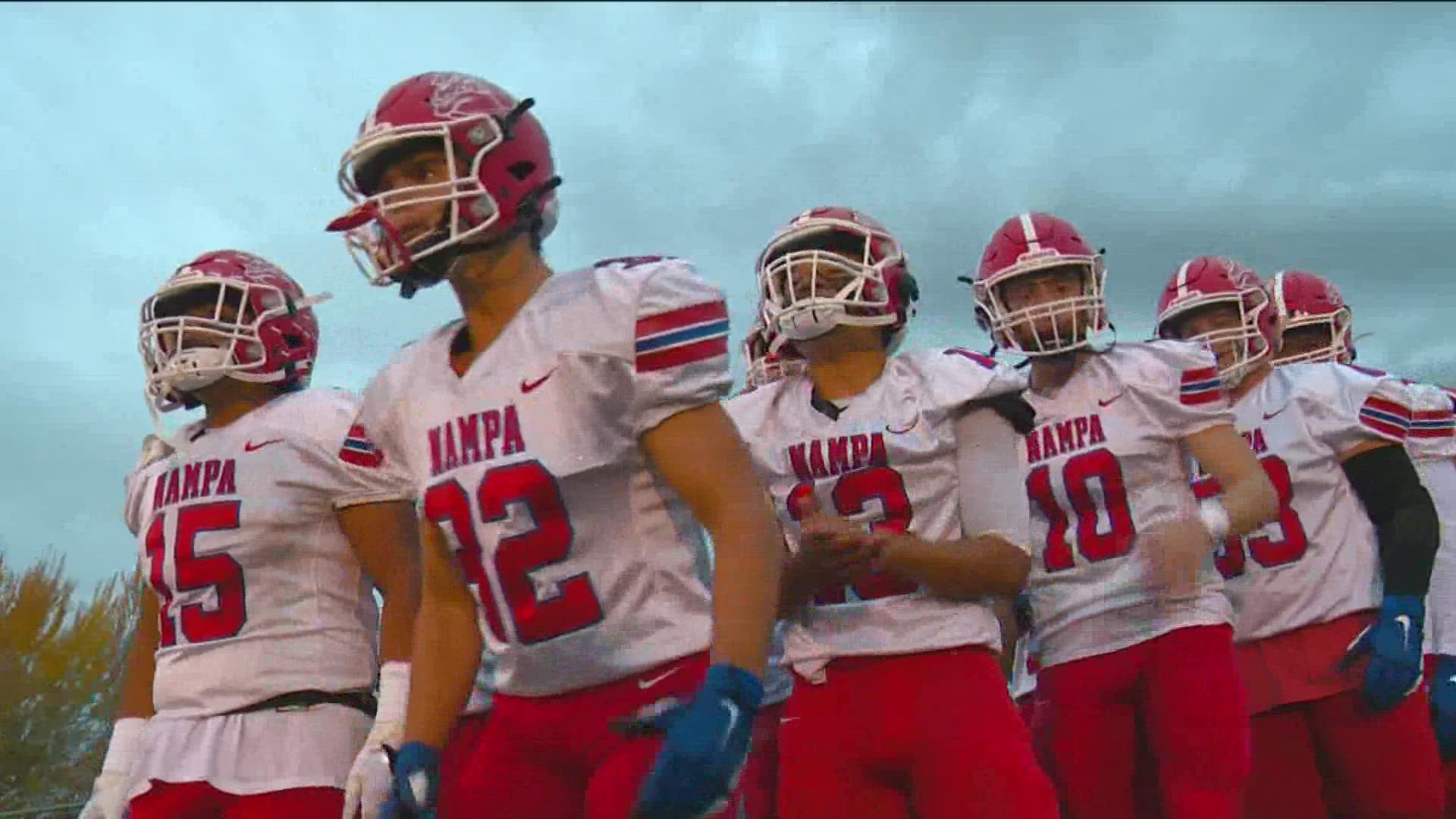
5. Nampa Bulldogs - Est. 1901 - Nampa, ID - Classification: 5A
The only Nampa-based high school I wouldn't have a case to be able to attend. Nampa is the oldest high school in the Nampa School District, having been the only high school in the town for almost 100 years until Skyview and Columbia came along in the late 90s/ early 2000s.
Nampa has seen a few changes in classification in the last 10 or so years, and even more recently than that. In 21-22, BK played them at the 4A level, the next year they were back up to 5A. I think with the forthcoming changes to the classification, their place will be a little bit more cemented. While Nampa's teams haven't brought a state title home in the 21st century (I did my best to dig through a voluminous PDF to confirm this), they did have a pretty impressive athletic run in the 1949-1951 athletic seasons, where their football, basketball and baseball teams combined for a 55-1 record, capturing the state championships or equivalents of.
BK and Nampa had some good battles in the past. Nampa whooped us in my freshman year, we returned the favor the following season to the tune of 70-7. From there I think there was some classification jumping for Nampa. In one of their brief returns to 4A, they did end BK's season in the playoffs with a comeback effort in a 35-28 win.
Nampa Bulldogs - Identity:
- Colors - Red and blue. When gang violence in the area was particularly bad, there were jokes made about how Bloods and Crips could possibly get along at a school that used their main colors.
- Primary Logo - It's that damn bulldog logo. But they've used it so long, it felt wrong not using it. Double outlined N behind the head.
- Secondary Logo - Just the bulldog logo.
- Wordmarks - Arched NAMPA
- Jersey Fonts - Classic varsity block.
Nampa Bulldogs - Uniforms:
-
Home - Away:
- Jerseys /Socks - Unlike Middleton, the uniforms at Nampa are actually pretty nice to look at and inspired these. Triple stripe around the sleeves and hem, little bits of color at the ends of the sleeves. White jersey has a red yoke. Primary logo front and center.
- Equipment - Red helmets, blue pants with a white stripe. Gloves have a NY Rangers thing going on.
-
Alternate:
- Jersey/Socks - I originally intended the the college wordmark design to be the home and away look, thinking it had a "classic, varsity" look that fit the oldest school in the city. But I liked how it looked on blue better so it became the alternate design. Only change is the bulldog logo is now on the shoulders.
- Equipment - Nothing changes.
Let me know what you guys think!
-
And since I'm here:
4. Middleton Vikings - Est. c.1930s - Nampa, ID - Classification: 5A
Like all the areas in Canyon County, Idaho, they're growing. Middleton is in that group, and I can't say too much with a lot of certainty, since I haven't been there since I drove through on the way to my grandparents house for my wedding reception. The Vikings made the jump to the top flight of Idaho's classification starting this past year actually, though they could be back on their way down with changes coming to the classification structure, possibly starting as early as 2024.
While the Vikings were at the 4A level, they did offer decent challenges on the field, court, etc. I wanna say they won a district title at BK's expense but I can't find the schedule to back that up unfortunately. They also have a lacrosse team but they are not as competitive as other teams and play a division below BK.
Middleton Vikings - Identity:
- Colors - Navy Blue and Gold
- Primary Logo - So before I started this nonsense, Middleton used the Vikings (the Minnesota ones) logo and had done that for quite a while. I start working on them, and come across an article saying they're getting community input on a new logo. So it seems they're moving on from that and opting for something new. In that spirit, I whipped up a M logo with a Viking helmet.
- Secondary Logo - Shifted the Vikings logo to the secondary.
- Wordmarks - Block font alternate.
- Jersey Fonts - Double outlined block font
Middleton Vikings - Uniforms:
-
Home - Away:
- Jerseys /Socks - The other sports' uniforms at Middleton are largely uninspiring so I looked outside that for these and landed on a Cleveland Browns/old Green Bay Packers stripe set up on the sleeves and hem. The hem color extends to the bottom of the jersey. new logo on the chest.
- Equipment - Navy all around, gloves have a gold accent on the thumb side of the gloves.
-
Alternate:
- Jersey/Socks - The same design as the home and away but the gold drops to jersey color and the white acts like a detail stripe. Also went with Viks on the chest, kinda like those Sens alternates from the early Reebok days.
- Equipment - Nothing changes.
Let me know what you guys think!
-
On 6/26/2023 at 2:26 PM, stumpygremlin said:
For Emmett's alternate, I would put the player number on the front instead of the "E". Having the block E and the script wordmark together like that is jarring.
Yeah it was after looking at it again. I did the suggested fix and moved the E to the shoulders.
-
11 minutes ago, GDAWG said:
So if Lacrosse was ever an Olympic sport, would the players from the Iroquous Nation be dispersed among USA and Canada?
https://www.cbc.ca/sports/olympics/iroquois-lacrosse-team-olympic-competition-1.5948810
They're trying to compete as the Iroquois Nation in 2028. The article mentions that they'd "have to prove to the International Olympic Committee that they represent a sovereign nation distinct from Canada or the United States."
I personally hope they get the chance.
-
2
-
-
I feel like I've been away for longer than a week but I guess time would disagree with me there.
3. Emmett Huskies - Est. c.1930s - Nampa, ID - Classification: 4A
There are a lot of areas in Idaho that are growing pretty quickly, many of them are located in the Treasure Valley. Emmett is one of them. In fact a lot of my Costco coworkers were moving to Emmett from out of state or moving to Emmett from other areas around the valley. Emmett's biggest issue however, is that there is really only one way in and out of the town: Highway 16. biggest issue with 16 is that it doesn't connect to the Interstate and its intersection with Highway 20/26 is a disaster. However, they've since begun, probably the biggest road construction project in recent and probably all time, on widening/expanding and connecting 16 to the interstate with a whole gaggle of other improvements. Other than that, if you're ever in that area around early/mid June, Emmett hosts a wonderful Cherry Festival that is a lot of fun.
Emmett High School's enjoyed some modest success at the 3A level and within the last 10 years, made the move up to 4A. They had a few matchups with BK in that time, actually beating BK the year before I started going to school there. A couple years later they returned the favor. Now being conference mates, Emmett and BK square off more regularly. Emmett actually beat BK on the road for the first time ever in 2020 to secure their first 4A district title, en route to a state title game appearance.
Emmett Huskies - Identity:
- Colors - Blue and white. Nothing else. They've played around with black, but it feels very BFBS and I didn't like it.
- Primary Logo - I feel like this is a collegiate logo being repurposed but I couldn't find its owner (no pun intended).
- Secondary Logo - This logo started popping up since 2020, and while it's nothing more than a chopped up version of Boise State's B alternate logo, I think it works for Emmett as an E.
- Wordmarks - A script worked out well for the alternate jersey and so it stayed on as the wordmark logo.
- Jersey Fonts - Thicker than your average block font.
Emmett Huskies - Uniforms:
-
Home - Away:
- Jerseys /Socks - Emmett really sticks well to their blue and white, even with some occasional intrusions from black. The uniforms also stayed pretty simple, largely based on the northwestern stripe. That was a good place to start for me. So I brought the NW stripe over, and did a upper sleeve fill. Contrasting stripes on the hem and socks.
- Equipment - Blue gloves and helmet. White gloves. Felt like a good choice for our second team to rock the white gloves.
-
Alternate:
- Jersey/Socks - With no tertiary color, a second white jersey is my choice for an alternate. No contrasting sleeve colors. Stripes don't change. Huskies script and E logo now fill the chest. No changes to the socks.
- Equipment - It was bound to happen eventually. I know white pants are pretty taboo in hockey (I would know, my travel team wore white shells with our white jerseys for a couple seasons), but we got white shells on the alternate! I would hope that they'd only wear them with these jerseys and not mix and match if these were real, but we all know they'd get used with the blue jerseys eventually.
Let me know what you guys think!
-
On 6/23/2023 at 8:33 AM, TBGKon said:
Devil's advocate here....this may have something to do with the Adidas deal ending this upcoming season for production purposes.
based on the information I still think is accurate, we're still proceeding with the Military App & Hockey Fights Cancer designs at Fanatics, beyond that, that's all i got.


/cdn.vox-cdn.com/uploads/chorus_image/image/52097359/usa_today_9545765.0.jpeg)
/cdn.vox-cdn.com/uploads/chorus_asset/file/19926469/577368704.jpg.jpg)


NFL 2023 Changes
in Sports Logo News
Posted
Yes. that was my mistake. Read ahead to the Ravens section and got mixed up.