


MDGP
-
Posts
1,883 -
Joined
-
Last visited
-
Days Won
1
Posts posted by MDGP
-
-
6 minutes ago, WSU151 said:
MLB 16 The Show (the latest one) had the black and blue roundel Royals logo in the dugout. That logo hadn't been used in a long, long time.
The Show 16 has a TON of uniform examples. Off the top of my head: Throwback pullover uniforms all had buttons (at least all the ones I saw), a lot of minor league teams had issues... The Portland Sea Dogs had royal blue helmets, navy blue numbers, and the Red Sox old socks (The Seadogs are basically just a carbon copy of the Red Sox in real life), the Binghamton Mets had orange numbers, and at least one or two teams had alternates that I can't prove exist.
-
 1
1
-
-
It's not a problem with the uniforms themselves, but in NCAA 14, the home crowd for Umass (who played generic stadium, rather than Gillette) wore red and blue.

-
1
-
-
Dude stop using strips on all the jersey. Like same thing for every team. So simple anyone could cold come up with it. Just so boring see the same thing 50 thousand times
My goodness, I must be hallucinating again. All those unique stripe patterns that I'm seeing are actually boring and generic!
Love the work OldSchool. Some really ingenious ideas here, though I'm not huge on the Columbus road jersey, I'd stick to white. I know it isn't matching with the home if you do that, but it'd still be close enough where I think it could work.
-
Lawsuit time!

-
1
-
-
Has anyone else had this happen to them?
Basically, the page I was on was in my reply box, and was fully functional. I've never had this happen before, and no clue how it occurred. Refreshing the page fixed the problem, but I'm pretty curious about it.
-
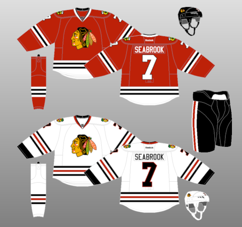
I think the Blackhawks road jersey is overrated. It's still a lot better than most teams, but where is the color balance? Their red jerseys are some of the most vibrant in sports, but the roads are mostly black and very drab looking. Switch the black and red and it would be a winner.
I was thinking the exact same thing watching the game the other night. Red numbers would make the road set infinitely better than what they have now. I'm not a huge fan of the homes because I'm not a fan of that style of hem striping, which is incidentally why I like Dallas' white sweater so much more than the home.
-
The red jerseys are mostly hated around here. The inaugural home sweaters that were green with the bear head front and centre are rightfully loved by pretty much everybody I've seen comment about them here.
I don't like the inaugural green sweaters
-
1
-
-
Remember when the Falcons wore Zubaz? Let's never let Adidas get the NFL contract, just to be safe.

-
Okay but what programs do most of you use?
MS paint is the easiest to use, but image quality as a whole suffers and it takes a lot of time and patience to draw something very high quality. This is definitely a good place to dip your toes in the water.
Inkscape (which is free) and Illustrator are great vector programs that can be used to make some beautiful looking concepts, but both definitely have a learning curve to them. If you use one of these, practice a good amount before posting a concept.
Photoshop uses bitmap imagine like paint, but is much more complex and can also create some very high quality concepts. This one also has a learning curve to it.
-
The Dodge Viper is my favorite car. I have been enamored with them ever since they came out. But I will never own one.
That's okay, you can buy a knockoff for half the price!

-
Upper lip? I don't understand what you're seeing, lol.
Looks like a slightly deformed horse.
Well, take a look at the right picture. Then take a look at the gap where the bronco's mane is. Then look at the dot right in the middle of the bronco. That's the eye. I think you see it now, lol. I've never seen anything more scary in my life. The way the arms look wrenched out of place and everything. Here come the nightmares.
Yeah, I don't really see it... But on that topic, I used to hate the old Lions logo for a similar reason.
The issue for me was that the bottom jaw and the upper leg of the lion connected, so that space created looked like an eye, and the legs seemed like a weird mouth. I think I was 15 before I realized that it wasn't just some really deformed lion.

-
No... the Lightning, Capitals, Senators, Penguins all come to mind as worse uniform sets.
I like each of those sets MUCH more than the Blackhawks (Besides the Senators, those ones are worse).
-
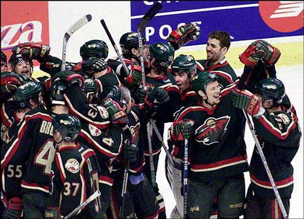
Personally, I think the Chicago Blackhawks have one of the worst uniforms in the NHL.
Please don't hurt me.
-
I love Niagara's grey shorts/grey helmets.

and the 90' Patriots uniforms are still some of my favorites all time... I just love that sublimated torso striping.

I also love almost any yellow jersey.

Minor/Independent/Collegiate League Baseball Logo/Uniform Changes
in Sports Logo News
Posted
Humongous Melonheads is the only truly valid name for a Backyard Baseball themed night