


MDGP
-
Posts
1,883 -
Joined
-
Last visited
-
Days Won
1
Posts posted by MDGP
-
-
Lots of real throwbacks today in the NFC West.

49ers: You know the famous 49ers throwback that the team wore in Super Bowl XXIX and recently brought back? It, like many of the throwbacks from the NFL's 75th anniversary, is inaccurate due to the league not changing teams' primary helmets. In actuality, the team wore red helmets with a silver stripe. Honestly, it's amazing the Niners ever wore this as a throwback. The original jerseys were worn only during the 1955 season in which the Niners went 4-8 and finished 5th in the NFL West. The jersey is modeled here by Hall of Fame QB Y.A. Tittle.Rams: The Rams are synonymous with shoulder stripes, having worn at least one jersey with them every season since 1962. These are the jerseys that started it all. Worn for only two seasons before the Rams' experiment with blue and white, they feature blue-yellow-blue UCLA stripes with matching stripes on white pants. This looks is incredibly underrated and would still make a fantastic look for the team today. The jersey is modeled by The Secretary of Defense, Deacon Jones.
Cardinals: The Arizona Cardinals are the NFL's oldest franchise and one of two charter members that still exist, so naturally they're going to feature jerseys from the earliest days of the league. The jersey for this matchup is based on the team's second ever uniform paired with their socks from the version of the jersey worn in 1927. This jersey featured three large cream stripes on the sleeves and a similar striping patter on the socks, with an added 4th stripe. The original jersey also featured the team's wishbone C logo on the sleeve cuff. Due to constraints of modern templates, this small feature has been removed. Paddy Driscoll, the NFL's original triple threat, models this jersey.
Seahawks: Our only concept jersey of the day has the Seahawks in a double blue color scheme inspired by the team's 2000s jerseys. Thin stripes on both the chest and sleeves were pretty common during the earliest days of the league, so I placed 6 on the chest and 3 on each sleeve as an homage to Seattle's 12th man. Half of these stripes are Navy blue while the other half are steel blue, inspired by the Frankford Yellow Jackets' asymmetrical stripes worn during the 1926 and 1927 seasons. Finally, while a vest majority of teams during the era wore naturally colored leather helmets and pants, several teams wore dyed gear including the Green Bay Packers, who wore similar blue color pants in 1927 and 1928.
-
 1
1
-
 1
1
-
-
I am not letting this series die, damnit! Thanks to lessons learned doing my college hockey redesign series, I've actually made sure that got everything fully prepped and it's just about posting the actual designs, so this time we're actually getting it done!
Today we're moving back up to the AFC North for two wildly different eras of design.
Bengals: Everyone definitely loved and didn't despise those 1930s striped Steelers throwbacks (to be fair I genuinely loved them) so naturally everyone will want to see the Bengals do a similar thing. The Steelers, however, were not the first team to use hoops on their jerseys, as they were somewhat widespread during the 1920s as well. The concept is simple, tigers have black and orange stripes, so the jersey is entirely black and orange stripes. Unlike the Steelers numbers, there's enough contrast for white numbers with black outlines.
Browns: The Browns jersey takes its inspiration from several designs from the 1920s. The chest features a triangle, a nod to the Dayton Triangles who featured the shape on their chests, as well as a nod to the rock and roll hall of fame, famous for its pyramid shape and located right next door to Cleveland Browns Stadium. The sleeves take inspiration from the Cardinals sleeve stripes and logo from the era. This also features an homage to the famous <=B=> logo by depicting the C on the sleeves as a vertical football with the two stripes running through it. Finally, the jersey includes plain brown pants inspired by the darker leather pants color that some teams wore at the time.
Ravens: The Ravens take on a traditional 1960s NFL look featuring a purple helmet and jersey with white pants. I initially thought of black for the helmet, but in my research I discovered that only one team in the NFL or AFL wore a helmet that could be considered darker than the team's dark jersey during that era, the Denver Broncos. And even then it's debatable whether that color blue can be considered darker. Therefore, the purple helmet was used. The helmet features a logo inspired by the Ravens' original shield shape, but flipped sideways to form a B reminiscent of the Packers' iconic G logo. The jersey and socks feature a traditional triple stripe, and the pants have a single black stripe in honor of the Ravens' actual first jersey featuring a single white stripe on the pants. This stripe is somewhat anachronistic, as almost every team by this point had triple stripes on the pants, but Washington did have a single stripe at the time, so it wouldn't be out of the realm of possibility.
Steelers: The Steelers actually existed, so they get their real road jersey from 1963-1965. There's not much to say about these jerseys, the most notable feature being the contrasting yellow sleeves with a black northwestern stripe. This was also during the brief period in which the Steelers did not wear yellow pants. As with the other real throwbacks, this jersey is modeled by Hall of Fame full back John Henry Johnson.
-
5
-
2
-
-
23 hours ago, Haz_Matt said:
I haven't seen any "iconic" or non "bush/minor league" names suggested by the people dumping on the rumored options either
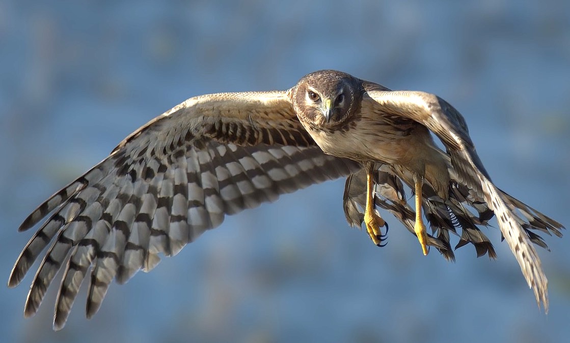
The Harriers. A bird of prey native to the area that conveys the old tropes of speed and toughness. And it's also the name of a military jet for the ever important "sports iz WAAAAARRRR" and military fetish crowds. To top it all off, it's a legit cool looking bird.
-
6
-
-
20 hours ago, rfraser85 said:
I don't know about sales for U-H, but if the NFL did nothing, how many other college teams may try to do something like this? One imitator may not be a problem, but the potential for cumulative damage may be worth taking action.
That said, I agree that shutting everything down may be excessive. The Iowa Hawkeyes have been using Steelers look-alike uniforms for decades, so there may be a middle ground somewhere.
Trademark law isn't like copyright where you retain the right no matter if you choose to defend it or not. Under US trademark law you are required to vigorously protect your trademark or you lose the right to challenge in the future. That itself can lead to the loss of the trademark and/or total genericization of the mark.
-
6
-
-
16 hours ago, FiddySicks said:
Oh great. These are all terrible. And you know that the very worst one of them all, Yetis, is ABSOLUTELY going to win in a landslide.
This league is a perpetually unserious joke.
Seriously, it's baffling. "Utah Yeti it's almost a rhyme hehehehehehe." What are you people, kindergartners?
-
4
-
 1
1
-
-
Penn State had a weird period where the basketball programs added light blue to the color scheme, making them look like Villanova and UNC.
-
3 hours ago, sky1324 said:
I feel like the whole reason 5280 is such a big deal because it's exactly one mile above sea level. Sure, some cities are higher, but none are perfect like Denver.
Except that almost nowhere in Denver is actually 5280 feet. But I guess "5280 feet at the 13th step of city hall and maybe the 4th highest row at Coors Field, they won't actually let us survey it" doesn't have the same ring to it.
-
7
-
-
6 minutes ago, RyanMcD29 said:
Hey now, they're also great at lacrosse!
But otherwise yes, rest of your point sums it up
Haha, I had a feeling someone was going to point out a smaller D1 sport they were good at
-
13 minutes ago, JustABallCoach said:
Locally the H-Town alts have near unanimous praise, so it matches what I've seen and heard.
Maybe. But I've also heard that with basically every single uniform unveil on this site.
Fact of the matter is, jersey sales always skyrocket right after an unveil because people want the new jersey. The actual popularity of a jersey is never measured by first day sales, but by how long the jersey sticks around. If these are still the jersey in 25 years it means the sales are strong enough where they don't feel the need to change.
But history has repeatedly shown that most of these jerseys that are supposedly the next big thing disappear after 5-7 years. Seattle's the main exception and that almost certainly is paired with the team having its best stretch with those uniforms.
-
1
-
 2
2
-
-
7 minutes ago, JustABallCoach said:
Love the deceptive phrasing here by using sold out incorrectly. This also isn't actually impressive. They said the exact same thing with the terrible 2015 Browns jerseys too as though it meant anything other than fans will buy new jerseys.
-
2
-
2
-
-
11 minutes ago, spartacat_12 said:
College teams don't carry the same importance in hockey as they do in basketball. If you did a poll of NHL fans asking them if they know what the University of Denver teams are called I think most of them would draw a blank.
Yeah, I think the premise that they're the [insert power 5 school nickname] of college hockey is the issue. Denver's really more like a Villanova or Gonzaga just with more national titles. They're phenomenal at one sport but not at all present in the top levels of D1 at anything else, while UConn, Duke, and UNC are all power 5 schools. I'm not sure I'd trust the average fan to know what Nova or Zags' mascot despite both being hyper generic.
Honestly, it really all comes down to the fact that football is the truly important sport for fan knowledge. The top level FBS schools are the ones everyone knows and everyone else is a crapshoot.
-
1
-
-
On 4/19/2024 at 1:38 PM, spartacat_12 said:
Thank god it's plural at least.
Is every single NHL team from now on going to have a "regional" nickname that has literally nothing to do with the region?
And before anyone jumps in and says it is regional, the Yeti myth has nothing to do with the American mountain region, it's not the same as bigfoot/sasquatch. It would be like a team calling themselves the Utah Himalayan Brown Bears because they're a bear so they're the basically same thing as a Grizzly.
-
7 minutes ago, Maroon said:
In fact, even showing your pen work with the paths helps me a lot, as I didn't create the "S" (or any of the letters) by creating a path that crosses over itself - I made an outline and then made another shape for the internal gaps. You make a really good point about the inner loop and outer loop. Now that you've explained your process and the need to make inner curves at least be generally the same as the outer curves, you can tell that the "S" has an inner shape is disconnected with the outer curve of the letter.
There are actually some benefits to doing it the way you mention in the bolded part (I honestly do it both ways depending on the circumstances), but when drawing the loops that way it just requires a bit more care and attention to get right.
Oh, I forgot to mention earlier, the advice with the flowing vertexes doesn't necessarily apply to the letter E. I've found in some cases having the letter flow works well, but in others you will actually want a corner in there. This is mostly just a stylistic decision that will depend on the rest of the script.
-
1
-
-
Man, this is the first time in awhile where the "it looks like an XFL/group of 5 college/high school/video game create a team" comments are actually right on the money.
-
8
-
-
There are a few things I'm noticing looking at your scripts that I think will help a lot.
First, and this is a general good practice, is to try to have as few anchor points as possible in your line work. The fewer points you have, the fewer opportunities for the logo to have unsightly kinks and bends in the shape. You'd be surprised at the complexity of shapes that can actually be made with so few anchors. For example, take a look at the image I drew below.
The cursive S on the left is made with only 4 anchor points, now it's not great, but with only two extra anchor points in the right spots, I was able to make a really clean looking cursive S with only 6 points. Obviously if you're doing shapes instead of strokes, you'll have more anchors, but the principal is the same. On your design, the difference is really noticeable between your S and your T.
My second tip would be to really pay attention to the vertexes of where the stroke crosses over itself. The S is once again the best example of this. In a script logo we're mimicking pen real life strokes of pen strokes. Using a slightly altered S below, see how where the S crosses over itself, the outlines still naturally flow into one another? Making sure that the flow of your lines is consistent even through those portions will make your letters look a lot more like natural strokes.
Finally, one of the things I've struggled with a bit is making sure that the inner loop and outer loop are consistent. They don't need to be the exact same curve, but they should be generally the same shape (Note, this applies to all the letters, the S is just the easiest example to work with). On your S, the inner loop is almost a triangle, while the outer loop is a lot more rounded which makes the shape awkward in a few places. Really focusing on making those portions look more cohesive will drastically improve the quality and really get you to the place you want to be with the design.
Also, I hope this advice doesn't come across overly harsh. There's definitely a lot of potential here and I think you're a few tweaks away from having a really great design.
-
1
-
-
3 minutes ago, MJWalker45 said:
If the blue helmet was used with the black jersey and either blue or silver pants, it could be such a good look. But we all know it will be Blue/Black/Black instead.
Not necessarily, if the image from earlier (added below for convenience) is in fact the black jersey, then it's pretty clearly paired with either blue or silver pants.
Obviously, they can decided to go with all black if they do in fact have black pants, but the image (assuming this is the black jersey) suggests they at least intend to wear it with different color pants.
-
4
-
-
Recently Aston Villa has undergone a crest redesign that can only be described as a complete and utter debacle. For those out of the loop. Since the 2000s Aston Villa has worn an honestly pretty bad light blue crest with a yellow lion, pictured below on the left. Its color scheme is a textbook example of the concept of contrasting colors and why you should use them. Last season, the club decided it was time to make a change and gave fans the option to vote for two honestly also pretty bad crests. The fans voted on the logo in the middle, which was an attempt to return to their 1980s crest, but without any of the charm. It also led many fans to claim it looked too close to Chelsea's design, which I don't necessarily agree with. However, this logo merely revives the worst, and most generic crests the team has ever worn. Then, after all the backlash, Aston Villa scrapped the new design and a leak of a new new crest which ultimately is just a worse version of the crest that they had all along.
Since nobody at the club seems to have any idea what they're doing, I've decided to fix it for them.
My version of the crest is designed to complete the following goals:
- Keep the 2000s era shield. Roundels are boring and overplayed. Just because social media websites use circles doesn't mean everyone needs to design their logos to fit snug inside them. The shield design helps Aston Villa avoid the spurious Chelsea comparisons, gives some continuity between designs, and has historical precedent.
- Claret and Blue as the primary colors. I achieved this by looking to the club's iconic jersey. The popular maroon and light blue jersey design originated with Aston Villa, so I incorporated that design on the shield with two light blue vertical stripes. This also has the added effect of referencing the crest designs of the 1970s and 90s through early 2000s, which featured a series of claret and blue vertical stripes.
- Retain the Redesigned Lion, but in Yellow. The lion from the first redesign is actually great. It reminds me a lot of the Detroit Lions redesign and how it only improved on a logo that was a bit of a blob. However, I made a few changes. First, the lion is flipped to face the left, matching basically every crest the club has ever worn. The lion also returns to yellow since it provides excellent contrast with the design so long as it has the claret outline to prevent blending with the light blue.
- Use the Full Team Name and Slogan. Another issue brought up in the redesign was the use of AVFC. Many fans felt that using Aston Villa would be more helpful in actually identifying the team. I also wanted to bring back the team's slogan "prepared" that had graced the crests for decades and quite frankly is more interesting and unique than the team's founding year.
The final result was the logo above, which I believe updates the team's crest in a unique way while also maintaining historical elements that fans of the club would appreciate. I'd love to hear what you all think!
-
7
-
2
-
1
-
12 hours ago, BBTV said:
I know we're never going back to my favorite era of logos (Nordiques, Flyers, Whalers, Devils, North Stars, and others that pass the book-cover test) but something along the line as the Kraken (with a better name) would be more than welcome.
Most of these concepts are over done and better suited for the concepts forum or a AHL, USHL, or inndor leagut
They're also both clearly AI, which makes sense as they just look like every esports logo on behance but rendered sloppily when looked at for more than 3 seconds.
-
So, looking like the northwestern stripe is staying on the helmet but with white, and unfortunately no pants stripes
-
1 hour ago, damnyoutuesday said:
There is so much color saturation in this that idk how we can discern anything other than the jersey is darker than the helmet and pants
Yeah, non-full spectrum lighting makes it difficult to tell things apart for humans. In some instances a color doesn't even need to actually be darker to appear darker in the correct lighting. This quote is an excuse to post one of my favorite youtube videos.
-
7
-
1
-
-
24 minutes ago, HOOVER said:
So hard to tell, although to the naked eye, it does look like a Black jersey & Black socks over either Silver or Blue pants.
Yeah, it's probably black. Under blue lighting (assuming it's true RGB blue) a blue jersey almost certainly wouldn't get that dark. Red would look considerably darker under blue light (depending on the shade), and would have historical precedent, but come on, that's not happening. In theory the green in honolulu blue would make it darker under blue light but I can't imagine it would be that dark.
So that leaves black or an uber darkhorse navy blue, which would also have historically precedence. But like red, I can't imagine the Lions ownership would ever go in that direction when black is on the table.
Of course, the above could all be rendered entirely moot by a variety of factors affecting how the room and the set are actually lit.
-
31 minutes ago, tBBP said:
I mentioned it before before several people shot back with now-30-year-old examples of dual nicknames existing across two different leagues, well before IP and trademark law/awareness was at the level it is now, but the Utah NHLs may not be able to use "Grizzlies" if the NBA's Memphis Grizzlies decide to file a trademark suit on that nickname. (Of course, that'd also require the Grizzlies to a/ be paying attention to all this and b/ care enough to actually do that, so...)
It really demonstrates how people don't understand the way that trademark enforcement works.
Trademark law specifically requires organizations to protect their trademark or they lose the right to do so in the future. Because that is a specific part of enforcement, the failure to enforce one's own trademark does not automatically mean that there is precedent that other teams cannot protect their own trademark, just as you noted with the Grizzlies.
People like to bring up the Jets, but the New York Jets had played for years while the Winnipeg Jets existed. The ship had sailed decades earlier on them using trademark protections to stop a team named the Winnipeg Jets from existing.
Of course, this is all soft IP law, so it also wouldn't be out of the norm for a judge to interpret things in a completely different manner and then create conflict of law that just muddles everything further.
-
2
-
2
-
-
Today's the day, the NCAA D1 Hockey National Championship! As we speak, Denver is up 2-0 against Boston College and is well on its way to its record setting 10th National Championship. Much like today's concepts, this title game is turning into a bit of a letdown excitement wise.
First up, the Wisconsin Badgers.
Like Penn State there is very little about Wisconsin's uniforms that need to be changed. Their red wings style jersey is iconic and stands out with the double stripe mirroring the team's football jerseys, and the diagonal wordmark on the front is one of the few that I actually really like. Only a few minor changes here, first the stupid arrow cutout thing that the team uses is removed. I also added the double stripe pattern to the collar and added the power W to the shoulders. Finally, I removed the black drop shadow from the logo as the logo is easily strong enough to survive on its own.
-------------------
And for the final team of this series, the school that started it all, the Yale Bulldogs. College hockey was introduced to the United States by Malcolm Chase, who gathered a team comprised of students from different Ivy league schools to learn the game from Canadian players. Despite their early adoption of the sport, it would take Yale until 2013 to win their first and only national championship.
Yale's navy and white double stripe design has been extremely consistent over the years, and I wanted to keep this design. However I also wanted to incorporate a thin shoulder yoke inspired the team's jersey design from the 1930s. The Yale Y logo is featured on the helmet, shorts, and yokes.
-
2
-
1
-
-
23 minutes ago, habsfan1 said:
Are there any Coyotes in Utah?
Still, Utah Coyotes and Salt Lake City Coyotes doesn't sound good. Relocation was inevitable. But getting their own identity would be better.
Even their basketball team took New Orleans' identity. Both of their big 4 pro sports teams have a brand that used to belong to someone else.
Yes, the range of coyotes is across the entire US, 90% of Mexico, and like 2/3 of Canada. There's almost nowhere in North America where the Coyotes name wouldn't make sense.
That being said, I agree they should probably change the name.
Only real downside in all this will be losing the Kachina logo, though it would absolutely be in character for a Utah team to just keep it even though it's irrelevant to the area.
-
3
-


2023-'24 NHL season
in Sports In General
Posted