


MDGP
-
Posts
1,883 -
Joined
-
Last visited
-
Days Won
1
Posts posted by MDGP
-
-
21 minutes ago, Chromatic said:
Addendum to my comment about the Broncos 'Club 1977' that was using an updated 'D' logo that was taken from a fan concept, apparently that's not the case.
https://twitter.com/masedenver/status/1778542035210752116?s=46&t=EsXZXf63qJs621q-gvh_Pw
https://twitter.com/mikeklis9news/status/1778541613729415265?s=46&t=EsXZXf63qJs621q-gvh_Pw
Also that portal no longer displays that logo either. I wonder if this is a case of some web-design intern going rogue.
Could've easily been told to use a throwback logo as well and just picked that one on google they saw and boom. Certainly wouldn't be the first time an intern did that.
-
 4
4
-
-
Tonight is the presentation of the Hobey Baker Award for the national player of the year. Each year the winner is selected out of three finalists, known officially as the Hobey Hat Trick. In honor of this today I'm presenting three concepts.
First up, the 2013-14 National Champion Union Garnet Chargers. Union wasn't a particularly notable team for their first 20 years of their D1 existence. In the last 2000s however, they hired Nate Leaman who led the program to its first D1 national tournament appearance in 2011. He would immediately leave for Providence College. The next season they made their first ever frozen four appearance, winning a title two years later, a year before Leaman would lead Providence to their first national title.

Union recently changed their name from the Dutchmen/Dutchwomen to the Garnet Chargers. Union is the only team in this project that includes a roundel logo on the jersey. I find them overplayed and generally a downgrade from just using the logo alone. However, there's something I like about Union's overall look with the roundel, so I kept it here. However, I made some alterations to better match the current identity. The new U bolt logo takes the place of the plain block U and different color versions are used for the home and road jerseys. The jersey design with the bruins style shoulder yoke is generally the same as the season they won the national title. Personally, I believe that when your name features a color, it should be the primary color, so I made some alterations to the home jersey. Now, the inside of the yoke and stripes are garnet, matching the numbers and the roundel designs. Finally, the pants feature a garnet lightning bolt on black pants. This is meant to be a bit more subtle than the tampa bay lightning pants with a similar design, so there's not white outline.
------------------------
Our second team is the final Hockey East squad, the Vermont Catamounts. Vermont is known as the team in hockey east that is generally one of the worst, but pops their head up every now and then with a legitimate contender. They've made two Frozen Fours, the most recent in 2009 after #4 in the nation Michigan was shocked by Air Force in the first round, and a Catamounts double OT victory in the regional final.
The logo design for the Catamounts is an updated version of a concept I made in 2020.
The jerseys feature double northwestern stripes, on the home in green and yellow, and on the road white, green, and yellow. These stripes are arranged to form a V on the hem and sleeves. The arched Vermont wordmark remains on the chest, however it is now joined by a front number, as I've always felt Vermont's jersey looks a bit plain with just the wordmark.
-------------------------
Our third team today is the final truly experimental design of the project. Western Michigan is very good at making the national tournament and very bad at winning once they make it. In their history the Broncos have made the national tournament 9 times; They are 1-9, making the regional final for the first time ever in 2022.
The hockey program didn't seem to get the memo that the school was reverting back to brown and yellow with the yellow W logo. In retaliation for their inaction, I've decided to go all-in on yellow and get weird with it. Both jerseys feature a thick chest stripe that aligns with the sleeves. This stripe is split in the middle by a smaller brown stripe. On the home jersey this stripe is all yellow, while the road jersey has a yellow and white stripe. The top stripe contains WESTERN and the sleeve numbers, while the bottom stripe contains MICHIGAN. The striping pattern is also featured on the hem and socks. The shoulders feature the new W primary logo while the shorts feature the Bronco logo that is actually recolored to not be a horrible blob of shapes. Seriously, what the hell is this, WMU?
-
1
-
-
5 hours ago, B-mer said:
Great job on UConn. Without reading the description I knew you tied the design to the basketball team, and it's completely identifiable as UConn. Also love using the huskey primary instead of a wordmark. Small detail i might adjust is the pants stripe to not go as high up. On the basketball shorts you have a tucked in top to allow visibility, and with a hockey jersey it would cover up the top portion. May make it only halfway up the side of the pants so it's still visible.
That's a good call, thanks! I've made the revision in the original post.
-
8 minutes ago, FiddySicks said:
I’m totally fine with three helmets. It also makes me slightly less worried about what the Broncos are apparently going to do.
Watch those reddit rumors be correct but for only the alternate jersey and third helmet.
-
Happy Frozen Four day to everyone. Let's all enjoy the excitement of 4 teams compete to be the team that nobody wants to see win again. Our next two teams are very much none of those four teams.
The Stonehill Skyhawks are the worst team in D1 hockey, and it's not even remotely close. They went a brutal 2-33-0, with their only wins coming against fellow basement dweller Lindenwood and D2 school Assumption (First year D1 hockey schools are allowed to have a transition year in which they can play a mix of D1, D2, D3, and club teams). In Stonehill's defense, Assumption were the D2 champions this year. This would be impressive if D2 hockey hadn't collapsed and now consisted of six programs who are not allowed to play in D3 conferences due to NCAA rules.
Stonehill doesn't seem to know whether they're a a purple and black team or purple and grey team, so I made them a purple, black, and grey team. This design fully embraces the three color system by using a variation on the traditional triple stripe (or a modified split double stripe if you prefer). The sleeves, hem stripes, and yoke stripes feature the same pattern: on the home black/silver/purple stripes and on the road black/white/silver stripes. The pants also use this scheme, with purple replacing black. The primary logo and numbers feature matching patterns; at home the purple logo and name/numbers are outlined in silver and black double outlines. On the road jersey they become black, with silver and black outlining it. The numbers also add a smaller white outline to aid a bit more with visibility from distance. Finally, I wanted to have fun with the captains patch which includes the win design from the primary logo.
--------------------
Did you know that Connecticut starts with the letter U? Because I do apparently! When I started the project I had intended to list teams alphabetically ignoring "University of . . ." when ordering the teams. However, I'm so used to referring to them as UConn that I labeled the file as such and didn't realize until well after their turn in the order had passed. Therefore I felt it made sense just to wait for U. UConn's bad at hockey. They're one of the 9 teams to never make a national tournament appearance, and are perennially a low tier to mid-low tier hockey east team.
Original version with longer pants stripe.
College hockey programs are no strangers to wearing jerseys inspired by their football programs; Penn State, Ohio State, Michigan, Wisconsin, Princeton, and Notre Dame all include elements directly inspired by their iconic football looks. At UConn however, basketball is king, and I wanted to give the hockey team a design inspired by the school's iconic basketball jerseys.
To do this, I went with an offset striping pattern with a thicker white stripe and a thinner red stripe. The shoulder yoke and pants do a variation of this, matching the basketball team's side and shorts pattern used in some capacity for decades. Otherwise, it's a pretty straightforward design, with numbers and letters based on UConn's signature font and the redesigned husky logo on the chest and shorts.
-
5
-
-
6 hours ago, Section30 said:
Love the quartered look for the Saints!
The Tommies look good without black, but I would suggest tweaking the jerseys just a bit by moving the hem stripes all the way to the bottom of the jersey. It would remove the little sliver of color on the bottom and would also give the shield a little more breathing room on the front.
Good call on changing up the stripe. However, after taking a look at it, I actually decided to go in the opposite direction. Making the stripes smaller addresses the two issues you highlighted, by giving more space for both the logo and the bottom of the jersey. It also makes jersey look more like how I intended as a variation on the traditional 3 stripe arrangement rather than a blackhawks variation if I had extended the stripe to the bottom of the hem.
-
1
-
-
Today we've got three Saints and two Toms.
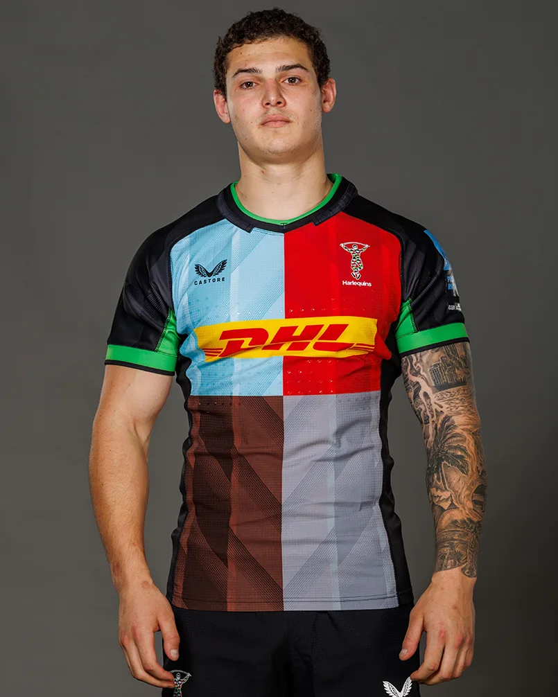
First up, we get a saints twofer with the St. Lawrence Saints. St. Lawrence has a student body of approximately 2,000 making it one of the smallest schools in division 1. Unlike the other tiny schools, St. Lawrence has a long history of success, with 9 frozen four appearances and two national title games. Their size has caught up with them a bit, as their last frozen four appearance was in 2000, and last tournament appearance was in 2007. They did win their conference tournament thus qualifying for the national tournament in 2021 However, their coach tested positive for Covid and the team withdrew from the national tournament.
I may have gone with another gimmick for these jerseys. I've always loved the quartered pattern on the shirts of Harlequins F.C.. I've always wanted to see the idea or variations of the idea make its way into other sports. I was tempted to go way over the top with the design, but I decided to keep the idea within the stripes. The stripe pattern is quartered in brown and red, inspired by the school's primary logo. The sleeves are designed to that the red quarter will be in the top left and bottom right corners when the player is viewed from the side. In order to maintain the effect, the red jersey includes a thin white border stripe.
----------------
The St. Thomas Tommies did not want to be a D1 school. They were contented as members of D3's MIAC. There, they were a dominant force, winning 1/3 of all conference titles across sports, and their student enrollment of nearly 10,000 nearly doubles the next biggest school. They were a D1 school, playing with low level D3 schools. The rest of the conference threatened to leave the conference if St. Thomas remained. The conference agrees, in order to protect its members and save itself St. Thomas had to be kicked out. In response St. Thomas petitioned NCAA to allow them to make the forbidden D3 to D1 jump. They've been very bad in their first two seasons at the top level, but that's to be expected under the circumstances.
St. Thomas' real jerseys are your standard, boring triple stripe jersey that heavily incorporates black. All my other purple teams include black so I wanted to do a jersey that just incorporated purple and white. I also wanted to create a striping pattern that was modern but evoked a vintage hockey jersey. This design is meant to combine the school's brand new era in D1 with the fact that the program has existed since 1920. The striping pattern is a triple stripe that doubles the stripe width on each stripe closer to the bottom of the jersey. The socks also include this design, which is mirrored and then paired with two smaller stripes at the top in order to evoke the wilder sock stripes of vintage jerseys.
-
4
-
 1
1
-
-
2 hours ago, B-mer said:
1. love NCAA Hockey concepts, so it's fun to see your work
2. GIMME A U! GIMME A N!!! GIMME AN H!!! WHAT'S THAT SPELL? UUUUUNNNNNNNHHHHHHH! (UNH alumn, what's with the UNH hate?)
Grew up a UMaine fan, it's just second nature for me, haha.
-
1
-
-
2 hours ago, Haz_Matt said:
Yeti seems to be a popular one as well based on comments
The NHL already has a team who's regionally specific team name actually has nothing to do with the region, why not make it another?
-
1
-
-
With the Frozen Four and national championship just days away, we're in the home stretch in this series. Today we've got the Sacred Heart Pioneers and the St. Cloud State Huskies.
Sacred Heart has a hockey team. A very bad hockey team. They are one of 9 teams to have never qualified for a national tournament. Of those 9 teams, 5 became D1 within the past 4 years. Sacred Heart is the second oldest program of the bunch, having joined in 1993, only younger than Navy who joined D1 in 1947. So 30 years of nothing, to me that means they're fair game for some experimentation.
I've had several teams that wear yellow at home, but I wanted to try a different non-white home jersey. Here, I decided to take Sacred Heart's lighter silver color as a base for the home jersey. Both jerseys feature an Ohio State throwback style striping pattern on the yoke, the sleeves, and the hem. The chest numbers are the secondary jersey color with a white outline on both the home and road jerseys.
--------------------
The St. Cloud State overall visual package is known for just ripping off various NHL teams. Their logo is a take on the Canadiens, their jerseys are just Blackhawks jerseys, and their home used to be a Montreal Canadiens jersey in black and red.
St. Cloud has a long, storied history of its own, and I think their teams should actually embrace that history. For the last time this series, I'm bringing in the help of Vintage Minnesota Hockey, you can follow along here.
The home jersey is based on the team's 1952-1966 jerseys. These had a large chest and sleeve stripe with an offset St. Cloud wordmark. It was clear that I would need to make some changes to fit as a modern design. The first chagne I made was converting it to a black-red-black stripe. On the stripe, I replaced the wordmark with the St C. logo. This logo emulates the original by having the logo offset up on the chest stripe. I also found the back stripe made things pretty illegible, so I terminated the stripe at the back.
The black jersey is a pretty faithful recreation of the 1933-1952 jerseys. The only major change was an update to the old school St. Cloud wordmark to and placed in a more modern location and size for a modern jersey. The only other real changes were some small adjustments were made to the sleeve stripes.
-
4
-
-
-
Next up we've got a couple of schools trying to recover from some hard times.
First up, the Robert Morris Colonials. When most teams "fall on hard times" it generally means they've had some bad, maybe even embarrassing seasons after years of success. Robert Morris's hard times were having to cut both the men's and women's hockey programs in 2021. Within 6 months, the school would announce that due to donor support, the both programs would return in 2023-24, and getting back to what it does best, being a mid to bottom tier Atlantic Hockey team!
RMU takes on shades of team USA and the Oshawa Generals. With their colonial america theme and colors, the similar design made sense. However, I didn't want them to just be carbon copies of the team USA designs. First, the design takes on navy blue, which ironically makes them closer in color to the current US hockey team. The sleeves feature 5 stripes with a 3 stripe hem. I've always felt it was a bit boring that most teams feel the need to ensure that both the hem and sleeve stripes are equal, hence all the teams wearing the same/almost identical triple stripe designs. Here, I wanted to demonstrate how stripes on different jersey elements can be different so long as effort to integrate them is taken. Finally, I gave the road jersey a white shoulder yoke, because apparently I've got a thing for white shoulder yokes now, and also because it further enhances the old school look I was going for.
--------------------
Remember those hard times I was discussing above? Yeah, the Rensselaer Polytechnic Institute Engineers, have the normal version of that. One of the oldest college hockey programs, RPI has been relevant in spurts. However, their early spurts were fruitful. Between 1593 and 1964 RPI made four frozen four appearances resulting in a 1954 national title. They would then be irrelevant for another 20 years, when in 1984 they returned to the national tournament. A year later, they would reach the promised land again, defeating Providence for their second national title. 10 years later they'd make back to back national tournaments. Since then, RPI has made one national tournament in 2011 and does not appear remotely close to returning. This year RPI's RPI was 54th in the nation.
I ran into a bit of a problem with RPI. You see, their most iconic look is their 1985 national championship jersey. But that jersey looks almost identical to Lake Superior State's jersey from the same era. So, I decided to try something a bit different. On these jerseys, the shoulder stripe that normally would go to the bottom of the sleeves stops just below the shoulder numbers, making them actually an extended shoulder yoke. The sleeves then feature the same design as the hem stripe, itself designed to match the shoulder yoke. And finally, because RPI's design is a tiffany/red sox font, I had to go with a matching number font and name on back.
-
3
-
-
We're continuing our journey through New England/Mid Atlantic portion of the thread.
Our first team, the defending national champions (until next week) Quinnipiac is the perfect example of the benefits of investment in a program. Quinnipiac was just another Atlantic Conference school struggling after making the jump from D2. However, in 2005 the school broke ground on state of the art facilities for both the basketball and the hockey programs. After the completion of their new arena (Fun fact, it is one arena with two separate playing surfaces and seating, so it's like two arenas in one), Quinnipiac saw its fortunes increase drastically and immediately. Six years later, Quinnipiac went from a nobody to a national finalist. Three years later they'd make the finals again, and would lose again. After two years of rebuilding, Qunnipiac was back to its winning ways, and haven't missed the tournament since 2018 (2020's cancelled tournament notwithstanding). Finally, last year Qunnipiac potted a point blank backhand off a cross-ice backhand pass a mere 10 seconds into overtime to topple the Minnesota Goldent Gophers and take home their first national title.
Quinnipiac has been pretty comfortable wearing a simple double stripe design for at least a decade now. It's to a point where it's becoming an iconic look, especially with yellow at home. However, during the national title game they channeled the Boston Bruins, wearing a navy blue version of the reebok edge era design.
I wanted to find a way to combine those looks into one. To do that I also emulated an old Boston University design with double stripes and a double stripe phantom yoke. The shoulders feature the school's Q logo which also features a sort of double stroke design. This letter design is mimicked for the Captain's patch.
I generally do not like how Q'Pac does their crest. Usually it's the cat head in a circl with an arm swiping below. It's supposed to look like a Q, but the execution fails pretty miserably in my opinion. I also dislike the roundel used for last year's title game jersey. The fact is, the bobcat head logo is EASILY strong enough (honestly it reminds me of a better version of my mullet bobcat look for UNH from 2014, see. UNH post for image).
-------------------
The Rochester Institute of Technology Tigers the type of team college hockey fans think of someone mentions Atlantic Hockey. They're a team that is never actually competing, but because the Atlantic gets an automatic bid for the conference champion, RIT has made the tournament 4 times since 2010. The Atlantic Seed as it has been colloquially called is almost always the 16th and final seed, as Atlantic champions to be ranked in the low 20s to high 30s, well out of at-large territory.
RIT did go on a shocking Final Four run in 2010, defeating Denver and New Hampshire before being downed by Wisconsin. Otherwise they've been top seed fodder, this season losing to #2 in the nation Boston University.
RIT is actually based on an unfinished design in a project I worked on years ago. I've always liked the design and felt that RIT's overall look (see, Flyers rip off) would translate well.
The design features a striping patter that features black double stripes on the arms, hem, collar, and socks. This stripe abuts the orange sections of the jersey, and between the stripes is a continuation of the white sections of the jersey. This is maintined for both the home and the away jersey. The crest features RIT's primary logo, which I like as it combines the traditional arched wordmark with the more modern logo on chest.
-
3
-
-
There's nothing particularly interesting to tie these next schools together for an intro. At best it's that they both start with Pr. Really missing those coincidences right about now.
The Princeton Tigers are the alma mater of one Hobey Baker, best known as the namesake of the Hobey Baker Award, "the Heisman of Hockey." Princeton's basically known for nothing else in the realm of hockey. Their best stretch came in 2008-09 when they won the ECAC in 2008 and made the NCAA tournament as an at large the following season. After the 2010-11 season coach Guy Gadowsky decided he wanted to ruin hockey tm and moved on up to my previous post to become the head coach of Penn State. Fun fact, they were still a club program during his first season with the program, which probably goes to show where Princeton was as a program.
Listen, I'm a sucker for the alternating striped shoulder yoke for tiger based teams. If you give me an orange and black team named the Tigers or Bengals, this shoulder yoke design will show up somewhere. Princeton felt like a perfect team due to its status as an Ivy League school, which immediately allows them to wear classic/anachronistic designs. Otherwise the design is pretty simple, the home jersey has a triple stripe, and on the home that stripe becomes a double stripe on the black background. I also decided against adding any white to the away jersey because like Navy and Yellow, Orange and Black just look great on their own. Princeton also keeps the winged helmet, something that they apparently don't always wear. It's stupid that they don't seeing as they invented the damn thing.
----------------
The Providence Friars are one of those teams that's a national power every 30 years. Their only national championship game appearances came in 1985 and 2015, winning the latter after the single most brutal goaltending mistake I've ever seen in my life was made by BU's goaltender (look up the video, because no description will do it justice). Otherwise they're usually just a decently competitive team in Hockey East with a few solid alums like Hal Gill and Tom Fitzgerald, who is best known for his time with the Pittsburgh Penguins as the Director of Inheriting Crosby, Malkin, and Fleury.
I've always felt that Providence needs to embrace silver more than they do. They have a silver alternate, but their primary jerseys generally feel black and white with silver as the tertiary color. Here, the shoulder stripes are back, this time taking on a northwestern stripe look, with a thick center stripe surrounded by two floating smaller stripes. On both jerseys, the numbers and name on back both match the shoulder stripes while the shoulder numbers match the jersey color.
Also of note, the logo is another one of my older designs. I hate the current angular skating friar. It doesn't match the rest of the identity at all, so I came up with a new design that it meant to resemble a front facing version of their current friar head logo.
-
4
-
-
1 hour ago, HOOVER said:
Not running to Nike's defense, but we pinned a decade's worth of bad helmet designs - Jags, Bucs, Browns, Titans, Commanders, Falcons, Jets, alternates for the Saints and many others - on the Swoosh, when in fact it was the teams and league who had final say.
Honestly, this is more on people on the site not listening/reading because we've known for nearly a decade now that Nike doesn't do the helmets, the league does.
Every single jersey unveil has had the same type of exchange where someone says 'Oh nike's pushing ______ feature" and someone points out that the league designs helmets without Nike's input.
It's similar to how the five year rule gets brought up for every US sports league even though it's only the NFL that has the rule.
-
9
-
-
All the small schools have been fun, but today we're sticking with two of the nation's biggest.
The Ohio State Buckeyes may have been the elite football program in the Big Ten over the last 15 years, their hockey program is not. Of the 7 Big Ten members, Ohio State is the only one that has not won the Big Ten Tournament Championship, though they did go on a surprise Frozen Four run in 2018.
I know, I know, just hear me out. I don't like Ohio State's hockey jerseys very much because the color balance is way too scarlet heavy. I'm aware that light pants are generally frowned upon in hockey, but I actually think the grey helmet/grey pants combination can work, as I noted in my Niagara concept. This combo should be limited to the white jersey, making the pants the darker color, avoiding the problems caused in jerseys like the Capitals white pants jersey. On the road jerseys, the customary scarlet pants and jersey combo stays, but grey socks are added to balance the colors. The sleeve stripes on both feature striping based on OSU's iconic helmets. Finally, the buckeye leafy logo is placed on the shoulders and used as a reward sticker on the helmets, a practice that, while not nearly as common as football, can be found in college hockey as well.
-------------------
Our second team is my alma mater, the team that Ruined College Hockey tm. Penn State's arrival to D1 hockey in 2012-13 set in motion the largest realignment in decades. The Big Ten sponsored hockey for the first time, pulling Michigan, Michigan State, Minnesota, Ohio State, and Wisconsin away from their traditional conferences. The CCHA would fold, and the NCHC was formed. Fears that big schools would take over the sport were rampant, and fans lamented how soon the sport would be nothing more than football or basketball. Those fears proved to be unfounded. Only a few years later the WCHA would fold, being replaced by the new CCHA. Arizona State was the only other large school to sponsor D1 hockey (Arizona State and PSU both had legendary club programs so the jumps made sense). 5 schools have won their first title since 2012, and UMass is the only champion in that time that also has an FBS program.
I'll admit, I feel like I cheated a bit with this design. The Nittany Lions got it almost perfect immediately, taking inspiration from the football jerseys. However, there is one design element I've always hated, the contrasting name plate, lifted straight from the Philadelphia Flyers. It was clear it was a trendy for the sake of it move, and it quite frankly doesn't add anything positive to the look. The only other changes are going to a true lace up collar and using a font based on the throwback jerseys that the football team has worn (I also think the football team should move to that font full time).
-
4
-
-
7 minutes ago, raz said:
As does Texas...
I'd like to tack on Ohio as being more iconic, and New Mexico as being more beautiful.
-
3
-
 1
1
-
-
34 minutes ago, Captain Poncho said:
I was noting for my oldest son how at most Avalanche games, whenever a team like Boston, Chicago, NYR/NYI, etc. visit, the crowd of visiting fans is absurdly thick, because natives know we can sell the tickets to the new transplants for a mint and basically pay for the season ticket package in one game.
It never goes the other way around, because Colorado people rarely leave for the perpetually grey, crime-infested, bung hole cities out east.
Damn dude, that's some serious cope over two people saying they don't like the state flag.
-
1
-
 8
8
-
 1
1
-
-
We're finally finishing up our slog through "M and N" letter schools, which at 18 schools, make up nearly 30% of all D1 hockey programs.
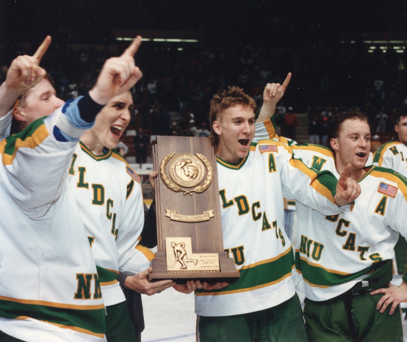
First up, the Northern Michigan Wildcats. Northern Michigan is a great example of how success works for the non-blue bloods of college hockey. These schools hire a new coach and within a few years, they're a national contender. Life is good, they make the national tournament often, and maybe even win a national title or three. And then after a decade, two if the school's really lucky, the coach retires, and with him goes the success. The school struggles somewhere between mediocrity and downright incompetence hoping that they will someday find that coach who will return them to their former glory.
The Wildcats' program began in 1976, and they hired Rick Comley, coming off two two NAIA national titles as the coach of Lake Superior State. Within 4 years they'd be a national runner up, and in 1991, they'd take home the ultimate prize, their only national championship. They'd make 3 more trips to the National Tournament before Comley left for Michigan State, where he'd win a national championship in 2007. Northern Michigan has made the tournament one time since.
The Wildcats underwent a logo change a few years back that did a really nice job cleaning up their old logo. On their jerseys, they have historically worn Wildcats on the diagonal with NMU below on the right side of the stomach (their right our left). This look is so dumb, there's no chance I'm retaining it even if they did win a title in it, sorry NMU fans. I decided to replace the diagonal wordmark (which I generally don't like for longer names outside of like the Rangers or Wisconsin (hint)), with the wildcat head. On the jerseys I decided to go with a pretty traditional striping pattern that you may notice is reminiscent to the Packers. They weren't specifically an inspiration, but come on, that stripe pattern is just gorgeous. For the home jerseys I implemented an upper arm and hem color block to maintain the above mentioned striping pattern, as well as to keep the design unique when compared to other green and yellow teams' white jerseys.
----------------
Next up is everyone's catholic grandfather's favorite college football team, the Notre Dame Fighting Irish. Notre Dame has a fun history of having no idea what they were doing or where they were playing in college hockey. Their varsity program has been suspended 3 times, including a downgrading from varsity to club in 1983-84 before immediately upgrading to varsity for the next season. The Irish's conference affiliation history is as follows: Independent, WCHA, CCHA, Club Team, Independent, ACHA, Independent, CCHA, Hockey East, Big Ten. It seems like the big ten affiliate move is actually going to stick this time but who knows.
Notre Dame's jersey history is relatively consistent. Notre Dame on the chest, with a gold and white triple stripe on blue sleeves on both the white and the blue jersey. There has been some variation regarding the number of stripes and whether the sleeves are blue up to the yoke, but it all looks pretty similar.
For my redesign I wanted to first fix the main problem I've always had with the jerseys. No more flat mustardy gold. We at MDGP know that shiny material is possible on jerseys despite white the major manufacturers claim (hell, Notre Dame demonstrated this a few years back). The gold across the jersey will now match the iconic gold fleck helmet the hockey team wears. The second change I made was going away from the triple stripe. When the gold color and white touch, I find there's a bit of a visual bleed issue that makes the white look a bit off-white, and I wanted to eliminate that effect. I also re-elevated the gold to primary status on both the numbers and letters throughout the jersey, except on the captain's patch and name on backs of the home jersey.
-
3
-
-
On 4/2/2024 at 12:43 PM, GriffinM6 said:
Absolutely love the uniqueness of the Omaha jerseys. You really made them stand out despite being a red and black team. The interlocking UNH logo is one of the best things you've done in this series as well.
Thanks! I had a lot of fun trying to go for something that wasn't the standard 2-3 letters in a diagonal arrangement that a lot of schools go with. There's so much potential, I'd love to see more schools push for more unique designs.
On 4/2/2024 at 12:51 PM, PERRIN said:Love this logo refresh for UNH. I was just at UNH for a rugby tournament last weekend, couldn’t help but notice how stilted the wildcat head logo was, with the mouth rendered at 3/4 view and the rest of the head at profile view. Very nice refresh, uniforms look excellent. I’m adoring this series so far, love seeing all the small schools—especially the ones from my home state—get some love. All the logo redesigns have been stellar. Makes me wanna give hockey concepts a try.
I'd definitely love to see some hockey concepts from you. Your NAFA stuff has been great, so I have no doubt you'd be able to put together some really cool and unique hockey looks.
-
1
-
-
Tonight we've got a couple of North teams, quite literally.
The North Dakota Fighting Hawks are a true blue blood, with 8 national titles (good for third most all-time) and 22 frozen four appearances. Their 3 national tournament appearances since 2017 would make most programs ecstatic, but for NoDak its their worst stretch in three decades, as they missed the tournament once (2002) between 1997 and 2017.
North Dakota is one of those schools that has an iconic look despite pretty regularly changing both their logo and jersey designs. It's the beautiful green and black combo that stands out so much. I actually really like the school's current look but I also wanted to combine it with the beautiful NoDak alternates that the school has introduced in recent seasons.
The home jersey sees a vast majority of that influence, with green taking total precedence on the jersey. The triple stripes and shoulder yoke stay, but they entirely green now. The black lettering and numbers have also been replaced by green. I also used a custom font inspired by the NoDak look.
The away uniforms implement one of my favorite dead/dying uniform quirks. Some of you may be too young to remember, but there was a time in Major League Baseball when the St. Louis Cardinals wore blue caps on the road. In 2013 the cardinals switched to red caps full time on both jerseys, a decision I disagree with to this day. I wanted to revive that quirk in a way, and thought NoDak was the perfect team, as black is such an iconic part of their look. The away jerseys feature a black yoke, equipment, and the triple stripe includes two black stripes.
--------------
The next team spent years as the eternally tortured little brother of the Boston area schools. The Northeastern Huskies are the only member of the Beanpot schools (BC, BU, Harvard, and Northeastern) to never win a national title. After winning 4 beanpot titles and a hockey east title in the 1980s they went nearly 30 years before they won either. Starting in 2016 however, their fate changed. They won hockey east twice in 2016 and 2019, and have won 5 of the past 6 beanpot championships, making them the most successful Boston college hockey team of the past decade. And then the 2023-24 postseason occurred. Boston College and Boston University are #1 and #2 in the nation, and are each a win away from facing each other in the national championship, while Northeastern watches from home. Easy come, easy go.
As noted in the Michigan Tech concept, Northeastern was the second team to join the husky logo revolution. Going from legitimately one of the worst rendered logos in sports, to an absolutely gorgeous logo. The only change I made was bringing back the red eye. The demon dog lives.
For the jerseys, it is my opinion that the Huskies' red throwback jerseys is their best look historically, as their primary look is just another Chicago Blackhawks template design. Despite their red look being their best, I feel like black is the Huskies' best option because BC, BU, and Harvard all wear a shade of red as their primary look. On the one hand having all teams in the same metro area having the same primary color is a fun idea, I think Northeastern would benefit from standing out from their historical tormentors.
The split double design is inspired by the school's old N logo, which featured a color split on the diagonal. I did not retain the N logo for this, but I think the double stripe idea is a solid design to build around, and a version of the paw logo features that split design as well. Otherwise, I wanted to keep the look pretty clean and simple, with the names and numbers featuring no outlines (I HATE red outlines on black numbers, and red numbers didn't feel right here). The home also features a simple black yoke and cuffs, while the road jersey features neither a contrasting yoke nor contrasting cuffs.
-
4
-
-
8 hours ago, WestCoastBias said:
College hockey and all these small schools is so interesting to me being from the west coast where it does not exist aside from ASU. Great concepts.
Yeah, it's one of the things that makes college hockey so fun. Only 16 of the 64 teams are FBS schools, and outside of the seven Big Ten members, there are only 3 power five schools. It lends to a unique atmosphere.
Funny story actually, there was a big deal made when Penn State and Arizona State joined, because it seemed like the tides were turning where all the big schools were going to start adding teams and push out the little guys. The teams that joined since then?
Long Island, St Thomas, Stonehill, Lindenwood, and Augustana.
Meanwhile Illinois is the only big school that seriously considered adding hockey, and they decided against it after the exploratory phase.
-
1
-
-
Gonna have a bit of a different twofer today, gonna actually try posting these at reasonable hours of the day for once! (Some day I'm going to remember to actually change the thread title when I post a team, but that day is not last night when I posted UNH).
The Niagara Purple Eagles are barely relevant in college hockey. They had a 5 year stretch in the early 2000s where they were the best team in a dying conference (4 of the 8 teams in the men's CHA have since dropped their programs, with Robert Morris actually being revived. Boston College has made the frozen four 5 more times than the entire conference combined has made the NCAA tournament, including their histories before and after the CHA existed.)
There's one thing however at which Niagara University is truly elite. Having a garbage ass logo.
If you're on this site, you probably need no introduction to the worst logo in D1 hockey and potentially in all of college sports. Awful line work, awful gradients, looks nothing like an eagle, may or may not have teeth. The whole thing is an absolute mess. My goal was to make an eagle that looks like an eagle. When that was done, I added some purple feathering to further accentuate the "purple" part of the name and then placed the head on a similar NU to the actual logo. And so ends my lesson in "Guy's it's not that hard to have a logo that isn't horrific".
For the jerseys, unlike the previous purple teams, I decided to eschew black entirely. Back in the late 2000s Niagara had a short lived experiment with silver helmets and pants. I actually liked this look and think it's an example of how light hockey pants can work in a very specific application (foreshadowing!). I didn't go with the extra silver here, but it was a major part in my reasoning the make Niagara a purple and silver team. I really wanted to push the purple as the primary color and made the sleeves on the home jersey purple along with a color blocked purple hem to go with purple equipment. On the road jersey the white is merely changed to purple and any purple lettering flips to white lettering to match the sleeves. Overall it's simple but I think helps them stand out from the other purple teams and still looks pretty modern.
-
5
-
-
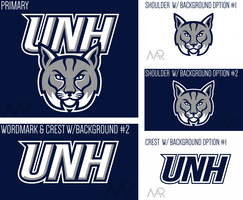
Only one team today, but we've got a full logo refresh!
Next up are the UNH Wildcats, and all I have to say about them is we've got two how about you?
Despite my hatred for UNH, I still think they should look good. Their current logo does not look good and looks nothing like a bobcat. This is why I've redesigned them numerous times, first with the mullet bobcat, then with the throwback bobcat. And while the UNH letter logo is okay, I wanted to try something different.
As I noted above, the main goal for the primary logo was to make it actually look like a bobcat. The secondary goal was to eliminate the awkward perspective of the real logo's head. I generally prefer side profile stuff so I went with that. I could throw some great nike speak your way, but ultimately the idea was pretty simple and I just wanted to execute that idea without trying to throw in a bunch of hidden details.
For the letter logo, I noticed that UNH has never really had a good letter lockup. Letter lockups are some of my favorite logos to do since it can be like a puzzle trying to get letters to fit together in an appealing fashion. For this logo I actually took inspiration from numerous designs in @PascalHugo's Alternative Football Universe. If you haven't checked it out before, you really need to, it's in my opinion the single best concept thread that's ever been on the boards.
For my design, I decided to take the U and make it a sort of framing device for the NH and H. The configuration is meant to give the lockup a type of shield shape that would allow it to be used in numerous applications that it otherwise might not be used for (i.e. hat logo, soccer crest, etc.).
UNH's jerseys are pretty iconic (at least to me) with it's simple navy blue and white design with double stripes. However, I have always thought that silver could and should be incorporated to the design without drastically changing the overall vibe. This incorporation was simple, adding a thing silver stripe on the inside of each double stripe. The UNH logo is placed on the chest, with the wildcat head logo placed on the shoulders.
-
4
-


2024 NFL Changes
in Sports Logo News
Posted
I just googled Denver Broncos Throwback D logo and it was literally in the first row of results from a version of your logo that someone posted on pinterest. At some point someone working for the broncos gave it a right click and trace, and either it was placed in the broncos database or whoever designed this did it themselves.