-
Posts
1,883 -
Joined
-
Last visited
-
Days Won
1
Posts posted by MDGP
-
-
Halifax Town FC is one of the newer teams in professional football, founded in 2007 after the former team folded, and almost certainly takes the cake for one of the worst, most generic crests in sports, there's pretty much nothing interesting or unique about the design.

For my design I wanted to keep in line with Halifax's teams histories of simple crests. However, I still wanted to give the squad a design that doesn't look like it was designed in Microsoft word. The main design uses an HT letter lockup on a half navy, half light blue shield. Upon the top of a shield is a Yorkshire rose, because apparently every team from Yorkshire is legally required to have one.


The jerseys continue the half blue style, with the primary kit mimicking the style of the crest, while the clash kit utilizes the pattern on a center stripe and sleeve cuffs. Halifax is the city where the popular british candy Quality Street was created by Mackintosh's. Eventually the brand was sold to Nestlé, so it made sense as the sponsor for the squad.
-
 4
4
-
-
On 11/25/2023 at 6:54 PM, VampyrRabbit said:
Unlike Boreham Wood and Banbury, I don't think the Chesterfield crest is an improvement over the original. It doesn't look like there is a representation of the Spire on the crest. I also don't think the striping on the kits work either with two of the three stripes being the same shade of orange. Maybe try using a shade between the crimson and the orange for the middle stripe.
Thanks for the C+C, I see where you're coming from with both points. I'm gonna take a look at a few ideas and make some adjustments, though it'll probably come after the next few teams get posted.
-
On 11/26/2023 at 5:05 PM, WestCoastBias said:
Why can't MLS get more well known companies for sponsorships? I understand it for less popular teams in smaller markets but LAFC, Galaxy, Seattle, Atlanta, and Miami are premier teams and all have not very well known or just weird sponsors.
Only teams I can think of with well known sponsors are:
Charlotte - Ally (at least for me)
Austin - Yeti
Toronto - BMO (big in Canada I guess)
Minnesota - Target
NYC teams - Kind of? But they are owned by them so not as cool
United Health (New England) is worth nearly $500 billion, Alaska Airlines (Portland) is the 5th largest airline in North America, Thomas' (Philadelphia) is just a sub brand of Bimbo, the largest bread company in America, American Family Insurance is a multibillion dollar company, and basically every company sponsoring an MLS jersey is a Fortune 500 company
Not being sufficiently well known to you =/= Not well known or extremely profitable
-
 1
1
-
-
On 11/23/2023 at 6:43 PM, dont care said:
TD Garden isn’t close, the Celtics hang less banners than the hitmen. Now if the hung individual banners for their retired numbers rather than consolidating them the Celtics would nearly double them. Regardless the bruins wouldn’t have enough banners to top them still I believe.
The TD Garden actually has 46 banners.
17 Celtics Championship Banners
3 Celtics Retired Numbers Banners
6 Bruins Stanley Cup Banners
6 Bruins Division/Conference/Presidents Trophy Banners
12 Retired Number Banners
1 Beanpot Champion Banner
1 Hockey East Champion Banner
The old Boston Garden had considerably more banners since the Bruins used to have a separate banner for every division and conference title.
-
Chesterfield is by far the most successful team I've done so far, historically spending much of their time in the third or fourth tiers of English football, the Spireites have recently cratered and now languish outside of the Football League.
The team's current crest depicts Chesterfield's famous twisted spire alongside their traditional CFC letter lockup.

My logo is a full modernization of the crest, darkening the blue to a navy, altering the spire to a more abstract depiction of the spire, changing the letter lockup to one that reads more like CFC than the current, and finally changing the shape of the crest to accentuate the tilt of the spire.


The striping pattern from the crest becomes the main focus of the jerseys. The clash kit takes inspiration from the Houston Astros' 1980-1993 shoulder stripes. The jersey manufacturer is puma and the sponsor is british sporting goods company Slazenger, so there are a lot of cats on this jersey.
-
 2
2
-
-
2 hours ago, WBeltz said:
There’s something about it I don’t like. Perhaps it’s the Stanford script instead of the S, but I’m not feeling these.
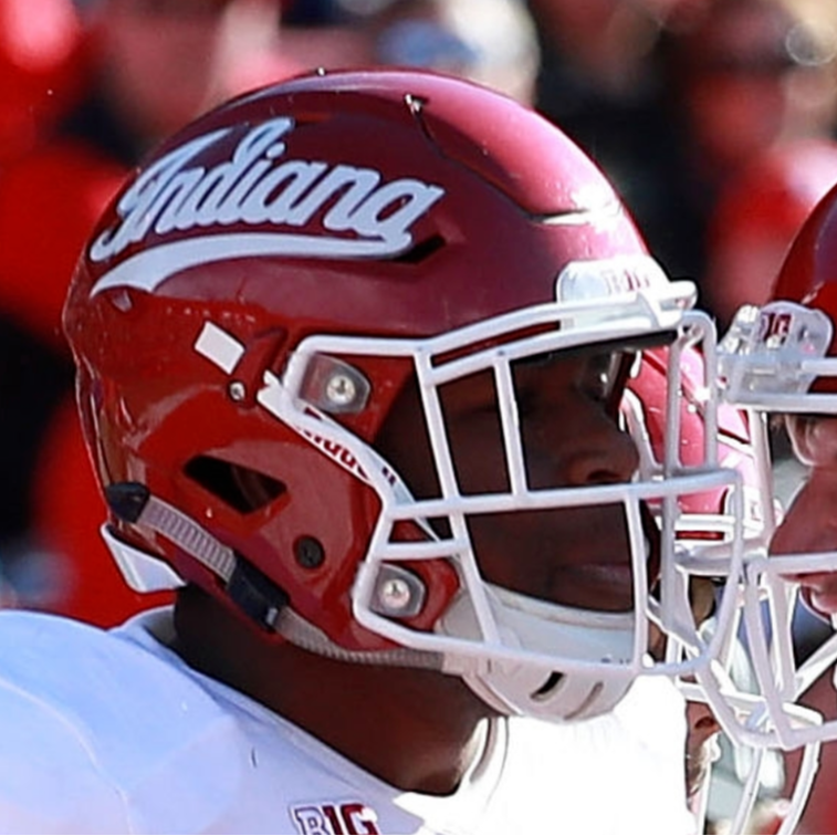
Stanford out there looking like Indiana West

-
 7
7
-
-
Boreham Wood FC is another club that has never played in the Football League, but recently gained moderate fame for its 2021-22 FA cup run, beating League One's AFC Wimbelon and the Championship's (at the time) Bournemouth, before losing to Everton.
Now, I generally hate when people describe logos as looking like a generic placeholder in a video game, but yeah, that's about as generic as it gets.

I decided to drastically change the logo and incorporate the local flair. Borehamwood is famous as the home of Elstree Studios, the filming locations of films including the Shining, Star Wars, and Indiana Jones. The new crest depicts a classic film camera, with the film reels represented by soccer balls. The main focal point of the crest, BWFC is a modified Steel Tongs font, a font inspired by film poster credits.


The uniforms are kept simple, stark black and white. The main feature is the northwestern stripe on the cuffs and collars. Originally the idea was that the stripes would depict film reels, but the look was a too kitschy, so I simplified it into the northwestern stripe as seen here.
-
 3
3
-
 1
1
-
-
It's apparently been a full year since I've posted any concepts here, and I'm getting withdrawals. one of my favorite sports games is Football Manager, and I almost exclusively play Park to Premier style playthroughs in which a team from the very bottom of the pyramid is picked, and you try to get promoted all the way up to the Premier League and continental tournaments.
These playthroughs also have the added effect of exposing me to a lot of smaller teams and their terrible, terrible crests. Since the game is extremely moddable, I like to take it upon myself to update the crests for these teams. I've shown off a few of these in the past with my Oxford United and Wolves designs.
There's not going to really be any rhyme or reason to the designs other than they're smaller teams who's designs I wanted to update. I also realize that these teams, despite being small, have storied histories and passionate fans, and I want to design a logo that recognizes and respects these histories.
First up, the team I'm leading to glory, Banbury United!
Banbury is a semi-pro team founded in 1931 have existed almost exclusively in leagues you've never heard of, but in 2022 they made the climb to the Vanarama National League North. Their logo depicts what appears to be a lego minifigure dressed up like a puritan.

My update takes this general design and makes it look more human, giving the figure clear eyes, a nose, and a mouth as well as adding a mustache, because I'm from New England and every depiction of a puritan I've ever seen is John Carver, so you're stuck with it too. I did try to keep the general blocky style, but modernized the overall shape of the crest, with a new simplified banner and the hat extending beyond the bounds of the roundel.


The jerseys feature a double pinstripe hoop pattern that I've used in my playthrough, and features Nike as the kit manufacturer and Sophos as the jersey sponsor, two brands wildly above the stature of Banbury in real life, but I have them in the EFL Championship in FM, so they make sense in that regard.
-
 5
5
-
-
Excellent work as always. The modern primary is great, but I gotta say, I think I like the 1932 logo even better. It's so simple, but looks so classy. Great stuff.
-
Great to see you back in the concepts section, Fraser.
Some pretty fantastic work here, pretty much everything is an upgrade. I especially like the Warriors, Raiders, Broncos, and Featherstone Rovers.
The only logo I'm not entirely sold on is St. Helens. I like the idea of combining the chevron with the S-H lockup, but I find the letters end up getting muddled a bit, especially where the S, H and the chevron meet and create what looks like a little point jutting from the crossbar of the H. Ultimately though it's still considerably better than the actual crest.
-
33 minutes ago, the admiral said:
The Heat have had the steady and competent hand of Pat Riley guiding them all these years. That helps a lot. Consider how many front offices routinely do stuff that's really, really dumb. The Bulls front office did really dumb stuff while they were winning championships. Desirable weather and tax situations certainly help, but the Heat have a higher floor than most because they're not run by an idiot.
You could put a team in literal heaven and Jeffrey Loria would've still put together a 65 win team every year.
-
-
6 minutes ago, pepis21 said:
Who cares about Kyrie and Luka if it's still the best league in the world with the best players in the world. Mavs should've won easily even without them.
Anyway I'd strongly recommend to watch some EuroLeague games, is really enjoyment, maybe even more than NBA nowadays. Today there is El Clasico, good game to start.
It was a preseason game, it didn't matter to anyone on the Mavericks outside of like 4 players who were trying to not get cut from the roster. I'm not saying that euroball isn't enjoyable, but it's disingenuous to use a preseason game to insinuate that a euroball team would ever even come remotely close to the NBA Finals.
-
 4
4
-
-
On 10/25/2023 at 2:53 AM, pepis21 said:
That OKC was a 75th Remix too.
Lives on , because he is right and if he isnt't then remind me who's won Mavs-Real game?
Luka Doncic scored 9 points in 5 minutes and Kyrie Irving didn't play. The Mavericks would've won by 30 if both played a full game.
-
48 minutes ago, the admiral said:
Were they savvy enough to say "no tape that isn't white or black" for visual-distraction reasons, or did they just straight-up say no one's allowed to have gay tape?
Given the demographics of the league, I wondered if they also want to preempt blue and yellow Personal Opinion Tape on teams that don't wear blue and yellow, but I don't think people care as much about that now.
Doesn't look like there's been an official statement released, but I've seen this paragraph verbatim on multiple articles:
"The updated guidance reaffirms that on-ice player uniforms and gear for games, warmups and official team practices cannot be altered to reflect theme nights, including Pride, Hockey Fights Cancer or military appreciation celebrations. Players can voluntarily participate in themed celebrations off the ice."So it seems like the league specifically said no gay tape. Though knowing the state of journalism it might have just been a bunch of sites just copying the same article.
-
1 hour ago, Pabig93 said:
It's not really random. For time elements they use the serif and for non-time elements they use sans serif.
-
 3
3
-
-
11 minutes ago, FiddySicks said:
It’s definitely over the top to call him a “liability”, but I feel like Josh Allen hasn’t been good in about the last ten games.
He's had 27 turnovers in the last 19 games. He's reverted to all his old bad habits since Dabol left.
-
 1
1
-
-

-
 4
4
-
 5
5
-
 8
8
-
-
This is legitimately dumber than "the iconic jaws of husky stadium," though nothing will ever beat "contrasting stitching honors YOU, the hard-working, blue-collar CLEVELANDER (the brown is unchanged)."
-
 5
5
-
 5
5
-
-
3 hours ago, AJM said:
Sun Devils new black uni with some glow in the dark elements...
Would've liked to see what the effect actually looks like rather than what happens when an intern lowers the exposure and slaps green + gaussian blur over the original image.
-
 1
1
-
-
-
Looking at it this way, I'd actually go with #3 as well. The angled number didn't translate the same way in the picture with the purple jersey the way it does on the white jersey. Definitely would go with #3 for both seeing it in that context.
-
 3
3
-
-
Yeah, 2 is easily the best. Not everything has to be geometrically perfect to look good. At least in my mind the wordmark doesn't need to be centered because it's a part of a larger graphic as a whole that fills in that space.
-
 1
1
-
-
3 minutes ago, ramsjetsthunder said:
Please tell me we're getting a Pats/Dolphins throwback matchup in week 5?
Nope. Patriots are wearing their throwbacks against the Dolphins week 2. So both games between them will feature one team in a throwback.
-
 1
1
-


Atlantic Hockey - Fixing the Worst College Conference Logo
in Concepts
Posted
College hockey, like many of the smaller and/or regional sports sanctioned by the NCAA, is structured much differently than the more familiar sports. Division I Men's Hockey features only six conferences, with the Big Ten being the only conference to host universities across multiple sports. The other five exclusively host hockey, being: Hockey East, CCHA, ECAC Hockey (not affiliated with the larger ECAC), NCHC, and Atlantic Hockey Association.
Of the conferences, the Atlantic is by far the worst by just about every metric, with the 16th and final seed in the National Tournament colloquially referred to as the Atlantic Slot. This is due to its eleven member teams being so noncompetitive that, usually, its only representative is the the conference's autobid champion in that final slot.
The conference also has the absolute worst conference logo I've seen in college sports at any level. This logo is not a joke, it is actually what a Division I conference uses to represent itself.
Needless to say, this logo barely befits a youth hockey league let alone an actual collegiate conference. I decided that I was going to take a shot at designing a new logo that isn't a complete embarrassment.
The best conference logos are generally simple, easy to read, and identifiable even in smaller applications. I also wanted to make it quickly apparent that this is a hockey specific conference. I took the conference's little used acronym "AHA" and made it the focal point, with the A's titled towards the center and the outer legs designed to appear like a hockey stick. Ultimately the design is simple, but easily recognizable and versatile in its application. Below is the new logo side by side with the other current conferences, and below that a patch version of the logo in the various color schemes of its member schools.
Let me know what you think! C+C is always appreciated.