


MDGP
-
Posts
1,898 -
Joined
-
Last visited
-
Days Won
1
Posts posted by MDGP
-
-
**** THIS POST IS NOT A LEAK NOR A PREDICTION ****
One thing that's interesting to me about all this, assuming that the information TruColor has received is correct, is that the new color scheme will be more like the St. Louis Cardinals color scheme of the 1960s (top colors vs. the current color scheme on bottom) with the maroon color and yellow that's a bit darker.
But I would also be willing to bet that they will make exactly zero reference to this fact during the unveiling.
**** THIS POST IS NOT A LEAK NOR A PREDICTION ****
We've reached within two days of reveal where this board goes from fun to exhausting, so I figured I'd place this disclaimer for everyone.
-
 3
3
-
-
41 minutes ago, tBBP said:
I'm pretty sure that whatever the name of the orangeish color is won't actually have the word "orange" in it...because that wouldn't be "innovative" enough...
Oh, no doubt. It's gonna be something like Vermillion or Ercolano, 100%
-
2
-
-
21 minutes ago, TruColor said:
Again I was told today, but I’m getting nervous if it is actually happening today or not.
I accept responsibility if it doesn’t happen today…
-
 15
15
-
-
-
2
-
14
-
 1
1
-
 1
1
-
 1
1
-
-
33 minutes ago, flyersfan said:
Is there a world where the new colors not used in major sports is simply Red-Yellow-Blue? As in the state flag?
there are plenty of teams that use 2/3 but no team uses all 3 besides the avalanche/blues/devils alternates…??? Real Salt Lake but idk if that counts to TruColors hints?
-
2
-
-
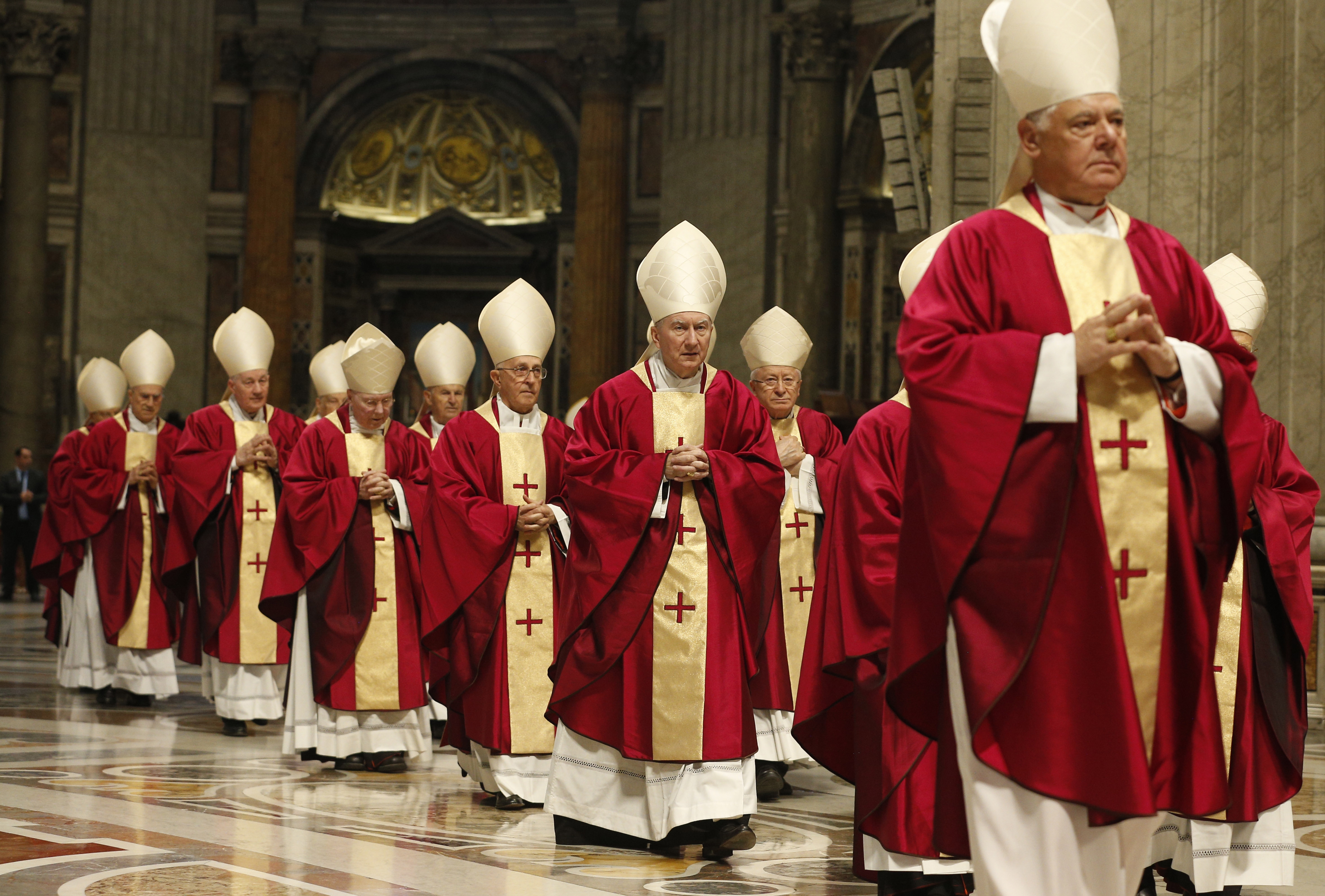
I love when we get close to a reveal on this site because someone will spitball something like "this color scheme would look good for the cardinals"
Which immediately is followed by five pages of people treating the post like a leak and genuinely debating whether they'll wear uniforms inspired by catholic cardinals.
-
5
-
 1
1
-
13
-
-
12 hours ago, oldschoolvikings said:
So, exactly when have gradients worked on a sports uniform? I’m coming up blank.
A couple soccer teams have broken out jerseys with gradients that work.
-
2
-
 1
1
-
 1
1
-
-
5 minutes ago, Cujo said:
Reebok: "Hold my beer"
Any time someone says Reebok jerseys were better constructed than Nike's I can only think of these and the Jaguars awful jerseys.
It's one thing to make a template that can't handle traditional stripes, or a template that can't handle modern designs, but to have a template that can't handle ANY designs is a whole other thing.
-
7
-
4
-
-
21 minutes ago, LogoFan said:
The more I think about this, the more I have to laugh. The "elite" sporting apparel company couldn't deliver the client's desired color for years and can't even do decent-looking stripes. But they can push garish designs, lots of piping and other ugly gimmick like gradients. Nike is becoming the 8-track or Beta tape of their industry.
You've got the analogy backwards. Betamax is generally considered to have had better video and audio quality than VHS and a better overall product. So if anything Nike is the VHS of the industry since they're the top dog but can't do the little things as well as the smaller companies being pushed out.
-
5
-
-
5 hours ago, aawagner011 said:
That’s putting it nicely. It looked way worse towards the end of the game.Looks like I wasn’t patient enough and the field looks great now, indeed.
It certainly helps that both teams use black as their secondary color. Makes the designs actually feel like team designs unlike other years.
-
1
-
-
Okay, time to cool it with these “leaks.” Every single one of these is an obvious concept that doesn’t nearly match the quality or style of the actual logos.
The logo will be here when it’s here.
-
5
-
-
Would you look at that! Thanks to everyone who voted for me!
And thanks to @rsaline for running the competition again. This has always been one of my favorites on the boards and always brings out the best in me as a designer, so I was happy it was brought back for this cycle!
Want to give a shoutout to @gswansea. You are one hell of a designer. I knew I was going to have to really step it up if I was going to compete with any of your 4 excellent designs. Seems fitting that we'd match up again in the finals.
Great work to all the other competitors for a series of excellent designs. Special shoutout to @dsaline97 who seemed to fly under people's radar a bit despite getting 3 of 4 to the knockout round and put up a real fight against both finalists.
And to anyone who didn't advance or feels disappointed with how they finished, don't let these results discourage you. It took me three goes to finally get the gold. Keep improving and honing those skills and you'll get there!
-
3
-
-
Oh right, I forgot I could vote still.
I’m going with Wales. Both designs were fantastic
-
2018: Both finalists were eagle crests
2022: Both finalists are lion crests
Excited to see which animal reigns supreme in 2026!
-
2
-
1
-
-
-
France
Cameroon
Brazil (honestly, I'd give this one a tie if I could. Two very solid designs that represent their nations well)
-
France #2 (gswansea)
Cameroon #3 (gswansea)
Mexico #1 (Josef_Bretones)
Argentina #2 (lightning25)
Netherlands #1 (GriffinM6)
-
I think I agree with you about the W. The logo overall is solid, but that right triangle on the end of the W is kinda making my brain fight against seeing it as a W. Definitely excited to see what ideas you have to adjust that
-
Sure, I’m in
-
On 7/21/2022 at 5:04 PM, PERRIN said:
I fully agree, but it's incredibly entertaining to see it play out until the bitter end. It's nice to see the whole of the board come together to dunk on a troll, even if such engagement encourages other trolls in the future.
Glad I'm not the only one who loves the trolls here. The boards calling out and messing with outsiders who don't realize we have years of experience with people trying to trick us regarding sports design is legitimately one of my favorite parts of this site. Those early Nike NFL years were incredible.
-
3
-
-
I guess if you're gonna play like a minor league team you might as well look like one too
-
1
-
1
-
1
-
2
-
-
-
-


NFL 2023 Changes
in Sports Logo News
Posted
The Bills were Reebok