


panthers_2012
-
Posts
1,604 -
Joined
-
Last visited
Posts posted by panthers_2012
-
-
I REALLY like both of them, but Seal Slingers holds a slight edge as the favorite for me.
-
29 minutes ago, HighCheese said:
No no no no no no no no no no no no no no no no no no no no no no no no no no no no no no
-
 7
7
-
-
4 hours ago, stumpygremlin said:
My relatively uneducated hunch: they're a D3 school. They will probably run through that cycle of uniforms through at least this academic year.
Yeah, they said they're rolling it out throughout the year.
I know BW took a while to update certain parts of campus with their new logo back in 2009.
One part was by the concession stand at the main gym. They had this logo, only the yellow jacket, painted on the wall for about 8 or so years (2009-2018 or 2019) until they repainted it with the current logo.

Fun fact, that logo (just the yellow jacket) is still used for IT and it's still on the marching band uniforms

-
Cleveland Monsters unveiling 15th anniversary logo
-
2 hours ago, Ted Cunningham said:
I like this. I don't know how those who work in or are otherwise educated in design would evaluate it, but it's striking this nice balance of busy, ambiguity, and familiarity (i.e. the state flag, as panthers_2012 pointed out.).
Fun fact: I went to Marietta, which is also in the OAC.
I went to BW! AwwwJackets!
But the best name is the OAC is the Fighting Muskies. I want to see what Capital comes up for the mascot. Maybe a spaceman?
-
Capital (DIII, OAC) are becoming the Comets.
It looks like they based the comet off of the Ohio State flag. I like the name and looking at the logo more, I like it.
-
7
-
-
10 minutes ago, jmatt116 said:
Y'all see the Warriors new court "Origins?"
The site wont let me post pictures but someone can look it up and post it pls
This?
-
7
-
-
1 hour ago, spartacat_12 said:
I'm worried this could mean they're planning on introducing some sort of black & grey 'stealth' alternate like Tampa.
-
7
-
-
50 minutes ago, daniel75 said:
Meh I honestly preferred the howling Coyote sweater. I get the nostalgia , but that’s gonna run dry eventually.
So they're running dry in the desert? Lol
I'm glad they're keeping that logo, but their current logo is unique and I like the uniqueness.
-
2 hours ago, Survival79 said:
-
5
-
-
4 hours ago, GriffinM6 said:
The nickname itself isn't bad, but that logo is horrible. It looks like someone made it in MS Paint in 20 minutes.
I'll have you know they paid me good money for that logo

Yeah, not a fan of the logo or the name, but that's just me.
-
2
-
-
1 hour ago, O.C.D said:
I hope they end up repurposing the howling Coyote logo. It would look good as a shoulder patch if nothing else
Same here. Or keep it as a third jersey.
-
2
-
-
2 hours ago, AFirestormToPurify said:
They're still using the howling coyote head on their official website and on the NHL's website where they're announcing the draft picks, so that's puzzling. Somehow I'm not convinced the rumors are true. Either way, what a mess. This team can't do anything right
No they can't.
Fun fact, here's a tweet from the NHL Public Relations using the Kachina logo
And the Coyotes tweeted this out a day after the first round... Just announce it already
-
4
-
-
1 hour ago, AFirestormToPurify said:
I'm kind of surprised the Coyotes haven't unveiled their new/old away jersey yet. I feel like the draft would have been a perfect opportunity
I thought that too. I haven't seen an "official" press release (or whatever) of them going back to their old logo. I know it's on all of their social media sites and even the NHL has been using that logo, but I'm shocked nothing "official" has happened yet.
-
6 hours ago, AFirestormToPurify said:
PIT: Gradient RoboPen in white
Yes!!!
7 hours ago, GriffinM6 said:I'm hoping that if they bring back the RR programs next year, the Penguins use blue.
IMO, I don't think the Pens will do the blue uniforms anytime soon, just because of all the bad things that happened with them last time.
-
1
-
-
21 hours ago, rorinator said:
Glad to know I'm not crazy. Spotted this when I was at GilaRiver a couple days ago on one of their official trucks and had to take a picture because I didn't remember the Kachina with the new Arizona wordmark, but I guess this is old news haha.
Oh that's nice.
-
3
-
-
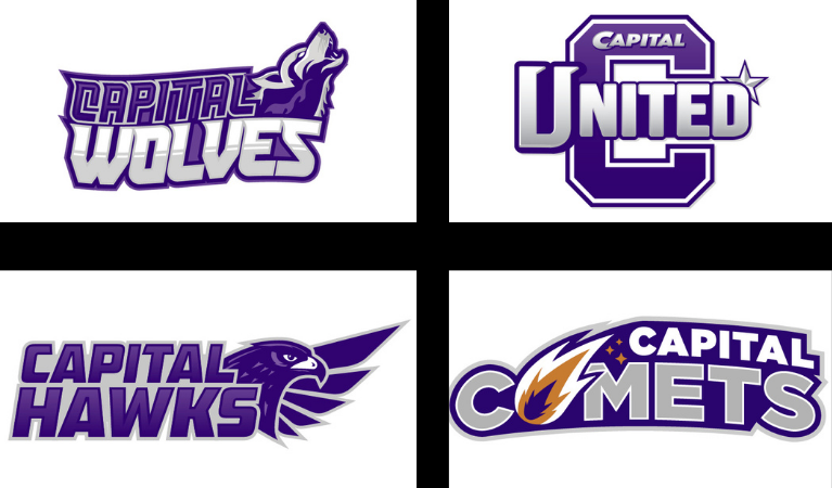
5 hours ago, CaliforniaGlowin said:
Wolves and hawks?
 More boring common crap. Comets has a nice ring to it.
"In my opinion, what I think most people are upset with is that the options presented to us were bland and unoriginal in the end. We felt that we ordered a filet mignon and instead got a hamburger,” said Butts."
Glad I'm not the only one.
That quote made make laugh.
It's true. Capital United is the dumbest one in there. It sounds like a soccer team. Capital dropped the ball on this and I'm hoping that Capybaras can be considered.
-
Capital Crusaders, D3 school in Ohio, announced the final four for their name change. Here are the logos for each potential replacement.
Personally, I like the Comets. It's a unique name, and there's a bunch of unique names in the Ohio Athletic Conference (Student Princes, Polar Bears, and my favorite, Fighting Muskies).
The twist to the story is that "Capital Capybaras" had caught on within the student and the alumni and they want it to be included within these choices. And here's the link to the article: https://cuchimes.com/06/2021/capital-alum-shares-thoughts-on-mascot-nominees/
-
1
-
-
Cleveland Monsters are celebrating their anniversary of winning the Calder Cup in 2016 with a logo
Wouldn't be surprised (off topic) if the Cavs do something like this for their championship.
-
12 minutes ago, parallaxish said:
Hey, some intern somewhere spent like
10 minutes5 minutes making this, give them some credit.Edit: oh my god they didn't even center the text why was there no effort put into this at all
Oh great... Now my OCD is acting up
-
52 minutes ago, Delicate Genius said:
Interesting choice of jersey to use for the 2021-22 Season Seat Registry...
It's better than the orange. They never should've switched their primary jersey from blue to orange. This is a promising sign that they'll return to blue at home and have orange as the alternate.
-
8
-
-
Same with everyone is saying. Don't worry about the reimbursement. I'm happy to help out to keep the site running.
-
2
-
-
1 hour ago, Burmy said:
Brace yourselves...Seattle was the first, but MANY teams in the coming years are going to want to hop on the gravy train and call themselves the Kraken (just as nobody was called the Wild before Minnesota announced it as their name, but afterwards it's become quite a common minor-league name).
Ugh I know.
-
10 hours ago, kiwi_canadian said:
The other team is the Lake Cowichan Kraken and yes they took a lot of similarities from the Seattle team.
A lot?!? They just took off the curve of the S, added a couple things to make it they're own, and called it a day! It looks bad, especially since the Seattle Kraken haven't even played yet!


College athletics identity changes
in Sports Logo News
Posted
I like the "new" one, but I grew up with the the old logo so I like it. I like to call it "the praying mantis" logo.