


panthers_2012
-
Posts
1,605 -
Joined
-
Last visited
Posts posted by panthers_2012
-
-
Maybe it's suppose to represent this?
-
 1
1
-
-
2 hours ago, Discrimihater said:
And they make ham too....eeeeeeevil ham.

-
2
-
-
9 hours ago, Brian in Boston said:
The Westfield Starfires' jerseys don't, in fact, feature horizontal stripes. The player in this photo is wearing a horizontal-striped polo shirt under his jersey.Oh that makes me feel better. Good catch!
-
4 hours ago, CaliforniaGlowin said:
Kinda weak the Starfires use the whole logo on their jersey. Just the wordmark would have been awesome. Stripes are kinda weird too.
Ban horizontal stripes on baseball jerseys. It doesn't look right.
-
22 hours ago, CaliforniaGlowin said:
Yeah the bear looks like it's been slashed
The logo looks like when I'm designing logos and I don't like it, I slash it out. I can't believe that was the best that Brandiose came up with...
-
1 hour ago, jmoe12 said:
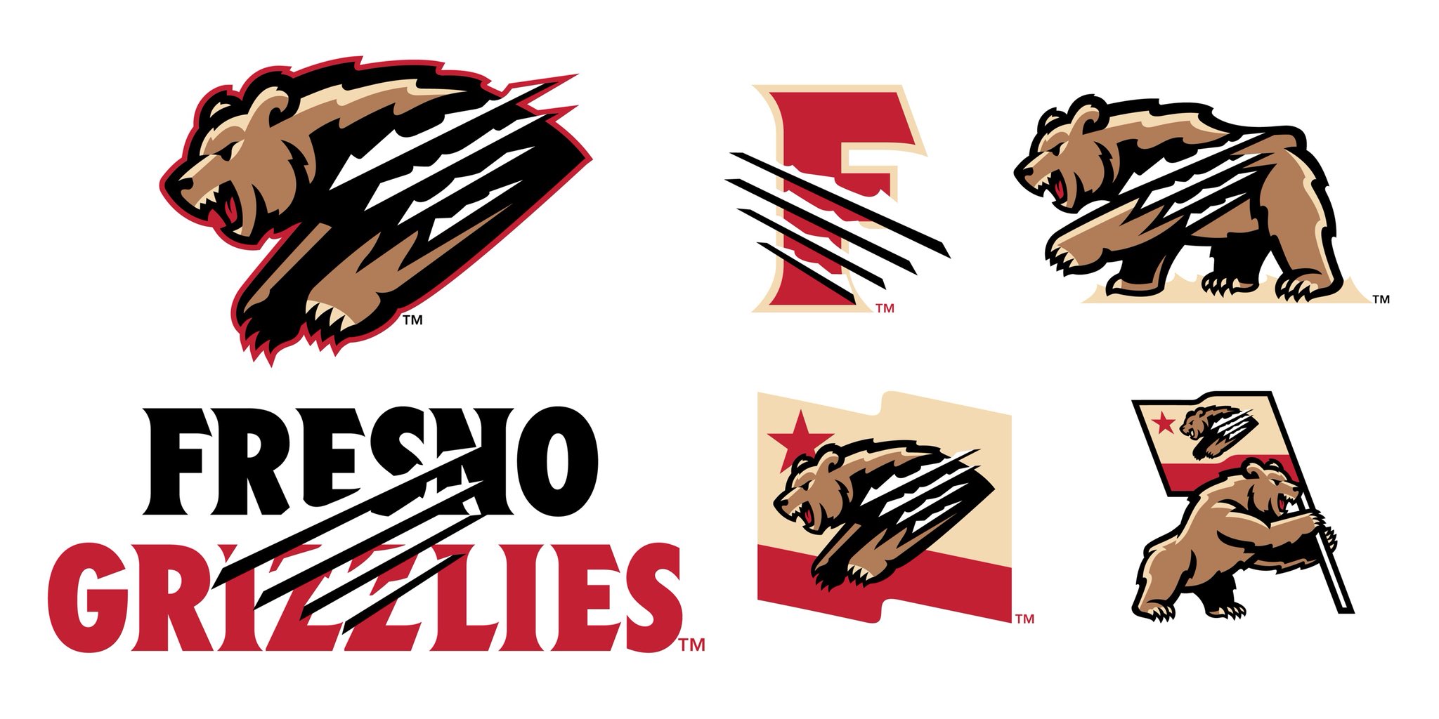
Fresno Grizzlies new logos. I don't know what to think about it. The bear's proportions just feel off
Claw make everywhere ruin the design for me. Just having them on the F or use the F logo in the flag would've been fine, but this...yuck.
-
1
-
-
5 hours ago, CaliforniaGlowin said:
Traverse City new name coming next Tuesday. C'mon Black Pearls!!!
I still like Beach Bums... Sad they won't be returning to that name.
-
2
-
-
Tri-C unveiled their logo today and I have to say, I really like it.
-
4
-
-
11 hours ago, Brian in Boston said:
The summer collegiate Expedition League's Brandon, Manitoba-based expansion team has unveiled its identity. The team will be dubbed the Wheat City Whiskey Jacks and sport official colors of Carolina Blue, Dark Gray and Light Gray.
The team's logos were designed by Ross Johnson of the Ross Johnson Design Company in Rapid City, South Dakota.
The way the bird is standing just looks weird...
-
2 hours ago, hormone said:
Weren’t they the cakes for only like 2 or 3 years? The zephyrs had far superior logos.
Here's the story describing what might happen
-
The Cornbelters, formally of the Frontier League, has joined the Prospect League.
-
20 minutes ago, buzzcut said:
Interesting news coming out of Nashville. Sounds talking about a "remaster" of their branding.
Please just let it be a recoloring of the logos

-
1
-
-
1 minute ago, Green27 said:
Looked up Traverse City to see what they are known for and what would make a good new team name, and saw cherries mentioned in the summary paragraph. If this was Brandiose, we all know it would be the Fightin' Cherries.
Well fun fact, Traverse City gets a lot of tourists and that's why they were named the Beach Bums. If I were the new owners, I would keep the Beach Bums name, but get new logos.
-
1
-
-
Frontier League announced their schedule today. Notably missing is the Traverse City Beach Bums and the Normal Cornbelters.
The Beach Bums, along with their stadium, were sold to a group led by the Midwest League West Michigan Whitecaps and will play, under a new team name, in the Northwoods League next season. Here's the statement from the Beach Bums: https://traversecitybeachbums.com
According to this article, the Cornbelters might be moving to the collegiate league level, but no official statement yet from the Cornbelters organization. https://ballparkdigest.com/2018/09/27/normal-cornbelters-no-decision-on-2019-league/
I'm very upset that the Cornbelters are leaving the FL. They were my second favorite team in the league.
-
1 minute ago, Ferdinand Cesarano said:
I am still wondering why I have experienced absolutely none of this, even without any ad-blocking software.
Am I just on a run of amazing luck? Should I get to my nearest casino and try to parlay it into a six-figure payday?Now you did it...
-
2
-
-
29 minutes ago, BringBackTheVet said:

So now there are actually COMPETING bottom ads - one eventually gives you a little x on the right, the other on the left. They “stack” while forming, then eventually (once the border ad goes away) take their place at the bottom.
The thjng is, while they’re stacked (the shaded area in my screen shot) you’re locked - you cannot click on anything without waiting for all the ads to form and take their places, then x them out, which is hard without actually clicking on them. Only then can I click anything.
Im open to the idea that maybe it’s something on my iPhone, except that it’s ONLY this site, and restarting hasn’t changed anything, which is 99.9% all you have to do when an iPhone develops weird behavior like this.
It's not a iPhone thing. It happens in my Android too. It's getting very annoying, but I can't stay away from the boards, so I'll live with it!
-
1
-
-
5 minutes ago, Earl said:
Concordia University Chicago Cougars of Division III unveiled their new brand during Homecoming for the first time since 1983. New is the cougar logo and font. I take it uniforms will be updated next summer and will be slightly brighter, including for football. Source
OLD
NEW


Personally, not a fan at all. The old logo wasn't fantastic but it was unique enough that I always knew who it belonged to. Now it's seems too cartoonish and bland. Wordmark is decent.I think it's a good update. Needs some shading in the logo, but a lot better than what they had.
-
2 hours ago, CaliforniaGlowin said:
Cuyahoga CC will now be called the Triceratops. Definitely different, I dig it, hope the branding is good. Unusual color opportunities.
http://www.tri-c.edu/news-and-events/news/tri-c-announces-triceratops-as-new-mascot.html
Is it sad that I live in the area and didn't even know they had athletics?!? I new Lorain County Community College did, but didn't know about Tri-C.
-
Happened to me in General design thread... Twice with the same ad
-
21 hours ago, mmejia said:

-
1
-
-
They could've done a milk mustache for the cap logo.
-
4 hours ago, tjs11 said:
I can't find a record of it, but I'm 90% sure this was an istockphoto logo at one point. They have a bunch of generic sports team logos just like this. And would explain why another college uses it too.
Yep you're right. You can see the watermark on it.

-
1 hour ago, dont care said:
But really though what’s going on with the spam bots. I don’t ever remember them being this bad.
Wow, this is really bad.
-
Happened to me.. Can't remember what topic I was on


Minor/Independent/Collegiate League Baseball Logo/Uniform Changes
in Sports Logo News
Posted
Yes to the killer tomatoes!!!