


neo_prankster
-
Posts
4,967 -
Joined
-
Last visited
-
Days Won
7
Posts posted by neo_prankster
-
-
1 hour ago, pitt6pack said:
Notable Fields from Week 2
Atlanta
Falcons went with the throwback field, that we've seen the last couple years, although, as we saw once last year, not Falcon logos in the endzones.

Houston
The Texans went with "white" endzones, although, they looked mostly gray on TV
Jacksonville
The Jaguars fully painted the endzones for an early regular season game, which they have never done before. Will be interested to see if they paint them all year long.
Tennessee
The Titans moved to an artificial playing surface this season. Design is the same as last season, although the colors do look a bit darker on the turf this year.
Arizona
The Cardinals pretty much have the same field they have had since the mid 2000s. Big difference this year is the change in number font, to match the Cardinals new uniforms. This has been a growing trend in the NFL over the past several seasons now.
New England
Lastly, the Patriots went with the throwback design. This is the same design they used last season as well.
The Atlanta, Tennessee, Arizona and New England fields have a sameness that could be broken up by filling in the end zones with more color or adding the conference and league logos like some teams used to do.
-
10 hours ago, pitt6pack said:
Jets Field from last night
That actually looks better than normal.
-
Before I forget, your New York logos could easily work for the Giants if you have time to do an NFL series.
-
For Jacksonville, I think the Stingray would look better against that bluish gray you use for the road jersey.
Or, you can keep the lavender Helmet and add a white outline to the stingray decals.
For teams like the Suns and Evergreens, I think the stripe patterns on the jerseys should be condensed just a teensy bit to account for the way sleeves on football jerseys have shrunk in real life since the 1990's.
-
On 8/29/2023 at 12:26 PM, B-mer said:
Here it is. How does it fit?
That actually fits perfectly.
-
 1
1
-
-
How does TBL have more teams than the NBA?
-
 1
1
-
-
4 hours ago, WideRight said:
Not that I intended. But maybe there could be?
And here is the final piece of the puzzle, the new Glory Uniforms, where you will see a lot of original elements from the WLAF (jersey sleeves in particular) along with a lot of use of the "buckeye".
That honestly looks really good.
Although, the new red circle/white star logo gives me Indianapolis vibes.
-
Nice to see the Glory stay consistent with the evolution of their brand.
By the way, what do the other sports look like in terms of alignment? Because I feel like if Columbus didn't have the Blue Jackets, the logo with the state flag, or the cannon or some Civil War imagery could fit the Glory brand.
-
On 8/20/2023 at 5:20 AM, wildwing64 said:
I originally went with blue shoulders because - as I undertand it - the yoke serves as a way to put emphasis on a team's primary colour on the white jersey. In this case the Steelers are a blue team. But their main logo is mostly red, so I guess this works too.
Got a couple of different versions here, the first one with standard red lettering:
I wasn't feeling the red name bar, but then I remembered the Hurricanes road jersey from the late 2010's had sort of a cape effect going on, so I did another version based on that:
How's this? I tweaked the logo a bit and went with a brighter blue, partly inspired by the Habs' 2016 Winter Classic jersey.
--
Now that I've made these tweaks I'll be starting on the next team soon. With any luck, it'll be done in a flash.
I like the Steelers throwback but I think it could use more gold trim.
Also, I would like to see a Winter Classic sweater that could pay homage to the Fleischer cartoons, with the black shield, red S and yellow border.
-
3
-
-
I think the dragon would look better with a gold head, gold neck, red wing, red horn and green outline.
-
2
-
-
So far, your conferences make far better sense than what has been taking place in just the past week in real life.
-
1
-
-
I wonder if the Steelers could have a blue sweater/red pants throwback.
Plus, I like the Stan Lee Cup play on words. Very clever.
I'm curious as to how the conferences and divisions will look like.
-
1
-
-
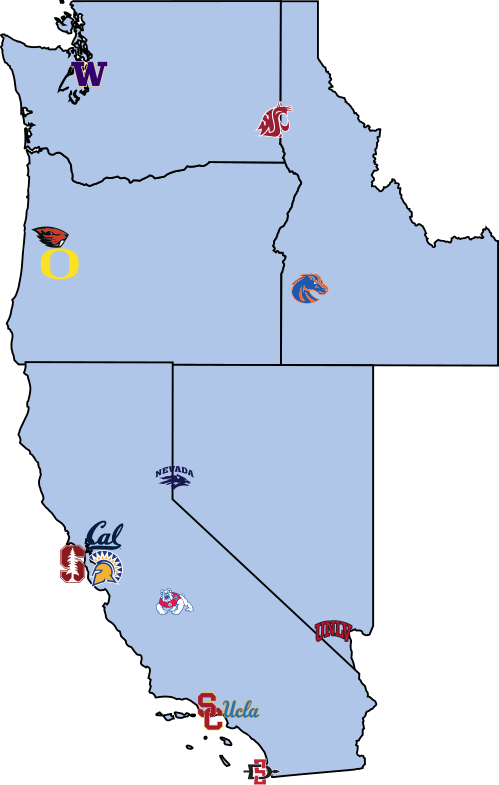
18 minutes ago, RBronish said:
As an SDSU fan, please let this be a reality.
-
2
-
-
-
How about the lighter burgundy with the darker gold?
-
Nice Robin Hood/Green Arrow hybrid logo.
-
2
-
-
On 7/15/2023 at 5:57 AM, Old School Fool said:
And here are the then new ones before they changed the graphics in 1998. We have all of them accounted for now.
They also seemed to realize the Raiders one was weird and fixed it.
Nice to see they did fix the Raider logo. Although, if they wanted a black background to contrast with the gray oval, they could've got away with having just the Jolly Roger guy by himself like ESPN did on Countdown and Primetime during that same period.
-
2
-
-
On 7/20/2023 at 12:36 AM, Germanshepherd said:
FOX World Cup graphics are great. A lot of character, but still functions well, aside from that weird 1 digit
Yeah, but I think they do a good job for the most part.
-
1
-
-
On 7/25/2023 at 9:45 AM, WideRight said:
A good point. Navy socks, or white socks with stripes, might be needed.
Also, since I am here, I have decided on the 3 teams that will get new looks in 2010:
Arizona-- A tweak to the logo and a bit of ombre are coming to the desert.
Ohio-- The eagle and the uniforms get an update
Seattle-- A new dragon makes an appearance, one folks might recognize.
We are building up to 2015, when Under Armor will get the USFL contract and every single team will have an overhaul with 2 primary sets, 1 alt set, and 1 throwback look. Yup, teams are going to get on board with the "too many options" trend of the 2000's. It won't be as bad as Oregon, but new combos, new alts, even 2nd helmets are coming to the USFL in about 7 seasons. Sorry for the wait, but for now, 3 teams a year get tweaked by Reebok.
Was there a point when the individual teams had more control over the uniform contracts before the USFL had one supplier for the entire league?
Also, who currently has the USFL TV rights?
-
For the Invaders, is there a Navy blue sock that can be worn with the sky blue pants? Otherwise, you'd end up with the unitard look that you dislike.
-
I'd like to see how the home and away on the Sea Turtles would look with Columbia blue or light green pants.
-
23 minutes ago, JQK said:
It's a good start.
However, the only thing I don't like on the logo is the outlike around the lower jaw and cheek. That part makes the head separate from the body unless you wanted to have a partial logo with just the head.
-
The canceled Madden 96 for the PS1 was supposed to feature the Fox graphics package. However, not a fan of how the inverted the colors of the Raiders logo.
-
6
-
 1
1
-
 2
2
-
-
Let's see if you guys can spot the uniform and stadium inaccuracies in NFL Blitz 2002.


International Baseball League 33/40 : Bay Area and St Louis Added
in Concepts
Posted
I still feel a little uneasy about the use of AI generators.
That said, I think you're off to a good start. However, the primary logo should be simplified so that it would be easier to reproduce if this were to be put on T-shirts or hats.