


neo_prankster
-
Posts
4,967 -
Joined
-
Last visited
-
Days Won
7
Posts posted by neo_prankster
-
-
On 9/24/2021 at 6:25 PM, pepis21 said:
In first NBA 2k Lakers had a mashup of Showtime and Shaq-Kobe unis:

That actually looks pretty cool for the Lakers to be honest.
-
 1
1
-
-
Very nice work once again.
Can't wait for the 2023 GSL season.
-
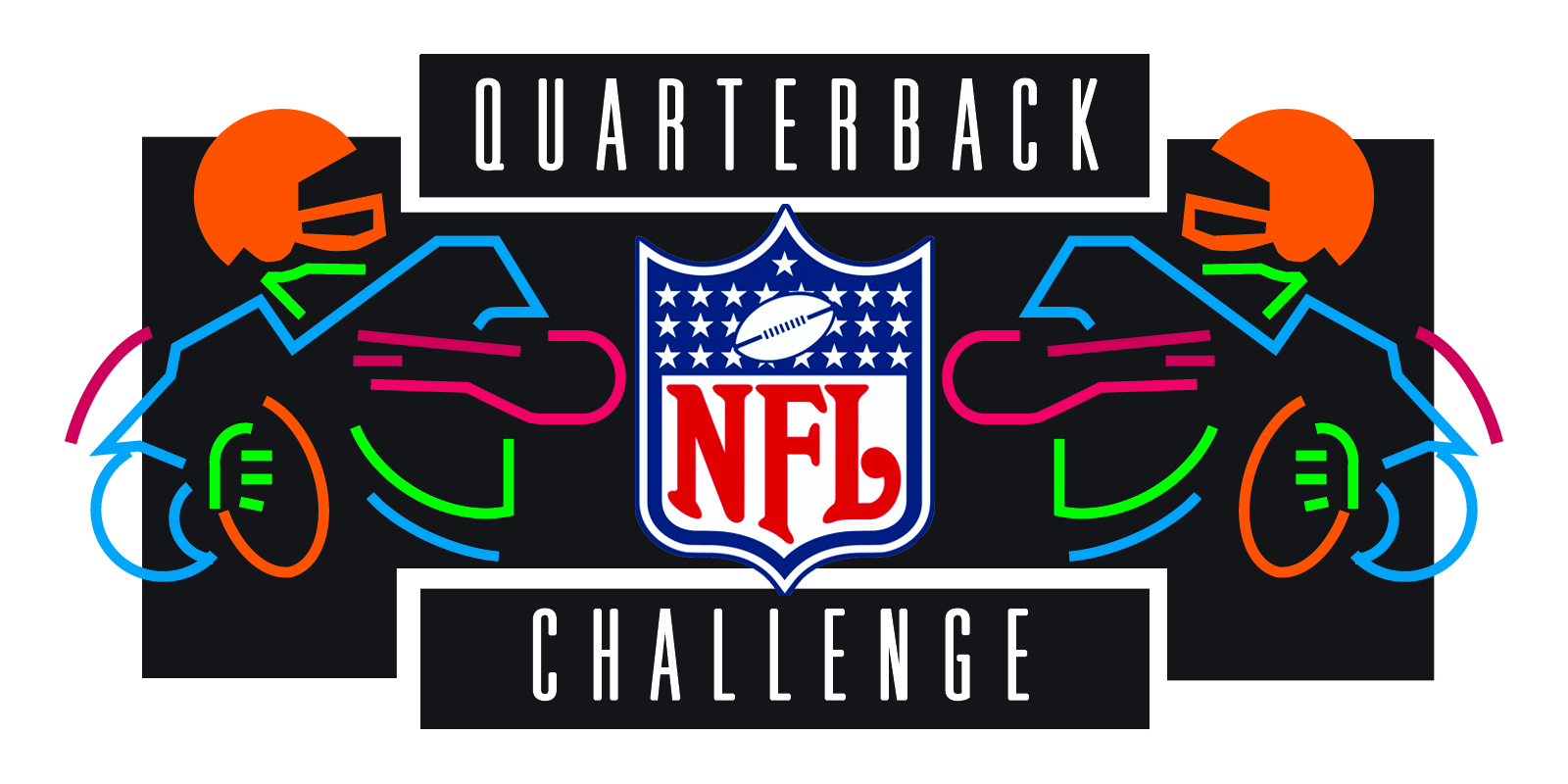
Anybody remember NFL Quarterback Challenge?
-
I think the primary logo would look better in a silver or blue helmet instead of black.
-
I feel like some of the NBA logo changes that took place during Tom O'Grady's tenure as the league's creative director could count as Factory Pomo, right?
-
1
-
-
17 hours ago, Bomba Tomba said:
Too simple and abstract, I'd say
You could probably incorporate a G into that somewhere, but I dunno exactly how
Yeah I figured.
I was trying to see how the Galaxy's brand could be minimalized.
That was just a starting point until I could figure out how to reduce the original logo to its essentials.
-
-
Here's a rough idea for the Frankfurt Galaxy.
C&C Welcome.
-
 1
1
-
-
12 hours ago, BengalErnst said:
I was hoping you’d take your own take on the Admirals logo rather than just recreate the old one.. more of an artistic take like you did with Dragons
As I stated before, I was trying to see if I could reduce the original down to the bare essentials.
Any thoughts on the tulip/anchor secondary logo?
-
-
Another alternate I’d like to see for Winnipeg would be something loosely based on the light blue RCAF Flyers sweaters that the Manitoba Moose wore a few years back in the AHL.
For Anaheim, I’d like to see the Disney era look, but with modifications to fit the current template.
-
3 hours ago, WideRight said:
I am going to agree here. Gold pants seem a logical choice. Nothing wrong with the original 1991 versions.
So basically bring back the original look from '91, except with modifications to account for shorter jersey sleeve caps?
-
The white pants look way too plain and don't match the rest of the uniform.
-
1
-
-
Cool. What I was trying to do was simplify the logo so that it would be easier to shrink into like a mobile app icon or something.
Does the banner still need work?
Here's an alternate or Reverse Retro/fauxback idea for Amsterdam.
The anchor by itself with a tulip bulb for a background.
C&C Welcome.
-
3
-
-
Bump.
Still waiting for feedback on the Admirals.
-
Made a few tweaks to the Admirals for what should be a first draft.
C&C Welcome.
-
1
-
-
9 minutes ago, Hat Boy said:
By default, maybe.
And not even close.
-
Bump.
I put up the unfinished Admiral concept because I wasn't sure if I should keep the green from the original or just stick with the orange and navy.
After I get done with Amsterdam, I'd like to hear what team you guys want me to do next.
I might do the London Monarchs, but their original logo had a timelessness that makes me too squeamish to mess with it too much.
-
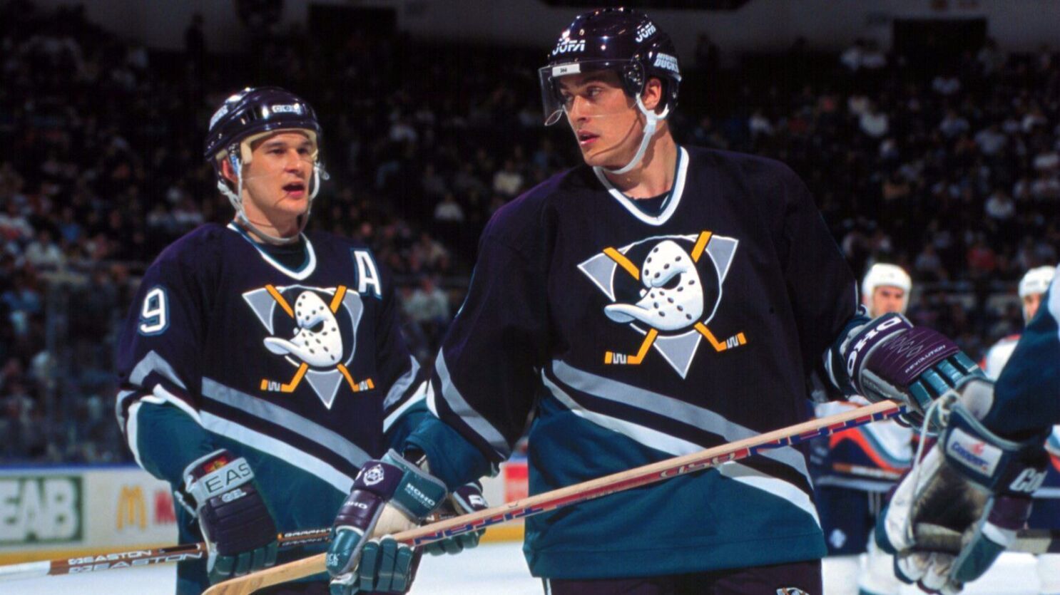
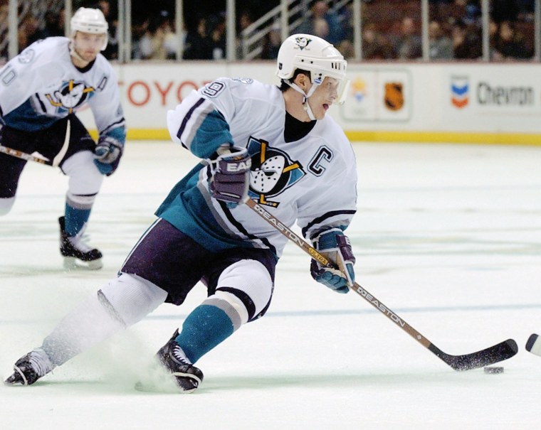
This is the best that the Anaheim Ducks have ever looked.
Just because sports purists treated the Ducks worse than the Harlem Globetrotters all because of the Disney connections early on was a silly reason for Henry Samueli or Brian Burke to get rid of the original look IMHO.
-
5
-
 3
3
-
-
On 6/13/2023 at 9:11 PM, BengalErnst said:
Amsterdam was actually the first to come to mind
Here's a work in progress for the Admirals as I expand this into a series.
C&C Welcome.
-
3
-
-
18 minutes ago, BengalErnst said:
This variation is so much better than where it previously started. Waiting for you to take on another old nfl Europe logo
Which one would you like to see?
I plan to do the Galaxy at some point, but that one might take me a few tries before I get it to your liking.
I might do Scotland, Amsterdam or London first.
-
4 minutes ago, B-mer said:
It would look better?
Or how about the older Scooby Eyes Senator?
-
1
-
-
What would happen if you replace the Scooby Eyes logo with the 2D Senator?
-
Made a few revisions to the ear and cheekbone.
C&C Welcome.
-
5
-


Inaccurate colors/uniforms in video games that should know better
in Sports Logo General Discussion
Posted
The black numbers on green jerseys can work as long as there's a white outline.