


SFGiants58
-
Posts
8,287 -
Joined
-
Last visited
-
Days Won
79
Posts posted by SFGiants58
-
-
On 5/20/2024 at 9:04 AM, GrayJ12 said:
I enjoyed that late stage in the late 90s when the Dodgers decided to experiment with white on their uniforms.
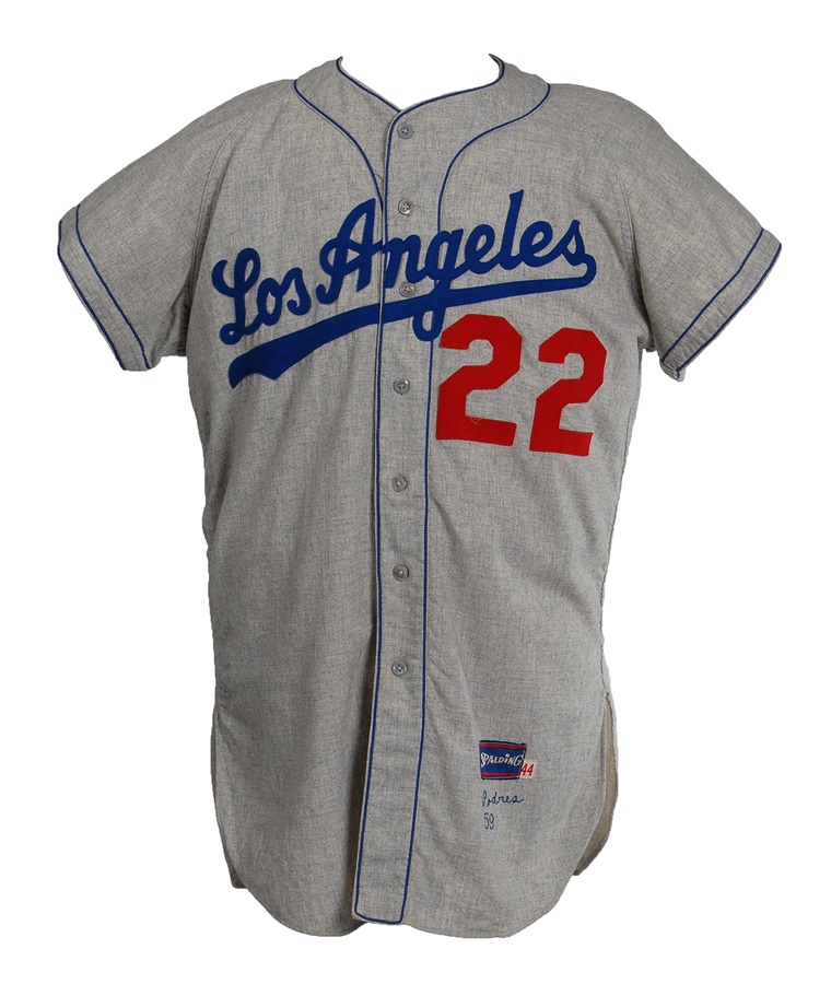
Likewise, my favorite Dodgers road uniform is their 1959 set - "Los Angeles" script with the Brooklyn-style placket and sleeve trim.

-
15 minutes ago, JerseyJimmy said:
I don't understand the "whoa, pump the brakes, speed racer, dallas winning the finals?!?!" narrative when they've literally won one in recent-ish memory.
I mean, they've generally been in the pits since they won the finals 13 years ago. But that's a more recent title than any of the other contenders right now (Boston in 2008, Minnesota and Indiana never in the NBA).
-
Well, it’s nice to not have Josh Giddey in the playoffs anymore.
-
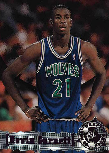
Admiral has mentioned before about how royal/kelly teams tended to be terrible and misuse the color scheme, especially when they were green-first in their branding. I think that holds when we talk about the old Dallas and Minnesota designs.
The "Saloon Clarendon" looks terrible, especially paired with a basic sans-serif "Athletic Gothic" font. Double outlines do nobody any favors. The subsequent look let the colors blend together too much. The Wolves looked a little better with their blue set, but still had double outlines at home and a generic Gothic (sans-serif) font.
Color blocking, especially in royal/kelly, is hugely important to how a look comes across. The Seahawks and modern Canucks are the closest anybody has come to getting in right. Even the Whalers screwed up their design on the green sweater and then had their navy period.
-
 3
3
-
 1
1
-
-
2 hours ago, infrared41 said:
Is it bad that I replied to one of Carolina's tweets with this?

I’d have picked this:
Given the list of free agents, the Hurricanes are going to feel like they took a Tiger Driver ’91.
-
1
-
-
2 hours ago, ltjets21 said:
What in the world is this supposed to be?
A lame fursona for somebody who ghosts you when it comes time to pay for commissions. -
20 minutes ago, tBBP said:
(That doesn't diminish the truth of your point, however.)
Isn't the quality of the driving notoriously bad in the DMV area?
-
1
-
-
It's definitely a development on the more well-rounded "WB Crush" aesthetic: https://antifandom.com/aesthetics/wiki/The_WB_Crush*
Add some light undersaturated/sage green and you have 2K5.
*I miss that era of TV aesthetics, when film-to-video/digital transfers had improved but widescreen was still rare (e.g., Charmed, Gilmore Girls, and the first few Sopranos seasons). Hell, even stuff shot on video had a more "charming" look to it (see early-'00s Kamen RIder and seasons 1-4 of IASIP).
-
Just now, The_Admiral said:
Those both feel like subgenres of everyone's favorite graphic representation of NAFTA neoliberalism, Global Village Coffeehouse.
I'd say that Acid Surf is more related to Factory Pomo, but both are only a few steps removed from Global Village Coffeehouse. New Wave Tropical predates GVC, but you can see the lineage from the former to the latter.
I do agree with the nostalgia for Global Village Coffeehouse - hell, it's why I buy these cookies whenever I can.
They taste better after at least 24 hours in the freezer (as most cookies do, I find).
-
Disco Deco is such a lovely aesthetic. https://cari.institute/aesthetics/disco-deco
ITC really peaked as a typeface design house in the '70s.
I'm also happy to have a name for the "Neon Surf" aesthetic. https://cari.institute/aesthetics/rad-dog-neon-surf
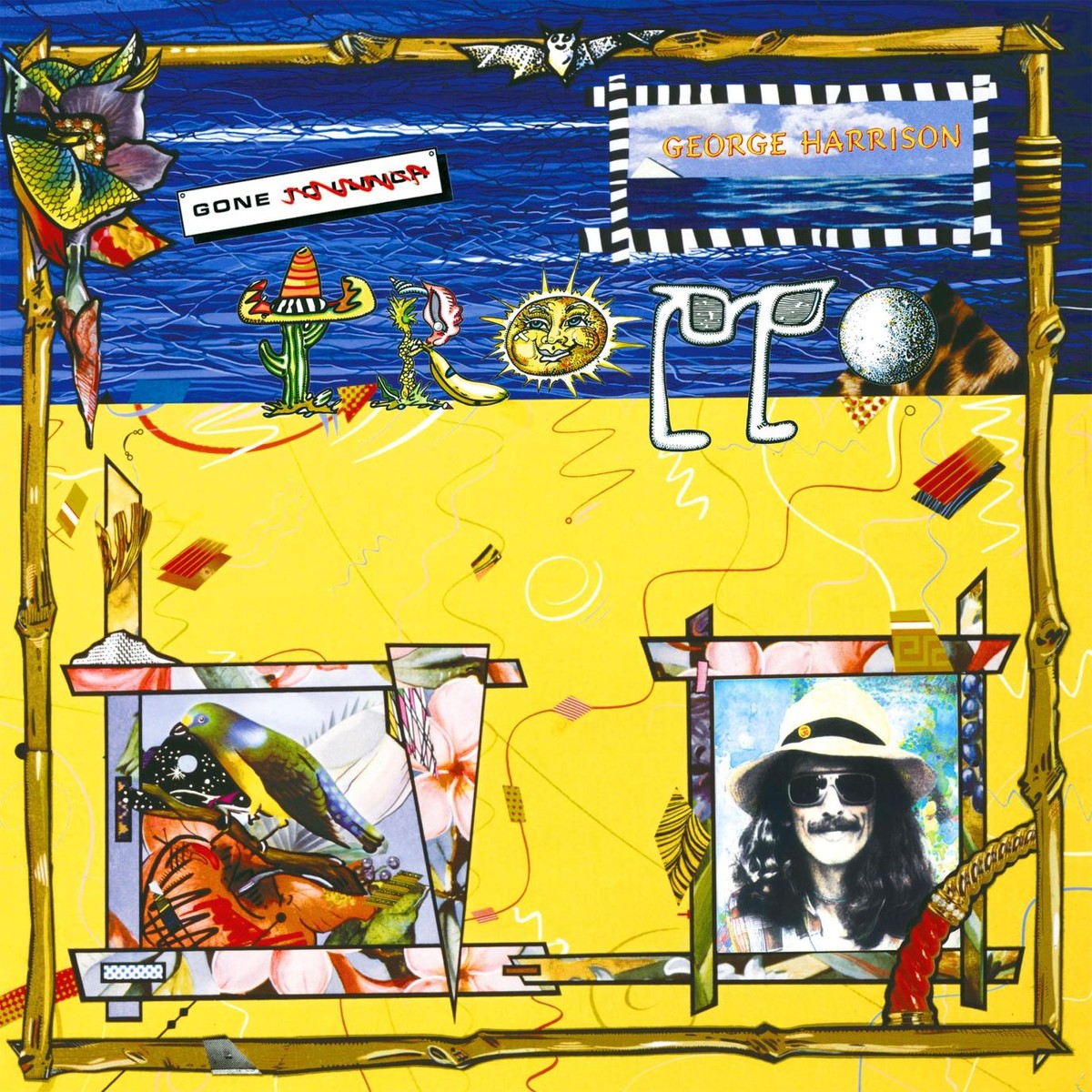
...and "New Wave Tropical" is oddly appealing to me (yes, I used this example - my second-least favorite George album) https://cari.institute/aesthetics/new-wave-tropical:
-
16 minutes ago, coco1997 said:
I'm actually fine with the lack of black and the decision to use only orange--the problem is they used the wrong shade!
That’s my issue too. Well, that and the Giants got blown out in them.-
 1
1
-
-
11 hours ago, adsarebad said:
How can "Guardians of traffic" be taken seriously? That is a joke.
I mean, they're very cool art deco statues and are among the best of Cleveland's landmarks. It beats the hell out of crap names like Commodores and Rockers (insert rant about Jann Wenner here), while also not referencing the Spiders (worst team ever, albeit through shady circumstances).
An Art Deco-period font would've helped the brand immensely (e.g. non-bold Futura, proper Gill Sans, etc.).
-
7
-
 1
1
-
-
10 hours ago, See Red said:
All Murray not being suspended did was make it so Minnesota wasn’t the first NBA team to blow a 3-0 lead.
I blame it on their reticence to wear the throwback uniforms this round.
-
1
-
-
Dwight Howard would be remembered with more fondness if he simply treated people better in his prime.
-
10 hours ago, The_Admiral said:
Underrated fun micro-era was 2007-2010, the time of Kobe, Kevin Garnett, and LeBron James.
And Dwight Howard, before he became a serial bridge burner. -
1 minute ago, The_Admiral said:
The era of Steph Curry, Kevin Durant, and LeBron James was overall a good one, though.
It was better than a lot of the oldheads give it credit for, beyond a doubt. I still prefer the “post-Jordan dark night of the soul” era that was dominated by the Lakers and Spurs. -
51 minutes ago, Digby said:
It's reasonable to blame Doc Rivers for the Bucks falling to the 3 seed (if they stayed at 2, Philly probably would've been an even tougher matchup) but losing Giannis for this series was the bigger problem for them, in all fairness. Has every team in the East lost a key starter for this playoff run? That's unfortunate for the game.
Yeah, it’s unfortunate that injuries are sandbagging the East thus far.
51 minutes ago, Digby said:Doc wasn't the problem for the Celtics in 2009 or 2010, injuries were.
Now, 14 years and 3 teams later, on the other hand...
Indeed, that was an unfair judgement on my part for the ‘09 and ‘10 Celtics (and I wouldn’t hold 2011 against anybody). But still, the Clippers and 76ers tenures for him have been nothing short of damning regarding his ability to coach past mid-April. -
That 2008 title was such a fluke, given the rest of Doc’s resume.
-
1
-
-
17 hours ago, Morgan33 said:
This is how you make a fluorescent colour scheme work. That is a stellar looking jersey, I don't care what anyone says.
Exactly - a black base allows the fluorescent colors to properly function. -
I guess 5280 feet is better than 1609.3 meters (Santa Fe being 2133 meters above sea level).
-
3 hours ago, DCarp1231 said:
Teal hats have been spotted
Now I want one of those!The jerseys need to be more legible, but the whole graphics package is such a breath of fresh air compared to the current Rays set. It’s derivative of the ‘90s – but it’s still very good.
-
5
-
-
5 hours ago, TrueYankee26 said:
The Wrexham-Necaxa consortium now:
Fat Mac is the best Mac.
-
2
-
-
7 hours ago, tigerslionspistonshabs said:
They might just slap this bad boy on the front for year one.
I’m burned out on most slab-serif fonts these days, especially ones with a terrible perspective distortion from Illustrator CS2.-
2
-
-
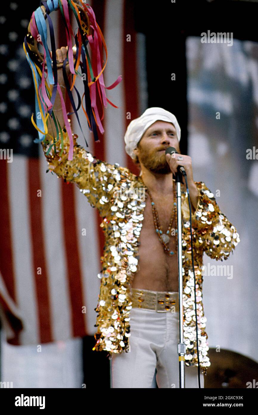
25 minutes ago, FiddySicks said:
Now I’m picturing a scenario where all the great QBs of the past wear caps instead of helmets. What hats would they wear?But which QB would wear the thing that
literally SatanMike Love wore in the ‘70s?


~ a e s t h e t i c s ~
in General Design
Posted
Whimsigothic looks very “Alex Proyas making a kids show,” which is basically Tim Burton’s goth aesthetic.