


SFGiants58
-
Posts
8,270 -
Joined
-
Last visited
-
Days Won
79
Posts posted by SFGiants58
-
-
How about this one?

-
This Cardinals cap logo (1940-55):

That's not the Cardinals. The cap was from the St. Louis Browns, the ancestor of the current Baltimore Orioles.
That is actually the Cardinals, according to their official guide (cap above has the same logo as the top left insignia). The Browns used it too (it was common for multiple teams to use the same cap logo before the 60's).
-
This Cardinals cap logo (1940-55):
-
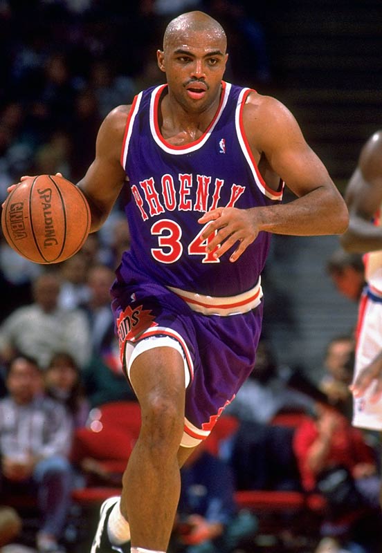
Right team, but completely the wrong uniform:

-
The Sharks have never had a good look. The primary is poorly designed, the team fails to use their solid alternate logos to any real capacity, and the orange piping looks really out of place (especially when it's only on one side of the striping).

The only decent look they've had was their inaugural set:
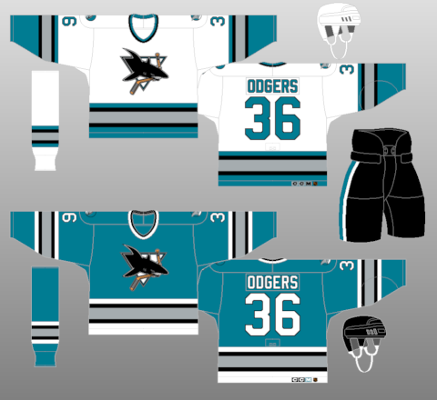
However, that set had the misfortune of bearing the keyline-ridden crest. I just hope that the team will completely overhaul one day.
-
The A's really need to phase out the road cap, especially considering that the home hat (represented by the batting helmet) looks great with the grey uniform.

-
 2
2
-
-
Giants edition:
Orlando Cabrera

Jeff Keppinger

Joe Nathan
-
The team isn't necessarily wrong, but the style is quite wrong.
-
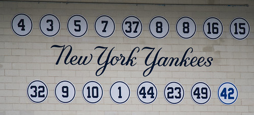
Better example than the Giants. The more I look at the Giants' retired numbers, the more I think they put Robinson's retired number in their font.
As someone who has been to AT&T countless times, it's in the Giants' font. But, on the bright side, it's quite a bit removed from the other retired numbers.
-

This is one of the best logos in NBA history.
-
I like my LA Kings in purple and gold and not silver and black.
Amen, brother!!!
Also, I like the Padres in brown and orange only.
-
I cannot figure out how to change the title or subtitle of a topic. Help please?
-

This is absolutely hideous and frightening.
You're not alone.
-


UPDATING VINTAGE LOGOS
in Concepts
Posted
Thank you good sir! Love the work!