


SFGiants58
-
Posts
8,280 -
Joined
-
Last visited
-
Days Won
79
Posts posted by SFGiants58
-
-
10 hours ago, McCarthy said:
I just want to talk about why "when the kids grow up" is off the table here.
That line of logic is only brought out when we talk about Mighty Ducks nostalgia, when it also applies to so many other facets of branding and marketing.
I'd also add that part of the Rays' problem is marketing. They totally bungled marketing themselves in 1998 and in the following years.
-
From the latest edition of Game Worn Guide to MLB Jerseys by Bill Henderson, we now know that the Padres had an interesting navy/orange prototype:1

I'm a little disappointed that they didn't go with it. While the wordmark is still a bit crappy, the two-color format really helped it.
1William F. Henderson, “San Diego Padres,” in Game Worn Guide to MLB Jerseys: 1970-2017: Eighth Edition, 8th ed., ed. Rick Subrizio (Philadelphia, PA: Aardvark Publishing, 2017), 2191.
-
 2
2
-
-
3 hours ago, Gothamite said:
It usually does.
At the very least, fans come out to a new team if it does well. But when a team leads its division every day of the season, wins the pennant, goes to the World Series, and still can't draw flies, that says something.
It seems that you've ignored the key part of Raysox's post:
22 hours ago, raysox said:I grew up with this team and nearly everyone who grew up here is a Rays fan. The fan base is growing. If only someone pointed out it's a location and facility problem, rather than the market being broken.
I know that it may seem tough, but it would be good for us to show a little compassion towards Rays fans. They've spent almost a decade hearing the "they couldn't draw flies, even when they went to the World Series" and "you should lose your team" epithets. The former ignores that it was the first season that the team was worth a damn in the standings. They didn't have the same kind of entrenchement in the area that an older, historically more successful franchise would have (I might also cite poor marketing as a reason for this). The latter is just plain insulting. Put yourself in their shoes, and try to understand why they're sick of people from outside of the area telling them that the team they've poured their heart into should go away.
-
1
-
-
Frank Robinson wearing the head of Mr. Red, and the pre-1956 uniforms (in 1956 Spring Training, I presume):

-
Maybe it's just me, but...

-
1
-
-
Had the Astros changed their name to "Diesels," "Railmen," or "Colts" with their move to Minute Maid Park, I would have loved to see their identity form around these two uniforms:

The brick-centric look could have been fantastic. Still, I'm glad they came to their senses and brought back navy/orange. Tangentially, this color scheme (if the Diamondbacks weren't using it) would be good for the Rangers.
-
4
-
-
7 minutes ago, Lights Out said:
Montreal was a good basketball market ruined by a lot of different factors: poor ownership after Bronfman sold the team (especially the Loria era), the Blue Jays screwing the Expos on TV rights just as the Expos were starting to get really good in the '80s, the '94 strike, stinginess by the local business community in Montreal, etc. The fans didn't "quit" on baseball until the MLB made it abundantly clear that baseball was quitting on them.
Don't forget the PQ's rise to power, Bill 101, and the failed Quebec Independence referendum as factors in the Expos' downfall. While there are many Francophone Expos fans, the decline in the Anglophone population did not help matters.
1 hour ago, BringBackTheVet said:It would have been hard to avoid expanding to TB. Weren't they all but promised a team after all the Giants thing fizzled out after they had already built a park? Or White Sox - I forget which team used them and discarded them first.
Both the White Sox and Mariners nearly moved to Tampa Bay, until the White Sox got their stadium and Nintendo bought the Mariners. The Giants' then-owner, Bob Lurie, was in the process of selling the team to a Tampa Bay ownership group (led by Vince Naimoli, the first primary owner of the Rays) until San Francisco officials pressured the league into blocking the sale.
-
4
-
-
16 minutes ago, DG_Now said:
If MLB had to do it over again, were the Florida expansions worth it?
One was plenty, two was just overexposure.
Under good ownership, a team could thrive in Florida. However, both teams have had shoddy ownership. The Marlins have had to deal with off-field problems with their owners and the scams that Loria pulled to get their current stadium built. The Rays moved into a horrendous stadium in a less-than-ideal location with the Tampa Bay Area (St. Petersburg) which has hampered their ability to be competitive.
If anything, have a team in either Miami or Tampa and use that other 1990's expansion slot on a D.C. team. That way, there may be a small chance of the Expos sticking around in Montreal.
-
2
-
-


The Falcons got it right from 1966-70 (black bird, white bird, and stripes), and all of their uniforms since then have been downgrades. The current set is their best since the '67-'70 uniforms, if only because the helmet contrasts the jersey color.
-
3
-
-
On 7/6/2017 at 2:51 PM, raysox said:
Unpopular Opinion: The 90s Lightning logo sucked and the jerseys were meh and there's nothing redeeming or better compared to the current set. I've never seen an "add black and silver" Lightning concept that I've liked since the rebrand. it's forcing a square peg into a round hole since the logo wasn't designed to have outlines or fill.
Yup. The current "Maple Wings" identity is the best that the team has looked, and even then it's only because they're not messy and don't use fonts of a "particular vintage" (i.e. Word 97-04 Brush Script).
Speaking of blue, the Royals looked terrible in powder road uniforms:


The lack of royal blue on the scripts really hurt it, along with the bulky stripes, lack of a cursive script "Kansas City" logo, and the absence of powder blue from the logos. The current home alternate is slightly better due to the minor tweaks of smaller stripes and incorporation of royal onto the scripts and numbers. No powder blue pants also makes the look easier on the eyes.
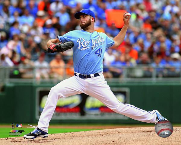
The only teams that ever looked "good" in powder blue were the Blue Jays and Phillies, and even they looked better with gray road uniforms.
-
3
-
-
55 minutes ago, FinsUp1214 said:
Great find!
It would've really been interesting if the Cardinals for whatever reason stuck with these long-term. Or if this lasted into today in some form (going through the pullover phase and back again).
They kind of did stick with it, in a way. It was the 1956 change that saw the debut of the all-navy cap with an outlined "StL" logo, and it was the first time the Cardinals used a cursive script on their uniforms (something they've done ever since).
-
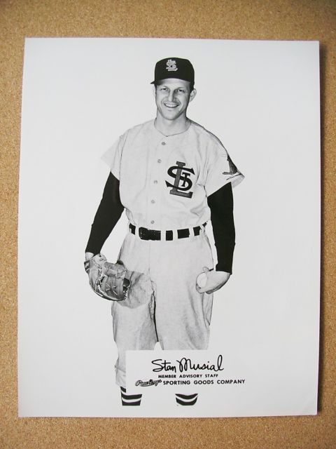
On 5/23/2017 at 7:21 PM, FinsUp1214 said:
Stan the Man's all like "What in the green earth is this $#!+? Birds-on-bat or nothing at all, dumb-a's!"

Here's a picture of him wearing the prototype road uniform.
-
1
-
-
So, since Photobucket decided to get pissy with charging $400 per month for embedding images in websites, will the images be moved to a new hosting service (imgur, flickr, etc.)?
-
The Cardinals should reinstate the navy road cap and belts, but only if they add a red bill to the hat. That would not only tie it in with the 1940-55 cap, but it would also add a nice dash of color in the same way the red hat does now.

The all-navy hat is too drab, while the all red hat is too bright when paired with the road uniforms. This is the perfect "happy medium." Also, the red hat should always be the home cap. It's a nice cap that's been a symbol of the team's post-Musial identity (through their classic-styled sets and the pullover/sansabelt/powder blue zaniness).
-
3
-
-
18 hours ago, DouglasQuaid said:
I feel like its a great concept but I would rather see it colored like the original TC

Yeah, that ignores the whole issue of the red "C" on the navy background clashing with the white letter. It doesn't look nearly as good as interlocking logos that are all the same color:


Having the logo be one color with a single outline unifies the shape and makes it easier to project the team's desired color balance (Red first? Navy first? Are Red/Navy co-dominant? - the Twins sorta have had a problem with this).
There's also my desire to bring back the "M" cap logo in a modernized form:

It's still unique (a cursive "M" as a cap logo), it's more closely tied to the two World Series championships, and it's less of a pain to use on a navy or red background.
-
3
-
-
While I like the idea behind the Twins' "TC" logo, the actual logo is not a well-designed mark.

The "wishbone C" is overused (and should have been dropped in the 1987 redesign), the width difference between the "T" and "C" is a little distracting, and the red doesn't stand out enough from the navy background of the caps. I wish the team had touched it up during the 1987 redesign and tweaked it again during the move to Target Field. Basically, turn it into @the admiral's top-notch concept:

The other thing that makes me despise the current "TC" logo is how defensive Twins fans get about it (look at the response to Admiral's redesign). They swear that it's "untouchable" and that it can't change because "it's been there from the start." Guys, if other teams can change up classic logos without sacrificing their "spirit" (i.e. Cardinals - football and baseball, Orioles, Blue Jays, Vikings, Bruins, Maple Leafs, Blues, and a whole host of college teams), then so can the Twins.
-
1
-
-
4 hours ago, FinsUp1214 said:
Mickey Lolich and Al Kaline in the Tigers pullovers:

That's a uniform oddity right there, the home batting helmet paired with the road uniform.
Also, here's Willie McGee in a doubly wrong Cardinals uniform (from his 1996-99 stint with the team). Not only is he wearing the their button-front/belted pants grey set with the navy road cap, he's also missing a front number (from the 1997-98 "no front number" period).

-
3
-
-
38 minutes ago, OnWis97 said:
You only hate it because it's terrible.
I hope this is a popular opinion.
Several people on the concepts section think of it as a viable name because it's sorta plural. Here are the examples of it:
I don't like the name, and I don't like that people like it. There are better New Orleans-centric names.
-
3
-
-
Hey guys, I'm having issues embedding images from the mothership. Whenever I try to copy a url in, all it says is "The link could not be embedded because content.sportslogos.net does not allow embedding of that image." Is something messed up on my end, or is it the software somewhere? Thanks in advance.
-
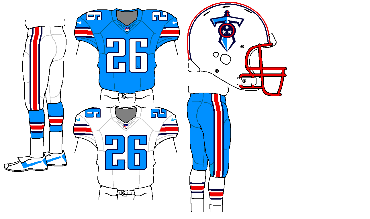
Powder blue/red is a terrible color scheme. It needs navy to balance out the two bright shades, and powder should never touch red. That's why these uniforms look good (Concept Credit: @oldschoolvikings):

...and this looks hideous:


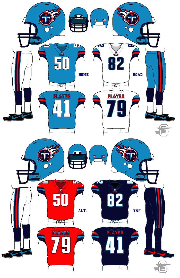
Additionally, the Texans and the Titans (when wearing the right combos) look better than the Oilers ever did.
-
1
-
-
I really don't get the love for any of the Sabres' crests (classic, classic in navy/yellow/silver, goat head, and the slug). Heck, the only one I remotely like is this guy:
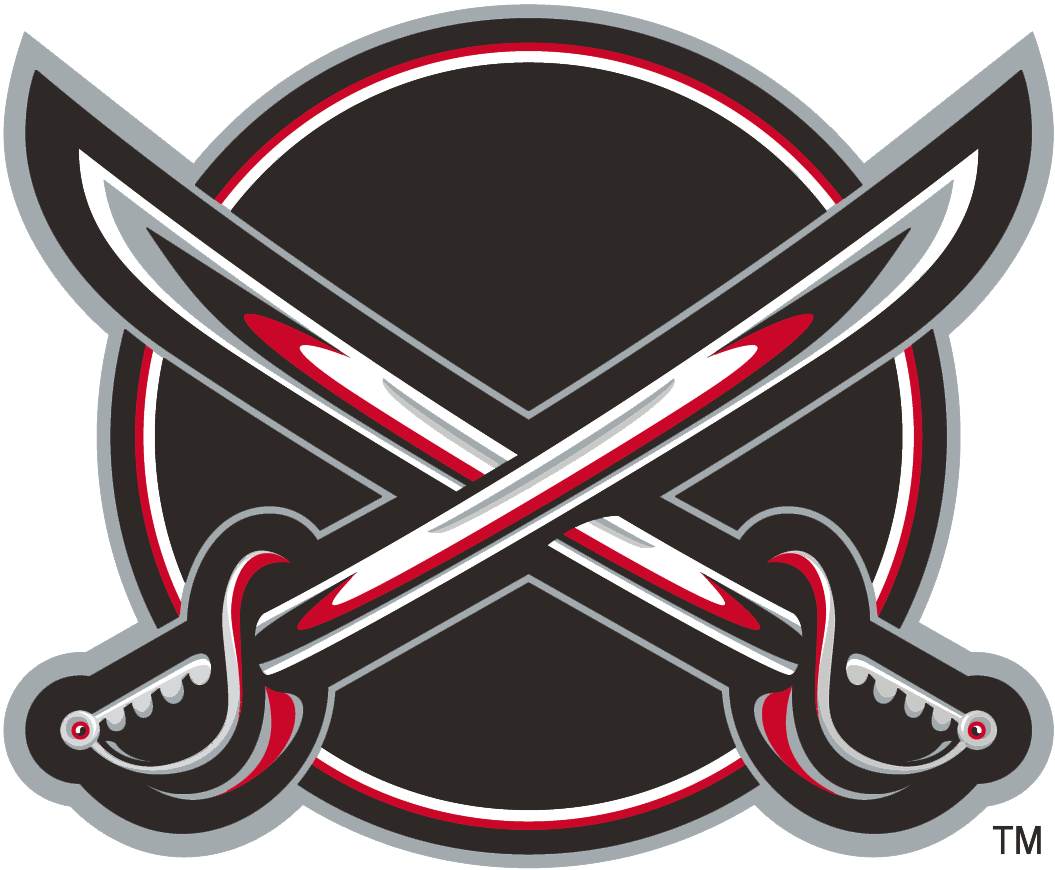
I like the complex design of the swords, and I really like that there's no buffalo in the logo. Just because they play in Buffalo, doesn't mean they have to have a buffalo in their logo. Putting that logo in the royal, yellow, and silver/gold/powder would produce the best possible crest for the team. As for a template, something like the 2010-12 alternate sweater would be ideal (as it doesn't infringe on the '67 Maple Leafs' template, my preferred look for Toronto).
-
2
-
-
I wish the White Sox would have one alternate uniform with the full "White Sox" name on it, preferably based on either of these uniforms (1942, 1987-90):


Putting either one of those uniforms in the black/grey/white color scheme would be fantastic.
-
2
-
-


Johnny Bench in 1966 or 1967 Spring Training, not only wearing the wrong uniform style (1961-6/7 Spring Training) but also the wrong number (53).
On a side note, I enjoy the number font on those uniforms. At least one team in the majors should use this thin, wide varsity block with a Packers-style "5" and minimal serifs.
-
1
-
-
1 hour ago, oldschoolvikings said:
I was just looking at the way the top of the logo curves, which I'd never noticed before. This odd idea popped to mind. I also did a version without the chest stripes and it was workable but I wanted to get a reaction from this.
It's unusual striping for sure, but I like it. The Sharks are a modern enough team where they can get away with it.


Unused Logos and Uniforms
in Sports Logo General Discussion
Posted
Remember the 1956 Cardinals' plan to use their "StL" crest on the road uniforms? Well, now we have color pictures of some of the prototypes!
Yeah, getting cold feet was a good idea.