


SFGiants58
-
Posts
8,281 -
Joined
-
Last visited
-
Days Won
79
Posts posted by SFGiants58
-
-
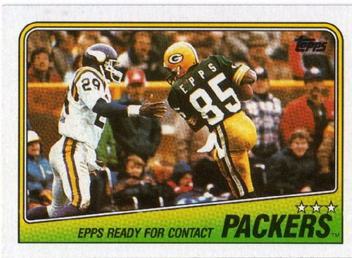
1996 - Packers with full Lombardi stripes (last year for those) vs. Midnight Green Eagles (specifically, the first variant with the sleeve stripes).

-
This really isn't an unpopular opinion, but more an observation based on things I've seen. Would it be wrong to say that the Hartford Whalers are more popular know than they ever were when they existed? When you consider all the vintage logo merchandise for the Whalers and how well it sells, along with the mystique of representing a non-existent team, would that assessment of the Whalers' post-mortem popularity be incorrect?
-
I find it odd that when people mention the color issues on the Cowboys' home uniforms, they almost all leave out the black outlines on the sleeve stripes:
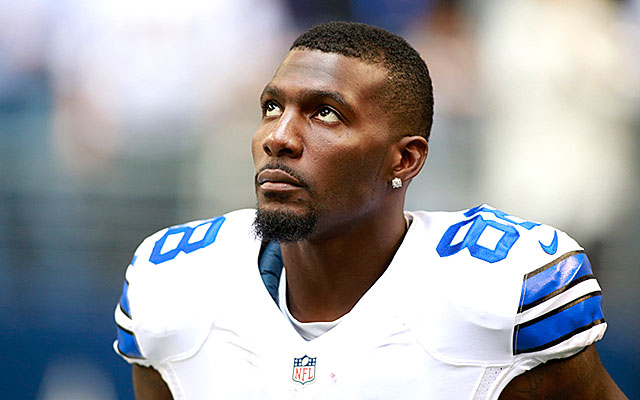
I know that this is how the stripes have been outlined since 1966, but they really should have changed it when they returned to this style of home uniform in 1995.
-
Not sure if you got anything for the Milwaukee Brewers 1990-93 jerseys or wordmark:
...


Thanks!
-
Another unpopular opinion is my love for the Vikings with a white face mask.
Seconded. I like white facemasks for some teams, and the Vikings (when they didn't have purple pants) pulled it off really well.
-
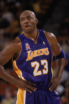
I'm not sure if this one has been posted yet, but Mitch Richmond on the Lakers:
-
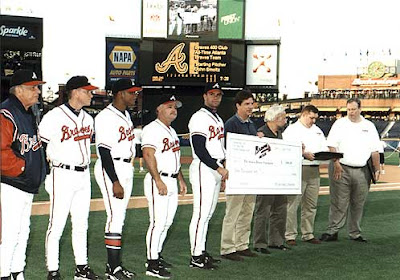
I wish the Braves would dump their navy and red alternates, dump the road cap, and bring in these as road throwback alternates (so they can still sell more hats):

I also wish they'd bring back their striped socks for the home/road/home throwback, as shown here with the current home uniform (on Andruw Jones).
On the players that do go high-cuffed, the stripe really balances out the colors on the uniform.
-
A peak into a Glendale City Council meeting:
I take that back. Comparing the Glendale City Council to the inbred is deeply insulting to people who are inbred.
-
 1
1
-
-
The black, yellow, and reddish-orange color scheme that the Canucks wore from 1978-1997 wasn't all that bad. If they had just taken their early-'90s template and used a recolored stick-in-rink instead of the skate, the scheme might have lasted longer. While royal blue/kelly green is my favorite color scheme for the team, the black/yellow/reddish-orange comes a distant second.
-
Chief Wahoo is a terribly designed logo, regardless of whether or not it's a racist caricature:
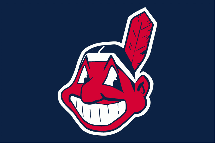
Just look at it. The terrible line weights in the teeth (which don't even connect fully) and the other really bad attempts at detailing in the feather and the eyes make for a horrendous logo. It may be that some details didn't translate well when the logo was originally digitized in the 90's, but come on. If they had to keep him (which I hope they don't), at least modernize him.
-
2
-
-
Read that this morning in the SF Chronicle. Yeah pretty much Mayor Quan, the Oakland City Council and the Coliseum Joint Powers Authority are all nitwits. By the way Mark Davis shouldn't be owning a pro sports franchise much less anything else.
Am I the only one who sees how similar these two look?


Ask yourselves, do you really want a guy with a Bam-Bam haircut running anything?
-
I actually really like the block "C" and the block wordmark fonts that the Cleveland Indians started to use more. Very simplistic, in my opinion.
I still like their really nice cursive script logo, though.
I've warmed to the block "C" and the block wordmarks too, but I think it would be better if the Indians went with this wordmark on the creme alts:

Also, flipping the text colors on the road uniform would be nice (red text with navy outlines).
-
This is my favorite Seahawks look from the 2002-2011 set:

and my favorite Seahawks look overall:

Would have been even better if the numbers will twill and not screen-printed.
-
Me too. I didn't realise part two.
I feel better knowing that last part. I thought they would be stuck in that
1. They don't have much choice. The only other option they want is San Jose, which they can't have.No. No. Noooooooooooooooooooooooooo. I'm not even an A's fan. Noooooooooooo. How could they do such a dreadful thing?
2. The extension reportedly contains a clause allowing them to leave early if they can secure a new ballpark elsewhere, so why not sign it?
 hole for another 10 years.
Well, that's good for the interim and it's great that the clause is there in case this gets sorted out (hopefully within a few years, but probably not). Just out of curiosity, do the Rays also have a clause allowing them to leave early if they find a new place elsewhere in their Trop lease (the one place in the MLB that's probably worse than the Mausoleum)?
-
Sharks aren't going anywhere; the Bay Area is way too valuable and too demographically picture-perfect (young, affluent, tech-savvy). I wouldn't be surprised if they wound up in the Warriors' new arena, though. The Shark Tank won't age gracefully.
That's pretty much what I thought when the Warriors announced their intentions to build a new arena, way back in 2012. We might even see a rebrand (no way that they keep the San Jose name if they permanently move to SF, unlike their temporary stay in the Cow Palace), which would be welcome in my book.
-
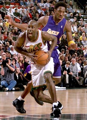
Only two seasons of these two together (uniforms, not players):
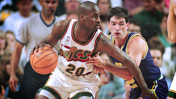
Also, only one season together (1995-96):
-
These are the best road uniforms the Saints have ever worn:
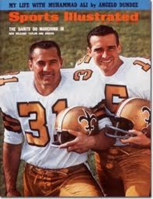
Really love the gold numbers and the helmet/pants stripes matching.
-
1
-
-
This is the best uniform set the Suns have ever worn:

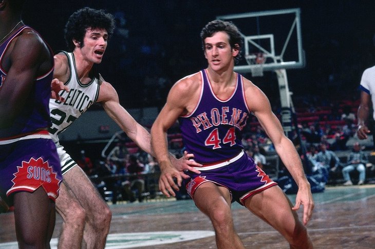
No gray, no black, no sublimination, nothing to clutter it. Admittedly, it would've been better if the home uniform used a "Suns" wordmark and the wordmark fonts matched, but it still forms a great set.
-
This is not as bad as some people say it is:

Granted, it's no masterpiece (the poor attempt to duplicate the gradient version of the logo, the full-body side stripe on only one side, the Forum-era Lakers number font, and the miniature "Miami" on the shorts), but the real collar, the striping pattern, and the red wordmark are all fairly nice. The originally Heat look was OK. Decent, but some tweaks and it could be made into something unique and lovely. The current Heat look is also great, but a balance between the two could be struck nicely.
-
1
-
-

This needs to be the Eagles' primary. Now. Excellent job Ren!
-
It would be nice if Montreal used this uniform as a road alternate:

-
2
-
-

How long until we can get the Nats using this logo? Nice!
-
1
-
-
Wizards vs. Warriors in 2011. First year in Golden State's current unis, last year in Washington's blue and gold unis.

Also from that year:


The first year for the Jazz and Cavs uniforms, the last for the Wizards' uniforms.
-
That above scheme can be done in a far more tasteful manner:


 hole for another 10 years.
Unpopular Opinions
in Sports Logo General Discussion
Posted
While it is certainly better than the Edge duds, I still don't get the love for it. There is far too much black on the uniform (black should only be used as a trim color, like it was on the white version of this sweater, and should never be the color of the shorts or helmet), the fire-snot horse hasn't aged well, and the number font has never really looked all that good.