


SFGiants58
-
Posts
8,279 -
Joined
-
Last visited
-
Days Won
79
Posts posted by SFGiants58
-
-
Per uni-watch.com today, we've got a 1970 Brewers prototype!

It seems that one of the reused Pilots jerseys (the source for most of the 1970 Brewers' uniforms) got turned into this, a modernization of the American Association Brewers' vintage uniforms (per borchertfield.com).
-
 2
2
-
-
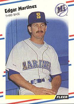
Edgar Martinez in the royal/yellow drop shadow set for the Mariners.
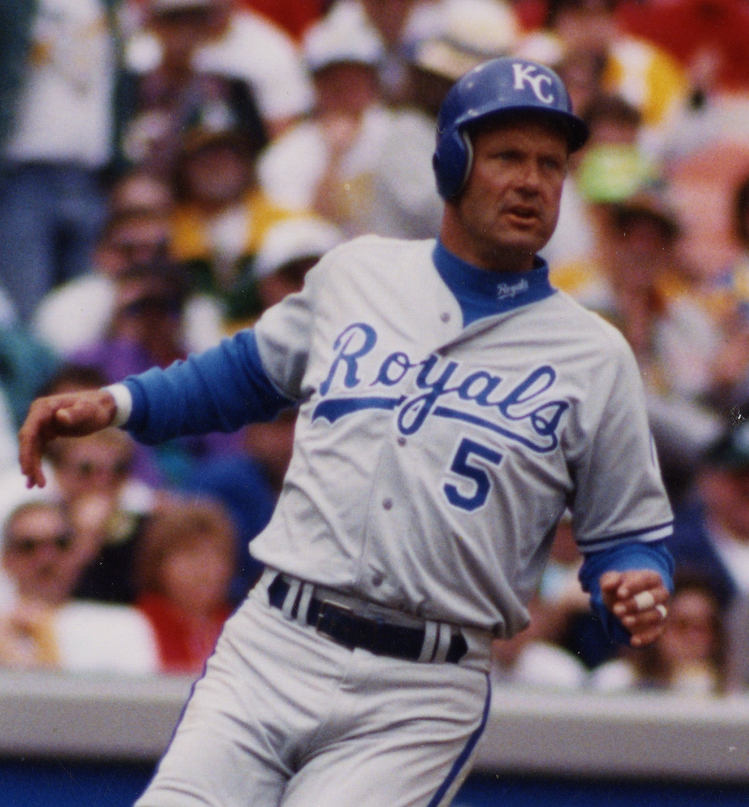
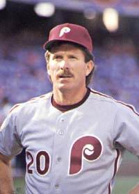

George Brett, Mike Schmidt, and Expos Gary Carter in grey road uniforms.
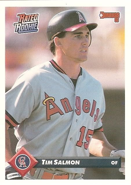
Tim Salmon in the 1989-92 Angels' uniforms.

Frank Thomas with the navy/red White Sox.


Barry Bonds wearing the 1983-93 Giants' uniform set.
-
6
-
-
30 minutes ago, kroywen said:
I hated this update. I know that seems extreme for a simple change in outlines, but it actually gets to my post above - the silver outline in the middle effectively creates what looks like a gapped outline, since the silver is virtually indistinguishable from either the white or gray fabric from a distance. It looks especially bad on the home uniform, IMO.
The original version, with silver on the outside, looked far superior, since the silver basically blended in with the background. I'd personally prefer a simple blue-outlined-in-teal wordmark, but the silver was barely noticeable, so it basically created the same effect.
I do think the road uniform is better with the alterations. The teal used to just blend in with the navy wordmark and white outline. However, this prevented the tweak I actually wanted to see:

Using teal like the Orioles use orange (a statement I've been saying a lot lately) would allow the Mariners to stand out from the other navy teams and promote their unique color scheme. Also, going down to one outline makes for clearer scripts.
-
6
-
-
20 hours ago, chcarlson23 said:

Yeah, I've really soured on this logo. Never mind that it lacks purple, but it also has another glaring issue. The triangle backing, presence of hockey sticks (showing equipment is a mark against any hockey logo), and the prominence of teal and black make it look a little too much like the Sharks' logos. I know that they're in different styles and nobody in real life would confuse them, but the phenotype similarities are a little too strong for my liking. The purple/teal color scheme was nice, but the NBA Hornets use those colors in a better capacity.
I don't even like the pumpkin guts look. While the foot-d is a decent logo, it's really best left on the shoulders. An ornithologically-correct duck logo (either a portrait view from within a bounding shape - be it a roundel or a shield or a full view of a duck in flight) would be better. What also would be better is a dark green/orange/vegas gold color scheme, as there's too much black and not enough green in the NHL. A better template, like the current third sweater, should be implemented.
22 hours ago, OnWis97 said:I think my opinion is unpopular...
...I prefer with absolutely not a shred of hesitation, "Anaheim Ducks" to "Mighty Ducks of Anaheim." First, regardless of "Ducks" vs. "Mighty Ducks" the "...of Anaheim" is terrible. In other words "Anaheim Mighty Ducks" would be better than what they were actually called. I think I actually thought they were called "Anaheim Mighty Ducks" for a while and once I learned the real name, I probably let out a groan.
Second, the "Mighty" is a little too campy, or whatever...call me humorless, but it's just not a serious enough name. "Anaheim Ducks" is just fine and would have worked from Day 1 with the original look.
All that said, I also did not like their original look as much as most of you do but it was at least unique, with the eggplant color. I think I prefer the current look, but it would be fine with me if they went back to the old look, so long as they keep the name "Anaheim Ducks."
That's not unpopular. Heck, most of the people who want the old Ducks identity back don't want the "Mighty... of Anaheim" to return. These are people who've had to put up with the whole Los Angeles Angels of Anaheim crap, and I think they'd appreciate both a more straightforward/Anaheim-centric name.
-
2
-
-
I love these uniforms as a modernization/New Orleans-ized version of the original Hornets' set:

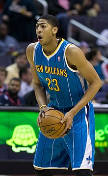
Heck, I wish the current Hornets used these uniforms as a template. All they'd need do to would be to swap "Creole Blue" for teal, incorporate more purple in outlines/striping, dump the yellow accent color, and add either their current font or Rockwell Condensed Bold.
-
4
-
-
48 minutes ago, The Giant Pacific Octopus said:
You see here is the thing. I dont go through my life keeping a bibliography of every news report I read or recording every radio spot that I hear especially in the pre-Internet era.. Back in the 1980s and 1990s it never occurred to me that one day I would have to cite something I heard or read to some stranger on something called a "message board" on something called an "Internet". I have a strong memory (especially from the 90s and 80s. When I was younger) and I remember specifically the little girl winning entry news bit.
Now if you are so obsessed with tracking down a citation or radio report to verify the story, I've given you the avenues to pursue your research.
Here is the Fan590 link
Contact them and tell them you wish to listen to their radio archives from the 90s (providing they still have the original recordings on file somewhere) and they will help you on your way.
Her is The Toronto Star website
Inquire about finding archives from the sports news stories from the 1990s, and I'm sure they will point you in the right direction.
I'm hardly obsessed. I merely take issue with people who randomly throw out things like "a little girl picked the team name" while providing weak evidence. If you want me to believe that "a little girl picked the team name independently and the expansion group bypassed all focus group testing and a team naming contest (which is thoroughly documented) to listen to a specific little girl," you'd best provide a link to it (preferably The Toronto Star, due to the difficulty of linking to radio), please.
Bold claims need bold, concrete (linkable, if discussing things on the internet medium) evidence provided by the claimant. If a student turned in a research paper with no specific citations and told their professor to "go look it up," they'd receive a failing grade on that paper. You don't have the best track record with citing your sources on your claims, and coupled with your gimmicks (a pathological hatred of the Mighty Ducks, blaming the North Stars' failure entirely on high school hockey, and pretending that your actually a giant octopus) growing stagnant, I would like you to buck that trend.
Citation matters. MLA, APA, Chicago/Turabian, a simple link to a website or a picture, etc., are the backbone of any good claim in an argument. The joke's probably on me, though. AFAIK, I'm telling a sentient octopus to cite its sources on a story that's about 75% apocryphal.
-
7
-
-
2 hours ago, The Giant Pacific Octopus said:
The winning entry was a little girl. I remember it specifically. I remember the Toronto Star article and I remember them announcing it and discussing it on the Fan 590. I don't know if the Fan 590 has archives of their old shows but you should contact their website and inquire.
Point us to it in the Toronto Star's online archives, please. I'm sure you can find it, you're a crafty octopus.
-
4
-
-
-
6 minutes ago, The Giant Pacific Octopus said:
The fact that they listened to a little kid who liked Jurassic Park. They name a professional sports team Raptors because some kid loved a movie.
A citation for that would be nice. It could be a simple link, a page from a book, etc.
Speaking of unused uniforms, we have some interesting concepts about what a "baseball uniform of the future" looked like to 1968 conceptual artists:
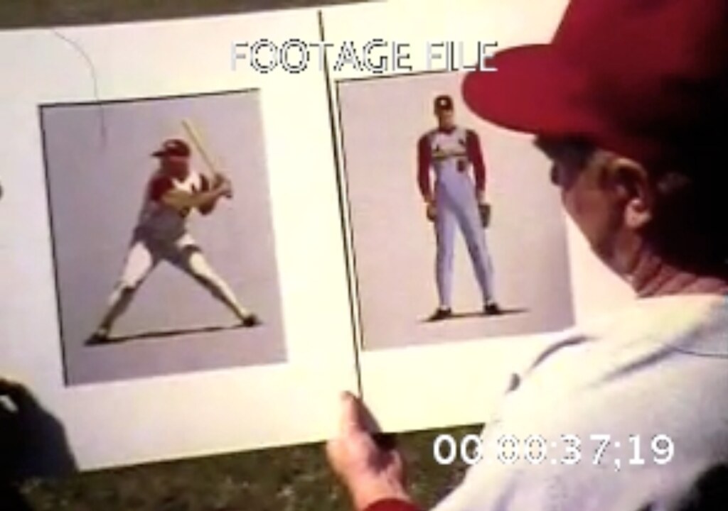
Here's the source, and the referral point to source.
-
2
-
-
If it weren't for Wahoo, the 1965-9 uniform set would be my favorite look for the Cleveland Indians:
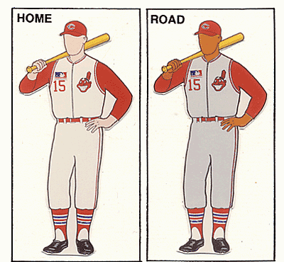

It makes excellent use of red and doesn't use a cursive/lettering script, differentiating them from the Twins, Red Sox, and Angels (since the Angels don't use a similar template). Sure, it makes them look like their Ohio brethren, but the navy accents and different road template should be enough to differentiate them (more than the Dodgers and Royals, anyway). Swap out Wahoo and the wishbone-c for a block C with feathers, and you've got my ideal look for the team.
-
I must say, you've really been on a roll with this latest batch of NHL concepts!
Penguins: The updated version would be my ideal modernized Penguins. Incorporating grey effectively (through both the striping and shading in the logo), while promoting yellow to the home sweater color (differentiating them more from the Bruins), produces a solid look.
Canucks: I like what you've done with the template, and the color distribution is fantastic. However, I think using the full bodied-version of Johnny Canuck would really put it over the top. The Orca and the "Johnny Canuck head + v", while both fine logos, just don't do it for me. I'd also recommend adding green outlines to the numbers on the white sweater.
Capitals: This is a fantastic modernization of their classic set with the current logos. I'm not a fan of the script logo, but you've managed to make it look good. I second the critiques that the Weagle on the third sweater doesn't need the roundel backing it. I'd also be curious to see what the red and white sweaters would look like with the Weagle as the primary crest.
Seals: You've managed to make the crest look halfway decent, and your uniform templates effectively balance the kelly/yellow/royal color scheme (something I thought couldn't be done). I can't really think of any way to improve it. Nice work!
North Stars: Thank you for not including black, instead using that lovely dark kelly green as a primary color. Your striping pattern beautifully balances green, yellow, and white (no white yoke is also a good touch), and the drop shadow on the numbers (in a font that resembles the crest, which I like) is handled in a far better manner than the actual North Stars' uniforms. I think it might be my favorite North Stars concept I've seen here.
All in all, I look forward to more of your handiwork.
-

India's flag has always been a favorite of mine, namely because of how it incorporates the Ashoka Chakra (symbolizing the "eternal wheel of law" and tying the nation to the Edicts of Ashoka, commissioned by Mauryan Emperor Ashoka in the third century BCE) alongside the green, white, and saffron bands.

Maryland's flag is the perfect demonstration of an effective way to incorporate heraldic symbols into a flag without compromising aesthetics. That said, it does not belong on sports logos.
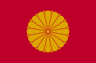
The Emperor of Japan's flag, a golden 16-petaled Chrysanthemum on a red background. It ties in well with the national flag, while also incorporating a historical symbol of the Imperial throne that dates back to the 12th century (the Chrysanthemum). Also, Japanese prefecture flags are an excellent demonstration of how to follow the rules of vexillology while incorporating significant regional symbols (often in the form of stylized kanji).

I grew to like the Portland, Oregon flag when I lived there for undergrad. The colors are striking (with a tiny vexillogical violation of dark gold and white touching), the pattern is an interesting take on the Nordic cross style, and it fits well within the green/blue aesthetic of Cascadian flags.

Denver's flag carries the symbolism of the sun and mountains (two well-recognized attributes of the city), rendered in an eye-pleasing rendition of the red/blue/white/yellow color scheme.
-
3
-
-
1 hour ago, Matito said:
I think if the team had been called the Rays from 1998 and they considered rebranding to the Devil Rays, it would have been met with total opposition from this board. For the 90s, it fit, but if it happened in reverse, 2008-era baseball fans would have seen it as minor league-ish.
I think they could have split the difference and just been the "Stingrays." It's one word (a two syllable one at that), refers to an aquatic animal (albeit one that looks somewhat different from a Devil Ray), and it doesn't have the connotations of failure that "Devil Rays" has.
-
1
-
-
Double post.
-
9 hours ago, Thomas said:
Nah, don't have time for that, i am too busy collecting baseball and hockey jerseys, and talking about logos and uniforms, it's a great hobby. You should try either of those things.
You've been trying it over several accounts, and the mods wind up banning you for a variety of reasons, sometimes in spite of your precious VPN protecting your IP address. Remember:
TomTucker
Rays
Angels
JasonFromMiami
Almighty
That one account where you posted Leviticus 18:22 in response to the SCOTUS gay marriage thread
...and a few I'm forgetting at the moment.
Go back to 8chan.
20 hours ago, C-Squared said:The obvious middle ground (to me, anyway) is a primary uniform with classic stripes, a lace-up neck, and the old alternate logo filtered through the classic colors:

...and, for the shoulders, a slightly modernized & isolated version of the Buffalo from the classic logo:

...and a yellow alternate DONE RIGHT!
Quite frankly, they don't even need the Buffalo. The "sword-B" logo would work well on the shoulders, tying in perfectly to that royal/yellow/silver crest.
Unpopular opinion, the Sabres are a Buffalo team that can get away with not using a buffalo in their logos.
-
2
-
-
I would be totally cool with the NHL dropping the requirement for NOB's, especially for Original Six teams. It could really help teams with traditional aesthetics evoke an additional vintage style. I'd advocate for teams to try it out during an outdoor game, be it the Winter Classic or Heritage Classic.
Besides, they're not as important as TV numbers (pre-empting a @hockey week reminder on the importance of TV numbers for sportscasters).
-
2
-
-
People here adore the Germanic Brewers identity (both the "MB" and "M" versions). I've lived in Milwaukee for the past few months now, and I have yet to see anybody selling or wearing anything from the Germanic years (compared to the abundant amounts of BiG and current merch). Not even 1990's-loving hipsters will touch it, which I find strange.
There are also some of us on here who love the Islanders' Fisherman set, while most people mock it and associate it with the darkest time in the Islanders' history.
The Cowboys' home uniforms are routinely mocked around here, but are largely beloved or tolerated by the public.
-
3
-
-

The Broncos navy/white set is their best combo, and should still be their primary home uniforms. There's enough orange on the set to differentiate them from the Bears, they're paired with Superbowl success (at least this uniform style), and they've outlasted all of their imitators (on the NFL, college, and high school levels) to the point where they've become modern classics. Their "dated-ness" has given them a kind of character, one absent in the "Orange Crush" uniforms.
It's also a great example of how to achieve a modern football look, with only two "gimmicks" (the swoosh panels and the helmet stripe), a powerful logo, and a legible proprietary font. Other modern looks try to cram too many gimmicks into their uniforms (i.e. the Titans' mixed stripe styles and weird font, the Browns' semi-illegible numbers and the pants, just about everything on the Buccaneers' uniforms, and the Jaguars' stripes and helmet), while the Broncos keep things relatively simple. That's why they've endured for so long, and that's why I think it'd be bad if they went back to the "Orange Crush" uniforms and logos with minimal modernizations.
-
11
-
-
11 minutes ago, Ray Lankford said:
Green and gold then. You could even throw in dark blue as an accent color, kind of like what the Brewers had in the mid-90s.
That's not a bad idea, but dark blue should probably be a light blue, so it doesn't look all muddy. I still think Royal/Yellow is better (and still unique), but to each their own.
-
1
-
-
2 minutes ago, Ray Lankford said:
You could argue for the Padres to switch to navy and red using that logic.
Of course you could. But that goes against the point of diversifying color schemes.
Royal Blue/Yellow would still be unique, and Green/Yellow wouldn't be.
-
Just now, Ray Lankford said:
I'm a big fan of regional colors so I think the Brewers should switch to green.
The history of the American Association Brewers with blue would make me defend blue/yellow for the Brewers. Besides, the A's should be the only green/yellow team.
-
I wish more baseball teams had followed Charlie O. Finley's example and diversified their color schemes in the 1960's. These color changes wouldn't be nearly as drastic as the A's, but would be enough to prevent the navy/red or royal/red overdose we have today. Some examples of this would be:
Red Sox: Forest Green (to tie in with the Fenway deco)/Red
Twins: Navy Blue/Kelly Green, Royal Blue/Kelly Green, or Forest Green/Powder Blue
Indians: Red/Brown
Braves: Black/Red/Yellow-Gold (for accents)
Royals: Purple/Yellow
Rangers: Blue/Silver or Blue/Bronze
I wouldn't want any of these teams changing their colors now, but I still think it would have been interesting and visually refreshing to see more teams take advantage of color TV in the same way Finley did with the A's and other teams did with their initial color schemes (Pilots/Brewers, Padres, etc.).
-
1
-
-
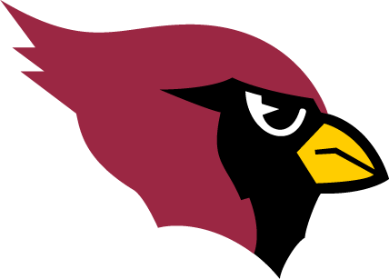
You guys are using the wrong Cardinals logo. That one is associated with several big playoff runs (including a Superbowl appearance), and only one franchise location (Phoenix/Arizona). This one has less winning behind it, and is associated with two separate locations (St. Louis and Phoenix/Arizona):
-
6
-
-
Well, we've got another unused St. Louis Blues uniform.


Unpopular Opinions
in Sports Logo General Discussion
Posted
I've thought about the team going for a Philadelphia Athletics-esque look, albeit in forest green/gold. Basically, take the current gold and green alternates and make a white version of them, with an "Oakland" road uniform using an updated version of this script: