


Green27
-
Posts
357 -
Joined
-
Last visited
Posts posted by Green27
-
-

Love the rebar effect on the DeWalt scheme!
-
Certainly a modernization from this!
-
 6
6
-
-
Oregon will unveil their black uniform this Wednesday, and it will be the first of many. They usually don't unveil new uniforms so early, but I have to imagine they wanted to beat any EA Sports game leaks.
-
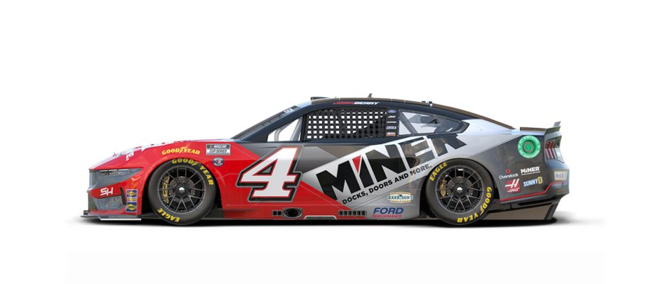
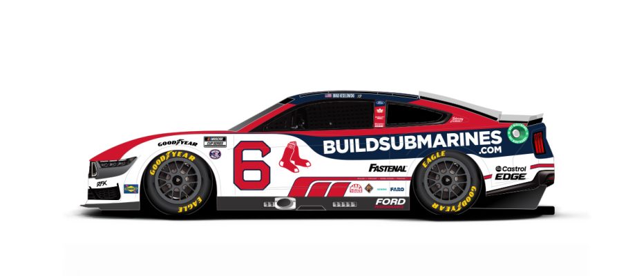
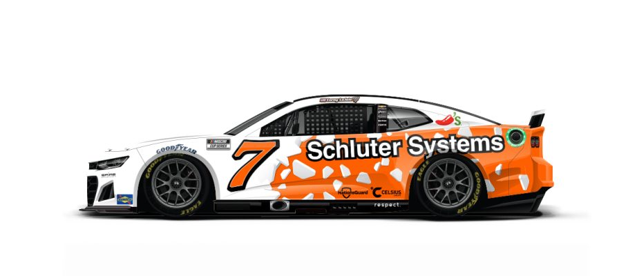
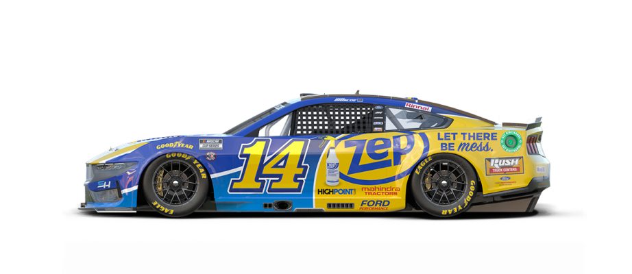
Rundown of most of the new(er) schemes for New Hampshire weekend!
I'm a sucker for crossovers so the Red Sox car is pretty special! Also really like the 14 Zep.
The 4 Miner scheme is probably the cleanest but most interesting take on the many red/black/grey schemes at SHR the last few years IMO.
-
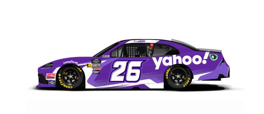
12 hours ago, mjarvie said:
Call a spade a spade, but the yahoo schemes suck. They look as dated as yahoo itself.
If you think yahoo is dated I have a few other search engines to sell you!
-
1
-
-
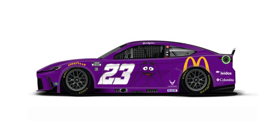
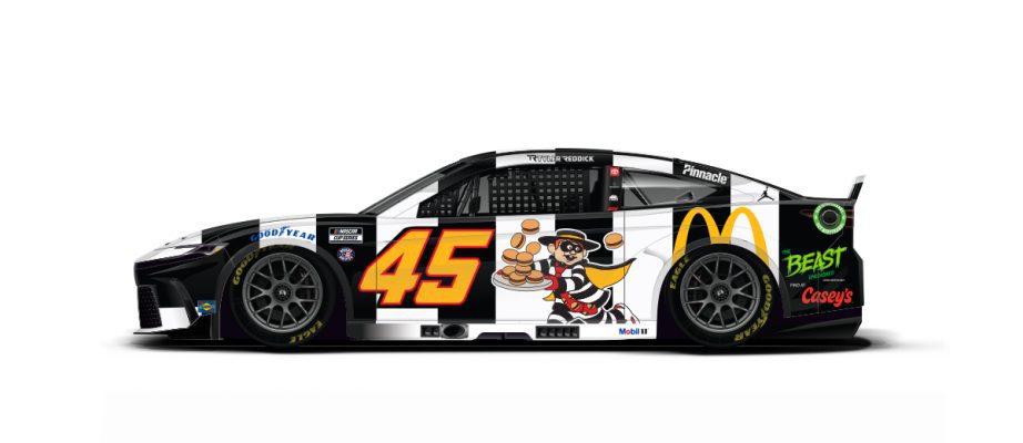
-Few more updates for Iowa. Sadly the McDonald's cars are big downgrades from last year IMO.
-Few others I don't recall being run yet:
I really love the fact that all 3 Trackhouse Kubota schemes have been different while maintaining the brand color that is surely a major part of their sponsorship. Suarez has the Dia de los Muertos pattern one, and Chastain has a solid orange one.
-Johnson will drive a special one-off Carvana scheme with his daughters drawings on it for Indy
-
2
-
-
Speaking of college cars!
Aw shucks
-
2
-
-
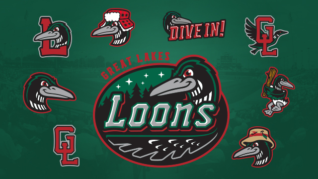
I'm an amateur ornithologist, but I'm concerned for this poor 'loon' and its health.
But really, there are already many regional loon sports logos done 10x better.
Why did they need to shove another branding element in? The loon, the state outline, the MN, the North star, the 10,000 lakes 'wordmark'...way too many things competing on one uniform. This feels like instead of a pitch meeting where ideas were worked out and streamlined into a simple concept, they just had 5 different designers work on each component and then mashed them all together.
-
6
-
 1
1
-
-
-
Some new or returning alt schemes for Sonoma this weekend:
-
1
-
-
I was at the race in Portland and so many schemes looked 10x better up close than on tv. Many cars had subtle textures or patterns that aren't visible on camera or graphics. The 26, 31, and 38 all featured much more detail than I had ever known prior to seeing them in person. Here's some photos I took of cars pre-race!
-
1
-
-
-
1 minute ago, thisguyphelps said:
That #47 OIKOS car... man i wanna see what the hood looks like
-
 1
1
-
-
Also 3 of the 4 SHR Cup cars are donning the Overstock scheme this weekend...
-
1
-
-
-
To save everyone the time, I won't post all this weekend's patriotic paint schemes. Here's a generalized depiction of them all, anybody have a favorite or one that stands out?
-
2
-
-
The Cardinals CC isn't bad, it's just extremely boring. I'm exhausted from teams posting 10 emojis reacting to their own jersey that is just their city name but abbreviated for fun.
-
2
-
-
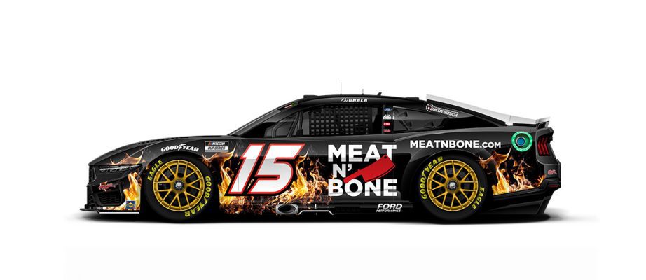
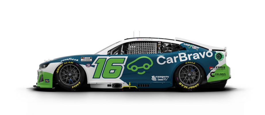
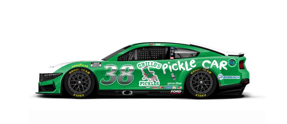
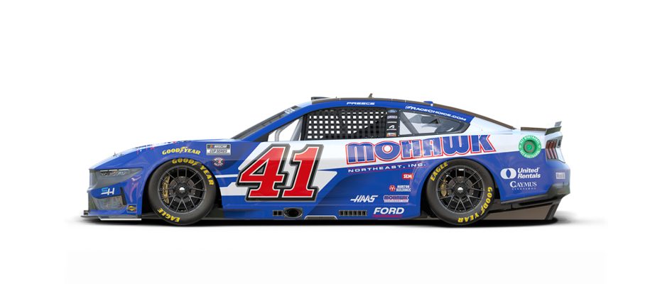
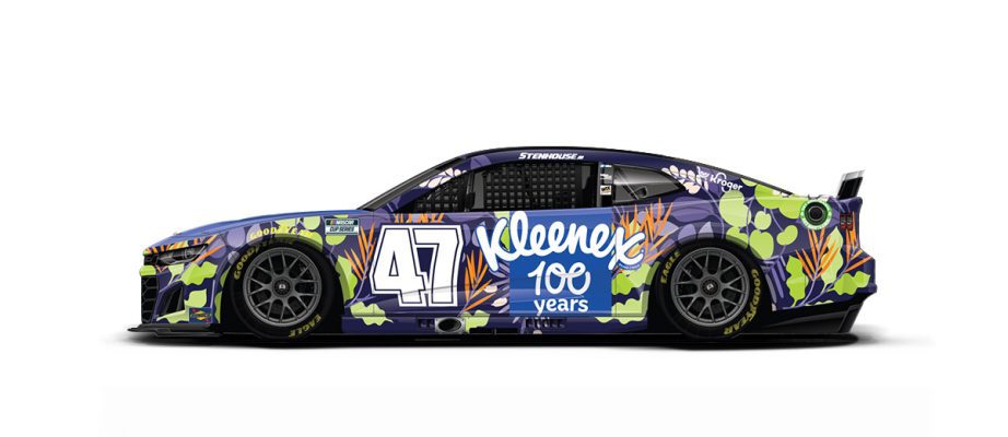
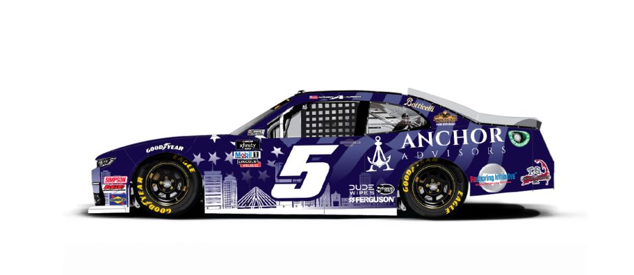
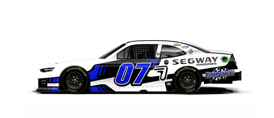
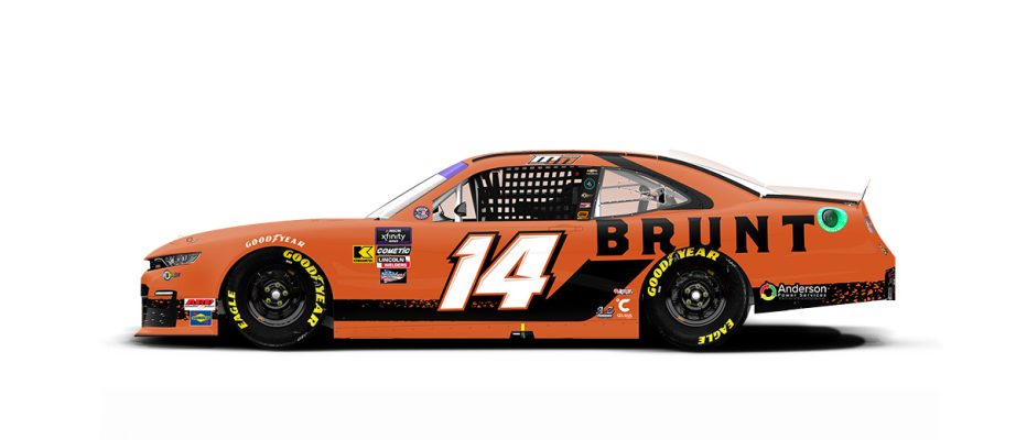
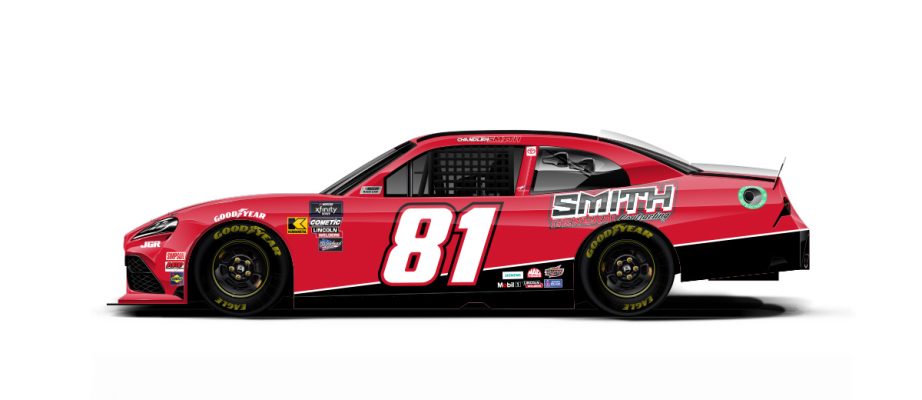
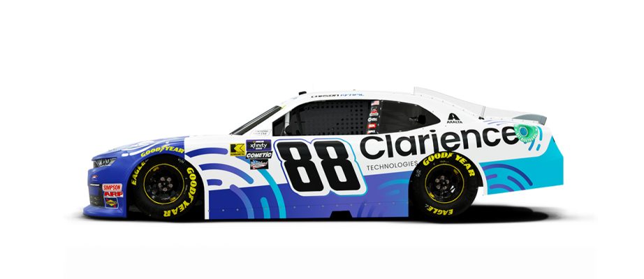
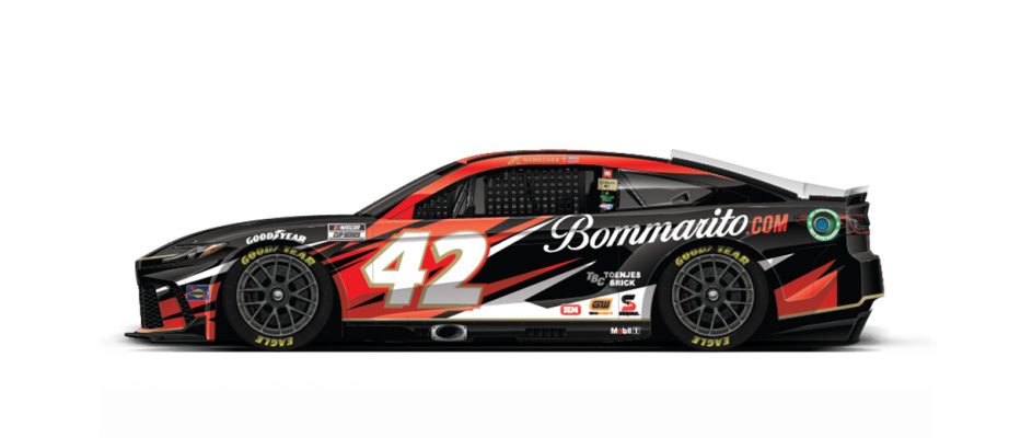
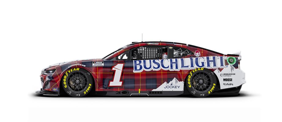
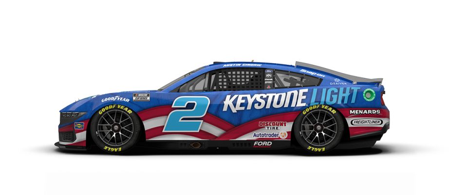
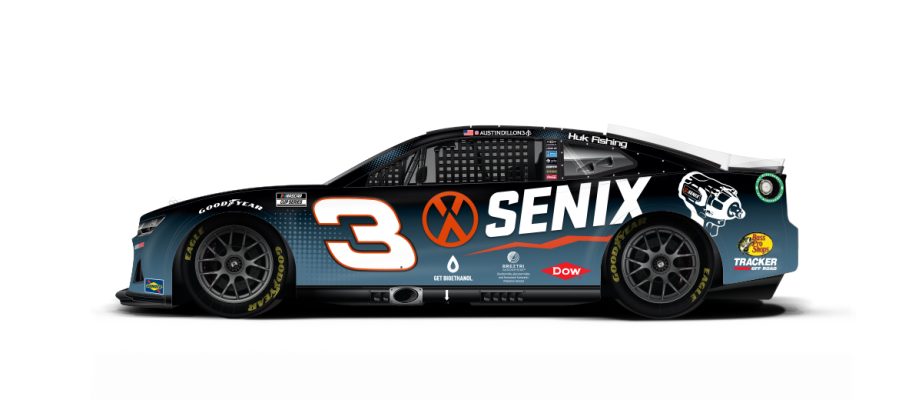
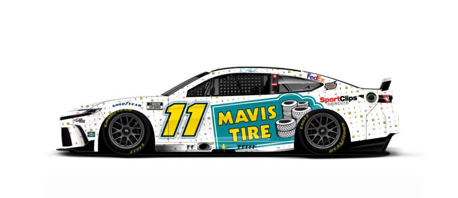
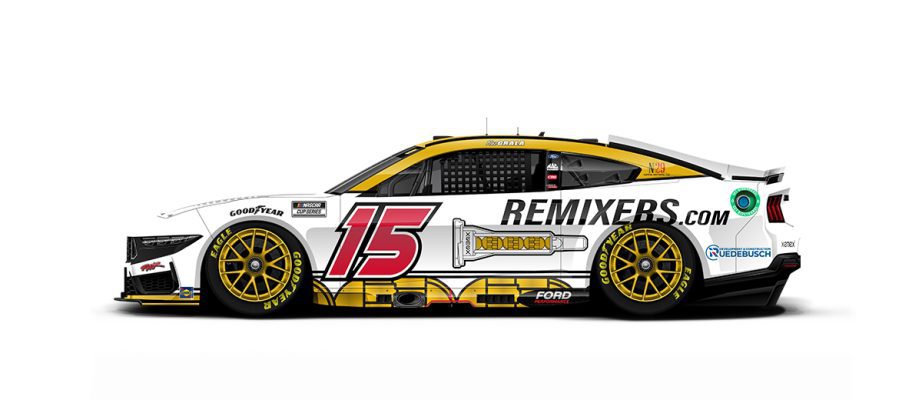
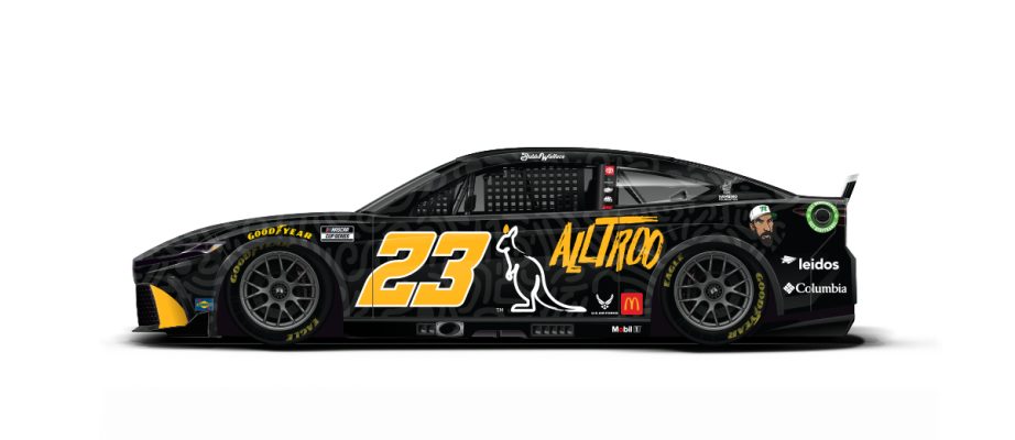
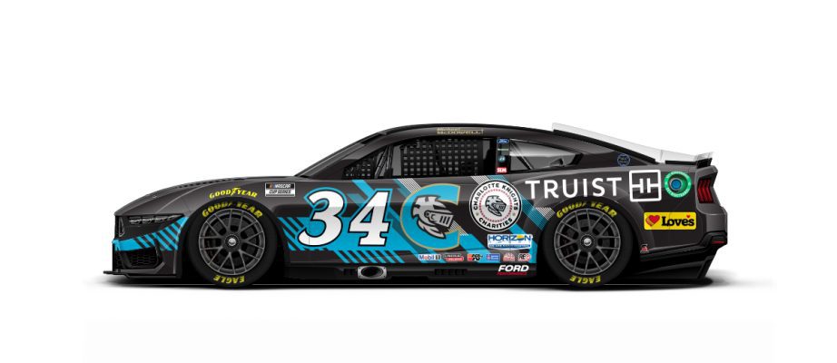
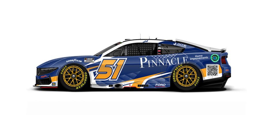
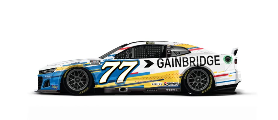
Lots of new schemes for this weekend's All-Star Race at North Wilkesboro:
-
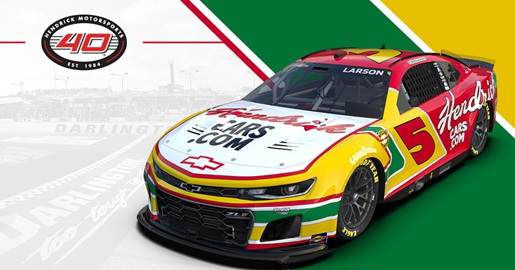
Another batch of throwbacks:
-
On 5/6/2024 at 5:26 PM, DCarp1231 said:
SVG will run a Marcos Ambrose throwback at Darlington—
Easily throwback of the year for me. Great colors, sharp edges, and sweet tribute to the Aussie/Kiwi bond.
-
1
-
-
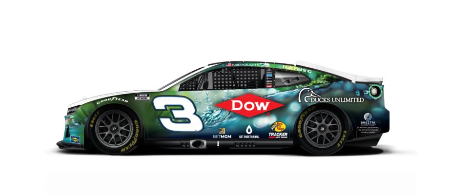
Some Trackhouse updates, first 2 at Kansas and next one at Darlington
This Hot Wheels throwback

-
1
-
-
I love the JJ throwback, but it feels weird considering he's back to actively racing for another team (albeit in a limited manner)...
I love the Castrol throwback even more! If it had white wheels I think I would have to buy the 1:24.
Here's some other new schemes announced recently.
-
I always thought the old George Mason logo fit in perfectly with the 2000's NBA D-League.
-
5
-
8
-
-
Embedded an image of your linked article. Wow, this is beautiful.
More new schemes:
-
 1
1
-


2024 NASCAR Schemes
in Sports Logo News
Posted