


Green27
-
Posts
357 -
Joined
-
Last visited
Posts posted by Green27
-
-
On 4/30/2023 at 8:09 PM, CDCLT said:

I've been really impressed with the unique colors and rotation of the 45 team's sponsors this year. The Monster, Sirius, and Moneylion cars all look spectacular.
-
 1
1
-
-
This season is really flying by! What are everyone's favorite paint schemes so far? I'll go first.
-
1
-
-
Simple and clean uniforms, but yikes at not including any team name or city name on them. Seeing these photos without context, I have little to no idea what teams are playing. The logos are good, but for a league that is so far from being in the cultural zeitgeist, casual fans need to have something to identify the teams with. Replacing the USFL logo on the center front chest with the city or team name would be huge.
-
2
-
-
The Eugene Emeralds have unveiled an alternate identity for the upcoming season, paying homage to a rather unique local bit of history.
The TLDR is in the 70’s the Coast Guard blew up a dead whale on a beach near Eugene and it went…poorly.
-
2
-
 2
2
-
-
14 hours ago, chcarlson23 said:
Why does everyone who’s made/designed major sport uniforms, feel the need to have toilet bowl collars? Like seriously, who signs off on those, saying they look good?? And why is it impossible for them to complete the circle on their uniform style? Just an obnoxious, weird, little, thing…
I'm getting major 2010s NFL flashbacks and I'm not happy about it.
-
2
-
-
On 1/5/2023 at 8:42 PM, TheGiantsFan said:
Seeing you're from Eugene, is there anything you would like to see for Lane County's three remaining teams? I have a Simpsons theme in mind for Springfield, but I'm wondering if you have any [non track-related] ideas for Eugene and for Cottage Grove. Any ideas would be very appreciated!
")
I think the Simpsons theme makes sense for Springfield! As a Deadhead, I have to mention one of the greatest (IMO) shows they ever played was in nearby Veneta as a benefit for the Springfield Creamery, that still exists today. The largest hospital group in Lane County (really anywhere other than PDX and Salem) is PeaceHealth and they have their primary campus in Springfield. I think they are still one of the largest employers in the county. Hop Valley is a large nationally-owned and distributed brewery that started in Springfield.
I loved the Track Town theme! That's definitely what Eugene is most well-known for. I'd throw out a nod to the original settlers of the Willamette Valley, the Kalapuya, either on a Eugene kit or one of the other nearby town kits. The two rivers played a big part in both the ancient and current Eugene. The city has also garnered a reputation for the 60's hippie movement that never really went out of fashion here, with Ken Kesey growing up in town. Eugene is also very into the craft beer scene, and has many large nationally distributed breweries (Ninkasi and Oakshire are the two biggest, Oakshire sponsors the minor league soccer club Lane United FC).
For Cottage Grove, I think there's a lot to work with. They are very proud of their history of covered bridges and movie filming locations (Buster Keaton's The General, Animal House parade scene, Stand By Me railroad tracks). It's a small town but has a cute historic downtown stretch to walk. There are no notable companies that come to mind for the sake of kit sponsor.
-
 1
1
-
-
As an Oregonian, I love this project so much. I never even thought you could combine city history and iconography with uniforms for such hyper-specific locales.
-
Sharp batch of new uniforms and designs there. Richmond has done amazing utilizing their history and design for a clean look.
-
4 hours ago, fouhy12 said:
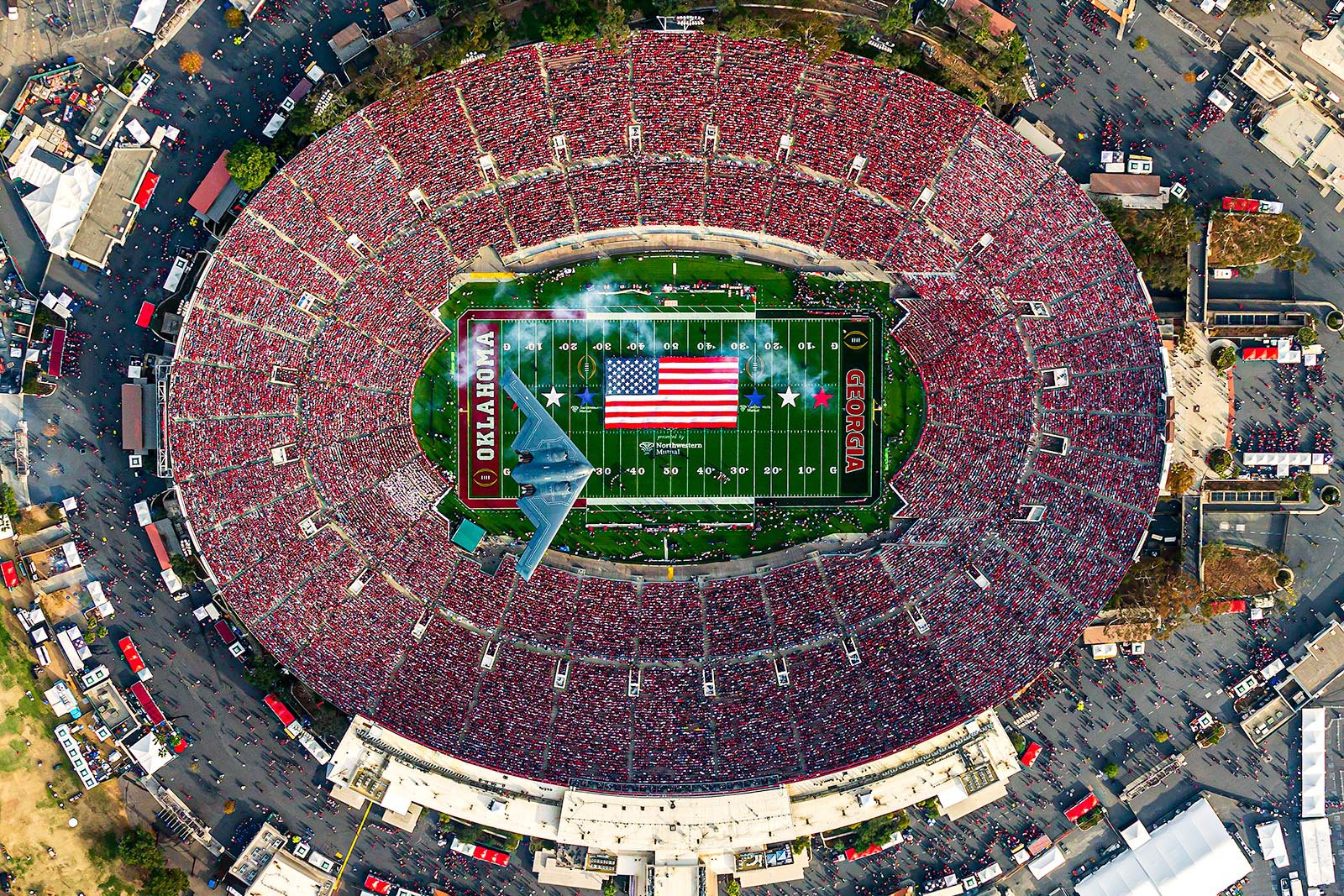
Wow, this looks absolutely amazing. The Rose Bowl has such a great aesthetic.
By far one of the coolest stadiums I've been to. The history of it all and the views of the mountains are beautiful.
-
13 hours ago, pelicanfan said:
infamous jerseys debuted last night.
they look ridiculous but i’d be lying if i said i didnt want to see them wear these more. they’re just so funny to look at.
Plenty of jokes have been made, but wow they genuinely 'rebranded' to the placeholder jerseys an expansion team wears in their first season.
-
1
-
-
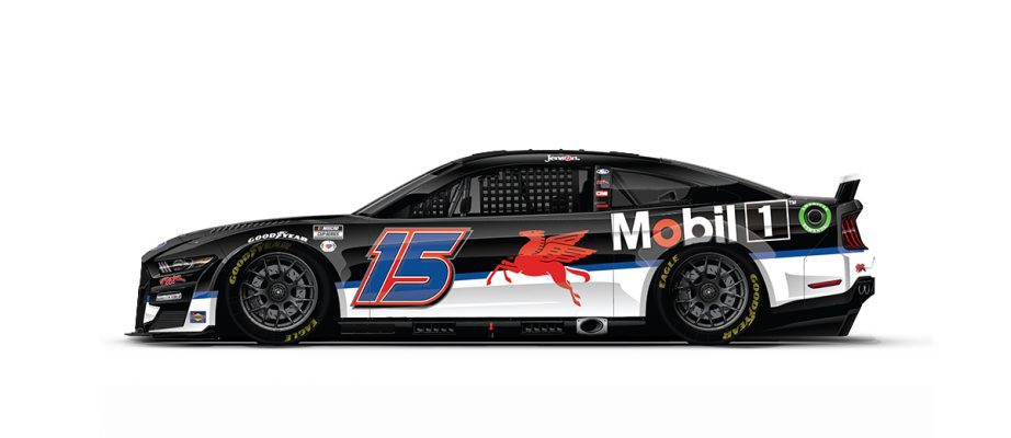
This photo of the Harvick #4 Busch really shows what sponsors can now do with the larger real estate on the sides of the cars.
-
Silly name of course, but I'm ok with the branding. Feels weird for a team that was recently independent to now be the AAA club AND getting a rebrand but could look much worse.
-
The long-discussed Beloit rebrand will be unveiled on Monday. I'm assuming Sky Carp based on colors.
https://twitter.com/MiLBPromos/status/1459613175209365505?s=20
-
On 9/7/2021 at 9:37 PM, Brian in Boston said:
The Winnipeg Goldeyes of the American Association have announced that they and their fans will be moving "Forward Together" in 2022. The first step on that journey is the introduction of a sleek new look to accompany the team's name of 28 seasons.
CREST ICON
CITY MARK
BRANDMARKS
Winnipeg Goldeyes: Forward TogetherThat is far too many random chunks of partial logos. One is literally just a maple leaf and another is just a generic hashtag...
However, I will say that the drastic simplification of the logo is slightly better than what they have been using.
I mean this guy looks like he was the clean-up batter behind the 2003 Blue Jays juiced logo.
-
1
-
-
Return of the Fresno Tacos, one of the earlier food one-offs.
-
1
-
-
On 5/5/2021 at 2:40 PM, Dilbert said:
It seems the Quad Cities River Bandits have an identity crisis.
The left is still being used as their primary logo and on their website, but the right is being used as an alternate colors logo and is being used on social media
Weird, good find. I assume the blue version is new to represent their affiliation with the Royals, whereas they had been affiliated with red teams Cardinals and Astros for the last 15+ years.
-
1
-
-
Every year I look forward to the Army-Navy uniforms. It's nice to see real military tributes and not just 'we made our logo into a flag logo'. The thought and research that goes into these mean something other than just generic 'patriotism' and 'cool jerseys'. Another well done round of design on both sides.
-
5
-
-
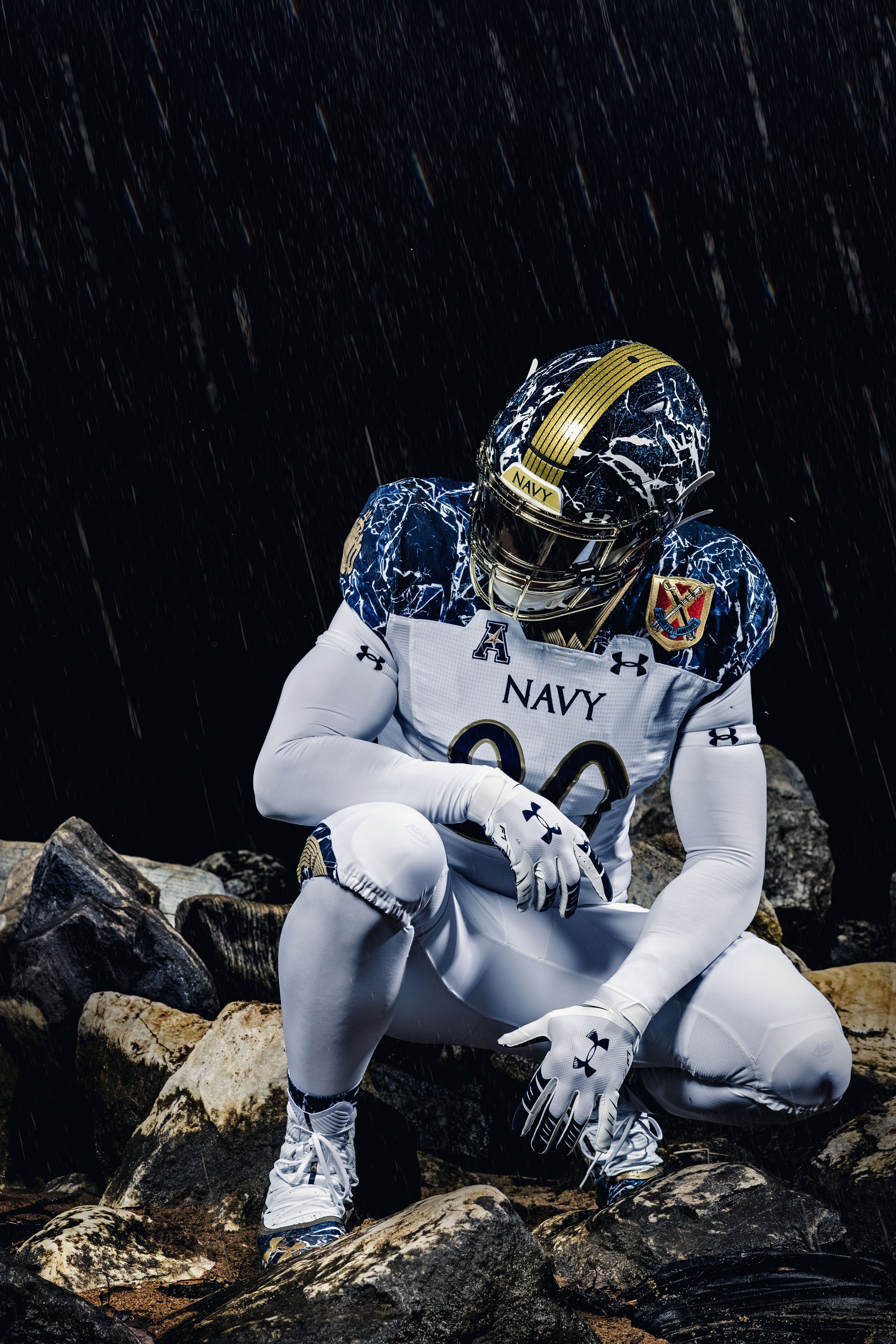
Call me a homer but I love the new one-off uniforms. The team and Nike have really learned what works well for one-offs and improved over the years. This uniform has a lot of details that make it feel special, like the starry galaxy pattern on the helmet to the pattern throughout and the back helmet bumper.
-
8
-
-
On 10/29/2020 at 9:48 AM, Brian in Boston said:
The new Butte, Montana-based team in the summer collegiate Expedition League has settled upon an identity: the Mining City Tommyknockers.
Tommyknockers are gnome-like creatures that originated in the folklore of Cornwall, England. Cornish miners claimed that tommyknockers were humanoid creatures - not unlike leprechauns or brownies - who lived deep beneath the earth. Dressed in clothing that mimicked that of the garb sported by human miners, these imps were thought to manifest their existence in a couple of different ways. First, miners claimed that mischievous tommyknockers were responsible for stealing any tools, personal items, or food that might go missing in the mines. More importantly, the creatures were said to knock and hammer on the walls of mines to signal that a shaft or tunnel was about to cave in. If miners hearing the sound - actually the creaking of timbers and shifting of earth - escaped such a collapse, the tommyknockers were said to be well-meaning. However, if a particular mine saw numerous collapses that resulted in death or injury, the tommyknockers therein were thought to be in a malevolent mood, usually brought about by the presence of miners who doubted in their power or refused to believe in them at all.Garnering 72% of the votes cast, Tommyknockers bested Blasters, Powder Monkeys, Prospectors, and Ridge in the final round of the ballclub's "Name the Team" campaign.
The logo was designed by Jason Stemm of Stemm Creative.Mining City seems odd and not exactly rolling off the tongue. Butte Blasters would have been...amazing. Butte/Mining City Powder Monkeys sounds like an 1800's slur.
-
2
-
-
I think the powder blues work well, but only as an alternate. The helmets should definitely be their primary lids though. I just don't like the powder blue mixing with the navy, red, and grey they have.
-
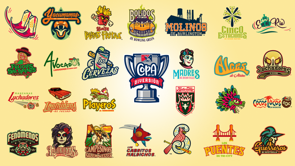
Presenting the Copa identities for 2020! 22 new teams participating makes 92 overall participants. Read more about the names and looks here.
-
1
-
-
12 hours ago, CaliforniaGlowin said:
I discovered this rebrand while browsing sports logos. It was done a couple of years ago. This cat looks badass, almost like a robot. I wish the XFL's Wildcats had a logo like this.
Shoutout to Skye Dillon of Skye Design Studios, constantly putting out quality stuff.
-
2
-
-
Old tweet, but the MILB's Copa de la Diversion uniforms will roll out tomorrow. I assume most teams will unveil tomorrow but some may trickle in later once they receive actual inventory of uniforms and caps.
-
2
-
-
A team being named the Unicorns? Where am I, a Brandiose-led MILB thread? Jokes aside, I wish there was a concept for a small school brand built around unicorns from the 70s.
-
3
-


NASCAR 2023 Season Thread
in Sports In General
Posted
Some fantastic throwbacks on deck for Darlington! I'm definitely ordering a diecast of the #9 car.