


Green27
-
Posts
357 -
Joined
-
Last visited
Posts posted by Green27
-
-
On 7/22/2023 at 11:23 AM, vtgco said:
The branding for the new USL League 1 team in Spokane has been released.

Glad it's not "Spokane FC" but this name and the logo leave a lot to be desired.
I know it's supposed to be Spokane Falls, but honestly the logo looks like Nevada.
Who designed this? A graphic designer from 1992 Arena Football or the local city council that didn't want to spend more than $400 on the project?
-
-
At least it looks less like a long-lost cousin of the Kansas Jayhawk now, but the massive head and yoked calves are clear signs of PEDs...
-
 3
3
-
-
I personally love the Black/Green/Black combo. The yellow accents really pop, and the green gets to be the star without being overbearing. I really think it embraces school colors while looking sleek and modern, pleasing both sides of the aisle.
-
7
-
 3
3
-
-
The ASU-Fresno game really looked incorrect. Am I the only one who thinks of Fresno as a red/white school not a red/white/blue school? ASU also looked off in the hazy night, with the maroon looking almost grey on the broadcast.
-
5
-
-
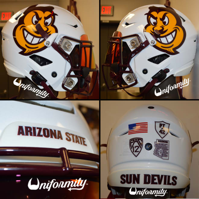
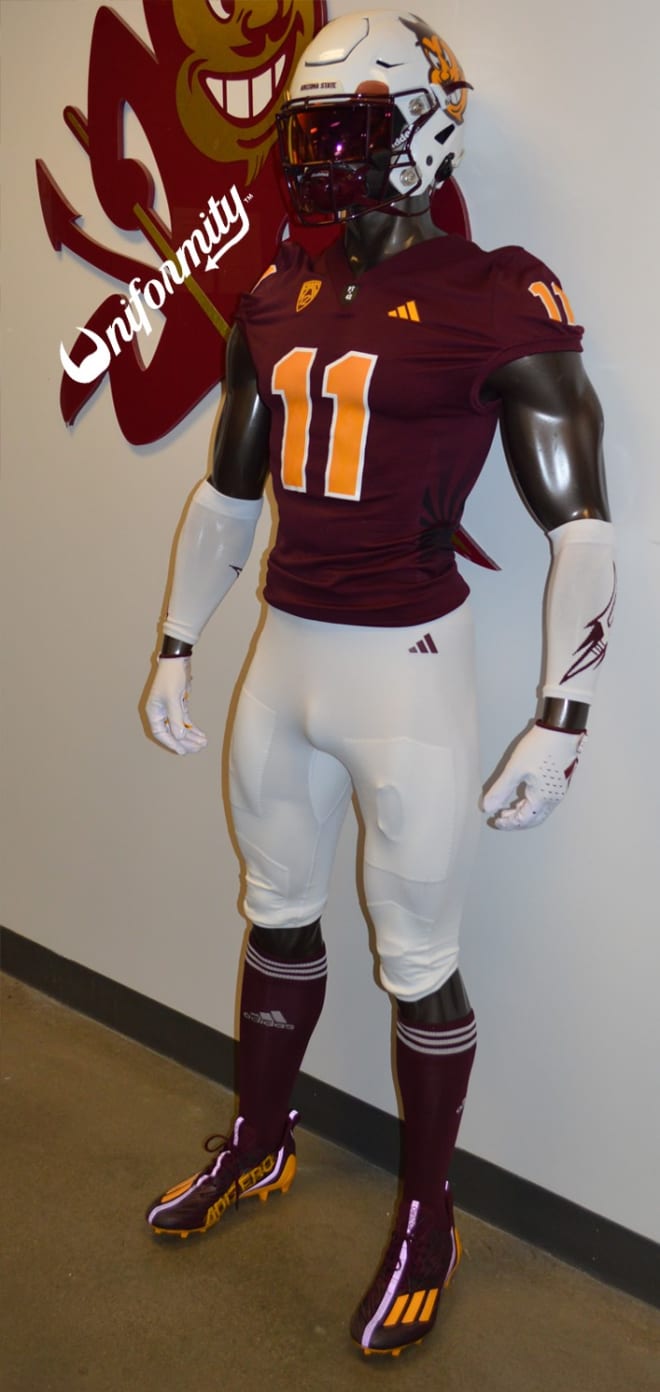
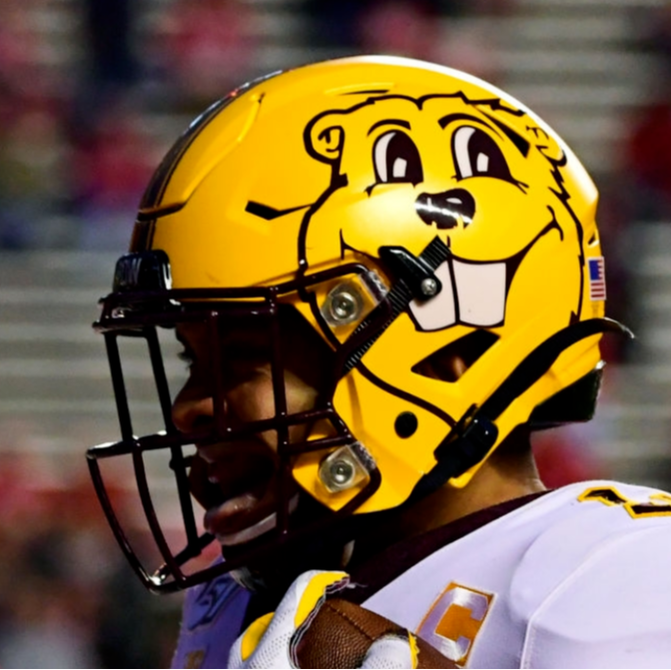
9 hours ago, upperV03 said:
Arizona State going white/maroon/white with large Sparky face decals on the helmets:
I don’t really care for the big Sparky face decals (just use the regular Sparky), but they’re still better than any of the million different pitchfork decals they use.
The giant floating Sparky head is pretty bad. The classic full body Sparky and the Pitchfork are the only helmet decals they need. The head only feels tacky, like this.
-
2
-
 2
2
-
-
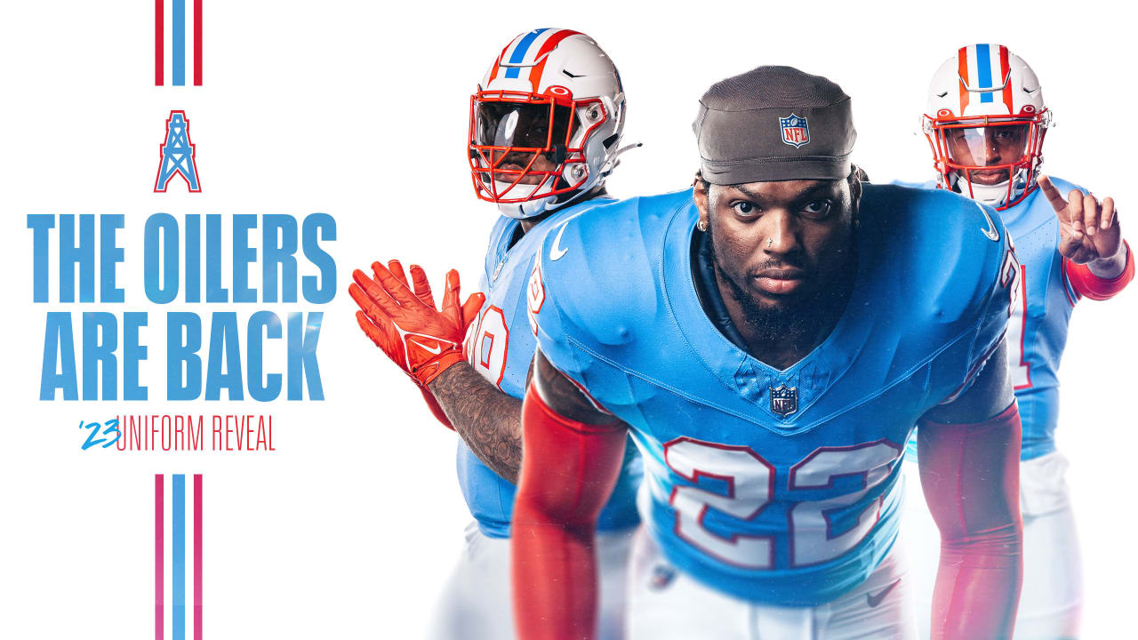
"The primary logo, designed by Skye Design Studios based in New Jersey, features a pilot clad in a red aviator hat and red-and-white baseball uniform astride a C-119, which was manufactured by Fairchild Aircraft in Hagerstown in the 1940s and '50s."
-
1
-
-
5 hours ago, CaliforniaGlowin said:
Do the G league teams have alternate uniforms?
A lot of the teams will do partnership specialty one-offs for theme nights to be auctioned after the game, much like MILB. Otherwise it's usually just the light and dark uniforms.
-
1
-
-
-
On 8/14/2023 at 8:58 AM, CaliforniaGlowin said:
Just learned of the Mariners doing a Boise State jersey special last weekend. I love BSU's blue turf, and I watched their brief baseball season.
Really odd to me considering how many other schools are in proximity to Seattle. UW, WSU. Gonzaga, SU, Whitman, etc
-
Yeah the ideas are all there, but lacking in execution. White ball, no black, horrible font. Looks like a rough draft come to life.
-
Absolutely fantastic work all-around! Congrats on wrapping such a long and detailed project!
-
 1
1
-
-
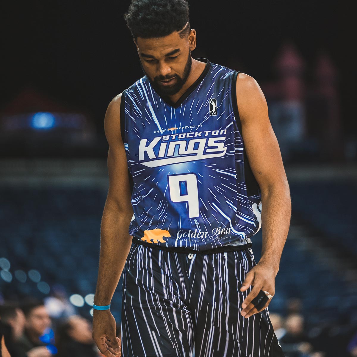
Really the only negative I have to say about the Kings new uniforms is that I think purple font on the white uniform, not black, would be a more cohesive brand look. I love the Kings script font, and think the limited use of grey is for the best.
Their first version of the black script from the 2010s was fantastic, so I'm really excited they will have a similar look but updated. Thankfully the new ones are not so angular.
-
8
-
-
Lots of patriotic schemes this weekend for the 4th, as well as some Chicago tributes.
-
Some music-inspired schemes for Nashville this weekend!
-
Unfortunately it really shows in recent years. Between the pandemic and the multiple alternate identity nights, the amount of passable/good enough in-house work is too high. I know teams are looking to save on costs, but I think at least some brand value is being sacrificed in the process of churning out half-baked logos and putting them on quickly screen-printed tees for a random fun night.
-
Consider me...whelmed. The pant stripe really adds a lot, almost too much. I think the biggest issue I have is the dropping of gold number outline, it really helped tie the shiny gold helmets in with the jerseys.
-
10
-
-
-
I really just want the consistent pattern of team Home/Away uniform and fun local host inspired cap.
Plain uniforms with a side patch is lame.
Going all-in on host team branding can be fun, but easily goes too far in the direction of local beer league uni IMO
Going with a totally new/random design like the last several years is also bad IMO.
Wearing the team uniform with a patch and a special host-themed hat really works for me. This hits the perfect sweet spot of team-recognition and fun host-theming (and will help drive merch sales, which we know are key).
-
19
-
-
As many on Twitter pointed out, that LU logo is almost tauntingly close to being a direct rip of Liberty's LU logo.
-
1
-
-
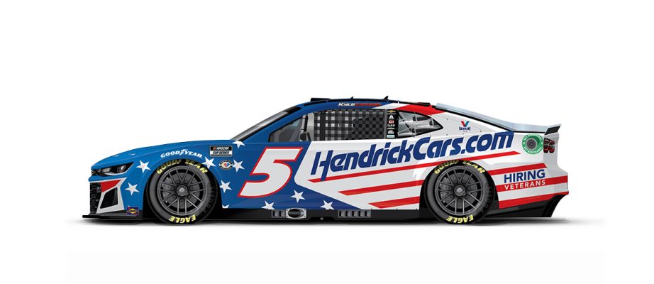
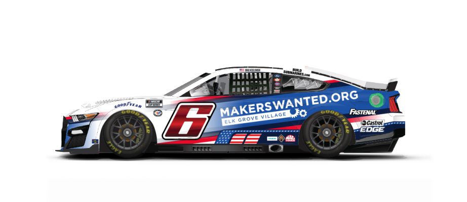
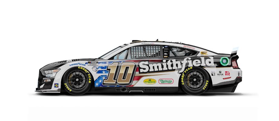
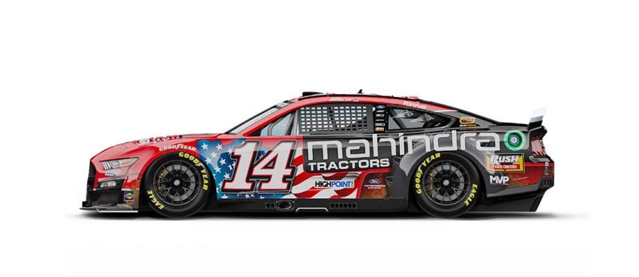
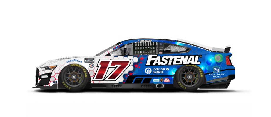
New Ryan Blaney scheme for the 600.
-
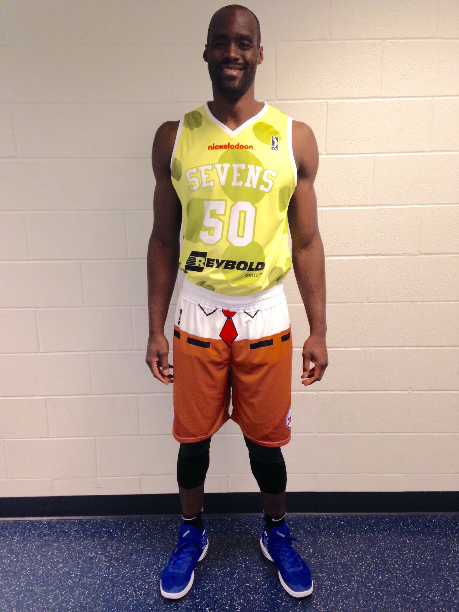
This is a now independent league team, but first time seeing a full suite of ads on a minor league uniform set. The Springs jersey has TWO on the same shoulder.
-
Not a lot of new or interesting notes for the All Star Race, other than Harvick's last laps in the 29 car.
-
1
-
-
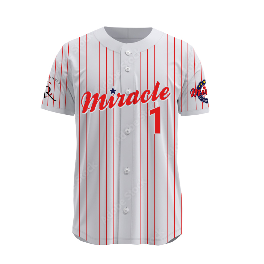
New Northern League team the Elkhart County Miracle debuting at the end of May. This team was supposed to debut in 2014 but has had major stadium development issues.

/cdn.vox-cdn.com/uploads/chorus_asset/file/22146902/city_edition_jerseys.jpg)


/cdn.vox-cdn.com/uploads/chorus_image/image/56931635/usa_today_10319493.0.jpg)
:format(jpeg)/cdn.vox-cdn.com/photo_images/4313814/128356847.jpg)

/cloudfront-us-east-1.images.arcpublishing.com/gray/2DYDSW5XUBBVVF77F3HDFBUGIU.jpg)


:no_upscale()/cdn.vox-cdn.com/uploads/chorus_asset/file/19302241/usa_today_13539224.jpg)

2023 High School football
in Sports Logo News
Posted
Some interesting Oregon schools:
West Linn has a unique shade of teal
Silverton Foxes use a very weird and old looking ripped cartoon fox on a block S
Great and colorful matchup between South Eugene Axe and Springfield Millers (love the script)
Cleveland Warriors have a fantastic retro-inspired set
Crater Comets (great name, lazy logo) use pretty much the standard Chicago Bears logo
Sheldon Irish played the Mililani Trojans from Hawaii, and wow at both pants...