-
Posts
357 -
Joined
-
Last visited
Posts posted by Green27
-
-
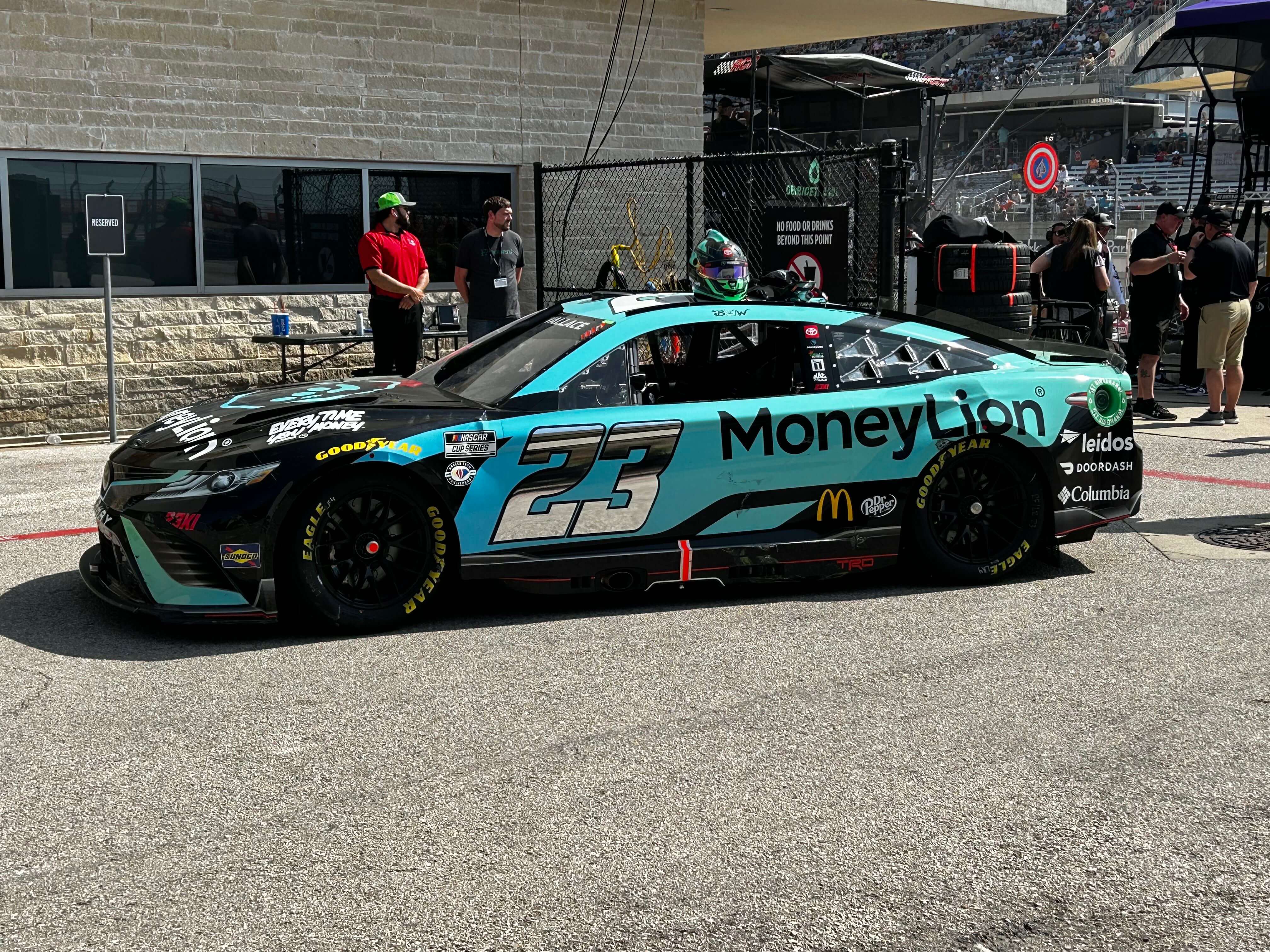
The Moneylion scheme is a major downgrade IMO. Love the idea of more color but there's absolutely nothing on the car other than color and logos. Would it hurt to throw some shape layers or edges on there?
2022 and 2023 were much better.


-
 2
2
-
-
After some good (and not so good) racing and weather, I will say I like both new Toyota and Ford bodies much more after seeing them in action. Is it just me or do they both look wider/flatter than the Chevy body?

I have to say, the new Busch Light car really won me over. In a field of so many white cars, they achieve the clean light color without just slapping a logo on a white body.

-
 2
2
-
-
Love the Coal Cats branding so much! Unique name that isn't Brandiose'd, unique colors, and solid design work across the board. Nice tie-in to Marshall University with whom they will share a stadium. Props to Dylan Winters Design Co.
-
 6
6
-
-
Some new and noteworthy Daytona schemes.

No more black rectangle Axalta


One of few white cars I like this year

Love this Mobil scheme

-
 2
2
-
-
-
JGR doing a mashup for Bell at Daytona

-
 1
1
-
-
The new Trackhouse Wendy's car to be driven by Daniel Suárez in the Xfinity races.

-
 1
1
-
-
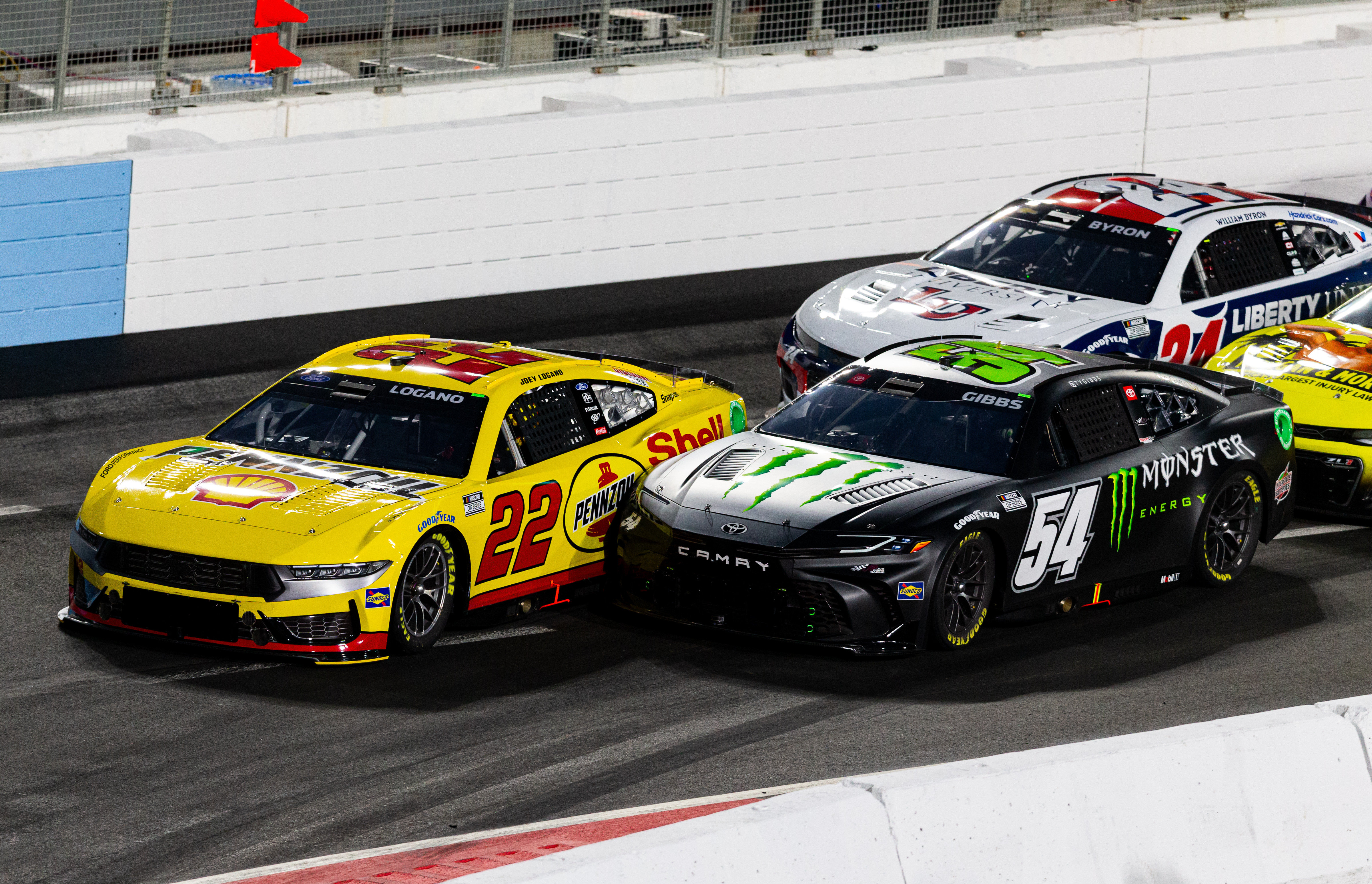
Image from last night that nicely shows off the new Toyota and Ford bodies as well as the slightly different black (54) vs grey (22) rims.

-
The Dollar Tree/Family Dollar schemes are extremely...whelming. Not offensive, not great. Just fine, safe. Wish there was more color, the DT has some green background pattern but is mostly white. The FD has a middle chunk of red but otherwise plain white.
I miss the wild neon and flame days of the 2000s.
-
 1
1
-
-
Ricky Stenhouse to have about 47 brands on his car at The Clash this weekend.

FRM announces an extension with Love's to continue being a featured sponsor.

-
 2
2
-
-
Joey Logano's 2024 Hunt Brothers Pizza scheme
-
 1
1
-
-
From an above link, the Giants darker cream home uniform. New on left, old on right.

-
 4
4
-
-
The Busch car is everything I want in light color designs. Lots of details, complimentary colors, doesn't feel bland or generic.
-
 2
2
-
-
Love the corn texture 7 on the one Brandt scheme. I want to see more creative implementations like that, rather than some basic design like most of the other recent reveals. That white Napa 9 is boring and I'm worried the DollarTree/FD cars will be white with small streaks of color for each brand at best.
-
Some more Hendrick schemes. A lot of boring white across the board IMO.


-
Byron's Raptor and Axalta schemes dropped today.


-
Trackhouse has a big deal with WeatherTech, which will serve as Primary Sponsor on Shane van Gisbergen’s 2024 Xfinity and Cup Races

Zane Smith’s Spire Motorsports car for 2024 Daytona 500

Looks like Ross Chastain's new Busch Light scheme got leaked via this bar sign on ebay!

-
 1
1
-
-
I would love this to be the one place we go to in order to talk upcoming paint schemes, what's on our wishlist, sponsors etc.
Here's a few shots of testing at PHX from this week. NASCAR is rolling out the all-new Ford Mustang 'Dark Horse' body, and Toyota has a revamped Camry body. Chevy will still be rocking the 2021 Camaro redesign for 2024.


-
 2
2
-
-
I really want the Mankato Mayhem to be a thing but maybe that's best left to an AF2 team somewhere down the road.
-
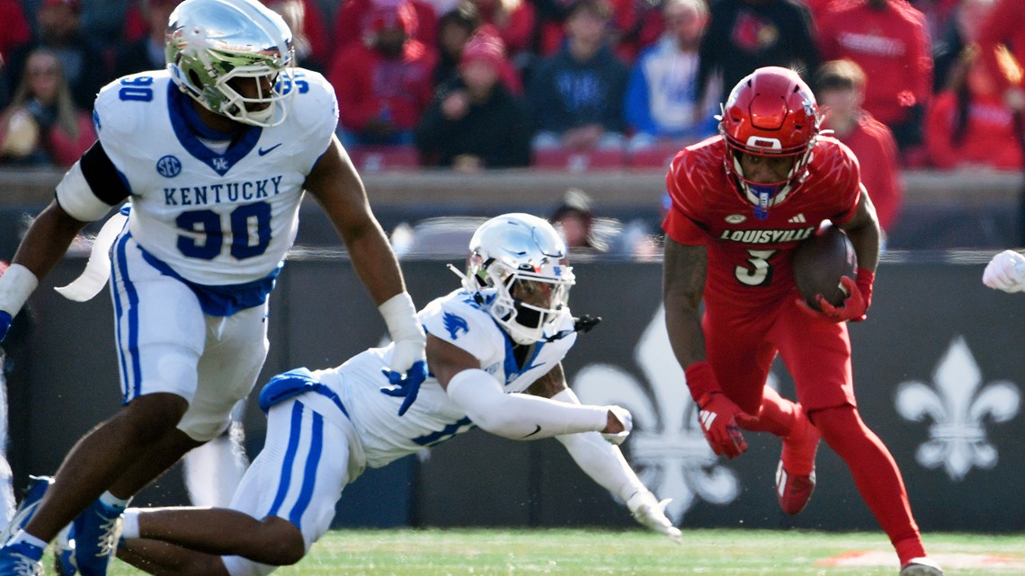
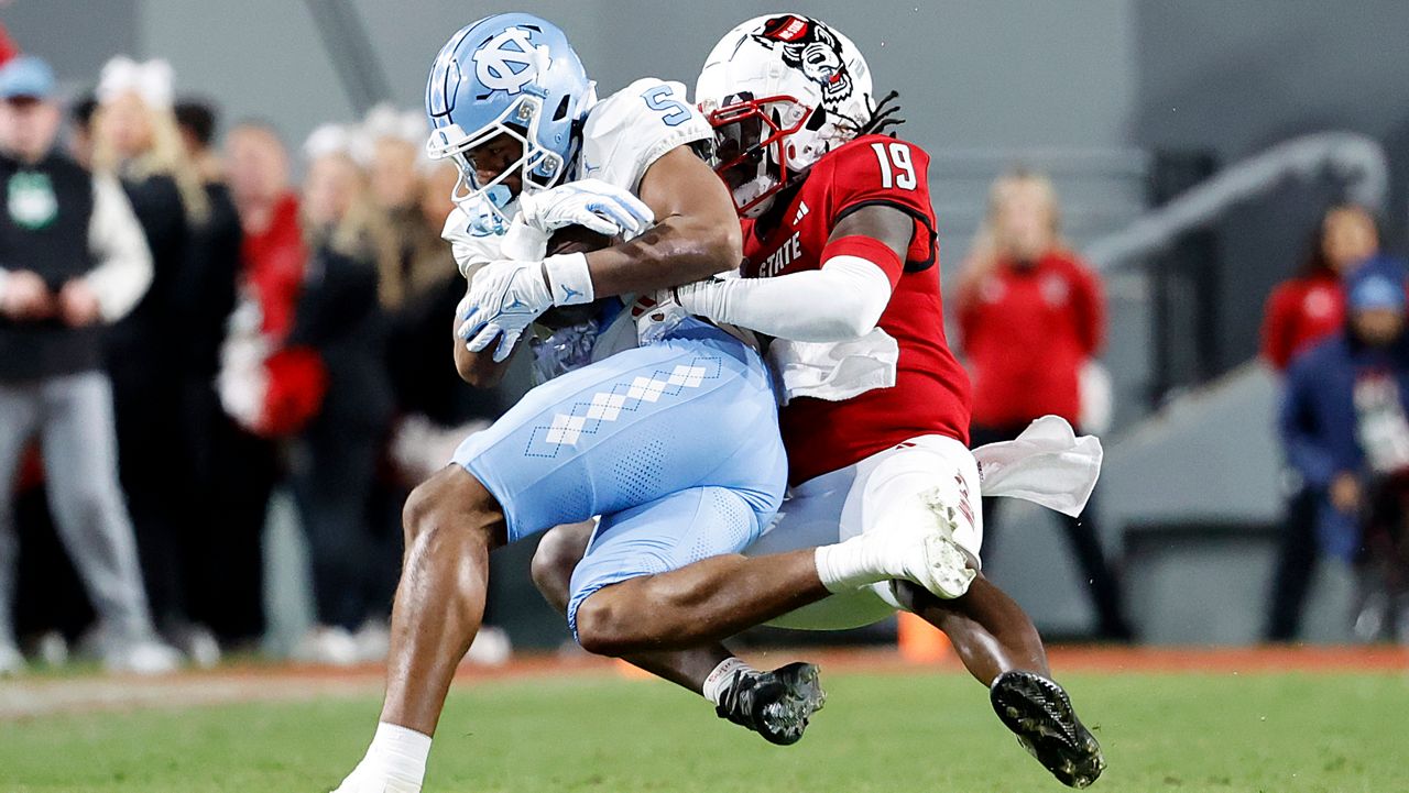
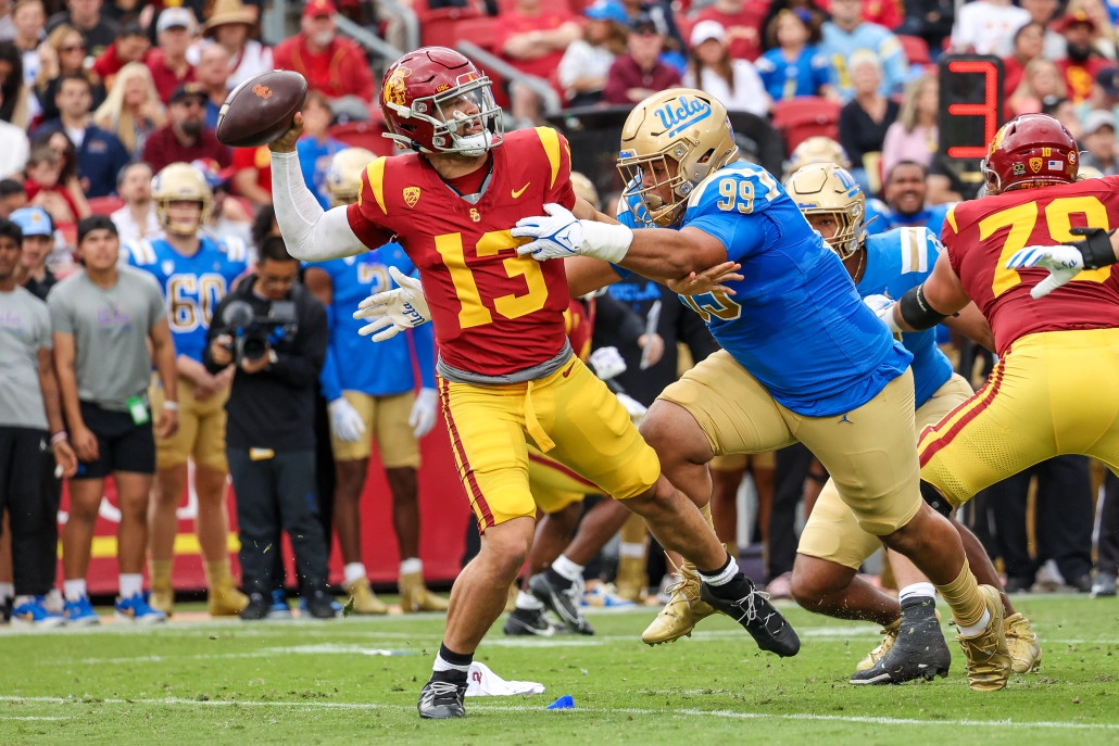
So many beautiful color v color and generally contrasting matchups this week! Some of my favorites:


Nominee for worst of the week: Tulane has amazing colors, logos, and uniforms. These happen to be their worst IMO, which still aren't horrible. UTSA has perfectly fine uniforms (and a fantastic nickname), but I prefer their blue pants over the orange, especially when their white jerseys feature almost no orange. When a school with deep green and powder blue faced a team with navy blue and orange yet most of those colors were relegated to accents, that's disappointing to a uni-nerd like myself. Both schools have many other options that would look better than this.

-
 5
5
-
-
My best of Week 12:
Long live color v color in rivalry games

A clean and highly-contrasting matchup

A rare time where I loved OSU's combo!

And the stinker...Rutgers, you are playing the team famous for wearing the same home uniform for centuries, so why would you choose nothing but white and black to matchup with the stadium infamous for wearing white and dark blue? So many Big Ten members wear red, so avoiding it makes sense in many cases. This is NOT one of them.

-
 9
9
-
-
2 hours ago, ORLMagic86 said:
I'm not saying he's a bad person, but I had a negative experience with him earlier this year. My friends and I run an amateur football team, and we discussed having Dan design a logo for us. Because one of my friends is well-off, the cost would not have been an issue. Anyway, I emailed Dan about our team and asked if he could design a logo for us. He responded a week later, saying that while he has worked with amateur and semi-pro teams, we couldn't afford him. I'm not going to lie, that surprised me. The price and budget were never discussed, and the guy assumed we couldn't afford his services. I emailed him back and asked why he thought we couldn't afford him, but he never responded.
We ended up hiring another designer, Skye Dillon, who was extremely gracious and kind throughout the entire process. Yes, it's unfortunate that my experience with Dan was anything but positive, but that's life.

I'm only joining in to second that Skye is incredibly kind and generous with his time. Great guy who does awesome work.
-
 1
1
-
-
Huge professional upgrade from their previous single logo.

-
 7
7
-
 2
2
-
-
Wow, they absolutely crushed this. Fun word play, character-based, and great looking uniforms.
-
 8
8
-
 2
2
-
 3
3
-











College athletics identity changes
in Sports Logo News
Posted
University of Tennessee Southern rebranded 3 years after their last rebrand, and...UND called and wants their minimalist hawk logo back...