


Green27
-
Posts
357 -
Joined
-
Last visited
Posts posted by Green27
-
-
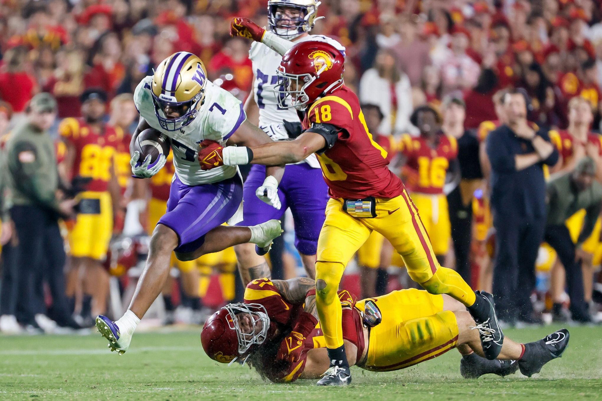
Some of my favorite Week 11 matchups:

What a classic look!
A rare time where all white actually looks fantastic IMO
Using powder blue, dark green, and gold in one matchup feels like cheating.
Two simple but great templates.
The two worst matchups IMO, both feature a few of the 50 shades of grey at home.
Why WVU went all white against all-anthracite is not for me to say.
Arizona almost saved the day with their generic Dick's Sporting Goods red pants.
-
 12
12
-
-
Ohio State going grey this week vs MSU
Marshall with their black tributes to 1970's tragedy
Louisville has new 'Ghost Stories' uniforms that feature glow in the dark details similar to ASU.
Oklahoma going with their anthracite alternates
-
3
-
-
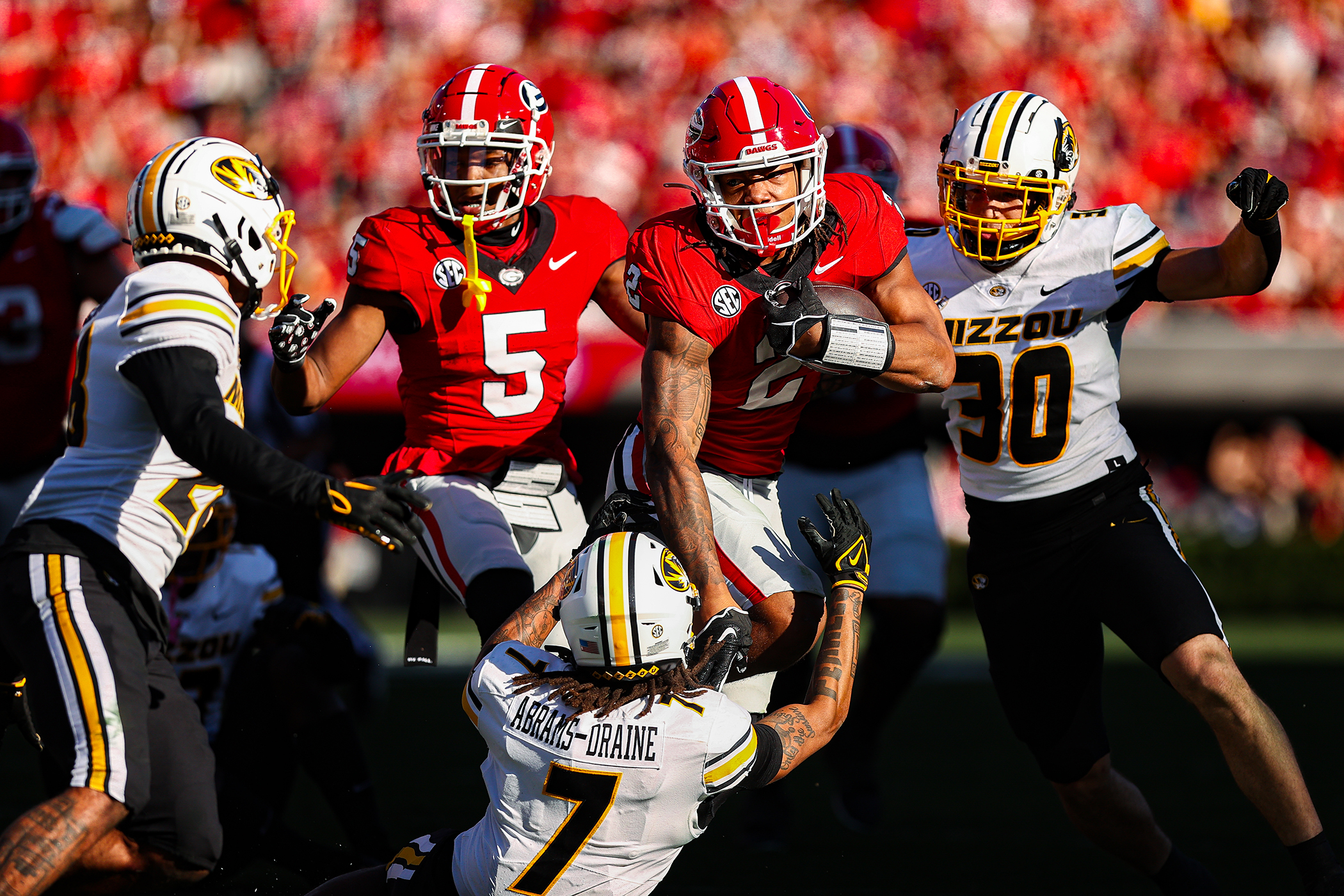
I'm a sucker for some good contrast. Here are some of my favorite matchups from the week!
Stinker of the week has to be the all-black vs all-white battle. Very odd choice by Arkansas to go completely white knowing Florida was donning the specialty black unis. This matchup could have been saved by red helmets or pants.
-
8
-
-
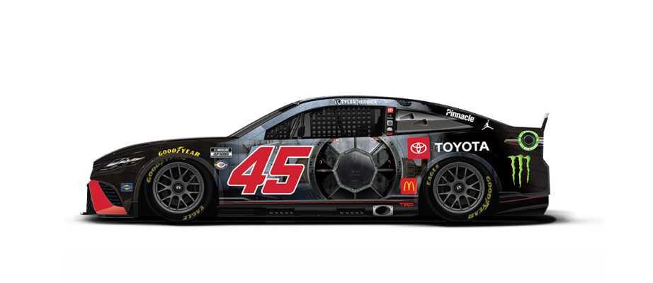
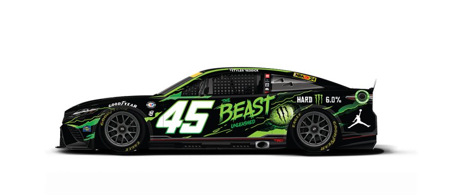
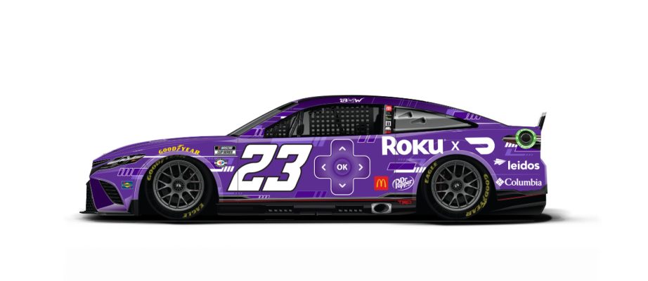
Championship weekend is here! 23XI has a Columbia x Star Wars thing going. Few notable schemes:
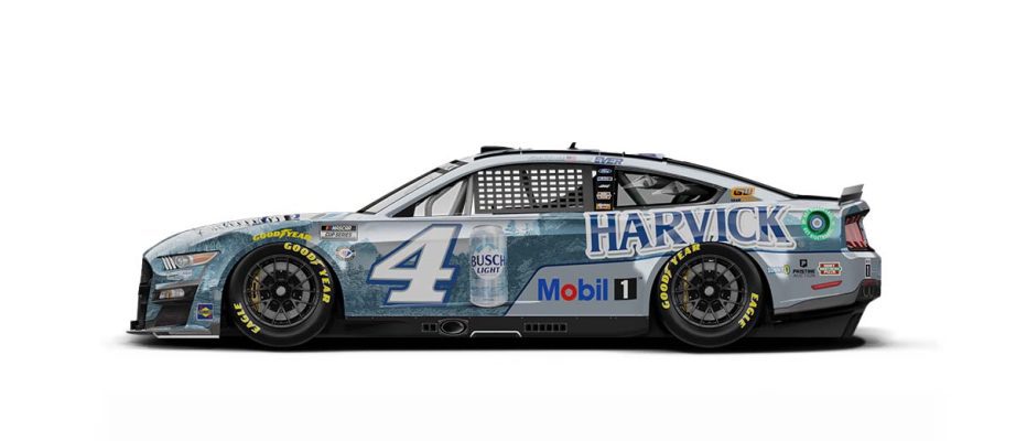
All SHR drivers will have a Harvick decal
-
All of the City uniforms officially released today.
Lakers highlighting a new logo.
Some great examples of PR speak going on...
-
1
-
-
Cougs going matte grey, crimson and white this weekend vs Stanford.
Florida breaking out the black with a Vetrans Day theme
Cincy also doing a military tribute
-
Studio Simon with another clean refresh.
-
4
-
-
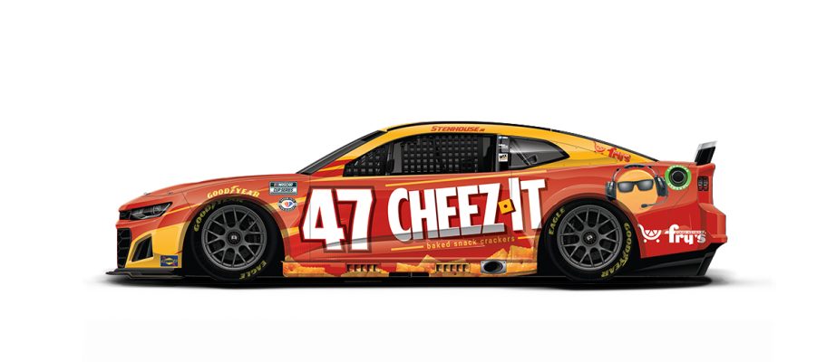
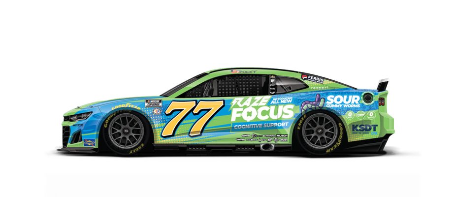
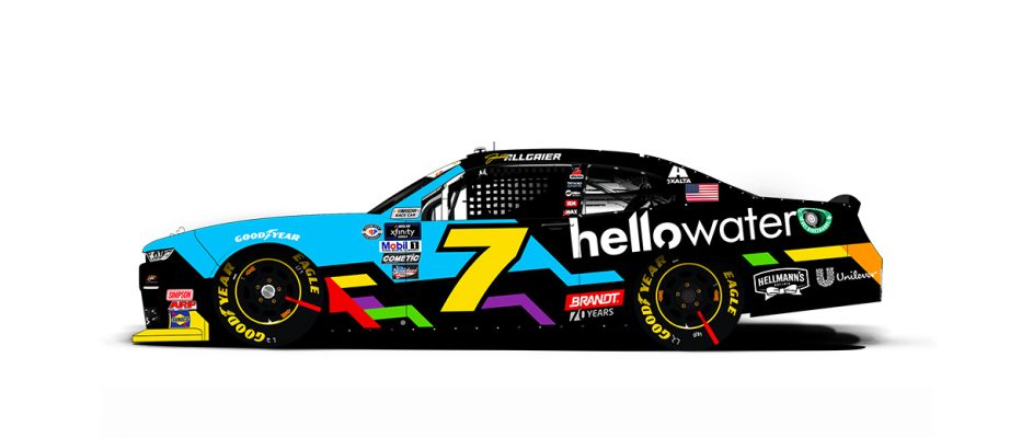
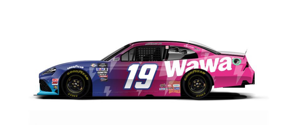
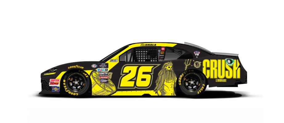
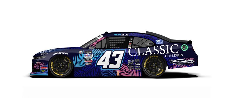
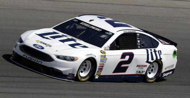
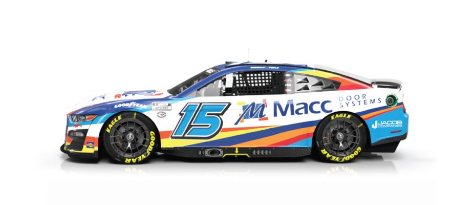
Some of the newer schemes running at Martinsville this week!
-
Lots of good uniform matchups yesterday!
-
7
-
 1
1
-
-
Utah with a new hand-painted helmet with the student section logo. They will be in Red/Red/White against the Ducks Black/White/Black.
I don't believe Utah has worn red vs Oregon since 2016.
-
1
-
-
It's so weird to see schools now moving to one logo for everything. I know the multiple schools I have worked with/for have had very strict brand guides and standards of 'this logo is for athletics only, and this one is for academics only'.
-
4
-
-
-
Some Miami schemes for this week:
-
 1
1
-
-
Agreed, as white can certainly be a clean look, but it's odd how bland these recent schemes have been. There are modern all/mostly white schemes that look so much better.
-
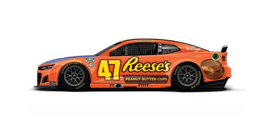
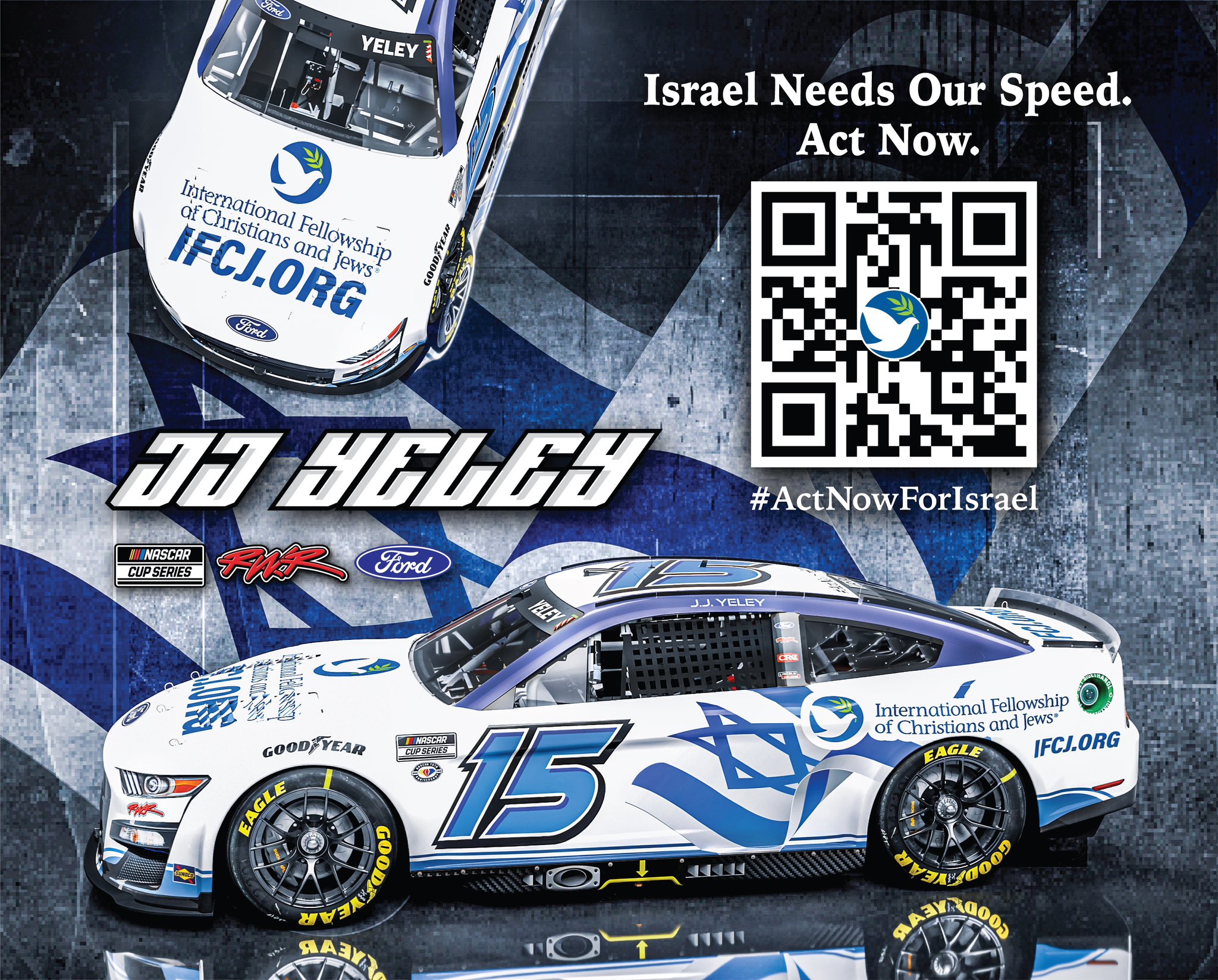
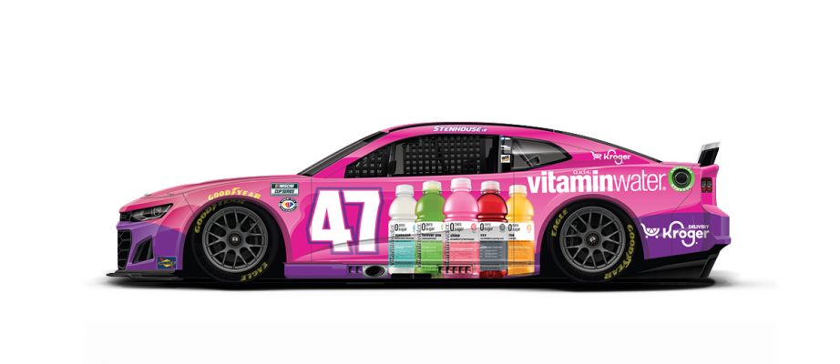
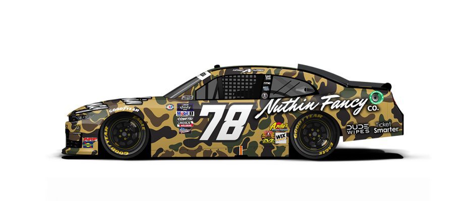
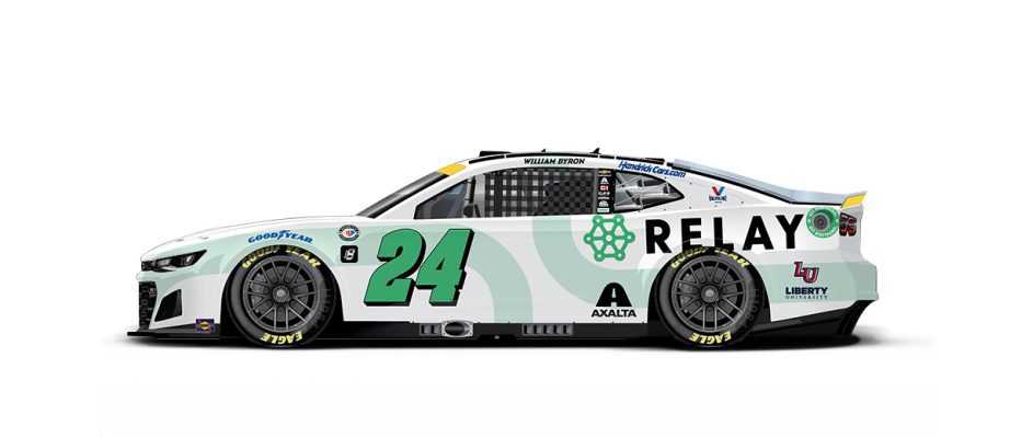
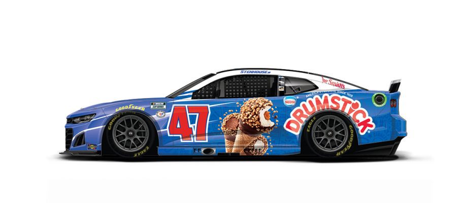
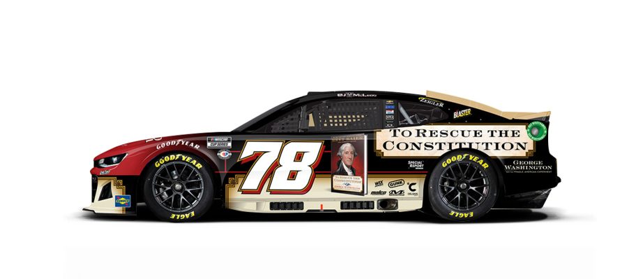
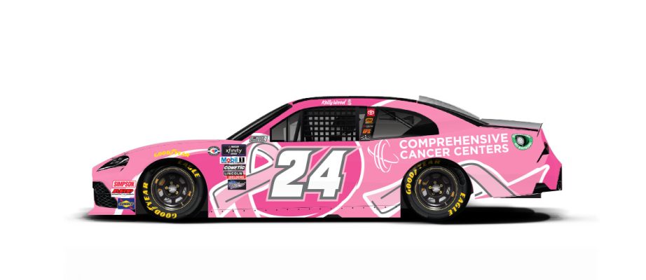
Some of the new schemes for Vegas:
Also Conor Mosak in Xfinity has an October Cancer Month themed car.
-
On 10/12/2023 at 11:35 AM, stumpygremlin said:
I get it, but it would've been cooler if they'd have modernized that logo. At the very least, it would've been cool if they kept the R-Cross mark in the package.
The old package was horrible, but yeah the new stuff looks like it took 5 minutes on Canva for a high school. Gotta be somewhere to exist between those 2 looks.
-
4 hours ago, dsaline97 said:
Can't believe I beat @colinturner95 to it this week

The script looks fine, but a plain all-white helmet is not the move here.
Man, Boise really has fallen off the face of the Earth. Absolutely no creativity with this program anymore. Pretty much always some combo of white and blue with one of 7 different clashing logos/fonts on the helmet. This one broke me because their pants have their current font but this helmet has a throwback/retro font? And not even a splash of color on the facemask, bumpers, or socks? Just sad after they were so eager to be on the forefront of pushing the envelope not too long ago.
-
3
-
-
Another new Jordan design for Reddick and Co.
-
1
-
1
-
-
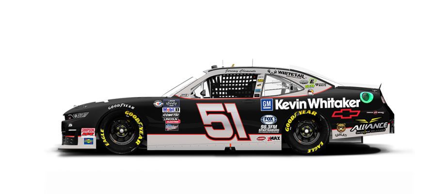
Jeremy Clements has a fantastic throwback scheme this weekend at the Roval!
-
1
-
-
15 hours ago, mjarvie said:
There is a thread on page 3 that hasn't been updated since July. It's just motorsports threads don't gain much traction around here because they aren't stick and ball sports.
It's a 2022 thread, so I thought this one would be the go-to moving forward into the playoffs and offseason.
-
I didn't see a thread dedicated to paint schemes, just talk about the season in general. Figured I would try to get one going here! I would love this to be the one place we go to in order to talk upcoming paint schemes, what's on our wishlist, etc.
Here are some schemes for the upcoming race at the Charlotte ROVAL!
-
1
-
-
Looking forward to seeing these matchups this weekend:
GB@LAS
DAL@SF
Not looking forward to:
CHI@WSH
NYJ@DEN
-
One of the truly iconic marks in sports, RIP to a visionary. I loved to see this image in the UniWatch story.
-
3 hours ago, WBeltz said:
If they’re gonna do City editions make them like the MLB ones where the uniform stays for 3-4 years. With how much the jerseys have had a lot of lackluster (and some great designs) in such a short time, I think giving them some longevity would do wonders.
Fully agree. There have been plenty of bad ones and plenty of great ones, but almost all of them are here and gone forever within an 8 month span. I really love the lore building around certain uniforms, so seeing the special ones every so often for 3-4 years would build so much more of a relationship with them. I would think Nike would value fans connecting with their product more.
-
1
-


 Why WVU went all white against all-anthracite is not for me to say.


/cloudfront-us-east-1.images.arcpublishing.com/gray/GFDNKQ75HNHDROUJVQ4SNZEZKY.jpg)


/cdn.vox-cdn.com/uploads/chorus_image/image/69912732/1342988209.0.jpg)
College Football 2023
in Sports Logo News
Posted
TCU has a new helmet with a new version of the blood frog.
Cougs going with a (new?) Wazzu wordmark helmet and all anthracite for Senior Day vs Colorado (hoping CU doesn't wear grey pants or helmets).