


HOOVER
-
Posts
1,461 -
Joined
-
Last visited
-
Days Won
12
Posts posted by HOOVER
-
-
2 hours ago, HopewellJones said:
I hate the new Broncos set more and more with each passing day. The pants stripe is so weak. The white logo on a white helmet looks like a high school helmet. The sleeve stripes only look like mountains on the blue jersey - snowcapped mountains against an orange sunset. Looks terrible on the primary home jersey. It's just so bad. Makes the original unis look amazing.
Yeah, these are a lateral move. I hated the old set, but these are a miss.The helmet and numbers are an improvement, but the sleeve stripe, pant stripe, and ridiculous combinations ruin it.
I'm really looking foreward to the games where they wear the Throwbacks. Those will be beautiful football games and I pray we get one of those Week 18 at Mile High against the Chiefs in all-White.
I'm also really looking forward to 5 years from now when they clean these up and dump the silly stripes and combos.
This is perfect right here:
-
 6
6
-
 1
1
-
-
At the end of the Jags schedule release video, which is well done if you're an X-Men '97 fan, the young boy at the beginning of the video is grown up at the end, and at the 1:27 mark, before getting up from his seat in front of the TV, he throws a Fred Taylor throwback jersey over his shoulder. It'll be the '97-'08 number font, not the '95-96.
Antonio Brown...right again.
https://www.jaguars.com/schedule/-
7
-
 1
1
-
 1
1
-
 1
1
-
-
On 5/14/2024 at 4:22 PM, DCarp1231 said:
Jags creative director deserves a raise for this.-
2
-
-
9 hours ago, PlayGloria said:
This debate will probably never end and that's probably because there is no right answer. History is crazy complex. As society progresses and changes, the ideas of the past get simplified and all context of past eras is lost. This causes people to label people, groups, and movements of the past as simply "good" or "bad".
There is an issue that I have with that way of thinking. It seems that people either say "that concept from the past is bad! Get rid of it and never speak of it again!" (see statues of figures from Civil War era that get ripped down, etc.) - or - people say "stop being a snowflake and get over it!" (see people that fly confederate flags just to piss people off).
There is a ground - it's called the middle - where society can actually learn from the past, accepting the good and the bad of each individual scenario. Our history shouldn't be erased, but we should also expect ourselves to grow from it.
So how does this tie into Washington? Well, as I see it, I think a side step in branding, keeping the same logo and uniforms but just changing the name, would have been a fantastic move. I also think teams with Native American themed names could and should go a step further and involve those communities with their teams with charity and game festivities. Let them be a part of the franchise - after all that is who you are honoring. Bring a positive change to something about the past that was carrying some negativity. GROW FROM IT. Feel free to thumbs me down, but if you do, please let me know why you think the Blackhawks, Chiefs, Seminoles, etc are exempt from this discussion then. Because if Washington just changed their nickname, they would be no different than those teams.
Pardon the essay here, but I also want to say this. The term "Native American" is no better in my eyes than Cleveland's old nickname or Washington's old nickname. They weren't "American" until Europeans got here and the work "native" sparks the idea of some old cartoon that mocks them. They are Apache, Cherokee, etc.
Respect. The mature perspective is much appreciated.-
3
-
-
9 hours ago, LAWeaver said:
At least with the 49ers and 76ers, those brands are named after historically-significant moments/eras in American history. I'm sorry but naming yourself the 32s because you were "founded" in 1932 is dumb.
I personally don't have any gripes about "Commanders" as a name, just the uniforms from the neck down. That being said, ever since I saw this concept from @mcrosby several years ago (particularly the plane logo), I've been a fan of the name Redtails honoring the Tuskegee Airmen. It keeps the obligatory military theme that the team/league apparently want to keep (because 'MERICA and FOOTBALL).
Not a fan of the name, helmet logo/striping, or inclusion of Red into the uniform, but I really, really love the basics of the home & away of this concept. Change "REDTAILS" to "WASHINGTON" in Gold on Maroon and Maroon on White, and remove the Red from the pant stripe, and this would be an absolute winner of a uniform. Perhaps repeat some of those starts from above the sleeve stripe on the pant stripe. These with the current Washington helmet and a Yellow-Gold mask would be really great.
I actually really like that alternate, too. For what it's supposed to be, it's a well-done alt. -
On 5/10/2024 at 7:49 PM, DCarp1231 said:
The full Texans number font- 4, 6, & 9 are the only three digits with a separate set depending on if it’s first or second for double digit numbers
Despite its quirks, which really don't bother me...I kinda like this number set.-
4
-
 1
1
-
-
7 hours ago, Carolingian Steamroller said:
For the record.
Washington operated as The Football Team for two whole seasons using the 80's uniforms and nobody had a problem with it. None of the folks, myself included, who wanted the old moniker dropped had beef with the uniforms themselves.
The Commanders got new uniforms because the team, inventing a new nickname, wanted new uniforms to go with the rebrand.
So there's no straw manning the uniforms as potentially offending anyone.
Personally, I would've loved it for Washington to stay the Washington Football Team and roll with the numbers on the helmets.
These, with the current helmet, would’ve sufficed.-
2
-
-
Jaguars and apparently the Giants and Vikings will debut new Throwbacks/Alts soon…is anyone else rumored to be doing anything?
Anyone have a list of alt uniforms & helmets yet to be unveiled for the ‘24 season?
-
2
-
-
54 minutes ago, coborjobs2010 said:
loving this combo
I do too. Not sure how I’ll like it with either helmet. A White helmet with Navy facemask would’ve been great with these.-
1
-
-
17 minutes ago, LAWeaver said:
I could maybe see the Rams and Dolphins tweaking their looks, especially with the popularity of Miami's throwback uniforms.
The Saints are in dire need of an update too.
Saints, good call. Would be nice to see them switch to the Throwback/Color Rush unis permanently with an updated helmet color shell to match.-
1
-
-
8 minutes ago, Chawls said:
Maybe it’s too soon to be asking this now, but who’s on the shortlist of teams who need a uniform overhaul now that the Bengals, Cardinals, and Broncos have all updated their looks?
I elect the Jaguars and Commanders.
Falcons.Ravens need to but they seem content to stick with what they have.
I think the Titans will be eligible, maybe they’ll want to return to a more classic or updated Oilers look.
Eagles need to, but I think that wordmark change reset their clock.Commanders - will be interesting to see if they rebrand, and if they wait until stadium plans are finalized before they do, or if they just decide to do new uniforms quickly with the new ownership waiver.
My wildcard is Seattle. New HC Mike Macdonald is putting his stamp on that team. Just read they’ve taken down all of the old Pete Carroll slogans and wall murals featuring past players and that they want the team to enter a new era with their own identity. Makes sense that they might want to update their 2012 look.
I wouldn’t be surprised though if no team updated in 2025.
-
Love the primary home & away uniforms.
The home is classy, though the 1-color TV numbers don’t make sense to me.
The away is an improvement and I like the change to Navy numbers.
The red alternate is no good. Too much red.
The H-Town alt isn’t as bad as I thought.
One major thing I noticed is the difference in some of the decoration materials used here; from FlexStyle logo patches to the materials used on the numbers and pant striping, it really adds to the simplicity of the design.
Number font & helmet finish are also a big improvement.
-
9 minutes ago, aawagner011 said:
Just because you have so many possible combos does not mean you need to show off all of them!
These have a couple redeeming qualities but definitely a few too many pieces of flair. They didn’t know when to stop and just said “give me all of it.”
Here’s the fix:1. Navy Helmet
2. Orange Jersey (home) White Jersey (away)
3. White Pants
4. Navy Socks
This is all the team should ever wear. The White helmet, Navy uniform, Orange pants, and Orange and White socks should all go in the incinerator.
We need to shame these teams out of thinking all of these combos are necessary. All it does is devalue the primary look and water down the identity.
-
3
-
 1
1
-
-
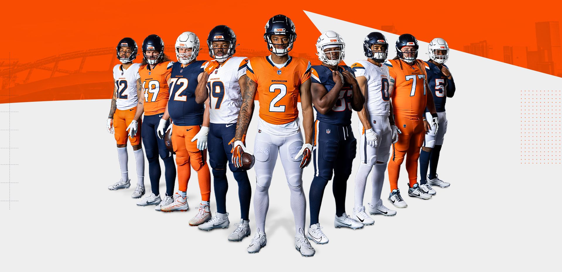
So, eating crow here.
I thought these would be horrendous.
Turns out they are a huge upgrade. The videos that they created for these also were absolutely top-notch. They hit me right where it mattered: they went just about full John Dutton in Yellowstone in the Mile High Collection video (and Ford Broncos will always be cool) and they took it back to the 80's with the Throwback video. This is coming from a diehard Chiefs fan who hates the Donkeys.
PROS: Jersey, pant, and helmet are all solid and all upgrades. The small details are done well, not obnoxious. I dig the small triangles as a separator. Love the helmet finish. Didn't think I'd like the number font but it's absolutely an upgrade.
CONS: The 5280 helmet bumper bothers me, as does putting it on the pant stripe. The elmet stripe is silly. The set does give off Virginia/Arizona vibes due to all of the combos. The White helmet is pointless if not being worn with the White uniform. And the Stripe should be Navy/Orange, not White/Navy. I only like the Orange pants with the Orange jersey. Mono-Navy is no good. I hate the Navy over White too.
Congrats, Broncos fans.-
 1
1
-
2
-
-
23 minutes ago, Blast_Brothers said:
The Broncos remains unchanged.
It's a pity they didn't update the font. -
18 minutes ago, Lights Out said:
These uniforms lasted almost as long as the ones they replaced. I'd say they did stand the test of time.
Respectfully, if they're being replaced, they aren't standing the test of time.
I'm comparing these to teams like Pittsburgh, Chicago, Kansas City, Las Vegas, Green Bay, etc.-
1
-
-
2 minutes ago, Brave-Bird 08 said:
Everyone give this baby one last good look (always loved it and will never apologize for it, just didn't mold well onto modern templates)
I remember when these debuted...it was a big deal. This striping pattern resonated down through high school football for over a decade.
But, it's run its course (years overdue) and it's yet another example of why non-traditional uniform elements typically don't stand the test of time.-
3
-
-
12 minutes ago, rfraser85 said:
Looks like the Ravens are adding a new helmet.
Source: Ravens Adding New Alternate Helmet (uni-watch.com)
Based on the color description, this helmet will most likely be for the CR uniform. I'm a little disappointed because I liked that the Ravens were able to stick with one helmet for all jerseys, but at it will match the CR. I didn't like most of CR, but I did like the uniforms better if the base color matched the helmet shells (such as Steelers, Texans, Vikings).
Nice find, thanks for sharing. Article states that it's likely Purple with a Gold facemask. Will be interesting to see what striping and paint finish they use. The Vikings' satin Purple would be really great for the Ravens, but it's unlikely they'll use it. My guess is metallic fleck, but maybe there's something new & interesting they can do to give it unique twist that's on-brand. It will be fun to see that alternate logo on the side of the helmet.
Hopefully this opens them up to permanently changing the paint finish & striping to their standard helmet at some point, as that a number font update are all they really need. -
11 minutes ago, PlayGloria said:
Might be an unpopular opinion, but I like the silver, white, purple combo of that Vikings jersey. The icicle numbers are not my favorite element, though. If this was just a straight recolor from their home/away set, I think I would actually dig it as an alternate.
I'm also guessing that their alternate helmet will be white? Part of me wants to already hate it because of the "icy" twitter stuff, but I am finding that I kind of like the idea of this specifically because it is for Minnesota and it is actually a cold weather state
Just feels very odd that teams are now potentially getting away from primary colors completely in alternates. I can't imagine seeing a 49ers uniform without Red or a Steelers uniform without Athletic Gold. If this begins to happen, I'll just be schocked that the NFL permitted it.
-
3
-
-
11 minutes ago, DCarp1231 said:
Sarcasm?
They either only showed the guys who said they liked them, pressured the guys into saying they liked them, or the guys felt like they needed to say they liked them.
Right? It's not like any of these guys are going to walk up and say, "Hey, these are dog:censored:."-
1
-
1
-
-
2 minutes ago, McCall said:
How does the Chiefs winning Super Bowls validate your statement about Bills fans clamoring for the return of the Jim Kelly era uniforms?

How does your douchebag reply to my comment prove they aren't?
This board is super enjoyable...except when the few contrarian pricks aren't chiming in to :censored: on other people's opinions.If you don't agree with someone's opinion or statement, you can use the react buttons or you can offer an opposing opinion in a respectful way. You don't have to be an :censored:, though I know it makes you feel better (in a really pathetic, lonely way).
-
1
-
1
-
 1
1
-
 2
2
-
 4
4
-
1
-
-
5 hours ago, BBTV said:
Paul's piece. But that part was interesting for two reasons.
1. the timing. He said 2015 or 2016, which kindasorta lines up with when they started lobbying for the kelly green helmet to "test" a return to the color by first using it as an alt. The story says that Lurie got cold feet and thought he should just keep the current uniform, which validates his desire to "test" it first.
2. after he nixed the redesign, he asked for "just give me some cool pants stripes, something that's never been done" (paraphrasing.). The proposals that were shown in the article were rather tame, but Lurie just swiped left.
As for a rumor that he'd "never change", that's simply not true. He's flat out said that he'd consider it. But they're very conservative and brand conscious and aren't going to make any decision that's not very well thought out (note - I didn't say well executed, just well thought out.)
*the wordmark fiasco would seem to run contrary to what I just said, since it wasn't timed right to get on the uniform in time, though we don't know the fully story there (like, maybe they were told it was minor enough to not require 2 years, or something like that.)
Paul, yes, thank you. I mistakenly interchange Paul Lukas and Uni-Watch Deputy Editor and heir apparent Phil Hecken all the time. Appreciate the correction. -
So many "that's fire" comments in this short clip that I want to light myself on fire.
-
3
-
3
-
-
20 minutes ago, Chromatic said:
Looks like a Habs jersey you'd see on one of those "What if the NHL played football" concepts.
I also don't buy this one. They just brought back the Lawrence Taylor home & aways over the last few years. Why would they change Throwbacks when those have been so well-received? Especially when Mara is so resistant to uniform changes.
I hope all of these CTESPN "leaks" are bull:censored:, because that would at least give me hope for the Broncos & Texans through Tuesday.-
3
-


:format(jpeg)/cdn.vox-cdn.com/uploads/chorus_image/image/48650395/GettyImages-1497208.0.jpg)


2024 NFL Changes
in Sports Logo News
Posted
The world is healing.