


C-Squared
-
Posts
1,559 -
Joined
-
Last visited
-
Days Won
13
Posts posted by C-Squared
-
-
What an oddly arbitrary things to commemorate at a baseball game.
-
Love the now-old Titans set! The 13-year-old me became an instant Titans fan when they unveiled the look in '99. Absolutely butchered their aesthetic this go-round

-
 2
2
-
-
4 minutes ago, OnWis97 said:
I am guessing this is unpopular...
I don't like the throwback Saints jersey worn yesterday. The "gold" is too close to copper. I prefer the current primary.
(or is this the primary, now?)
I will say that the uni falls a bit flat with the saturated jersey colors vs. the almost tan helmet shell.
-
1
-
-
On 8/4/2018 at 9:26 PM, walkerws said:

Of course having a semipro basketball team, the wingfoot would be a great mark.
This is every high school track team ever's logo, but it just works.
-
4
-
-
5 minutes ago, Gothamite said:
I think I may be in the other camp - the name is fine, but the logo and uniforms are lacking.
Agreed. For as campy as the name is, the logo seems bland and frankly a smidge amateur... feels like an attempt to play to all tastes without successfully playing to any.
-
1
-
-
On 6/3/2018 at 10:14 PM, bwburke94 said:
What was with the kerning on that number font?
My favorite thing about vintage jerseys is the needlessly wide kerning!
-
I am a huge Senifeld fan, but ould anybody really make the connection without the Kramer picture alongside the jersey for context?
-
I haven't kept up on this thread to know if this was posted already, but I came across this fascinating Michael Irvin jersey this morning:

-
3
-
-
3 hours ago, Cujo said:
Players don't actually wear their "second place is first loser" rings in public, do they?
Former Bills safety Mark Kelso was a teacher at my middle school and used to bring in his set of rings at the end of the year. He said he doesn't even know if they fit because he never put them on... he also brought in the famous double helmet, which was way cooler.
-
1
-
-
-
20 hours ago, whitedawg22 said:
Founders is one of the biggest microbreweries


-
3
-
-
Getting old fast, but I will say that the Pizza Rats script across the jersey is beautiful.
-
6
-
-
"bung hammers"

-
11
-
-
I always really liked the Tennessee Oilers uni patch for whatever reason:

-
9
-
-
On 6/3/2018 at 4:47 PM, kroywen said:
Is anyone else having issues with liking posts? If I just click once, the like doesn't go through - I'm having to double click (and keep a brief pause in between the two clicks) in order for a like to go through. It's very strange. Has been happening the past few days.
Literally just happened as I tried to like this post

-
3
-
-
This trend will spread like wildfire until we forget why we liked it in the first place... a great summer coming up for graphic designers, tho!
-
4 hours ago, leopard88 said:
This one suffers from the grouper problem -- live animal in the middle of a sandwich.
His nonchalant attitude shows that he has no idea that fate that awaits him.
Looks like that cocky lobster scored himself a Pop Tart.
-
3
-
-
13 minutes ago, MCM0313 said:
I thought the Lions wore those blue pants only in the '98 season?
Ahh good catch - Reich was '97 & '98, not '96 & '97!
-
1
-
-
I'm sure these have all been done by now, but...
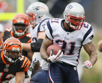
Fred Taylor w/ New England (09 & 10)
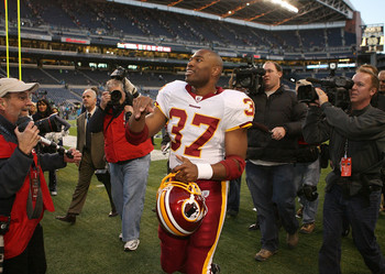
Shaun Alexander w/ Washington (08)

Andre Reed w/ Washington (00)

Larry Johnson w/ Miami (2011)

Kerry Collins w/ Indy (11)
Frank Reich w/ Detriot (96 & 97)

Jim Harbaugh w/ Carolina (01)
...and my personal sentimental favorite:
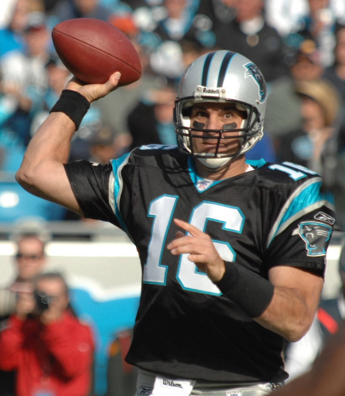
Vinny Testaverde w/ Carolina (07)
-
2
-
-
On 5/17/2018 at 11:35 AM, leopard88 said:
I love me a good fresh grouper sandwich, but that's a little too fresh. I don't want all of the scales and bones and assorted internal parts.
For real! This logo feels a bit morbid... look at that expression! You can almost see the fish trying to figure out where it all went wrong.
This is like if the Bisons "Wings" logo was a live chicken being dropped into a fryer.
-
1
-
-
These will sell like crazy in Buffalo... I don't love the sketch-style rendering, but I think it's pretty slick how they fashioned the wing and blue cheese into a B for the cap. Bonus points for celery stick socks!
-
4
-
-
On 4/19/2018 at 7:20 PM, pitt6pack said:
Figured this article on NFL.com today was relevant, although, I'm sure each of these players have probably been posted multiple times before...
Looks like we have an NFL.com spy among us... show yourself, Hanzus!
-
On 2/26/2018 at 6:14 PM, anythinglogos said:
Still the best looking uniform the 49ers have ever worn
I loved the white-on-white look and I like that it might return in 2018:

-
1
-
-
Does anyone recognize the large white font behind all the icons? Any help is appreciated!!


UPDATING VINTAGE LOGOS
in Concepts
Posted
I found an awesome throwback logo from my Alma Mater (the Niagara University Purple Eagles) on a t-shirt from a thrift store, so I decided to do a little cleanup vector over the weekend: