


C-Squared
-
Posts
1,559 -
Joined
-
Last visited
-
Days Won
13
Posts posted by C-Squared
-
-
3 hours ago, the admiral said:
Those were terrible, at least for Buffalo. I might not have minded the template for some expansion team, but Buffalo should look traditional. It's a traditional place
.
The obvious middle ground (to me, anyway) is a primary uniform with classic stripes, a lace-up neck, and the old alternate logo filtered through the classic colors:

...and, for the shoulders, a slightly modernized & isolated version of the Buffalo from the classic logo:

...and a yellow alternate DONE RIGHT!
-
 3
3
-
-
-
On 11/19/2016 at 11:26 PM, dont care said:
Since they are selling game and limited it looks pretty legit
So does every bootleg jersey site... unless you win a low-priced eBay auction, assume "too good to be true" prices are exactly that.
-
1
-
-
On 11/14/2016 at 9:38 AM, Rj0498 said:
Speaking of California NFL teams, I think these were the chargers best look

This specific picture with the blue sleeves gives this uniform a deceptive amount of balance. I always found the dark blue far too overbearing without the 80s yellow cutting through.
-
On 9/27/2016 at 0:26 PM, KittSmith_95 said:
On Fridays, we had Dressdown days for teachers in my school board (Jeans, hoodies, whatever the teacher likes), and technically he was a ECE (Early Childhood Educator) & it was when we had that playoff run in 2013.
I got suspended for uttering something offensive to a member of authority.
If one of my students called out a teacher for wearing a fake jersey, he/she would drown in A's tbh
-
1
-
-
That Hawks set looks amazing looking back at it, but, to be fair, I remember how bland and washed out it seemed at the time.
-
2
-
-
On 8/2/2016 at 9:42 AM, McCarthy said:
He had the misfortune of losing an extra 5th Super Bowl with the Falcons
Glenn Parker also of the Bills lost a 5th Super Bowl with the Giants in 2000.
Makes me happy this guy got his:

Bonus shotout to Mike Lodish for nabbing two rings in Denver.
-
With reports that Buffalo has offered Reggie Bush a 1 yr min. deal...

-
I have so much respect for painters. Some kids had swim test anxiety - I had watercolor anxiety. Everything I painted turned into a brown puddle. I would love to get into something like this:
http://twistedsifter.com/2014/07/thrift-store-painting-remixes-by-david-irvine/
-
I almost hate to create evidence of this opinion, but I caught some clips on NFL Network and love how this set looks in action:

-
1
-
-
21 hours ago, MCM0313 said:
Did The Edge take over by himself, or did Bono have a hand in the coup?
This is a common misconception! It was actually this man, who dropped his signature spear maneuver for the dreaded neutral zone trap:

-
3
-
-
A pretty big indy wrestling company in Toronto dropped this poorly-rendered logo a few weeks back:

After a little searching, I turned up this... at least they kept it local?

-
Edmonton has a great classic look and a smidge too tricky a namesake to rebrand gracefully (as the fossil drops made clear years ago)
-
1
-
-
What has the process been in the past to get moving? I have a few logos in mind to nominate!
-
On 5/6/2016 at 8:18 AM, tubby34 said:
I'm sure it's like the situation with the NYR- with two teams coming in the expansion draft the Blackhawks had to leave one goaltender unprotected and risk losing him for nothing. I'm sure they wanted Hasek as only a backup at that point since Belfour was an elite goaltender.
They traded Hasek for what they can get, exposed their new backup "Waite" to the expansion draft and didn't lose him and gained other assets.
Buffalo probably exposed Fuhr, Hasek or Draper in the expansion draft and none were selected.
Rangers traded Vanbiesbrouck to the Canucks to avoid losing him for nothing, and the cancks wanted him just to expose in th draft so they would not lose McLean.
If I recall correctly, Chicago used the pick from that trade to draft Eric Daze... not bad considering we flipped a known-as-elite Hasek for Slava Kozlov and a squandered 1st in '02

-
Purists aren't crazy about it, but unique branding could be a goldmine for teams like these who would otherwise generate zero interest outside their regions.
-
3
-
-
2 hours ago, BringBackTheVet said:
"NBA merchandizing types are constantly telling us it's the best in the league."
LOL Wut?
I read that whole excerpt in a Trump voice
-
9
-
-
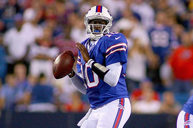
On 3/23/2016 at 8:51 PM, JosiahWVU said:
I love the Bucs over sized helmet logo.

Makes me miss the oversized logos on the Bills red helmets.
-
1
-
-
I learned of the Bananas today as I sat on the couch rooting through the huge pile of various banana-flavored candies my girlfriend gave my for Valentine's Day... needless to say, a hat has been pre-ordered.
-
The white helmet feels so empty... I don't know if it feels too gimmicky, but I love how this black helmet (ideally with no stripe at all) showcases the simplicity of the tweaked logo:
Of course, Nike-fied "blackout" uniforms would surely follow
-
2
-
-
I looked into Nike knock-offs and it seems like they're made better than their former Reebok knockoff counterparts... that being said, you can routinely buy legit game-worn jerseys of obscure 90's players on eBay that fit like a glove for less than the price of a legit Nike replica. Seems like a no-brainer to me.
-
Chelios as a Thrasher wins so far... so strange seeing such an old school player in such a clumsily modern uniform
-
At least in this uniform, Broncos look a lot better in blue than in orange.
How's this for an unpopular opinion - Denver shouldn't have ditched the toilet bowl collars.
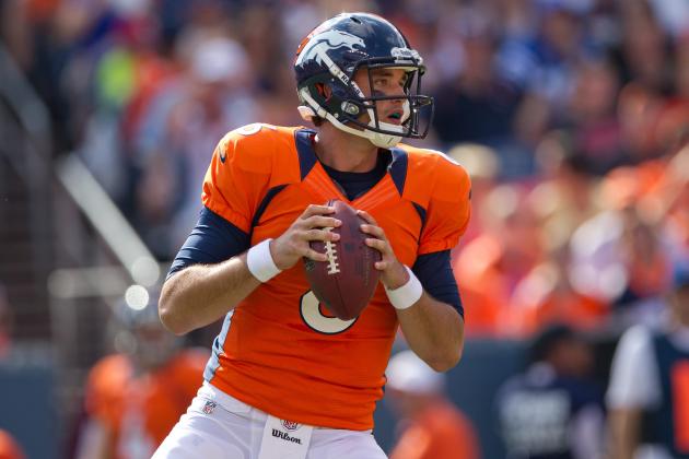
It matched the side panels so well that, if I didn't know better, I'd swear it was done on purpose. Their current collars are cartoonish and would be better off neutralized altogether a la Indy or Pittsburgh.
-

Bledsoe only wore these for a short time. This is clearly the Tom Brady era unis.
I was born in '98, so to me these are the correct uniforms for Drew. IIRC, that picture is from the AFC Championship in '01, which is the last time he saw playing time as a Patriot.
I strongly believe Bledsoe would have led the Pats to the title had they chosen him to start over Brady two weeks later.


Unpopular Opinions
in Sports Logo General Discussion
Posted
I tend to look at uni designs through manufacturer eyes since that has the biggest impact on these types of decisions. It makes no sense absorbing a profitable throwback market like that